How to Build a Post Detail Screen in Flutter (Full Code + Preview)
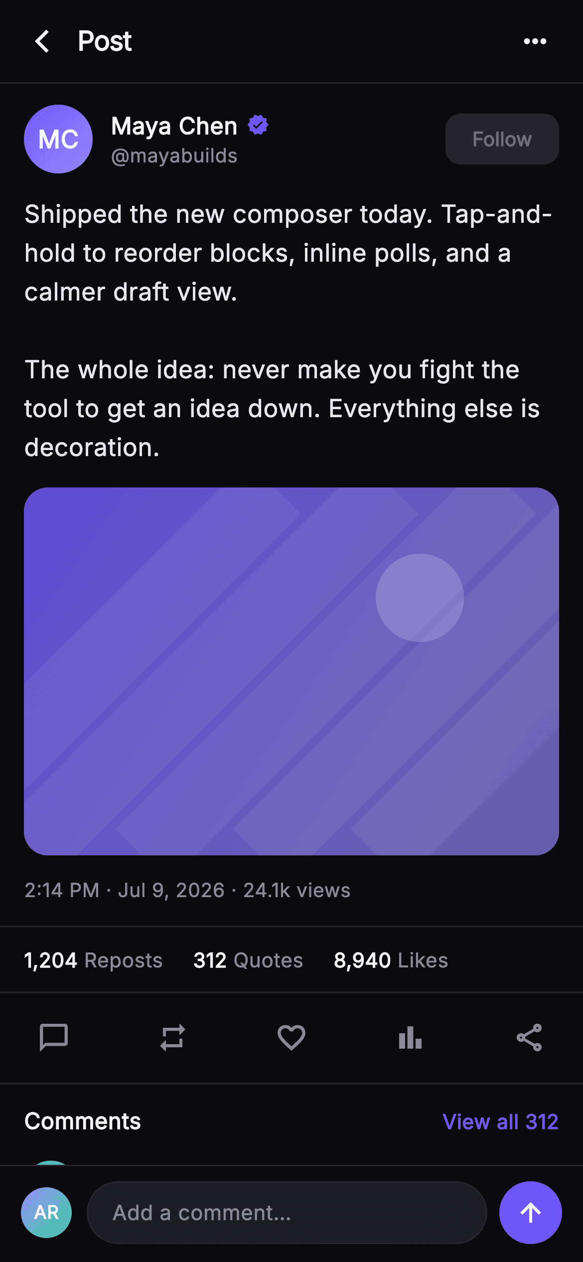
Opening a post from a feed should give you something the card could not: the caption in full, the media at readable size, and the numbers a compact card hides. This tutorial builds Pulse's post detail screen in Flutter — a verified author row with a Follow button, body copy at 16.5px on 1.55 line height, a 16:11 media card painted by a CustomPainter instead of a network image, a timestamp-and-views line, an engagement tally between hairlines, a five-action bar, and a composer pinned under the scroll.
Watch the Flutter UI walkthrough
A short screen recording of Pulse · Post Detail running, if you'd rather see it before you read the code. The written tutorial below covers everything in it.
Can't see the video? Watch it on YouTube.
What you'll build
- ✓An author row pairing a gradient monogram, an inline Icons.verified badge and a 34px Follow button that never squeezes the name
- ✓A 16:11 media card drawn by _MediaPainter — gradient, diagonal streaks, one translucent disc — with no asset and no network request
- ✓An engagement tally reading 1,204 Reposts · 312 Quotes · 8,940 Likes, framed by 1px hairline dividers
- ✓A five-icon action bar spaced with MainAxisAlignment.spaceBetween instead of fixed gaps
- ✓A fixed-height 'Add a comment…' composer pinned outside the ListView so it stays put while the post scrolls
Step-by-step build
Create the file
Add a new file at lib/social_post_detail/social_post_detail_screen.dart in your Flutter project.
Register the bundled fonts
No external packages — this is pure Flutter. It does bundle its design font (Inter), so drop the font file into fonts/ and declare it in pubspec.yaml:
flutter:
  fonts:
    - family: Inter
      fonts:
- asset: fonts/Inter-Regular.ttfBuild it, piece by piece
Here's how the screen goes together. Each block below is a real slice of the code with a plain-English explanation — paste them in order, or grab the whole file from the next section.
Callbacks, the Pulse palette, and comments as data
import 'package:flutter/material.dart';

/// Post Detail — the full single-post view: author row with a Follow button, the
/// full body, painted media, a timestamp + views line, an engagement tally, the
/// action bar, and a preview of the top comments. A pinned "Add a comment"
/// composer sits at the bottom at fixed height. Self-contained per CONVENTIONS.md:
/// pure Flutter, bundled Inter font, own dark theme, SafeArea, overflow-proof.
class SocialPostDetailScreen extends StatelessWidget {
  const SocialPostDetailScreen({
    super.key,
    this.onBack,
    this.onMore,
    this.onFollow,
    this.onLike,
    this.onComment,
    this.onShare,
    this.onOpenComments,
    this.onAddComment,
  });

  final VoidCallback? onBack;
  final VoidCallback? onMore;
  final VoidCallback? onFollow;
  final VoidCallback? onLike;
  final VoidCallback? onComment;
  final VoidCallback? onShare;
  final VoidCallback? onOpenComments;
  final VoidCallback? onAddComment;

  static const String _font = 'Inter';
  static const Color _bg = Color(0xFF0B0B0F);
  static const Color _surfaceAlt = Color(0xFF1D1D26);
  static const Color _brand = Color(0xFF6E56F7);
  static const Color _hairline = Color(0xFF26262F);
  static const Color _textHi = Color(0xFFF4F4F7);
  static const Color _textLo = Color(0xFFB5B5C2);
  static const Color _muted = Color(0xFF8A8A99);

  static const List<_Comment> _comments = <_Comment>[
    _Comment('Dev Kapoor', 'devk', '18m', 0xFF34D399, 0xFF6E56F7,
        'This is exactly the calm I want from a composer. Shipping the win early is everything.',
        42),
    _Comment('Lena Ortiz', 'lenaux', '31m', 0xFFF4476B, 0xFFFBBF24,
        'The reorder-by-hold detail is so good. Tiny interaction, huge payoff.',
        27),
  ];
The screen is a `StatelessWidget` taking eight nullable `VoidCallback`s — `onBack`, `onMore`, `onFollow`, `onLike`, `onComment`, `onShare`, `onOpenComments`, `onAddComment` — so it renders identically whether or not anything is wired behind it. The palette is five static consts: `_bg` `#0B0B0F`, `_surfaceAlt` `#1D1D26`, `_hairline` `#26262F` and two text greys, with a single indigo `_brand` `#6E56F7` reserved for the verified badge, the Follow button, the 'View all' link and the send button — every accent on the screen is the same colour, which is what stops a dark UI turning into confetti. The two preview comments are a `static const List<_Comment>`, so the copy is editable in one place rather than buried in widgets.
The author row and the verified name
  @override
  Widget build(BuildContext context) {
    return Theme(
      data: ThemeData.dark(useMaterial3: true),
      child: Scaffold(
        backgroundColor: _bg,
        body: SafeArea(
          child: Column(
            children: <Widget>[
              _TopBar(onBack: onBack, onMore: onMore),
              Expanded(
                child: ListView(
                  padding: EdgeInsets.zero,
                  children: <Widget>[
                    Padding(
                      padding: const EdgeInsets.fromLTRB(16, 14, 16, 0),
                      child: Row(
                        children: <Widget>[
                          const _Monogram(
                            initials: 'MC',
                            colorA: Color(0xFF6E56F7),
                            colorB: Color(0xFF9B8CFF),
                            size: 46,
                          ),
                          const SizedBox(width: 12),
                          Expanded(
                            child: Column(
                              crossAxisAlignment: CrossAxisAlignment.start,
                              children: <Widget>[
                                Row(
                                  children: <Widget>[
                                    const Flexible(
                                      child: Text(
                                        'Maya Chen',
                                        overflow: TextOverflow.ellipsis,
                                        style: TextStyle(
                                          fontFamily: _font,
                                          fontSize: 15.5,
                                          fontWeight: FontWeight.w700,
                                          color: _textHi,
                                        ),
                                      ),
                                    ),
                                    const SizedBox(width: 6),
                                    const Icon(Icons.verified,
                                        size: 15, color: _brand),
                                  ],
                                ),
                                const Text(
                                  '@mayabuilds',
                                  style: TextStyle(
                                    fontFamily: _font,
                                    fontSize: 13,
                                    color: _muted,
                                  ),
                                ),
                              ],
                            ),
                          ),
                          const SizedBox(width: 10),
                          _FollowButton(onTap: onFollow),
                        ],
                      ),
                    ),
`Theme(data: ThemeData.dark(useMaterial3: true))` wraps the Scaffold so this screen keeps its dark look regardless of the host app's theme. Inside a `Column`, the `_TopBar` is fixed and an `Expanded` `ListView` takes the rest. The author row leads with a 46px `_Monogram`, then an `Expanded` column so the name block claims whatever the avatar and Follow button leave. 'Maya Chen' sits in a `Flexible` with `TextOverflow.ellipsis` and the 15px `Icons.verified` badge outside it — that ordering matters: a long display name truncates while the badge stays visible, instead of the badge being shoved off the row.
Body copy, the painted media card, timestamp and stats
                    const Padding(
                      padding: EdgeInsets.fromLTRB(16, 14, 16, 0),
                      child: Text(
                        'Shipped the new composer today. Tap-and-hold to reorder '
                        'blocks, inline polls, and a calmer draft view.\n\n'
                        'The whole idea: never make you fight the tool to get an '
                        'idea down. Everything else is decoration.',
                        style: TextStyle(
                          fontFamily: _font,
                          fontSize: 16.5,
                          height: 1.55,
                          color: Color(0xFFE7E7ED),
                        ),
                      ),
                    ),
                    Padding(
                      padding: const EdgeInsets.fromLTRB(16, 14, 16, 0),
                      child: ClipRRect(
                        borderRadius: BorderRadius.circular(16),
                        child: AspectRatio(
                          aspectRatio: 16 / 11,
                          child: CustomPaint(
                            painter: _MediaPainter(
                                Color(0xFF6E56F7), Color(0xFF9B8CFF)),
                            child: const SizedBox.expand(),
                          ),
                        ),
                      ),
                    ),
                    const Padding(
                      padding: EdgeInsets.fromLTRB(16, 14, 16, 0),
                      child: Text(
                        '2:14 PM · Jul 9, 2026 · 24.1k views',
                        style: TextStyle(
                          fontFamily: _font,
                          fontSize: 13,
                          color: _muted,
                        ),
                      ),
                    ),
                    const SizedBox(height: 14),
                    const _Divider(),
                    const Padding(
                      padding: EdgeInsets.fromLTRB(16, 12, 16, 12),
                      child: Row(
                        children: <Widget>[
                          _Tally(count: '1,204', label: 'Reposts'),
                          SizedBox(width: 20),
                          _Tally(count: '312', label: 'Quotes'),
                          SizedBox(width: 20),
                          _Tally(count: '8,940', label: 'Likes'),
                        ],
                      ),
                    ),
                    const _Divider(),
                    _DetailActionBar(
                      onLike: onLike,
                      onComment: onComment,
                      onShare: onShare,
                    ),
                    const _Divider(),
The post body renders at 16.5px with `height: 1.55` in `#E7E7ED` — noticeably larger than the 14px a feed card uses, which is the whole point of a detail view. The media is a `ClipRRect` at 16px radius wrapping an `AspectRatio(16 / 11)` over a `CustomPaint` with `_MediaPainter`; `SizedBox.expand()` gives the painter a box to fill. Under it, '2:14 PM · Jul 9, 2026 · 24.1k views' states an absolute time rather than the relative '18m' a feed uses. The `_Tally` row of Reposts, Quotes and Likes then sits between two `_Divider` hairlines, with `_DetailActionBar` in its own banded section below.
Comments preview and the pinned composer
                    Padding(
                      padding: const EdgeInsets.fromLTRB(16, 14, 16, 6),
                      child: Row(
                        mainAxisAlignment: MainAxisAlignment.spaceBetween,
                        children: <Widget>[
                          const Text(
                            'Comments',
                            style: TextStyle(
                              fontFamily: _font,
                              fontSize: 15,
                              fontWeight: FontWeight.w700,
                              color: _textHi,
                            ),
                          ),
                          GestureDetector(
                            onTap: onOpenComments,
                            child: const Text(
                              'View all 312',
                              style: TextStyle(
                                fontFamily: _font,
                                fontSize: 13.5,
                                fontWeight: FontWeight.w600,
                                color: _brand,
                              ),
                            ),
                          ),
                        ],
                      ),
                    ),
                    for (final _Comment c in _comments) _CommentRow(comment: c),
                    const SizedBox(height: 16),
                  ],
                ),
              ),
              _Composer(onTap: onAddComment),
            ],
          ),
        ),
      ),
    );
  }
}
A 'Comments' header uses `MainAxisAlignment.spaceBetween` to push a 'View all 312' link, wired through `GestureDetector` to `onOpenComments`, to the right edge — the count matches the Quotes tally deliberately, so the numbers on the screen agree with each other. Only two `_CommentRow`s are emitted, via `for (final _Comment c in _comments)` spread straight into the children list, because a detail screen is meant to sample the discussion, not host it. `_Composer` sits after the `Expanded` in the outer `Column`, not inside the `ListView`, which is what keeps it pinned at the bottom while everything above scrolls under it.
The top bar and the Follow button
class _TopBar extends StatelessWidget {
  const _TopBar({this.onBack, this.onMore});
  final VoidCallback? onBack;
  final VoidCallback? onMore;

  @override
  Widget build(BuildContext context) {
    return Container(
      height: 56,
      padding: const EdgeInsets.only(left: 4, right: 8),
      decoration: const BoxDecoration(
        border: Border(
          bottom: BorderSide(color: SocialPostDetailScreen._hairline),
        ),
      ),
      child: Row(
        children: <Widget>[
          IconButton(
            onPressed: onBack,
            icon: const Icon(Icons.arrow_back_ios_new,
                size: 18, color: SocialPostDetailScreen._textHi),
          ),
          const Text(
            'Post',
            style: TextStyle(
              fontFamily: SocialPostDetailScreen._font,
              fontSize: 18,
              fontWeight: FontWeight.w700,
              letterSpacing: -0.4,
              color: SocialPostDetailScreen._textHi,
            ),
          ),
          const Spacer(),
          IconButton(
            onPressed: onMore,
            icon: const Icon(Icons.more_horiz,
                size: 22, color: SocialPostDetailScreen._textHi),
          ),
        ],
      ),
    );
  }
}

class _FollowButton extends StatelessWidget {
  const _FollowButton({this.onTap});
  final VoidCallback? onTap;

  @override
  Widget build(BuildContext context) {
    return SizedBox(
      height: 34,
      child: FilledButton(
        onPressed: onTap,
        style: FilledButton.styleFrom(
          backgroundColor: SocialPostDetailScreen._brand,
          foregroundColor: Colors.white,
          padding: const EdgeInsets.symmetric(horizontal: 18),
          shape: RoundedRectangleBorder(
            borderRadius: BorderRadius.circular(10),
          ),
        ),
        child: const Text(
          'Follow',
          style: TextStyle(
            fontFamily: SocialPostDetailScreen._font,
            fontSize: 13,
            fontWeight: FontWeight.w700,
          ),
        ),
      ),
    );
  }
}
`_TopBar` is a 56px `Container` whose only decoration is a bottom `BorderSide` in `_hairline` — a hairline rather than an elevation shadow, which is the right call on a near-black background where a shadow is invisible anyway. The title is simply 'Post' at 18px `w700` with `letterSpacing: -0.4`, left-aligned beside the back chevron, and a `Spacer()` pushes the `more_horiz` button to the right. `_FollowButton` is a `FilledButton` boxed in a `SizedBox(height: 34)` with 18px horizontal padding and a 10px radius, so it stays a compact chip inside the author row instead of adopting Material's default 48px button height.
Tally pairs and the five-action bar
class _Tally extends StatelessWidget {
  const _Tally({required this.count, required this.label});
  final String count;
  final String label;

  @override
  Widget build(BuildContext context) {
    return Row(
      children: <Widget>[
        Text(
          count,
          style: const TextStyle(
            fontFamily: SocialPostDetailScreen._font,
            fontSize: 13.5,
            fontWeight: FontWeight.w700,
            color: SocialPostDetailScreen._textHi,
          ),
        ),
        const SizedBox(width: 4),
        Text(
          label,
          style: const TextStyle(
            fontFamily: SocialPostDetailScreen._font,
            fontSize: 13.5,
            color: SocialPostDetailScreen._muted,
          ),
        ),
      ],
    );
  }
}

class _DetailActionBar extends StatelessWidget {
  const _DetailActionBar({this.onLike, this.onComment, this.onShare});
  final VoidCallback? onLike;
  final VoidCallback? onComment;
  final VoidCallback? onShare;

  @override
  Widget build(BuildContext context) {
    return Padding(
      padding: const EdgeInsets.symmetric(horizontal: 12, vertical: 6),
      child: Row(
        mainAxisAlignment: MainAxisAlignment.spaceBetween,
        children: <Widget>[
          _IconBtn(icon: Icons.chat_bubble_outline, onTap: onComment),
          _IconBtn(icon: Icons.repeat, onTap: () {}),
          _IconBtn(icon: Icons.favorite_border, onTap: onLike),
          _IconBtn(icon: Icons.bar_chart, onTap: () {}),
          _IconBtn(icon: Icons.share_outlined, onTap: onShare),
        ],
      ),
    );
  }
}

class _IconBtn extends StatelessWidget {
  const _IconBtn({required this.icon, this.onTap});
  final IconData icon;
  final VoidCallback? onTap;

  @override
  Widget build(BuildContext context) {
    return IconButton(
      onPressed: onTap,
      icon: Icon(icon, size: 22, color: SocialPostDetailScreen._muted),
      splashRadius: 22,
    );
  }
}
`_Tally` is a two-`Text` Row: the count at 13.5px `w700` in `_textHi`, then a 4px gap and the label at the same size in `_muted`. Same size, different weight and colour — the number reads first without the label shrinking into illegibility. `_DetailActionBar` lays five `_IconBtn`s with `MainAxisAlignment.spaceBetween` so they spread edge to edge on any width rather than clustering at fixed gaps. Note what is wired and what is not: comment, like and share receive the injected callbacks, while repost and `Icons.bar_chart` get `() {}` placeholders. All five icons are outline variants in `_muted`, and `splashRadius: 22` keeps the ripple inside the glyph.
The composer, the hairline divider and gradient monograms
class _Composer extends StatelessWidget {
  const _Composer({this.onTap});
  final VoidCallback? onTap;

  @override
  Widget build(BuildContext context) {
    return Container(
      decoration: const BoxDecoration(
        color: SocialPostDetailScreen._bg,
        border: Border(
          top: BorderSide(color: SocialPostDetailScreen._hairline),
        ),
      ),
      padding: const EdgeInsets.fromLTRB(14, 10, 14, 12),
      child: Row(
        children: <Widget>[
          const _Monogram(
            initials: 'AR',
            colorA: Color(0xFF9B8CFF),
            colorB: Color(0xFF34D399),
            size: 34,
          ),
          const SizedBox(width: 10),
          Expanded(
            child: GestureDetector(
              onTap: onTap,
              child: Container(
                height: 42,
                alignment: Alignment.centerLeft,
                padding: const EdgeInsets.symmetric(horizontal: 16),
                decoration: BoxDecoration(
                  color: SocialPostDetailScreen._surfaceAlt,
                  borderRadius: BorderRadius.circular(21),
                  border:
                      Border.all(color: SocialPostDetailScreen._hairline),
                ),
                child: const Text(
                  'Add a comment…',
                  style: TextStyle(
                    fontFamily: SocialPostDetailScreen._font,
                    fontSize: 14,
                    color: SocialPostDetailScreen._muted,
                  ),
                ),
              ),
            ),
          ),
          const SizedBox(width: 8),
          GestureDetector(
            onTap: onTap,
            child: Container(
              width: 42,
              height: 42,
              decoration: const BoxDecoration(
                color: SocialPostDetailScreen._brand,
                shape: BoxShape.circle,
              ),
              child: const Icon(Icons.arrow_upward,
                  size: 20, color: Colors.white),
            ),
          ),
        ],
      ),
    );
  }
}

class _Divider extends StatelessWidget {
  const _Divider();
  @override
  Widget build(BuildContext context) =>
      const Divider(height: 1, color: SocialPostDetailScreen._hairline);
}

class _Monogram extends StatelessWidget {
  const _Monogram({
    required this.initials,
    required this.colorA,
    required this.colorB,
    this.size = 42,
  });
  final String initials;
  final Color colorA;
  final Color colorB;
  final double size;

  @override
  Widget build(BuildContext context) {
    return Container(
      width: size,
      height: size,
      decoration: BoxDecoration(
        shape: BoxShape.circle,
        gradient: LinearGradient(
          begin: Alignment.topLeft,
          end: Alignment.bottomRight,
          colors: <Color>[colorA, colorB],
        ),
      ),
      child: Center(
        child: Text(
          initials,
          style: TextStyle(
            fontFamily: SocialPostDetailScreen._font,
            fontSize: size * 0.36,
            fontWeight: FontWeight.w700,
            color: Colors.white,
          ),
        ),
      ),
    );
  }
}
`_Composer` paints its own `_bg` fill and a top hairline so content scrolling beneath it disappears cleanly. It holds a 34px viewer monogram, an `Expanded` 42px-tall pill at `_surfaceAlt` with `BorderRadius.circular(21)` — exactly half the height, so the ends are true semicircles — and a 42px circular send button in `_brand`. Both the pill and the button call the same `onTap`, because tapping either should open the real editor. `_Divider` is a one-line class wrapping `Divider(height: 1)`, so a hairline never adds vertical space. `_Monogram` draws a `LinearGradient` circle top-left to bottom-right and sizes its initials at `size * 0.36`, which is why one widget serves the 46px author, the 36px comments and the 34px composer.
Painting the media instead of loading it
class _MediaPainter extends CustomPainter {
  _MediaPainter(this.colorA, this.colorB);
  final Color colorA;
  final Color colorB;

  @override
  void paint(Canvas canvas, Size size) {
    final Rect rect = Offset.zero & size;
    canvas.drawRect(
      rect,
      Paint()
        ..shader = LinearGradient(
          begin: Alignment.topLeft,
          end: Alignment.bottomRight,
          colors: <Color>[
            colorA.withValues(alpha: 0.85),
            colorB.withValues(alpha: 0.65),
          ],
        ).createShader(rect),
    );
    final Paint streak = Paint()
      ..color = Colors.white.withValues(alpha: 0.06)
      ..style = PaintingStyle.stroke
      ..strokeWidth = size.width * 0.14;
    for (int i = -1; i < 4; i++) {
      final double x = size.width * (0.22 * i);
      canvas.drawLine(Offset(x, size.height), Offset(x + size.height, 0), streak);
    }
    canvas.drawCircle(
      Offset(size.width * 0.74, size.height * 0.30),
      size.height * 0.12,
      Paint()..color = Colors.white.withValues(alpha: 0.18),
    );
  }

  @override
  bool shouldRepaint(covariant _MediaPainter old) =>
      old.colorA != colorA || old.colorB != colorB;
}
`_MediaPainter` fills the rect with a diagonal `LinearGradient` shader from `colorA` at 85% alpha to `colorB` at 65%. Over it, a stroke `Paint` at just 6% white with `strokeWidth = size.width * 0.14` draws five diagonals: the loop runs `i` from -1 to 3, starting each line at `x = width * 0.22 * i` on the bottom edge and ending at `x + size.height` on the top, so every streak sits at 45 degrees and the -1 start guarantees the left corner is covered. A single 18%-white circle at 74% across and 30% down adds a highlight. Everything is a fraction of `size`, so the art scales to any card, and `shouldRepaint` compares both colours.
Full code
The complete, ready-to-paste source. Free to use in your projects — one click copies it all.
import 'package:flutter/material.dart';
/// Post Detail — the full single-post view: author row with a Follow button, the
/// full body, painted media, a timestamp + views line, an engagement tally, the
/// action bar, and a preview of the top comments. A pinned "Add a comment"
/// composer sits at the bottom at fixed height. Self-contained per CONVENTIONS.md:
/// pure Flutter, bundled Inter font, own dark theme, SafeArea, overflow-proof.
class SocialPostDetailScreen extends StatelessWidget {
const SocialPostDetailScreen({
super.key,
this.onBack,
this.onMore,
this.onFollow,
this.onLike,
this.onComment,
this.onShare,
this.onOpenComments,
this.onAddComment,
});
final VoidCallback? onBack;
final VoidCallback? onMore;
final VoidCallback? onFollow;
final VoidCallback? onLike;
final VoidCallback? onComment;
final VoidCallback? onShare;
final VoidCallback? onOpenComments;
final VoidCallback? onAddComment;
static const String _font = 'Inter';
static const Color _bg = Color(0xFF0B0B0F);
static const Color _surfaceAlt = Color(0xFF1D1D26);
static const Color _brand = Color(0xFF6E56F7);
static const Color _hairline = Color(0xFF26262F);
static const Color _textHi = Color(0xFFF4F4F7);
static const Color _textLo = Color(0xFFB5B5C2);
static const Color _muted = Color(0xFF8A8A99);
static const List<_Comment> _comments = <_Comment>[
_Comment('Dev Kapoor', 'devk', '18m', 0xFF34D399, 0xFF6E56F7,
'This is exactly the calm I want from a composer. Shipping the win early is everything.',
42),
_Comment('Lena Ortiz', 'lenaux', '31m', 0xFFF4476B, 0xFFFBBF24,
'The reorder-by-hold detail is so good. Tiny interaction, huge payoff.',
27),
];
@override
Widget build(BuildContext context) {
return Theme(
data: ThemeData.dark(useMaterial3: true),
child: Scaffold(
backgroundColor: _bg,
body: SafeArea(
child: Column(
children: <Widget>[
_TopBar(onBack: onBack, onMore: onMore),
Expanded(
child: ListView(
padding: EdgeInsets.zero,
children: <Widget>[
Padding(
padding: const EdgeInsets.fromLTRB(16, 14, 16, 0),
child: Row(
children: <Widget>[
const _Monogram(
initials: 'MC',
colorA: Color(0xFF6E56F7),
colorB: Color(0xFF9B8CFF),
size: 46,
),
const SizedBox(width: 12),
Expanded(
child: Column(
crossAxisAlignment: CrossAxisAlignment.start,
children: <Widget>[
Row(
children: <Widget>[
const Flexible(
child: Text(
'Maya Chen',
overflow: TextOverflow.ellipsis,
style: TextStyle(
fontFamily: _font,
fontSize: 15.5,
fontWeight: FontWeight.w700,
color: _textHi,
),
),
),
const SizedBox(width: 6),
const Icon(Icons.verified,
size: 15, color: _brand),
],
),
const Text(
'@mayabuilds',
style: TextStyle(
fontFamily: _font,
fontSize: 13,
color: _muted,
),
),
],
),
),
const SizedBox(width: 10),
_FollowButton(onTap: onFollow),
],
),
),
const Padding(
padding: EdgeInsets.fromLTRB(16, 14, 16, 0),
child: Text(
'Shipped the new composer today. Tap-and-hold to reorder '
'blocks, inline polls, and a calmer draft view.\n\n'
'The whole idea: never make you fight the tool to get an '
'idea down. Everything else is decoration.',
style: TextStyle(
fontFamily: _font,
fontSize: 16.5,
height: 1.55,
color: Color(0xFFE7E7ED),
),
),
),
Padding(
padding: const EdgeInsets.fromLTRB(16, 14, 16, 0),
child: ClipRRect(
borderRadius: BorderRadius.circular(16),
child: AspectRatio(
aspectRatio: 16 / 11,
child: CustomPaint(
painter: _MediaPainter(
Color(0xFF6E56F7), Color(0xFF9B8CFF)),
child: const SizedBox.expand(),
),
),
),
),
const Padding(
padding: EdgeInsets.fromLTRB(16, 14, 16, 0),
child: Text(
'2:14 PM · Jul 9, 2026 · 24.1k views',
style: TextStyle(
fontFamily: _font,
fontSize: 13,
color: _muted,
),
),
),
const SizedBox(height: 14),
const _Divider(),
const Padding(
padding: EdgeInsets.fromLTRB(16, 12, 16, 12),
child: Row(
children: <Widget>[
_Tally(count: '1,204', label: 'Reposts'),
SizedBox(width: 20),
_Tally(count: '312', label: 'Quotes'),
SizedBox(width: 20),
_Tally(count: '8,940', label: 'Likes'),
],
),
),
const _Divider(),
_DetailActionBar(
onLike: onLike,
onComment: onComment,
onShare: onShare,
),
const _Divider(),
Padding(
padding: const EdgeInsets.fromLTRB(16, 14, 16, 6),
child: Row(
mainAxisAlignment: MainAxisAlignment.spaceBetween,
children: <Widget>[
const Text(
'Comments',
style: TextStyle(
fontFamily: _font,
fontSize: 15,
fontWeight: FontWeight.w700,
color: _textHi,
),
),
GestureDetector(
onTap: onOpenComments,
child: const Text(
'View all 312',
style: TextStyle(
fontFamily: _font,
fontSize: 13.5,
fontWeight: FontWeight.w600,
color: _brand,
),
),
),
],
),
),
for (final _Comment c in _comments) _CommentRow(comment: c),
const SizedBox(height: 16),
],
),
),
_Composer(onTap: onAddComment),
],
),
),
),
);
}
}
class _TopBar extends StatelessWidget {
const _TopBar({this.onBack, this.onMore});
final VoidCallback? onBack;
final VoidCallback? onMore;
@override
Widget build(BuildContext context) {
return Container(
height: 56,
padding: const EdgeInsets.only(left: 4, right: 8),
decoration: const BoxDecoration(
border: Border(
bottom: BorderSide(color: SocialPostDetailScreen._hairline),
),
),
child: Row(
children: <Widget>[
IconButton(
onPressed: onBack,
icon: const Icon(Icons.arrow_back_ios_new,
size: 18, color: SocialPostDetailScreen._textHi),
),
const Text(
'Post',
style: TextStyle(
fontFamily: SocialPostDetailScreen._font,
fontSize: 18,
fontWeight: FontWeight.w700,
letterSpacing: -0.4,
color: SocialPostDetailScreen._textHi,
),
),
const Spacer(),
IconButton(
onPressed: onMore,
icon: const Icon(Icons.more_horiz,
size: 22, color: SocialPostDetailScreen._textHi),
),
],
),
);
}
}
class _FollowButton extends StatelessWidget {
const _FollowButton({this.onTap});
final VoidCallback? onTap;
@override
Widget build(BuildContext context) {
return SizedBox(
height: 34,
child: FilledButton(
onPressed: onTap,
style: FilledButton.styleFrom(
backgroundColor: SocialPostDetailScreen._brand,
foregroundColor: Colors.white,
padding: const EdgeInsets.symmetric(horizontal: 18),
shape: RoundedRectangleBorder(
borderRadius: BorderRadius.circular(10),
),
),
child: const Text(
'Follow',
style: TextStyle(
fontFamily: SocialPostDetailScreen._font,
fontSize: 13,
fontWeight: FontWeight.w700,
),
),
),
);
}
}
class _Tally extends StatelessWidget {
const _Tally({required this.count, required this.label});
final String count;
final String label;
@override
Widget build(BuildContext context) {
return Row(
children: <Widget>[
Text(
count,
style: const TextStyle(
fontFamily: SocialPostDetailScreen._font,
fontSize: 13.5,
fontWeight: FontWeight.w700,
color: SocialPostDetailScreen._textHi,
),
),
const SizedBox(width: 4),
Text(
label,
style: const TextStyle(
fontFamily: SocialPostDetailScreen._font,
fontSize: 13.5,
color: SocialPostDetailScreen._muted,
),
),
],
);
}
}
class _DetailActionBar extends StatelessWidget {
const _DetailActionBar({this.onLike, this.onComment, this.onShare});
final VoidCallback? onLike;
final VoidCallback? onComment;
final VoidCallback? onShare;
@override
Widget build(BuildContext context) {
return Padding(
padding: const EdgeInsets.symmetric(horizontal: 12, vertical: 6),
child: Row(
mainAxisAlignment: MainAxisAlignment.spaceBetween,
children: <Widget>[
_IconBtn(icon: Icons.chat_bubble_outline, onTap: onComment),
_IconBtn(icon: Icons.repeat, onTap: () {}),
_IconBtn(icon: Icons.favorite_border, onTap: onLike),
_IconBtn(icon: Icons.bar_chart, onTap: () {}),
_IconBtn(icon: Icons.share_outlined, onTap: onShare),
],
),
);
}
}
class _IconBtn extends StatelessWidget {
const _IconBtn({required this.icon, this.onTap});
final IconData icon;
final VoidCallback? onTap;
@override
Widget build(BuildContext context) {
return IconButton(
onPressed: onTap,
icon: Icon(icon, size: 22, color: SocialPostDetailScreen._muted),
splashRadius: 22,
);
}
}
class _Comment {
const _Comment(this.name, this.handle, this.time, this.colorA, this.colorB,
this.text, this.likes);
final String name;
final String handle;
final String time;
final int colorA;
final int colorB;
final String text;
final int likes;
}
class _CommentRow extends StatelessWidget {
const _CommentRow({required this.comment});
final _Comment comment;
String get _initials {
final List<String> p = comment.name.trim().split(RegExp(r'\s+'));
if (p.length == 1) return p.first.characters.first.toUpperCase();
return (p.first[0] + p.last[0]).toUpperCase();
}
@override
Widget build(BuildContext context) {
return Padding(
padding: const EdgeInsets.fromLTRB(16, 10, 16, 6),
child: Row(
crossAxisAlignment: CrossAxisAlignment.start,
children: <Widget>[
_Monogram(
initials: _initials,
colorA: Color(comment.colorA),
colorB: Color(comment.colorB),
size: 36,
),
const SizedBox(width: 12),
Expanded(
child: Column(
crossAxisAlignment: CrossAxisAlignment.start,
children: <Widget>[
Row(
children: <Widget>[
Flexible(
child: Text(
comment.name,
overflow: TextOverflow.ellipsis,
style: const TextStyle(
fontFamily: SocialPostDetailScreen._font,
fontSize: 14,
fontWeight: FontWeight.w700,
color: SocialPostDetailScreen._textHi,
),
),
),
const SizedBox(width: 6),
Text(
'@${comment.handle} · ${comment.time}',
style: const TextStyle(
fontFamily: SocialPostDetailScreen._font,
fontSize: 12.5,
color: SocialPostDetailScreen._muted,
),
),
],
),
const SizedBox(height: 3),
Text(
comment.text,
style: const TextStyle(
fontFamily: SocialPostDetailScreen._font,
fontSize: 14,
height: 1.45,
color: SocialPostDetailScreen._textLo,
),
),
const SizedBox(height: 8),
Row(
children: <Widget>[
const Icon(Icons.favorite_border,
size: 16, color: SocialPostDetailScreen._muted),
const SizedBox(width: 6),
Text(
'${comment.likes}',
style: const TextStyle(
fontFamily: SocialPostDetailScreen._font,
fontSize: 12.5,
color: SocialPostDetailScreen._muted,
),
),
const SizedBox(width: 20),
const Text(
'Reply',
style: TextStyle(
fontFamily: SocialPostDetailScreen._font,
fontSize: 12.5,
fontWeight: FontWeight.w600,
color: SocialPostDetailScreen._muted,
),
),
],
),
],
),
),
],
),
);
}
}
class _Composer extends StatelessWidget {
const _Composer({this.onTap});
final VoidCallback? onTap;
@override
Widget build(BuildContext context) {
return Container(
decoration: const BoxDecoration(
color: SocialPostDetailScreen._bg,
border: Border(
top: BorderSide(color: SocialPostDetailScreen._hairline),
),
),
padding: const EdgeInsets.fromLTRB(14, 10, 14, 12),
child: Row(
children: <Widget>[
const _Monogram(
initials: 'AR',
colorA: Color(0xFF9B8CFF),
colorB: Color(0xFF34D399),
size: 34,
),
const SizedBox(width: 10),
Expanded(
child: GestureDetector(
onTap: onTap,
child: Container(
height: 42,
alignment: Alignment.centerLeft,
padding: const EdgeInsets.symmetric(horizontal: 16),
decoration: BoxDecoration(
color: SocialPostDetailScreen._surfaceAlt,
borderRadius: BorderRadius.circular(21),
border:
Border.all(color: SocialPostDetailScreen._hairline),
),
child: const Text(
'Add a comment…',
style: TextStyle(
fontFamily: SocialPostDetailScreen._font,
fontSize: 14,
color: SocialPostDetailScreen._muted,
),
),
),
),
),
const SizedBox(width: 8),
GestureDetector(
onTap: onTap,
child: Container(
width: 42,
height: 42,
decoration: const BoxDecoration(
color: SocialPostDetailScreen._brand,
shape: BoxShape.circle,
),
child: const Icon(Icons.arrow_upward,
size: 20, color: Colors.white),
),
),
],
),
);
}
}
class _Divider extends StatelessWidget {
const _Divider();
@override
Widget build(BuildContext context) =>
const Divider(height: 1, color: SocialPostDetailScreen._hairline);
}
class _Monogram extends StatelessWidget {
const _Monogram({
required this.initials,
required this.colorA,
required this.colorB,
this.size = 42,
});
final String initials;
final Color colorA;
final Color colorB;
final double size;
@override
Widget build(BuildContext context) {
return Container(
width: size,
height: size,
decoration: BoxDecoration(
shape: BoxShape.circle,
gradient: LinearGradient(
begin: Alignment.topLeft,
end: Alignment.bottomRight,
colors: <Color>[colorA, colorB],
),
),
child: Center(
child: Text(
initials,
style: TextStyle(
fontFamily: SocialPostDetailScreen._font,
fontSize: size * 0.36,
fontWeight: FontWeight.w700,
color: Colors.white,
),
),
),
);
}
}
class _MediaPainter extends CustomPainter {
_MediaPainter(this.colorA, this.colorB);
final Color colorA;
final Color colorB;
@override
void paint(Canvas canvas, Size size) {
final Rect rect = Offset.zero & size;
canvas.drawRect(
rect,
Paint()
..shader = LinearGradient(
begin: Alignment.topLeft,
end: Alignment.bottomRight,
colors: <Color>[
colorA.withValues(alpha: 0.85),
colorB.withValues(alpha: 0.65),
],
).createShader(rect),
);
final Paint streak = Paint()
..color = Colors.white.withValues(alpha: 0.06)
..style = PaintingStyle.stroke
..strokeWidth = size.width * 0.14;
for (int i = -1; i < 4; i++) {
final double x = size.width * (0.22 * i);
canvas.drawLine(Offset(x, size.height), Offset(x + size.height, 0), streak);
}
canvas.drawCircle(
Offset(size.width * 0.74, size.height * 0.30),
size.height * 0.12,
Paint()..color = Colors.white.withValues(alpha: 0.18),
);
}
@override
bool shouldRepaint(covariant _MediaPainter old) =>
old.colorA != colorA || old.colorB != colorB;
}
Plus bundled 1 binary asset (fonts/images). The CLI and MCP install those for you automatically.
Two faster ways to add it
Copy-paste works, but you can skip it entirely.
1. FlutterKit CLI
One command drops this screen — and its fonts — straight into your project.
$ flutterkit add social-post-detail2. AI agent (MCP)
Connect FlutterKit's MCP server in Claude or Cursor and just ask your agent to install social-post-detail — it fetches and writes the files for you.
FAQ
Can I use this post detail screen in a commercial app?
Yes. FlutterKit is free — there is no paid tier behind this page, no licence key and no attribution requirement. Copy the Dart from this page, install it with the CLI, or pull it through MCP, and ship it in a production social app. No sign-up needed.
Which packages and fonts does it need?
No packages at all — it is pure `flutter/material`. Typography is the bundled Inter family, referenced as `fontFamily: 'Inter'` on every `TextStyle`; declare it in your pubspec or delete the lines to fall back to the platform font. The media card and every avatar are drawn in code, so there are no image assets either.
How do I make Like and Repost reflect state?
As written the screen is stateless: all five icons are outline variants and `onLike` just fires outward. Convert it to a `StatefulWidget`, hold `bool _liked` and `bool _reposted`, then swap `Icons.favorite_border` for `Icons.favorite` in `_brand` (or a red) when set, and bump the Likes `_Tally` count in the same `setState`.
How do I show a real photo instead of the painted media?
Replace the `CustomPaint` inside the `AspectRatio` with your `Image.network` or `Image.asset` at `fit: BoxFit.cover`. Keep the `ClipRRect` and the `16 / 11` ratio so the card's height stays predictable while the image loads, and keep `_MediaPainter` as the placeholder you paint under a `FadeInImage` or an error builder.
Which Flutter version does this require?
Flutter 3.22 or newer, because `_MediaPainter` calls `Color.withValues(alpha: 0.85)` and the constructor uses the `super.key` parameter. On an older SDK swap each call for `withOpacity(...)` and expand the constructor to the `{Key? key, ...}) : super(key: key)` form.


