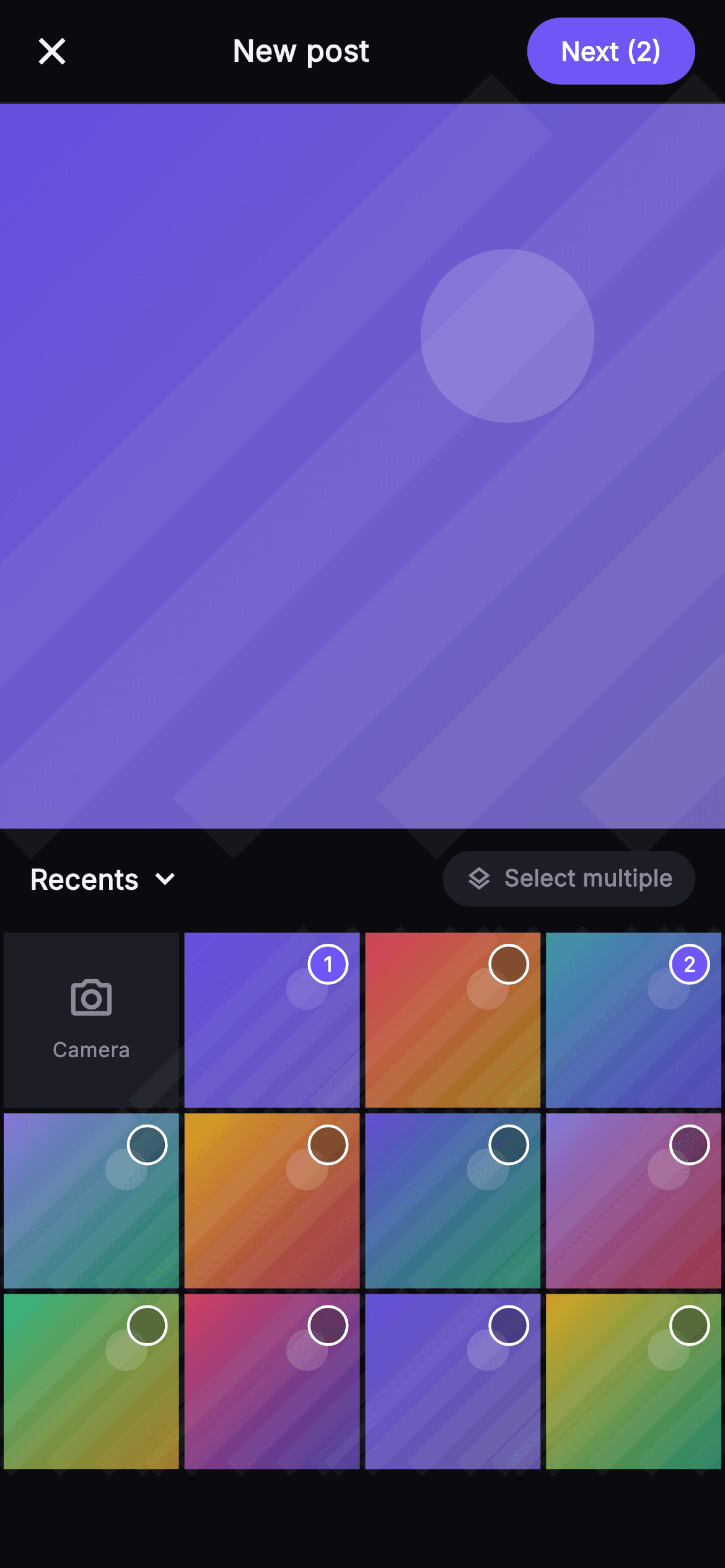
Pulse · Media Picker
Pulse · Media Picker is a production-ready Social Flutter screen from FlutterKit — free, with full source code.
The Pulse Media Picker is the gallery-attach step of the compose flow, laid out top-to-bottom as a single overflow-proof Column inside a SafeArea. A 56px _TopBar carries a close (X) icon, a centered 'New post' title, and an indigo #6E56F7 FilledButton whose label counts the current selection ('Next' becomes 'Next (2)'). Below sits a 1:1 AspectRatio hero preview rendered entirely by the _ThumbPainter CustomPainter — a diagonal gradient with white light streaks and a faux subject disc, drawn with a stronger vignette in hero mode so nothing depends on a network image. An _AlbumRow shows a tappable 'Recents' label with a chevron and a pill-shaped 'Select multiple' chip. The rest is an Expanded 4-column GridView.builder: index 0 is a _CameraTile (camera glyph + 'Camera' label) and the remaining cells are _GridCell tiles, each a painted thumbnail overlaid with an indigo wash and a circular selection badge that shows its 1-based order number when picked. Tapping a cell calls _toggle, which promotes it to the focused hero preview and adds or removes it from the ordered selection list, live-updating the badge numbers and the Next counter. It is self-contained pure Flutter with a bundled Inter font, its own dark near-mono theme (#0B0B0F background, #1D1D26 surfaces, #26262F hairlines), and is backend-agnostic — camera, album, cancel, and next behaviour flow through injected onCamera, onAlbum, onCancel, and onNext callbacks.
Full tutorial coming soon.
The step-by-step walkthrough and complete Dart source for this screen haven't been published yet. They'll be free when they are — no sign-up, no payment. In the meantime, browse the screens that already have their tutorial.
What's included
- ✓_ThumbPainter CustomPainter that draws every thumbnail and the hero preview from gradients, streaks and a disc — zero network images
- ✓1:1 AspectRatio hero preview that re-paints to whichever cell was last tapped via the _focus index
- ✓_GridCell tiles with an indigo selection wash and a circular badge that renders its 1-based pick order number
- ✓4-column GridView.builder with a leading _CameraTile at index 0 and a _toggle multi-select that maintains ordered selection state
- ✓_TopBar with close icon, 'New post' title and an indigo FilledButton whose label carries the live selection count
- ✓Bundled Inter font, dark near-mono palette (#0B0B0F / #1D1D26 / #6E56F7) and onCamera/onAlbum/onCancel/onNext callback hooks
Use cases
- ✓The photo-attach step of a social compose flow where users pick images before captioning and posting
- ✓A multi-image gallery picker for building carousel or album posts with a visible pick order
- ✓A message-attachment sheet in a chat app for selecting one or more photos to send
- ✓A profile or cover-photo chooser where a tapped grid cell drives a large live preview before confirming


