How to Build a Sign Up Screen in Flutter (Full Code + Preview)
A sign-up screen is where most apps ask for a user's first real commitment, so it needs to feel clean and trustworthy. In this tutorial you'll build a complete Flutter sign-up form: a welcome header, three input fields (name, email, password) with the name field auto-focused, a Terms & Conditions checkbox, two call-to-action buttons, and a sign-in link. Along the way you'll see how to manage text controllers and checkbox state correctly and dismiss the keyboard on an outside tap. It's pure Flutter — no packages, just one bundled font.
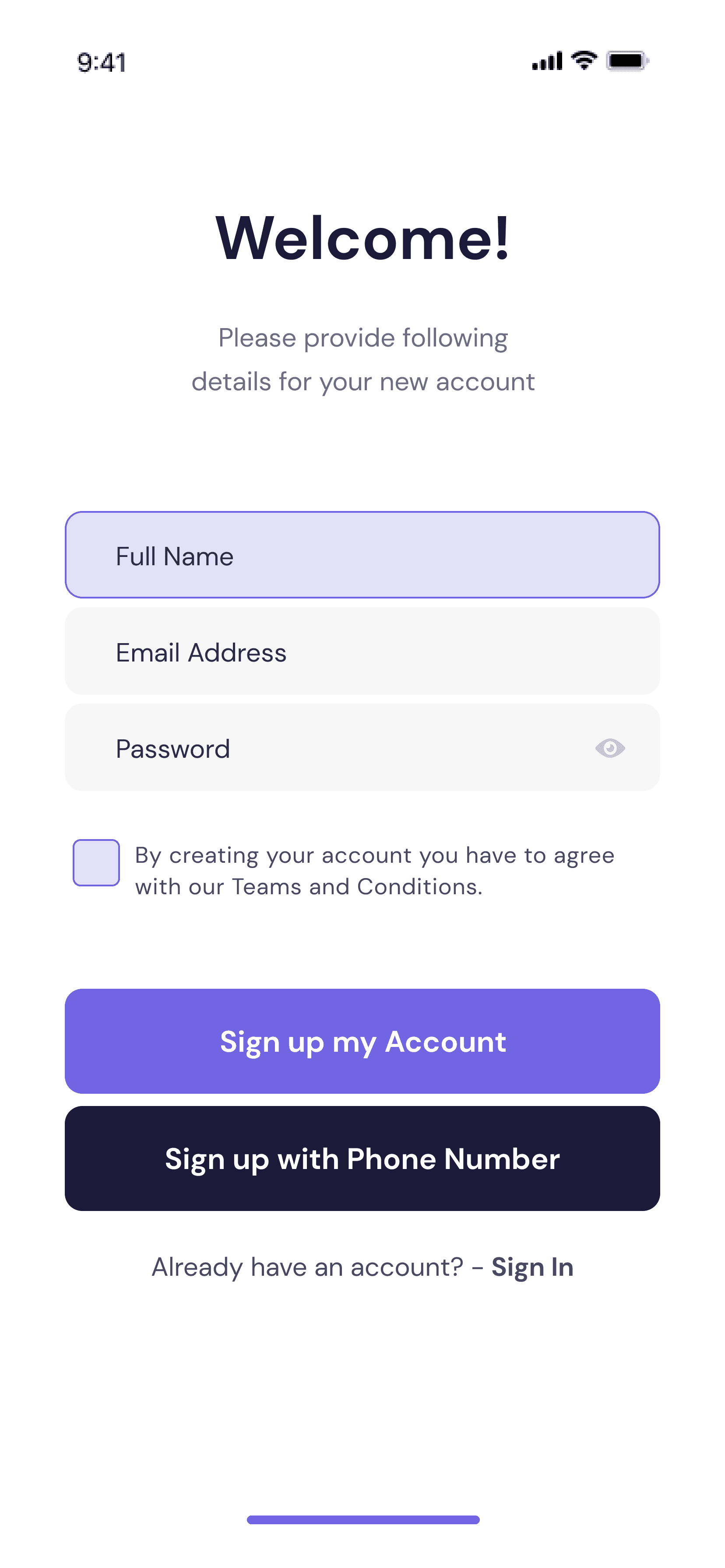
What you'll build
- ✓A centered welcome header with a two-line subtitle
- ✓Three text fields — name, email, and password — with correct keyboard types and focus order
- ✓A custom checkbox row for Terms & Conditions with tap-to-toggle state
- ✓Two full-width CTA buttons and a rich-text 'Already have an account? Sign In' link
- ✓Proper controller lifecycle management (created in state, disposed on teardown)
Step-by-step build
Create the file
Add a new file at lib/sign_up/sign_up_screen.dart in your Flutter project.
Register the bundled fonts
No external packages — this is pure Flutter. It does bundle its design font (DMSans), so drop the font file into fonts/ and declare it in pubspec.yaml:
flutter:
  fonts:
    - family: DMSans
      fonts:
- asset: fonts/DMSans-Regular.ttfBuild it, piece by piece
Here's how the screen goes together. Each block below is a real slice of the code with a plain-English explanation — paste them in order, or grab the whole file from the next section.
Imports, a stateful screen, and color tokens
import 'package:flutter/material.dart';

import 'widgets/cta_button.dart';
import 'widgets/sign_up_field.dart';

/// Sign Up screen from the "bankee" UI kit.
///
/// A centered welcome header over a form board: Full Name (focused by default,
/// per the design), Email Address and Password fields, a Terms & Conditions
/// checkbox, two CTAs (create account / sign up with phone) and a sign-in link.
///
/// Self-contained, pure Flutter. Bundles its exact design font (DM Sans) and
/// renders standalone when pushed as a route.
class SignUpScreen extends StatefulWidget {
  const SignUpScreen({super.key});

  @override
  State<SignUpScreen> createState() => _SignUpScreenState();
}

class _SignUpScreenState extends State<SignUpScreen> {
  static const Color _primary = Color(0xFF7165E3);
  static const Color _navy = Color(0xFF1C1939);
  static const Color _subtitle = Color(0xCC1C1939); // #1C1939 @ 80%
  static const Color _purpleTint = Color(0x337165E3); // #7165E3 @ 20%
Because a form holds changing input and a checkbox, SignUpScreen is a StatefulWidget — its State class will own that mutable data. It imports two local widgets, CtaButton and SignUpField, which keeps this file focused on layout instead of field internals. Four private const Colors define the palette: _primary is the purple used for the main button and checkbox, _navy is the near-black text, and _subtitle / _purpleTint are alpha-blended variants — note the 0xCC and 0x33 prefixes, which encode 80% and 20% opacity right in the color value.
State: text controllers and the checkbox flag
  final TextEditingController _name = TextEditingController();
  final TextEditingController _email = TextEditingController();
  final TextEditingController _password = TextEditingController();

  bool _agreed = false;

  @override
  void dispose() {
    _name.dispose();
    _email.dispose();
    _password.dispose();
    super.dispose();
  }
The state holds three TextEditingControllers — one per field — plus a single _agreed boolean for the Terms checkbox. The detail worth copying is dispose(): every controller is released when the screen is torn down. Forgetting this is one of the most common Flutter memory leaks, so any controller you create in a State should always be disposed here.
Scaffold, keyboard dismissal, and the header
  Widget build(BuildContext context) {
    return Scaffold(
      backgroundColor: Colors.white,
      // Tap anywhere to dismiss the keyboard (the Full Name field autofocuses).
      body: GestureDetector(
        onTap: () => FocusScope.of(context).unfocus(),
        child: SafeArea(
          child: SingleChildScrollView(
            padding: const EdgeInsets.fromLTRB(37, 66, 37, 32),
            child: Column(
              crossAxisAlignment: CrossAxisAlignment.stretch,
              children: <Widget>[
                const Text(
                  'Welcome!',
                  textAlign: TextAlign.center,
                  style: TextStyle(
                    fontFamily: 'DMSans',
                    fontSize: 35,
                    fontWeight: FontWeight.w700,
                    color: _navy,
                  ),
                ),
                const SizedBox(height: 21),
                const Text(
                  'Please provide following\ndetails for your new account',
                  textAlign: TextAlign.center,
                  style: TextStyle(
                    fontFamily: 'DMSans',
                    fontSize: 15,
                    height: 25 / 15,
                    color: _subtitle,
                  ),
                ),
                const SizedBox(height: 62),
build() opens with a white Scaffold wrapped in a GestureDetector whose onTap calls FocusScope.of(context).unfocus() — that's the standard idiom for 'tap any blank area to close the keyboard', which matters here because the name field autofocuses on open. SafeArea plus SingleChildScrollView keep the form clear of system insets and let it scroll up when the keyboard appears. The Column stretches its children to full width and starts with the 35px bold 'Welcome!' title and a lighter two-line subtitle.
Assembling the form
                SignUpField(
                  hint: 'Full Name',
                  controller: _name,
                  autofocus: true,
                  keyboardType: TextInputType.name,
                  textInputAction: TextInputAction.next,
                ),
                const SizedBox(height: 5),
                SignUpField(
                  hint: 'Email Address',
                  controller: _email,
                  keyboardType: TextInputType.emailAddress,
                  textInputAction: TextInputAction.next,
                ),
                const SizedBox(height: 5),
                SignUpField(
                  hint: 'Password',
                  controller: _password,
                  isPassword: true,
                  textInputAction: TextInputAction.done,
                ),
                const SizedBox(height: 28),
                _TermsRow(
                  agreed: _agreed,
                  onChanged: () => setState(() => _agreed = !_agreed),
                ),
                const SizedBox(height: 49),
                CtaButton(
                  label: 'Sign up my Account',
                  color: _primary,
                  onPressed: () {},
                ),
                const SizedBox(height: 7),
                CtaButton(
                  label: 'Sign up with Phone Number',
                  color: _navy,
                  onPressed: () {},
                ),
                const SizedBox(height: 19),
                _SignInLink(onTap: () {}),
              ],
The three SignUpField widgets are configured for real form behavior: the name field sets autofocus: true with keyboardType: name, the email field uses emailAddress, and the password field passes isPassword: true to obscure input. Their textInputAction values (next, next, done) wire up the keyboard's action button so users tab from field to field. Below them sit the _TermsRow — handed the _agreed flag and a toggle callback — then two CtaButtons and the sign-in link, with fixed SizedBox heights setting the rhythm between each.
A custom checkbox without the Checkbox widget
class _TermsRow extends StatelessWidget {
  const _TermsRow({required this.agreed, required this.onChanged});

  final bool agreed;
  final VoidCallback onChanged;

  @override
  Widget build(BuildContext context) {
    return Padding(
      padding: const EdgeInsets.symmetric(horizontal: 5),
      child: Row(
        crossAxisAlignment: CrossAxisAlignment.start,
        children: <Widget>[
          GestureDetector(
            behavior: HitTestBehavior.opaque,
            onTap: onChanged,
            child: Container(
              width: 26,
              height: 26,
              decoration: BoxDecoration(
                color: _SignUpScreenState._purpleTint,
                borderRadius: BorderRadius.circular(4),
                border: Border.all(
                  color: _SignUpScreenState._primary,
                  width: 1,
                ),
              ),
              child: agreed
                  ? const Icon(
                      Icons.check_rounded,
                      size: 18,
                      color: _SignUpScreenState._primary,
                    )
                  : null,
            ),
          ),
          const SizedBox(width: 9),
          const Expanded(
            child: Padding(
              padding: EdgeInsets.only(top: 1),
              child: Text(
                'By creating your account you have to agree with our '
                'Teams and Conditions.',
                style: TextStyle(
                  fontFamily: 'DMSans',
                  fontSize: 13,
                  height: 18 / 13,
                  letterSpacing: 13 * 0.0267, // 2.67% tracking
                  color: _SignUpScreenState._subtitle,
                ),
              ),
            ),
          ),
        ],
      ),
    );
Instead of Flutter's built-in Checkbox, the terms row draws its own 26×26 box so it matches the design exactly: a GestureDetector toggles the state, and the box is a Container with a purple-tinted fill, a 4px radius, and a 1px purple border. When agreed is true it shows a check icon; when false its child is simply null (empty). An Expanded wraps the terms text so it fills the rest of the row and wraps cleanly. This is the go-to pattern whenever a designer's control doesn't match the Material default.
A two-tone link with Text.rich
/// "Already have an account? - Sign In" — regular text with a bold link.
class _SignInLink extends StatelessWidget {
  const _SignInLink({required this.onTap});

  final VoidCallback onTap;

  @override
  Widget build(BuildContext context) {
    return GestureDetector(
      behavior: HitTestBehavior.opaque,
      onTap: onTap,
      child: Text.rich(
        const TextSpan(
          text: 'Already have an account? - ',
          style: TextStyle(
            fontFamily: 'DMSans',
            fontSize: 15,
            height: 25 / 15,
            fontWeight: FontWeight.w400,
            color: _SignUpScreenState._subtitle,
          ),
          children: <InlineSpan>[
            TextSpan(
              text: 'Sign In',
              style: TextStyle(fontWeight: FontWeight.w700),
            ),
          ],
        ),
        textAlign: TextAlign.center,
      ),
    );
  }
}
The sign-in prompt mixes two styles on one line, so it uses Text.rich with a TextSpan. The base span ('Already have an account? -') is regular weight, and a nested child span makes just 'Sign In' bold. The whole line sits in a GestureDetector with HitTestBehavior.opaque so a tap anywhere along it registers. This is how you style part of a string differently without breaking it into separate Text widgets inside a Row.
Full code
The complete, ready-to-paste source (3 files). Free to use in your projects — one click copies it all.
import 'package:flutter/material.dart';

import 'widgets/cta_button.dart';
import 'widgets/sign_up_field.dart';

/// Sign Up screen from the "bankee" UI kit.
///
/// A centered welcome header over a form board: Full Name (focused by default,
/// per the design), Email Address and Password fields, a Terms & Conditions
/// checkbox, two CTAs (create account / sign up with phone) and a sign-in link.
///
/// Self-contained, pure Flutter. Bundles its exact design font (DM Sans) and
/// renders standalone when pushed as a route.
class SignUpScreen extends StatefulWidget {
  const SignUpScreen({super.key});

  @override
  State<SignUpScreen> createState() => _SignUpScreenState();
}

class _SignUpScreenState extends State<SignUpScreen> {
  static const Color _primary = Color(0xFF7165E3);
  static const Color _navy = Color(0xFF1C1939);
  static const Color _subtitle = Color(0xCC1C1939); // #1C1939 @ 80%
  static const Color _purpleTint = Color(0x337165E3); // #7165E3 @ 20%

  final TextEditingController _name = TextEditingController();
  final TextEditingController _email = TextEditingController();
  final TextEditingController _password = TextEditingController();

  bool _agreed = false;

  @override
  void dispose() {
    _name.dispose();
    _email.dispose();
    _password.dispose();
    super.dispose();
  }

  @override
  Widget build(BuildContext context) {
    return Scaffold(
      backgroundColor: Colors.white,
      // Tap anywhere to dismiss the keyboard (the Full Name field autofocuses).
      body: GestureDetector(
        onTap: () => FocusScope.of(context).unfocus(),
        child: SafeArea(
          child: SingleChildScrollView(
            padding: const EdgeInsets.fromLTRB(37, 66, 37, 32),
            child: Column(
              crossAxisAlignment: CrossAxisAlignment.stretch,
              children: <Widget>[
                const Text(
                  'Welcome!',
                  textAlign: TextAlign.center,
                  style: TextStyle(
                    fontFamily: 'DMSans',
                    fontSize: 35,
                    fontWeight: FontWeight.w700,
                    color: _navy,
                  ),
                ),
                const SizedBox(height: 21),
                const Text(
                  'Please provide following\ndetails for your new account',
                  textAlign: TextAlign.center,
                  style: TextStyle(
                    fontFamily: 'DMSans',
                    fontSize: 15,
                    height: 25 / 15,
                    color: _subtitle,
                  ),
                ),
                const SizedBox(height: 62),
                SignUpField(
                  hint: 'Full Name',
                  controller: _name,
                  autofocus: true,
                  keyboardType: TextInputType.name,
                  textInputAction: TextInputAction.next,
                ),
                const SizedBox(height: 5),
                SignUpField(
                  hint: 'Email Address',
                  controller: _email,
                  keyboardType: TextInputType.emailAddress,
                  textInputAction: TextInputAction.next,
                ),
                const SizedBox(height: 5),
                SignUpField(
                  hint: 'Password',
                  controller: _password,
                  isPassword: true,
                  textInputAction: TextInputAction.done,
                ),
                const SizedBox(height: 28),
                _TermsRow(
                  agreed: _agreed,
                  onChanged: () => setState(() => _agreed = !_agreed),
                ),
                const SizedBox(height: 49),
                CtaButton(
                  label: 'Sign up my Account',
                  color: _primary,
                  onPressed: () {},
                ),
                const SizedBox(height: 7),
                CtaButton(
                  label: 'Sign up with Phone Number',
                  color: _navy,
                  onPressed: () {},
                ),
                const SizedBox(height: 19),
                _SignInLink(onTap: () {}),
              ],
            ),
          ),
        ),
      ),
    );
  }
}

/// Checkbox + "agree with our Terms and Conditions" line.
class _TermsRow extends StatelessWidget {
  const _TermsRow({required this.agreed, required this.onChanged});

  final bool agreed;
  final VoidCallback onChanged;

  @override
  Widget build(BuildContext context) {
    return Padding(
      padding: const EdgeInsets.symmetric(horizontal: 5),
      child: Row(
        crossAxisAlignment: CrossAxisAlignment.start,
        children: <Widget>[
          GestureDetector(
            behavior: HitTestBehavior.opaque,
            onTap: onChanged,
            child: Container(
              width: 26,
              height: 26,
              decoration: BoxDecoration(
                color: _SignUpScreenState._purpleTint,
                borderRadius: BorderRadius.circular(4),
                border: Border.all(
                  color: _SignUpScreenState._primary,
                  width: 1,
                ),
              ),
              child: agreed
                  ? const Icon(
                      Icons.check_rounded,
                      size: 18,
                      color: _SignUpScreenState._primary,
                    )
                  : null,
            ),
          ),
          const SizedBox(width: 9),
          const Expanded(
            child: Padding(
              padding: EdgeInsets.only(top: 1),
              child: Text(
                'By creating your account you have to agree with our '
                'Teams and Conditions.',
                style: TextStyle(
                  fontFamily: 'DMSans',
                  fontSize: 13,
                  height: 18 / 13,
                  letterSpacing: 13 * 0.0267, // 2.67% tracking
                  color: _SignUpScreenState._subtitle,
                ),
              ),
            ),
          ),
        ],
      ),
    );
  }
}

/// "Already have an account? - Sign In" — regular text with a bold link.
class _SignInLink extends StatelessWidget {
  const _SignInLink({required this.onTap});

  final VoidCallback onTap;

  @override
  Widget build(BuildContext context) {
    return GestureDetector(
      behavior: HitTestBehavior.opaque,
      onTap: onTap,
      child: Text.rich(
        const TextSpan(
          text: 'Already have an account? - ',
          style: TextStyle(
            fontFamily: 'DMSans',
            fontSize: 15,
            height: 25 / 15,
            fontWeight: FontWeight.w400,
            color: _SignUpScreenState._subtitle,
          ),
          children: <InlineSpan>[
            TextSpan(
              text: 'Sign In',
              style: TextStyle(fontWeight: FontWeight.w700),
            ),
          ],
        ),
        textAlign: TextAlign.center,
      ),
    );
  }
}
Plus bundled 1 binary asset (fonts/images). The CLI and MCP install those for you automatically.
Two faster ways to add it
Copy-paste works, but you can skip it entirely.
1. FlutterKit CLI
One command drops this screen — and its fonts — straight into your project.
$ flutterkit add sign-up2. AI agent (MCP)
Connect FlutterKit's MCP server in Claude or Cursor and just ask your agent to install sign-up — it fetches and writes the files for you.
FAQ
Is this sign-up screen free to use?
Yes — the full Dart on this page is free to copy into your own apps, personal or commercial. Paste it directly, run 'flutterkit add sign-up' with the CLI, or install it via MCP.
Does the form include validation?
The layout, controllers, and state are all here, but the CtaButton onPressed handlers are intentionally left empty ({}) so you can plug in your own validation and API calls. Read each controller's .text (for example _email.text) inside the handler to validate before submitting.
Does it need any external packages?
No — it's pure Flutter, built on the material library. The only asset is the bundled DM Sans font, which you register in pubspec.yaml as shown in step 2. The CLI and MCP install the font for you.

