How to Build an Account Created Success Screen in Flutter (Full Code + Preview)
After someone finishes signing up, you want to reassure them it worked before sending them into the app. This tutorial builds exactly that success screen in Flutter: a big thumbs-up illustration, a bold 'Account Created!' headline, a friendly confirmation line, a full-width purple 'Continue' button pinned near the bottom, and a Privacy Policy / Terms line with tappable underlined links. You'll also learn the scroll-safe layout trick that keeps the button glued low on tall phones but never overflows on short ones. It's pure Flutter, one bundled font.
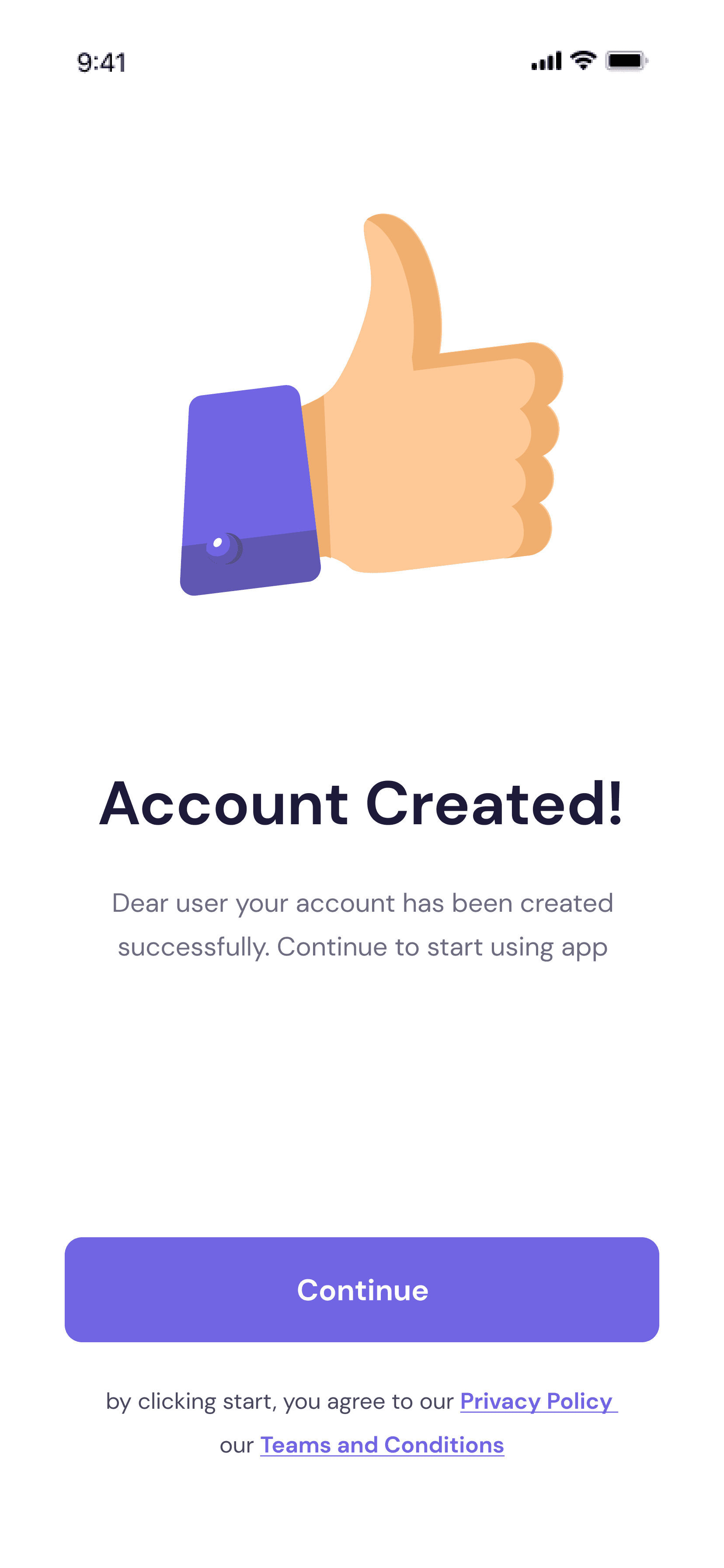
What you'll build
- ✓A centered thumbs-up illustration loaded from a bundled PNG asset
- ✓A bold 'Account Created!' headline with a two-line confirmation subtitle
- ✓A layout that keeps the Continue button near the bottom yet scrolls safely on small screens
- ✓A full-width purple 'Continue' CTA with an ink ripple, split into its own reusable widget
- ✓A centered Privacy Policy / Terms line with bold, underlined purple links via Text.rich
Step-by-step build
Create the file
Add a new file at lib/account_created/account_created_screen.dart in your Flutter project.
Register the bundled fonts
No external packages — this is pure Flutter. It does bundle its design font (DMSans), so drop the font file into fonts/ and declare it in pubspec.yaml:
flutter:
  fonts:
    - family: DMSans
      fonts:
- asset: fonts/DMSans-Regular.ttfBuild it, piece by piece
Here's how the screen goes together. Each block below is a real slice of the code with a plain-English explanation — paste them in order, or grab the whole file from the next section.
Imports, the screen class, and color tokens
import 'package:flutter/material.dart';

import 'widgets/cta_button.dart';

/// Account Created success screen from the "bankee" UI kit.
///
/// A thumbs-up illustration over a centered "Account Created!" headline and
/// confirmation copy, with a Continue CTA pinned toward the bottom and a
/// rich-text Privacy Policy / Terms line beneath it.
///
/// Self-contained, pure Flutter. Bundles its exact design font (DM Sans) and
/// the exact thumbs-up illustration from the Figma source (an SVG that pure
/// Flutter cannot render, so it is bundled as a transparent PNG — the same
/// documented asset exception as the product_detail screen). Renders standalone
/// when pushed as a route.
class AccountCreatedScreen extends StatelessWidget {
  const AccountCreatedScreen({super.key});

  static const Color _navy = Color(0xFF1C1939);
  static const Color _subtitle = Color(0xCC1C1939); // #1C1939 @ 80%
  static const Color _primary = Color(0xFF7165E3);
The file imports Flutter's material library plus the local CtaButton widget, then declares AccountCreatedScreen as a StatelessWidget — a confirmation screen has no changing state, so stateless is correct. Three private const Colors act as design tokens: _navy (#1C1939) is the near-black used for the headline, _subtitle is that same navy at 80% opacity (note the 0xCC prefix, which encodes the alpha right in the value), and _primary (#7165E3) is the purple shared by the button and the Terms links. Keeping them as named constants means one place to retheme.
A scroll-safe, full-height scaffold
  @override
  Widget build(BuildContext context) {
    return Scaffold(
      backgroundColor: Colors.white,
      body: SafeArea(
        child: LayoutBuilder(
          builder: (BuildContext context, BoxConstraints constraints) {
            return SingleChildScrollView(
              child: ConstrainedBox(
                constraints: BoxConstraints(minHeight: constraints.maxHeight),
                child: IntrinsicHeight(
                  child: Padding(
                    padding: const EdgeInsets.fromLTRB(37, 63, 37, 24),
                    child: Column(
                      crossAxisAlignment: CrossAxisAlignment.stretch,
                      children: <Widget>[
build() returns a white Scaffold, and SafeArea keeps content clear of the notch and home indicator. The clever part is the responsiveness stack: LayoutBuilder exposes the available height, then SingleChildScrollView + ConstrainedBox(minHeight: constraints.maxHeight) + IntrinsicHeight together force the Column to fill the whole screen on tall phones — so the later Spacer can shove the button down — while still becoming scrollable instead of overflowing on short ones. Padding.fromLTRB(37, 63, 37, 24) insets the content, and the Column uses crossAxisAlignment.stretch so children run full width.
The illustration, headline, and confirmation copy
                        Center(
                          child: Image.asset(
                            'lib/screens/auth/account_created/images/thumbs_up.png',
                            width: 258,
                            height: 233,
                            fit: BoxFit.contain,
                          ),
                        ),
                        const SizedBox(height: 93),
                        const Text(
                          'Account Created!',
                          textAlign: TextAlign.center,
                          style: TextStyle(
                            fontFamily: 'DMSans',
                            fontSize: 35,
                            fontWeight: FontWeight.w700,
                            color: _navy,
                          ),
                        ),
                        const SizedBox(height: 21),
                        const Text(
                          'Dear user your account has been created '
                          'successfully. Continue to start using app',
                          textAlign: TextAlign.center,
                          style: TextStyle(
                            fontFamily: 'DMSans',
                            fontSize: 15,
                            height: 25 / 15,
                            color: _subtitle,
                          ),
                        ),
A Center wraps Image.asset loading the bundled thumbs_up.png at a fixed 258×233 with BoxFit.contain (this success artwork ships as a PNG because it started as an SVG pure Flutter can't render). A tall SizedBox(height: 93) drops the headline well below it, then the 'Account Created!' Text renders at 35px, FontWeight.w700, in _navy and center-aligned. After a 21px gap, the two-string confirmation message ('Dear user your account has been created successfully...') is 15px in the 80%-opacity _subtitle, with height: 25 / 15 setting comfortable ~1.67 line spacing.
Pushing the CTA down and the terms line
                        const Spacer(),
                        CtaButton(
                          label: 'Continue',
                          onPressed: () {},
                        ),
                        const SizedBox(height: 21),
                        const _TermsLine(),
                      ],
                    ),
                  ),
                ),
              ),
            );
          },
        ),
      ),
    );
  }
}
A bare Spacer() eats all the leftover vertical space, which is what pins the button toward the bottom on tall screens (and collapses to nothing when the content already fills the height). Below it, CtaButton is given label: 'Continue' and an empty onPressed: () {} — that's your hook for navigation or an API call. A final SizedBox(height: 21) separates it from the _TermsLine widget. These closing lines wrap up the Column, Padding, IntrinsicHeight, scroll view, LayoutBuilder, SafeArea, and Scaffold in turn.
A two-tone terms line with Text.rich
/// "by clicking start, you agree to our Privacy Policy / our Teams and
/// Conditions" — regular grey text with bold, underlined purple links.
class _TermsLine extends StatelessWidget {
  const _TermsLine();

  @override
  Widget build(BuildContext context) {
    const TextStyle base = TextStyle(
      fontFamily: 'DMSans',
      fontSize: 13,
      height: 25 / 13,
      fontWeight: FontWeight.w400,
      color: AccountCreatedScreen._subtitle,
    );
    const TextStyle link = TextStyle(
      fontFamily: 'DMSans',
      fontSize: 13,
      height: 25 / 13,
      fontWeight: FontWeight.w700,
      decoration: TextDecoration.underline,
      decorationColor: AccountCreatedScreen._primary,
      color: AccountCreatedScreen._primary,
    );
    return Text.rich(
      const TextSpan(
        style: base,
        children: <InlineSpan>[
          TextSpan(text: 'by clicking start, you agree to our '),
          TextSpan(text: 'Privacy Policy', style: link),
          TextSpan(text: '\nour '),
          TextSpan(text: 'Teams and Conditions', style: link),
        ],
      ),
      textAlign: TextAlign.center,
    );
  }
}
_TermsLine defines two const TextStyles: base is 13px regular grey (_subtitle), and link is 13px w700 purple (_primary) with TextDecoration.underline. It returns Text.rich holding one TextSpan whose children mix them — plain 'by clicking start, you agree to our', then a bold underlined 'Privacy Policy', a '\nour' span that forces a line break, and a bold underlined 'Teams and Conditions'. This is the standard way to style just part of a sentence differently without splitting it into separate Text widgets; wire GestureRecognizers onto the link spans if you want them tappable.
Full code
The complete, ready-to-paste source (2 files). Free to use in your projects — one click copies it all.
import 'package:flutter/material.dart';

import 'widgets/cta_button.dart';

/// Account Created success screen from the "bankee" UI kit.
///
/// A thumbs-up illustration over a centered "Account Created!" headline and
/// confirmation copy, with a Continue CTA pinned toward the bottom and a
/// rich-text Privacy Policy / Terms line beneath it.
///
/// Self-contained, pure Flutter. Bundles its exact design font (DM Sans) and
/// the exact thumbs-up illustration from the Figma source (an SVG that pure
/// Flutter cannot render, so it is bundled as a transparent PNG — the same
/// documented asset exception as the product_detail screen). Renders standalone
/// when pushed as a route.
class AccountCreatedScreen extends StatelessWidget {
  const AccountCreatedScreen({super.key});

  static const Color _navy = Color(0xFF1C1939);
  static const Color _subtitle = Color(0xCC1C1939); // #1C1939 @ 80%
  static const Color _primary = Color(0xFF7165E3);

  @override
  Widget build(BuildContext context) {
    return Scaffold(
      backgroundColor: Colors.white,
      body: SafeArea(
        child: LayoutBuilder(
          builder: (BuildContext context, BoxConstraints constraints) {
            return SingleChildScrollView(
              child: ConstrainedBox(
                constraints: BoxConstraints(minHeight: constraints.maxHeight),
                child: IntrinsicHeight(
                  child: Padding(
                    padding: const EdgeInsets.fromLTRB(37, 63, 37, 24),
                    child: Column(
                      crossAxisAlignment: CrossAxisAlignment.stretch,
                      children: <Widget>[
                        Center(
                          child: Image.asset(
                            'lib/screens/auth/account_created/images/thumbs_up.png',
                            width: 258,
                            height: 233,
                            fit: BoxFit.contain,
                          ),
                        ),
                        const SizedBox(height: 93),
                        const Text(
                          'Account Created!',
                          textAlign: TextAlign.center,
                          style: TextStyle(
                            fontFamily: 'DMSans',
                            fontSize: 35,
                            fontWeight: FontWeight.w700,
                            color: _navy,
                          ),
                        ),
                        const SizedBox(height: 21),
                        const Text(
                          'Dear user your account has been created '
                          'successfully. Continue to start using app',
                          textAlign: TextAlign.center,
                          style: TextStyle(
                            fontFamily: 'DMSans',
                            fontSize: 15,
                            height: 25 / 15,
                            color: _subtitle,
                          ),
                        ),
                        const Spacer(),
                        CtaButton(
                          label: 'Continue',
                          onPressed: () {},
                        ),
                        const SizedBox(height: 21),
                        const _TermsLine(),
                      ],
                    ),
                  ),
                ),
              ),
            );
          },
        ),
      ),
    );
  }
}

/// "by clicking start, you agree to our Privacy Policy / our Teams and
/// Conditions" — regular grey text with bold, underlined purple links.
class _TermsLine extends StatelessWidget {
  const _TermsLine();

  @override
  Widget build(BuildContext context) {
    const TextStyle base = TextStyle(
      fontFamily: 'DMSans',
      fontSize: 13,
      height: 25 / 13,
      fontWeight: FontWeight.w400,
      color: AccountCreatedScreen._subtitle,
    );
    const TextStyle link = TextStyle(
      fontFamily: 'DMSans',
      fontSize: 13,
      height: 25 / 13,
      fontWeight: FontWeight.w700,
      decoration: TextDecoration.underline,
      decorationColor: AccountCreatedScreen._primary,
      color: AccountCreatedScreen._primary,
    );
    return Text.rich(
      const TextSpan(
        style: base,
        children: <InlineSpan>[
          TextSpan(text: 'by clicking start, you agree to our '),
          TextSpan(text: 'Privacy Policy', style: link),
          TextSpan(text: '\nour '),
          TextSpan(text: 'Teams and Conditions', style: link),
        ],
      ),
      textAlign: TextAlign.center,
    );
  }
}
Plus bundled 2 binary assets (fonts/images). The CLI and MCP install those for you automatically.
Two faster ways to add it
Copy-paste works, but you can skip it entirely.
1. FlutterKit CLI
One command drops this screen — and its fonts — straight into your project.
$ flutterkit add account-created2. AI agent (MCP)
Connect FlutterKit's MCP server in Claude or Cursor and just ask your agent to install account-created — it fetches and writes the files for you.
FAQ
Is this account created screen free to use?
Yes. The full Dart source on this page is free to copy into your own apps, personal or commercial. Paste it directly, install it with the FlutterKit CLI (flutterkit add account-created), or have an AI agent add it for you via MCP.
Does it need any external packages?
No — it's pure Flutter, built entirely on the material library with no plugins. The extras are the bundled DM Sans font and the thumbs-up PNG illustration, which you register under fonts and assets in pubspec.yaml. The CLI and MCP copy both files in for you automatically.
Which Flutter version does it target?
It uses super parameters (const AccountCreatedScreen({super.key})), so it targets a modern Flutter 3.x on Dart 3. There's no Color.withValues() call here — opacity is baked into the hex tokens (0xCC = 80%) — so nothing needs swapping to compile on any recent stable SDK.

