How to Build a Product Detail Screen in Flutter (Full Code + Preview)
The product detail page is where a shopper decides to buy, so it has to pack a lot into one scroll. This tutorial builds a complete Flutter e-commerce product screen: a full-bleed product hero with a wishlist tab, red hotspot markers and a carousel arrow, a Zoom/photos/videos media row, the brand and title, a sale price with the original struck through, tappable colour swatches, a size selector, a details paragraph, and a fixed three-segment bottom bar. You'll learn to position elements freely inside a Stack, place hotspots by fraction, and manage the selected-colour state — all in pure Flutter.
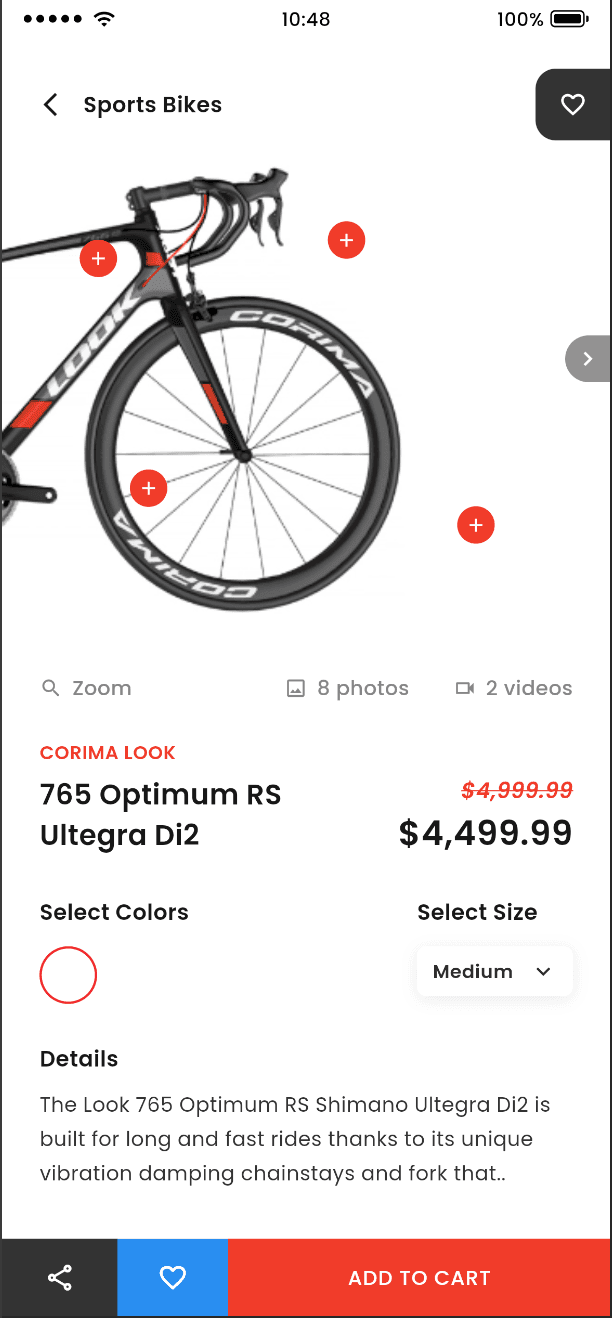
What you'll build
- ✓A full-bleed product hero built with AspectRatio + Stack, holding a back button, title, and a right-edge wishlist tab
- ✓Four red '+' hotspot markers placed by fractional coordinates over the product photo
- ✓A brand/title block beside a sale price that strikes through the original in italic red
- ✓A row of split-circle colour swatches you tap to select, plus a shadowed size selector
- ✓A fixed three-segment bottom action bar (share, wishlist, Add to Cart) as a separate reusable widget
Step-by-step build
Create the file
Add a new file at lib/product_detail/product_detail_screen.dart in your Flutter project.
Register the bundled fonts
No external packages — this is pure Flutter. It does bundle its design font (Poppins), so drop the font file into fonts/ and declare it in pubspec.yaml:
flutter:
  fonts:
    - family: Poppins
      fonts:
- asset: fonts/Poppins-Regular.ttfBuild it, piece by piece
Here's how the screen goes together. Each block below is a real slice of the code with a plain-English explanation — paste them in order, or grab the whole file from the next section.
Imports, the stateful screen, and design tokens
import 'package:flutter/material.dart';

import 'widgets/bottom_action_bar.dart';
import 'widgets/color_swatch.dart';

/// "Product Detail" — an e-commerce product page (Zeplin: ECommerce-Product-06).
///
/// A full-bleed product hero with a wishlist button, hotspot markers and a
/// carousel arrow; a media row (Zoom / photos / videos); brand, title and a
/// discounted price; selectable colour swatches and a size dropdown; a details
/// paragraph; and a three-segment bottom action bar.
///
/// Self-contained, pure Flutter. Bundles its exact design font (Poppins) and
/// uses a network product image. Renders standalone when pushed as a route.
class ProductDetailScreen extends StatefulWidget {
  const ProductDetailScreen({super.key});

  @override
  State<ProductDetailScreen> createState() => _ProductDetailScreenState();
}

class _ProductDetailScreenState extends State<ProductDetailScreen> {
  static const String _font = 'Poppins';

  // Palette taken verbatim from the design.
  static const Color _accent = Color(0xFFF13B2A); // brand red
  static const Color _ink = Color(0xFF181818); // titles / prices
  static const Color _muted = Color(0xFF8A8A8A); // media row
  static const Color _body = Color(0xFF323232); // description
  static const Color _heading = Color(0xFF171717); // "Sports Bikes"

  static const List<Color> _swatches = <Color>[
    Color(0xFFF12A2F),
    Color(0xFF2AE4F1),
    Color(0xFF2AFF3F),
    Color(0xFF2A4DFF),
  ];

  // The exact product photo from the Zeplin design, bundled (see CONVENTIONS
  // rule 4 — this screen is the documented exception: the hero is a real
  // bundled asset rather than a network URL).
  static const String _heroImage =
      'lib/screens/ecommerce/product_detail/images/product_hero.png';

  int _selectedColor = 0;
The file imports material plus two local widgets — BottomActionBar and ProductColorSwatch — so this file stays focused on layout. ProductDetailScreen is a StatefulWidget because one thing changes at runtime: the selected colour. The State declares the palette as named const Colors — _accent (#F13B2A brand red), _ink (#181818 for titles and prices), _muted (#8A8A8A for the media row), _body (#323232 for the description) and _heading (#171717). _swatches is a four-Color list (red, cyan, green, blue) that drives the swatch row, _heroImage points at the bundled product photo, and int _selectedColor = 0 tracks which swatch is active.
The scaffold: scrollable body plus a fixed bottom bar
  @override
  Widget build(BuildContext context) {
    return Scaffold(
      backgroundColor: Colors.white,
      body: SafeArea(
        bottom: false,
        child: SingleChildScrollView(
          child: Column(
            crossAxisAlignment: CrossAxisAlignment.start,
            children: <Widget>[
              _buildHero(),
              Padding(
                padding: const EdgeInsets.fromLTRB(24, 19, 24, 24),
                child: Column(
                  crossAxisAlignment: CrossAxisAlignment.start,
                  children: <Widget>[
                    _buildTitleAndPrice(),
                    const SizedBox(height: 25),
                    _buildColorsAndSize(),
                    const SizedBox(height: 25),
                    const _BodyHeading('Details'),
                    const SizedBox(height: 8),
                    const Text(
                      'The Look 765 Optimum RS Shimano Ultegra Di2 is built for '
                      'long and fast rides thanks to its unique vibration '
                      'damping chainstays and fork that..',
                      style: TextStyle(
                        fontFamily: _font,
                        fontSize: 13,
                        fontWeight: FontWeight.w400,
                        color: _body,
                        height: 1.7,
                      ),
                    ),
                  ],
                ),
              ),
            ],
          ),
        ),
      ),
      bottomNavigationBar: BottomActionBar(
        onShare: () {},
        onWishlist: () {},
        onAddToCart: () {},
      ),
    );
  }
build() returns a white Scaffold whose body is a SafeArea with bottom: false — the hero runs to the top notch area but the bottom is left for the action bar. Inside, a SingleChildScrollView holds a start-aligned Column: first _buildHero(), then a Padding of EdgeInsets.fromLTRB(24, 19, 24, 24) wrapping _buildTitleAndPrice(), the colours-and-size row, a 'Details' heading, and the wrapped description Text at 13px with height: 1.7 for comfortable line spacing. The Scaffold's bottomNavigationBar is the BottomActionBar widget, wired with three empty callbacks (onShare, onWishlist, onAddToCart) you fill in later.
The product hero: a layered Stack
  // ---- Hero ---------------------------------------------------------------

  Widget _buildHero() {
    return AspectRatio(
      aspectRatio: 375 / 414,
      child: Stack(
        children: <Widget>[
          const Positioned.fill(
            child: ColoredBox(
              color: Colors.white,
              child: Image(
                image: AssetImage(_heroImage),
                fit: BoxFit.cover,
                alignment: Alignment.centerRight,
              ),
            ),
          ),

          // Top bar: back + title grouped left, wishlist flush to the right edge.
          Positioned(
            left: 22,
            right: 0,
            top: 20,
            child: Row(
              children: <Widget>[
                const Icon(Icons.arrow_back_ios_new, size: 18, color: _ink),
                const SizedBox(width: 12),
                const Text(
                  'Sports Bikes',
                  style: TextStyle(
                    fontFamily: _font,
                    fontSize: 14,
                    fontWeight: FontWeight.w600,
                    color: _heading,
                  ),
                ),
                const Spacer(),
                Container(
                  width: 48,
                  height: 46,
                  decoration: const BoxDecoration(
                    color: Color(0xFF333333),
                    borderRadius: BorderRadius.only(
                      topLeft: Radius.circular(13),
                      bottomLeft: Radius.circular(13),
                    ),
                  ),
                  child: const Icon(Icons.favorite_border,
                      size: 18, color: Colors.white),
                ),
              ],
            ),
          ),

          // Hotspot markers scattered over the product, as in the design.
          ..._hotspots(),

          // Carousel "next" button on the right edge.
          Positioned(
            right: 0,
            top: 191,
            child: Container(
              width: 29,
              height: 30,
              decoration: const BoxDecoration(
                color: Color(0xFF929292),
                borderRadius: BorderRadius.only(
                  topLeft: Radius.circular(40),
                  bottomLeft: Radius.circular(40),
                ),
              ),
              child: const Icon(Icons.chevron_right,
                  size: 18, color: Colors.white),
            ),
          ),

          // Media row anchored to the bottom of the hero.
          Positioned(
            left: 24,
            right: 24,
            bottom: 4,
            child: Row(
              children: const <Widget>[
                _MediaChip(icon: Icons.search, label: 'Zoom'),
                Spacer(),
                _MediaChip(icon: Icons.photo_outlined, label: '8 photos'),
                SizedBox(width: 28),
                _MediaChip(icon: Icons.videocam_outlined, label: '2 videos'),
              ],
            ),
          ),
        ],
      ),
    );
  }

  List<Widget> _hotspots() {
    // Positions as fractions of the 375x414 hero, from the design.
    const List<Offset> spots = <Offset>[
      Offset(214 / 375, 120 / 414),
      Offset(51 / 375, 132 / 414),
      Offset(84 / 375, 282 / 414),
      Offset(299 / 375, 306 / 414),
    ];
    return <Widget>[
      for (final Offset s in spots)
        Align(
          alignment: Alignment(s.dx * 2 - 1, s.dy * 2 - 1),
          child: Container(
            width: 24,
            height: 24,
            decoration: const BoxDecoration(
              color: _accent,
              shape: BoxShape.circle,
            ),
            child: const Icon(Icons.add, size: 14, color: Colors.white),
          ),
        ),
    ];
  }
_buildHero() locks the image to the design's shape with AspectRatio(375 / 414) and layers everything in a Stack. Positioned.fill paints the photo with BoxFit.cover aligned centerRight. A Positioned Row at top holds the back arrow, the 'Sports Bikes' title, a Spacer, then a 48x46 dark wishlist tab rounded only on its left corners so it hugs the screen edge. Next the spread ..._hotspots() drops in markers, and a small grey carousel chevron sits at top: 191 on the right edge. A bottom Positioned row lays out three _MediaChip pills (Zoom, 8 photos, 2 videos). _hotspots() itself places four red circular '+' badges using Alignment computed from fractional offsets (like 214/375) so they track the product no matter the width.
Brand, title, and the discounted price
  // ---- Title + price ------------------------------------------------------

  Widget _buildTitleAndPrice() {
    return Row(
      crossAxisAlignment: CrossAxisAlignment.start,
      children: <Widget>[
        Expanded(
          child: Column(
            crossAxisAlignment: CrossAxisAlignment.start,
            children: const <Widget>[
              Text(
                'CORIMA LOOK',
                style: TextStyle(
                  fontFamily: _font,
                  fontSize: 12,
                  fontWeight: FontWeight.w600,
                  color: _accent,
                  letterSpacing: 0.3,
                ),
              ),
              SizedBox(height: 6),
              Text(
                '765 Optimum RS \nUltegra Di2',
                style: TextStyle(
                  fontFamily: _font,
                  fontSize: 18,
                  fontWeight: FontWeight.w600,
                  color: _ink,
                  height: 1.45,
                ),
              ),
            ],
          ),
        ),
        const SizedBox(width: 12),
        Column(
          crossAxisAlignment: CrossAxisAlignment.end,
          children: const <Widget>[
            SizedBox(height: 23),
            Text(
              r'$4,999.99',
              style: TextStyle(
                fontFamily: _font,
                fontSize: 14,
                fontWeight: FontWeight.w600,
                fontStyle: FontStyle.italic,
                color: _accent,
                decoration: TextDecoration.lineThrough,
                decorationColor: _accent,
              ),
            ),
            SizedBox(height: 2),
            Text(
              r'$4,499.99',
              style: TextStyle(
                fontFamily: _font,
                fontSize: 22,
                fontWeight: FontWeight.w600,
                color: _ink,
              ),
            ),
          ],
        ),
      ],
    );
  }
_buildTitleAndPrice() is a top-aligned Row split in two. The Expanded left column stacks the 12px red 'CORIMA LOOK' brand label (with 0.3 letterSpacing) above the two-line '765 Optimum RS / Ultegra Di2' title at 18px — the \n forces the break and height: 1.45 spaces the lines. The right column is end-aligned and shows the pricing: the old $4,999.99 in 14px italic red with TextDecoration.lineThrough (and matching decorationColor), then the live $4,499.99 in bold 22px _ink. Using the r'...' raw strings keeps the dollar sign literal instead of being read as a Dart interpolation.
Colour swatches and the size selector
  // ---- Colours + size -----------------------------------------------------

  Widget _buildColorsAndSize() {
    return Row(
      crossAxisAlignment: CrossAxisAlignment.start,
      children: <Widget>[
        Expanded(
          child: Column(
            crossAxisAlignment: CrossAxisAlignment.start,
            children: <Widget>[
              const _BodyHeading('Select Colors'),
              const SizedBox(height: 12),
              Row(
                children: <Widget>[
                  for (int i = 0; i < _swatches.length; i++) ...<Widget>[
                    if (i > 0) const SizedBox(width: 16),
                    ProductColorSwatch(
                      color: _swatches[i],
                      selected: i == _selectedColor,
                      onTap: () => setState(() => _selectedColor = i),
                    ),
                  ],
                ],
              ),
            ],
          ),
        ),
        const SizedBox(width: 12),
        Column(
          crossAxisAlignment: CrossAxisAlignment.start,
          children: <Widget>[
            const _BodyHeading('Select Size'),
            const SizedBox(height: 12),
            Container(
              width: 100,
              height: 32,
              padding: const EdgeInsets.symmetric(horizontal: 10),
              decoration: BoxDecoration(
                color: Colors.white,
                borderRadius: BorderRadius.circular(6),
                boxShadow: <BoxShadow>[
                  BoxShadow(
                    color: Colors.black.withValues(alpha: 0.08),
                    blurRadius: 8,
                    offset: const Offset(0, 2),
                  ),
                ],
              ),
              child: Row(
                mainAxisAlignment: MainAxisAlignment.spaceBetween,
                children: const <Widget>[
                  Text(
                    'Medium',
                    style: TextStyle(
                      fontFamily: _font,
                      fontSize: 12,
                      fontWeight: FontWeight.w600,
                      color: Color(0xFF2C2C2C),
                    ),
                  ),
                  Icon(Icons.keyboard_arrow_down,
                      size: 18, color: Color(0xFF2C2C2C)),
                ],
              ),
            ),
          ],
        ),
      ],
    );
  }
}
_buildColorsAndSize() is another two-part Row. On the left, under a 'Select Colors' heading, a for-loop walks _swatches and emits a ProductColorSwatch for each, inserting a 16px SizedBox before every item after the first; each swatch gets selected: i == _selectedColor and an onTap that calls setState(() => _selectedColor = i) to rebuild with the new choice. On the right, under 'Select Size', a 100x32 white Container with a rounded 6px corner and a soft shadow — Colors.black.withValues(alpha: 0.08), blur 8, offset (0,2) — shows 'Medium' and a keyboard_arrow_down icon via spaceBetween, mimicking a dropdown.
The shared heading and media-chip helpers
/// A small section heading used for "Select Colors", "Select Size", "Details".
class _BodyHeading extends StatelessWidget {
  const _BodyHeading(this.text);

  final String text;

  @override
  Widget build(BuildContext context) {
    return Text(
      text,
      style: const TextStyle(
        fontFamily: _ProductDetailScreenState._font,
        fontSize: 14,
        fontWeight: FontWeight.w600,
        color: _ProductDetailScreenState._ink,
      ),
    );
  }
}

/// An icon + label pill in the hero's media row (Zoom / photos / videos).
class _MediaChip extends StatelessWidget {
  const _MediaChip({required this.icon, required this.label});

  final IconData icon;
  final String label;

  @override
  Widget build(BuildContext context) {
    return Row(
      mainAxisSize: MainAxisSize.min,
      children: <Widget>[
        Icon(icon, size: 15, color: _ProductDetailScreenState._muted),
        const SizedBox(width: 6),
        Text(
          label,
          style: const TextStyle(
            fontFamily: _ProductDetailScreenState._font,
            fontSize: 13,
            fontWeight: FontWeight.w500,
            color: _ProductDetailScreenState._muted,
          ),
        ),
      ],
    );
  }
}
Two small private StatelessWidgets keep the screen DRY. _BodyHeading is the reusable 14px semibold label used for 'Select Colors', 'Select Size' and 'Details'; it reaches back to the state class for its _font and _ink tokens so every heading stays consistent. _MediaChip is the icon-plus-label pill in the hero's media row — a min-width Row pairing a 15px muted icon with a 13px medium label in the same _muted grey. Pulling these out means the main build methods read as layout, and any style tweak happens in one place.
Full code
The complete, ready-to-paste source (3 files). Free to use in your projects — one click copies it all.
import 'package:flutter/material.dart';

import 'widgets/bottom_action_bar.dart';
import 'widgets/color_swatch.dart';

/// "Product Detail" — an e-commerce product page (Zeplin: ECommerce-Product-06).
///
/// A full-bleed product hero with a wishlist button, hotspot markers and a
/// carousel arrow; a media row (Zoom / photos / videos); brand, title and a
/// discounted price; selectable colour swatches and a size dropdown; a details
/// paragraph; and a three-segment bottom action bar.
///
/// Self-contained, pure Flutter. Bundles its exact design font (Poppins) and
/// uses a network product image. Renders standalone when pushed as a route.
class ProductDetailScreen extends StatefulWidget {
  const ProductDetailScreen({super.key});

  @override
  State<ProductDetailScreen> createState() => _ProductDetailScreenState();
}

class _ProductDetailScreenState extends State<ProductDetailScreen> {
  static const String _font = 'Poppins';

  // Palette taken verbatim from the design.
  static const Color _accent = Color(0xFFF13B2A); // brand red
  static const Color _ink = Color(0xFF181818); // titles / prices
  static const Color _muted = Color(0xFF8A8A8A); // media row
  static const Color _body = Color(0xFF323232); // description
  static const Color _heading = Color(0xFF171717); // "Sports Bikes"

  static const List<Color> _swatches = <Color>[
    Color(0xFFF12A2F),
    Color(0xFF2AE4F1),
    Color(0xFF2AFF3F),
    Color(0xFF2A4DFF),
  ];

  // The exact product photo from the Zeplin design, bundled (see CONVENTIONS
  // rule 4 — this screen is the documented exception: the hero is a real
  // bundled asset rather than a network URL).
  static const String _heroImage =
      'lib/screens/ecommerce/product_detail/images/product_hero.png';

  int _selectedColor = 0;

  @override
  Widget build(BuildContext context) {
    return Scaffold(
      backgroundColor: Colors.white,
      body: SafeArea(
        bottom: false,
        child: SingleChildScrollView(
          child: Column(
            crossAxisAlignment: CrossAxisAlignment.start,
            children: <Widget>[
              _buildHero(),
              Padding(
                padding: const EdgeInsets.fromLTRB(24, 19, 24, 24),
                child: Column(
                  crossAxisAlignment: CrossAxisAlignment.start,
                  children: <Widget>[
                    _buildTitleAndPrice(),
                    const SizedBox(height: 25),
                    _buildColorsAndSize(),
                    const SizedBox(height: 25),
                    const _BodyHeading('Details'),
                    const SizedBox(height: 8),
                    const Text(
                      'The Look 765 Optimum RS Shimano Ultegra Di2 is built for '
                      'long and fast rides thanks to its unique vibration '
                      'damping chainstays and fork that..',
                      style: TextStyle(
                        fontFamily: _font,
                        fontSize: 13,
                        fontWeight: FontWeight.w400,
                        color: _body,
                        height: 1.7,
                      ),
                    ),
                  ],
                ),
              ),
            ],
          ),
        ),
      ),
      bottomNavigationBar: BottomActionBar(
        onShare: () {},
        onWishlist: () {},
        onAddToCart: () {},
      ),
    );
  }

  // ---- Hero ---------------------------------------------------------------

  Widget _buildHero() {
    return AspectRatio(
      aspectRatio: 375 / 414,
      child: Stack(
        children: <Widget>[
          const Positioned.fill(
            child: ColoredBox(
              color: Colors.white,
              child: Image(
                image: AssetImage(_heroImage),
                fit: BoxFit.cover,
                alignment: Alignment.centerRight,
              ),
            ),
          ),

          // Top bar: back + title grouped left, wishlist flush to the right edge.
          Positioned(
            left: 22,
            right: 0,
            top: 20,
            child: Row(
              children: <Widget>[
                const Icon(Icons.arrow_back_ios_new, size: 18, color: _ink),
                const SizedBox(width: 12),
                const Text(
                  'Sports Bikes',
                  style: TextStyle(
                    fontFamily: _font,
                    fontSize: 14,
                    fontWeight: FontWeight.w600,
                    color: _heading,
                  ),
                ),
                const Spacer(),
                Container(
                  width: 48,
                  height: 46,
                  decoration: const BoxDecoration(
                    color: Color(0xFF333333),
                    borderRadius: BorderRadius.only(
                      topLeft: Radius.circular(13),
                      bottomLeft: Radius.circular(13),
                    ),
                  ),
                  child: const Icon(Icons.favorite_border,
                      size: 18, color: Colors.white),
                ),
              ],
            ),
          ),

          // Hotspot markers scattered over the product, as in the design.
          ..._hotspots(),

          // Carousel "next" button on the right edge.
          Positioned(
            right: 0,
            top: 191,
            child: Container(
              width: 29,
              height: 30,
              decoration: const BoxDecoration(
                color: Color(0xFF929292),
                borderRadius: BorderRadius.only(
                  topLeft: Radius.circular(40),
                  bottomLeft: Radius.circular(40),
                ),
              ),
              child: const Icon(Icons.chevron_right,
                  size: 18, color: Colors.white),
            ),
          ),

          // Media row anchored to the bottom of the hero.
          Positioned(
            left: 24,
            right: 24,
            bottom: 4,
            child: Row(
              children: const <Widget>[
                _MediaChip(icon: Icons.search, label: 'Zoom'),
                Spacer(),
                _MediaChip(icon: Icons.photo_outlined, label: '8 photos'),
                SizedBox(width: 28),
                _MediaChip(icon: Icons.videocam_outlined, label: '2 videos'),
              ],
            ),
          ),
        ],
      ),
    );
  }

  List<Widget> _hotspots() {
    // Positions as fractions of the 375x414 hero, from the design.
    const List<Offset> spots = <Offset>[
      Offset(214 / 375, 120 / 414),
      Offset(51 / 375, 132 / 414),
      Offset(84 / 375, 282 / 414),
      Offset(299 / 375, 306 / 414),
    ];
    return <Widget>[
      for (final Offset s in spots)
        Align(
          alignment: Alignment(s.dx * 2 - 1, s.dy * 2 - 1),
          child: Container(
            width: 24,
            height: 24,
            decoration: const BoxDecoration(
              color: _accent,
              shape: BoxShape.circle,
            ),
            child: const Icon(Icons.add, size: 14, color: Colors.white),
          ),
        ),
    ];
  }

  // ---- Title + price ------------------------------------------------------

  Widget _buildTitleAndPrice() {
    return Row(
      crossAxisAlignment: CrossAxisAlignment.start,
      children: <Widget>[
        Expanded(
          child: Column(
            crossAxisAlignment: CrossAxisAlignment.start,
            children: const <Widget>[
              Text(
                'CORIMA LOOK',
                style: TextStyle(
                  fontFamily: _font,
                  fontSize: 12,
                  fontWeight: FontWeight.w600,
                  color: _accent,
                  letterSpacing: 0.3,
                ),
              ),
              SizedBox(height: 6),
              Text(
                '765 Optimum RS \nUltegra Di2',
                style: TextStyle(
                  fontFamily: _font,
                  fontSize: 18,
                  fontWeight: FontWeight.w600,
                  color: _ink,
                  height: 1.45,
                ),
              ),
            ],
          ),
        ),
        const SizedBox(width: 12),
        Column(
          crossAxisAlignment: CrossAxisAlignment.end,
          children: const <Widget>[
            SizedBox(height: 23),
            Text(
              r'$4,999.99',
              style: TextStyle(
                fontFamily: _font,
                fontSize: 14,
                fontWeight: FontWeight.w600,
                fontStyle: FontStyle.italic,
                color: _accent,
                decoration: TextDecoration.lineThrough,
                decorationColor: _accent,
              ),
            ),
            SizedBox(height: 2),
            Text(
              r'$4,499.99',
              style: TextStyle(
                fontFamily: _font,
                fontSize: 22,
                fontWeight: FontWeight.w600,
                color: _ink,
              ),
            ),
          ],
        ),
      ],
    );
  }

  // ---- Colours + size -----------------------------------------------------

  Widget _buildColorsAndSize() {
    return Row(
      crossAxisAlignment: CrossAxisAlignment.start,
      children: <Widget>[
        Expanded(
          child: Column(
            crossAxisAlignment: CrossAxisAlignment.start,
            children: <Widget>[
              const _BodyHeading('Select Colors'),
              const SizedBox(height: 12),
              Row(
                children: <Widget>[
                  for (int i = 0; i < _swatches.length; i++) ...<Widget>[
                    if (i > 0) const SizedBox(width: 16),
                    ProductColorSwatch(
                      color: _swatches[i],
                      selected: i == _selectedColor,
                      onTap: () => setState(() => _selectedColor = i),
                    ),
                  ],
                ],
              ),
            ],
          ),
        ),
        const SizedBox(width: 12),
        Column(
          crossAxisAlignment: CrossAxisAlignment.start,
          children: <Widget>[
            const _BodyHeading('Select Size'),
            const SizedBox(height: 12),
            Container(
              width: 100,
              height: 32,
              padding: const EdgeInsets.symmetric(horizontal: 10),
              decoration: BoxDecoration(
                color: Colors.white,
                borderRadius: BorderRadius.circular(6),
                boxShadow: <BoxShadow>[
                  BoxShadow(
                    color: Colors.black.withValues(alpha: 0.08),
                    blurRadius: 8,
                    offset: const Offset(0, 2),
                  ),
                ],
              ),
              child: Row(
                mainAxisAlignment: MainAxisAlignment.spaceBetween,
                children: const <Widget>[
                  Text(
                    'Medium',
                    style: TextStyle(
                      fontFamily: _font,
                      fontSize: 12,
                      fontWeight: FontWeight.w600,
                      color: Color(0xFF2C2C2C),
                    ),
                  ),
                  Icon(Icons.keyboard_arrow_down,
                      size: 18, color: Color(0xFF2C2C2C)),
                ],
              ),
            ),
          ],
        ),
      ],
    );
  }
}

/// A small section heading used for "Select Colors", "Select Size", "Details".
class _BodyHeading extends StatelessWidget {
  const _BodyHeading(this.text);

  final String text;

  @override
  Widget build(BuildContext context) {
    return Text(
      text,
      style: const TextStyle(
        fontFamily: _ProductDetailScreenState._font,
        fontSize: 14,
        fontWeight: FontWeight.w600,
        color: _ProductDetailScreenState._ink,
      ),
    );
  }
}

/// An icon + label pill in the hero's media row (Zoom / photos / videos).
class _MediaChip extends StatelessWidget {
  const _MediaChip({required this.icon, required this.label});

  final IconData icon;
  final String label;

  @override
  Widget build(BuildContext context) {
    return Row(
      mainAxisSize: MainAxisSize.min,
      children: <Widget>[
        Icon(icon, size: 15, color: _ProductDetailScreenState._muted),
        const SizedBox(width: 6),
        Text(
          label,
          style: const TextStyle(
            fontFamily: _ProductDetailScreenState._font,
            fontSize: 13,
            fontWeight: FontWeight.w500,
            color: _ProductDetailScreenState._muted,
          ),
        ),
      ],
    );
  }
}
Plus bundled 5 binary assets (fonts/images). The CLI and MCP install those for you automatically.
Two faster ways to add it
Copy-paste works, but you can skip it entirely.
1. FlutterKit CLI
One command drops this screen — and its fonts — straight into your project.
$ flutterkit add product_detail2. AI agent (MCP)
Connect FlutterKit's MCP server in Claude or Cursor and just ask your agent to install product_detail — it fetches and writes the files for you.
FAQ
Is this product detail screen free to use?
Yes. The full Dart source on this page is free to copy into your own apps, personal or commercial. Paste it directly, install it with the FlutterKit CLI (flutterkit add product_detail), or have an AI agent add it for you via MCP.
Does it need any external packages?
No — it's pure Flutter, built entirely on the material library, split across three files (the screen, the ProductColorSwatch, and the BottomActionBar). The only extras are the bundled Poppins font and the product hero image, which you register in pubspec.yaml as shown in step 2. The CLI and MCP install those assets automatically.
Which Flutter version does it target?
It uses modern APIs like Color.withValues() (for the size selector's shadow) and super parameters, so it targets Flutter 3.22+ (Dart 3). On an older SDK, swap Colors.black.withValues(alpha: 0.08) for Colors.black.withOpacity(0.08) and it will compile.

