How to Build a Search & Discover Screen in Flutter (Full Code + Preview)
A discovery screen is what many apps show before the user has even typed a query, and this one nails that job. In this tutorial you'll build a Flutter search-and-discover screen: a rose-tinted search field, a wrapping row of 'top searches' suggestion chips, and a two-column grid of image-backed category tiles with gradient text overlays, all sitting above a custom bottom navigation bar whose Search tab expands into a blue pill. Along the way you'll learn a neat trick — laying out a two-column grid inside a scroll view without a nested GridView. It's pure Flutter with one bundled font.
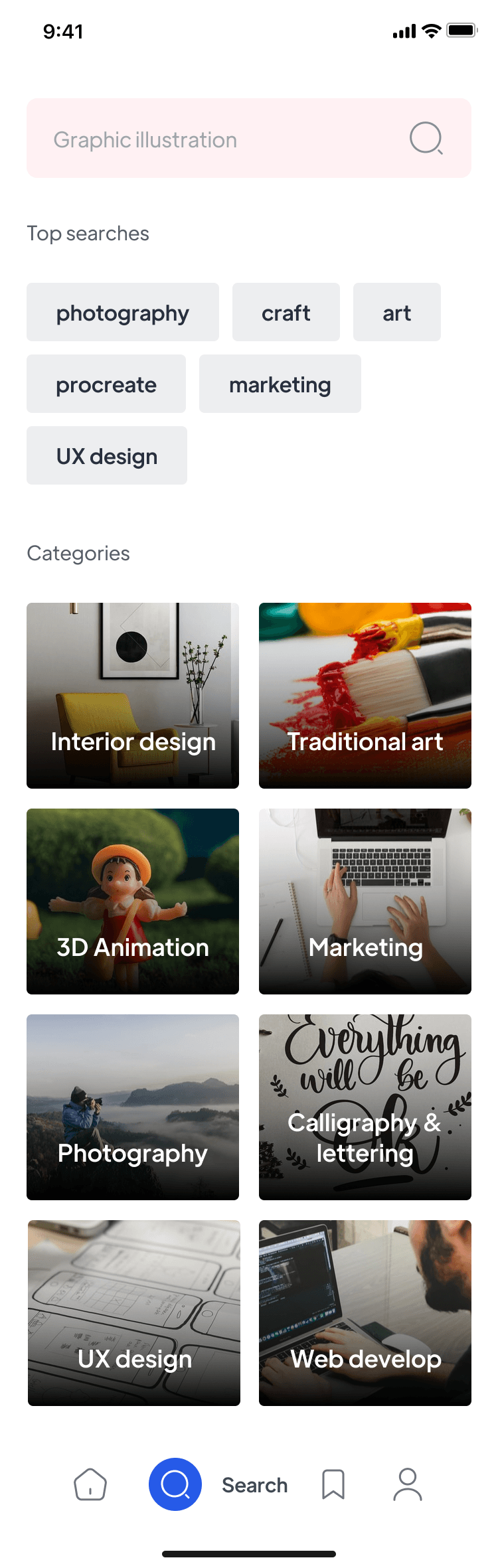
What you'll build
- ✓A rose-tinted rounded search field with a hint and trailing search icon
- ✓A wrapping 'Top searches' chip row built from a plain list of query strings
- ✓A two-column grid of photo category tiles with dark gradient overlays and centered labels
- ✓A category grid that lays out manually with Rows and Expanded — no nested GridView inside the scroll view
- ✓A bottom nav bar whose active Search destination expands into a blue circle with a label
Step-by-step build
Create the file
Add a new file at lib/search/search_screen.dart in your Flutter project.
Register the bundled fonts
No external packages — this is pure Flutter. It does bundle its design font (PlusJakartaSans), so drop the font file into fonts/ and declare it in pubspec.yaml:
flutter:
  fonts:
    - family: PlusJakartaSans
      fonts:
- asset: fonts/PlusJakartaSans-Regular.ttfBuild it, piece by piece
Here's how the screen goes together. Each block below is a real slice of the code with a plain-English explanation — paste them in order, or grab the whole file from the next section.
Imports, the stateful screen, and the nav index
import 'package:flutter/material.dart';

import 'widgets/category_card.dart';
import 'widgets/search_bottom_nav.dart';
import 'widgets/search_chip.dart';
import 'widgets/search_field.dart';

/// "Search" — a discovery screen with a search field, top-search suggestion
/// chips, and a grid of category tiles.
///
/// Self-contained, pure Flutter. Bundles its exact design font
/// (Plus Jakarta Sans) and uses network images (the original Unsplash photos
/// from the design). Renders standalone when pushed as a route.
class SearchScreen extends StatefulWidget {
  const SearchScreen({super.key});

  @override
  State<SearchScreen> createState() => _SearchScreenState();
}

class _SearchScreenState extends State<SearchScreen> {
  static const Color _sectionLabel = Color(0xFF585D69);

  int _navIndex = 1; // Search tab active, per the design.
The file imports Flutter's material library plus four local widgets — CategoryCard, SearchBottomNav, SearchChip, and SearchField — so this screen file stays focused on layout while each piece lives in its own file. SearchScreen is a StatefulWidget because one thing genuinely changes: which bottom-nav tab is active. Inside _SearchScreenState, the const Color _sectionLabel (0xFF585D69, a muted grey) is the design token for the small section headings, and int _navIndex = 1 starts the Search tab selected, matching the design.
The suggestion terms and category data
  static const List<String> _topSearches = <String>[
    'photography',
    'craft',
    'art',
    'procreate',
    'marketing',
    'UX design',
  ];

  // Exact Unsplash photos referenced by the Zeplin design.
  static const List<_Category> _categories = <_Category>[
    _Category('Interior design',
        'https://images.unsplash.com/photo-1586023492125-27b2c045efd7'),
    _Category('Traditional art',
        'https://images.unsplash.com/photo-1513364776144-60967b0f800f'),
    _Category('3D Animation',
        'https://images.unsplash.com/photo-1631582053308-40f482e7ace5'),
    _Category('Marketing',
        'https://images.unsplash.com/photo-1554415707-6e8cfc93fe23'),
    _Category('Photography',
        'https://images.unsplash.com/photo-1492691527719-9d1e07e534b4'),
    _Category('Calligraphy & lettering',
        'https://images.unsplash.com/photo-1591696919944-6d169b9e48d2'),
    _Category('UX design',
        'https://images.unsplash.com/photo-1576153192286-defd01e1e4b4'),
    _Category('Web develop',
        'https://images.unsplash.com/photo-1534665482403-a909d0d97c67'),
  ];

  static const String _imgParams = '?w=400&q=80&auto=format&fit=crop';
Two const lists hold the screen's content so the widget tree stays declarative. _topSearches is six plain strings ('photography', 'craft', 'art', 'procreate', 'marketing', 'UX design') that will each become a chip. _categories is eight _Category records, each pairing a title with an Unsplash photo URL. _imgParams ('?w=400&q=80&auto=format&fit=crop') is a query string appended to every image URL so the network fetch returns a 400px-wide, quality-80, auto-cropped image instead of a full-resolution original — a simple way to keep the grid fast.
The scroll view: search field, chips, and grid
  @override
  Widget build(BuildContext context) {
    return Scaffold(
      backgroundColor: Colors.white,
      body: SafeArea(
        bottom: false,
        child: SingleChildScrollView(
          padding: const EdgeInsets.fromLTRB(20, 20, 20, 24),
          child: Column(
            crossAxisAlignment: CrossAxisAlignment.start,
            children: <Widget>[
              const SearchField(),
              const SizedBox(height: 30),
              const _SectionLabel('Top searches'),
              const SizedBox(height: 18),
              Wrap(
                spacing: 10,
                runSpacing: 10,
                children: <Widget>[
                  for (final String term in _topSearches)
                    SearchChip(label: term, onTap: () {}),
                ],
              ),
              const SizedBox(height: 34),
              const _SectionLabel('Categories'),
              const SizedBox(height: 18),
              _CategoryGrid(
                categories: _categories,
                imageParams: _imgParams,
              ),
            ],
          ),
        ),
      ),
      bottomNavigationBar: SearchBottomNav(
        currentIndex: _navIndex,
        onChanged: (int index) => setState(() => _navIndex = index),
      ),
    );
  }
}
build() returns a white Scaffold whose body is a SafeArea (with bottom: false, since the nav bar handles the bottom inset) wrapping a SingleChildScrollView padded 20 on the sides and 24 at the bottom. Its Column is left-aligned (CrossAxisAlignment.start) and stacks the SearchField, a _SectionLabel('Top searches'), then a Wrap with 10px spacing and runSpacing that builds a SearchChip for every term via a for-in loop — Wrap lets chips flow onto new lines automatically. Fixed SizedBox heights (30, 18, 34, 18) set the vertical rhythm, and a _CategoryGrid closes the column. The bottomNavigationBar is the SearchBottomNav, wired to _navIndex with an onChanged that calls setState to switch tabs.
The section-label text style
class _SectionLabel extends StatelessWidget {
  const _SectionLabel(this.text);

  final String text;

  @override
  Widget build(BuildContext context) {
    return Text(
      text,
      style: const TextStyle(
        fontFamily: 'PlusJakartaSans',
        color: _SearchScreenState._sectionLabel,
        fontSize: 15,
        fontWeight: FontWeight.w400,
        letterSpacing: 0.225,
        height: 1.4,
      ),
    );
  }
}
_SectionLabel is a tiny StatelessWidget that renders a single Text in the screen's exact type spec: the bundled 'PlusJakartaSans' font at 15px, weight w400, the grey _sectionLabel color, letterSpacing 0.225, and line height 1.4. Pulling this into its own widget means both 'Top searches' and 'Categories' share one styled definition instead of repeating the TextStyle.
A two-column grid without a nested GridView
/// Two-column category grid (card aspect 160:140, 15px gaps), laid out as rows
/// so it composes inside the scroll view without a nested scrollable.
class _CategoryGrid extends StatelessWidget {
  const _CategoryGrid({required this.categories, required this.imageParams});

  static const double _gap = 15;
  static const double _aspect = 160 / 140;

  final List<_Category> categories;
  final String imageParams;

  @override
  Widget build(BuildContext context) {
    final List<Widget> rows = <Widget>[];
    for (int i = 0; i < categories.length; i += 2) {
      if (i > 0) {
        rows.add(const SizedBox(height: _gap));
      }
      rows.add(
        Row(
          crossAxisAlignment: CrossAxisAlignment.start,
          children: <Widget>[
            Expanded(child: _cell(categories[i])),
            const SizedBox(width: _gap),
            Expanded(
              child: i + 1 < categories.length
                  ? _cell(categories[i + 1])
                  : const SizedBox.shrink(),
            ),
          ],
        ),
      );
    }
    return Column(children: rows);
  }

  Widget _cell(_Category category) {
    return AspectRatio(
      aspectRatio: _aspect,
      child: CategoryCard(
        title: category.title,
        imageUrl: '${category.imageUrl}$imageParams',
        onTap: () {},
      ),
    );
  }
}
This is the key layout trick. Because the grid lives inside a SingleChildScrollView, dropping in a GridView would nest two scrollables and break. Instead _CategoryGrid builds the rows by hand: a for loop steps through categories two at a time (i += 2), and each pass adds a Row of two Expanded cells separated by a 15px _gap SizedBox. When the list has an odd tail, the second Expanded falls back to SizedBox.shrink() so the last row still aligns. The _cell helper wraps each CategoryCard in an AspectRatio of 160/140, giving every tile the design's exact proportions, and stitches _imgParams onto the image URL.
The immutable category model
@immutable
class _Category {
  const _Category(this.title, this.imageUrl);
  final String title;
  final String imageUrl;
}
_Category is a small @immutable data class holding just a title and an imageUrl, both final. It exists purely to give each grid tile a typed pair of values instead of loose parallel lists — the @immutable annotation lets the analyzer flag any accidental mutation.
Full code
The complete, ready-to-paste source (5 files). Free to use in your projects — one click copies it all.
import 'package:flutter/material.dart';

import 'widgets/category_card.dart';
import 'widgets/search_bottom_nav.dart';
import 'widgets/search_chip.dart';
import 'widgets/search_field.dart';

/// "Search" — a discovery screen with a search field, top-search suggestion
/// chips, and a grid of category tiles.
///
/// Self-contained, pure Flutter. Bundles its exact design font
/// (Plus Jakarta Sans) and uses network images (the original Unsplash photos
/// from the design). Renders standalone when pushed as a route.
class SearchScreen extends StatefulWidget {
  const SearchScreen({super.key});

  @override
  State<SearchScreen> createState() => _SearchScreenState();
}

class _SearchScreenState extends State<SearchScreen> {
  static const Color _sectionLabel = Color(0xFF585D69);

  int _navIndex = 1; // Search tab active, per the design.

  static const List<String> _topSearches = <String>[
    'photography',
    'craft',
    'art',
    'procreate',
    'marketing',
    'UX design',
  ];

  // Exact Unsplash photos referenced by the Zeplin design.
  static const List<_Category> _categories = <_Category>[
    _Category('Interior design',
        'https://images.unsplash.com/photo-1586023492125-27b2c045efd7'),
    _Category('Traditional art',
        'https://images.unsplash.com/photo-1513364776144-60967b0f800f'),
    _Category('3D Animation',
        'https://images.unsplash.com/photo-1631582053308-40f482e7ace5'),
    _Category('Marketing',
        'https://images.unsplash.com/photo-1554415707-6e8cfc93fe23'),
    _Category('Photography',
        'https://images.unsplash.com/photo-1492691527719-9d1e07e534b4'),
    _Category('Calligraphy & lettering',
        'https://images.unsplash.com/photo-1591696919944-6d169b9e48d2'),
    _Category('UX design',
        'https://images.unsplash.com/photo-1576153192286-defd01e1e4b4'),
    _Category('Web develop',
        'https://images.unsplash.com/photo-1534665482403-a909d0d97c67'),
  ];

  static const String _imgParams = '?w=400&q=80&auto=format&fit=crop';

  @override
  Widget build(BuildContext context) {
    return Scaffold(
      backgroundColor: Colors.white,
      body: SafeArea(
        bottom: false,
        child: SingleChildScrollView(
          padding: const EdgeInsets.fromLTRB(20, 20, 20, 24),
          child: Column(
            crossAxisAlignment: CrossAxisAlignment.start,
            children: <Widget>[
              const SearchField(),
              const SizedBox(height: 30),
              const _SectionLabel('Top searches'),
              const SizedBox(height: 18),
              Wrap(
                spacing: 10,
                runSpacing: 10,
                children: <Widget>[
                  for (final String term in _topSearches)
                    SearchChip(label: term, onTap: () {}),
                ],
              ),
              const SizedBox(height: 34),
              const _SectionLabel('Categories'),
              const SizedBox(height: 18),
              _CategoryGrid(
                categories: _categories,
                imageParams: _imgParams,
              ),
            ],
          ),
        ),
      ),
      bottomNavigationBar: SearchBottomNav(
        currentIndex: _navIndex,
        onChanged: (int index) => setState(() => _navIndex = index),
      ),
    );
  }
}

class _SectionLabel extends StatelessWidget {
  const _SectionLabel(this.text);

  final String text;

  @override
  Widget build(BuildContext context) {
    return Text(
      text,
      style: const TextStyle(
        fontFamily: 'PlusJakartaSans',
        color: _SearchScreenState._sectionLabel,
        fontSize: 15,
        fontWeight: FontWeight.w400,
        letterSpacing: 0.225,
        height: 1.4,
      ),
    );
  }
}

/// Two-column category grid (card aspect 160:140, 15px gaps), laid out as rows
/// so it composes inside the scroll view without a nested scrollable.
class _CategoryGrid extends StatelessWidget {
  const _CategoryGrid({required this.categories, required this.imageParams});

  static const double _gap = 15;
  static const double _aspect = 160 / 140;

  final List<_Category> categories;
  final String imageParams;

  @override
  Widget build(BuildContext context) {
    final List<Widget> rows = <Widget>[];
    for (int i = 0; i < categories.length; i += 2) {
      if (i > 0) {
        rows.add(const SizedBox(height: _gap));
      }
      rows.add(
        Row(
          crossAxisAlignment: CrossAxisAlignment.start,
          children: <Widget>[
            Expanded(child: _cell(categories[i])),
            const SizedBox(width: _gap),
            Expanded(
              child: i + 1 < categories.length
                  ? _cell(categories[i + 1])
                  : const SizedBox.shrink(),
            ),
          ],
        ),
      );
    }
    return Column(children: rows);
  }

  Widget _cell(_Category category) {
    return AspectRatio(
      aspectRatio: _aspect,
      child: CategoryCard(
        title: category.title,
        imageUrl: '${category.imageUrl}$imageParams',
        onTap: () {},
      ),
    );
  }
}

@immutable
class _Category {
  const _Category(this.title, this.imageUrl);
  final String title;
  final String imageUrl;
}
Plus bundled 1 binary asset (fonts/images). The CLI and MCP install those for you automatically.
Two faster ways to add it
Copy-paste works, but you can skip it entirely.
1. FlutterKit CLI
One command drops this screen — and its fonts — straight into your project.
$ flutterkit add search-discover2. AI agent (MCP)
Connect FlutterKit's MCP server in Claude or Cursor and just ask your agent to install search-discover — it fetches and writes the files for you.
FAQ
Is this search screen free to use?
Yes. The full Dart source on this page is free to copy into your own apps, personal or commercial. Paste it directly, install it with the FlutterKit CLI (flutterkit add search-discover), or have an AI agent add it for you via MCP.
Does it need any external packages?
No — it's pure Flutter built on the material library, with no third-party packages. The category tiles load photos over the network with Image.network (the demo uses Unsplash URLs, which you'd swap for your own), and the only bundled asset is the Plus Jakarta Sans font, which you register in pubspec.yaml as shown in step 2. The CLI and MCP install the font file for you.
Which Flutter version does it target?
It uses super parameters (const SearchScreen({super.key})), so it needs a modern Flutter 3.x on Dart 3. There's no Color.withValues() call to worry about — the gradient and colors use plain ARGB hex constants like Color(0x8C000000) — so nothing needs swapping for older SDKs beyond having Dart 3.
