How to Build an Enter Amount Screen in Flutter (Full Code + Preview)
Every UPI or wallet app needs a screen where you type how much to send, and it has to feel instant and unmistakable. This tutorial builds exactly that in Flutter: a verified-recipient header, a giant live ₹ amount, quick-pick chips for ₹100 to ₹2,000, an optional note field, and a custom numeric keypad ending in a Proceed to Pay button. You'll wire up the amount as a single String of digits, format it in the Indian comma style (12,34,567), and drive it from both the keypad and the chips. It's pure Flutter with one bundled font.
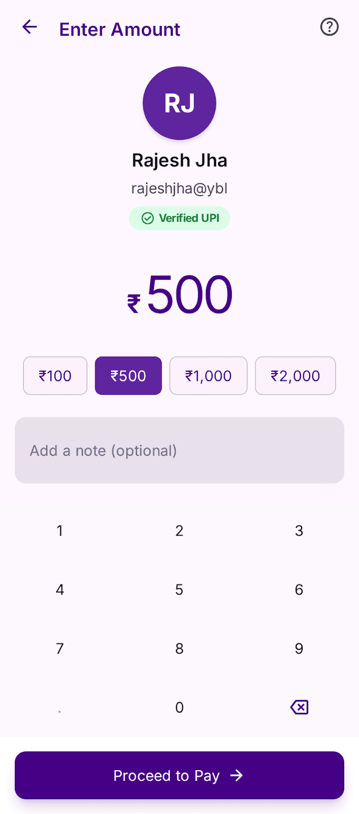
What you'll build
- ✓A live ₹ amount display that updates from an on-screen keypad and preset chips
- ✓Indian-style digit grouping (last 3, then pairs) written from scratch with a regular expression
- ✓Quick-amount chips that highlight the one matching the current value
- ✓A custom 3-column numeric keypad with per-key press animation and a disabled decimal key
- ✓A 'Verified UPI' recipient header and a Proceed to Pay CTA, all in the app's purple theme
Step-by-step build
Create the file
Add a new file at lib/enter_amount/enter_amount_screen.dart in your Flutter project.
Register the bundled fonts
No external packages — this is pure Flutter. It does bundle its design font (Inter), so drop the font file into fonts/ and declare it in pubspec.yaml:
flutter:
  fonts:
    - family: Inter
      fonts:
- asset: fonts/Inter-Regular.ttfBuild it, piece by piece
Here's how the screen goes together. Each block below is a real slice of the code with a plain-English explanation — paste them in order, or grab the whole file from the next section.
Imports, state fields, and the digit handlers
import 'package:flutter/material.dart';

import 'widgets/amount_keypad.dart';
import 'widgets/palette.dart';
import 'widgets/recipient_card.dart';

/// "Send Money — Enter Amount": a UPI amount-entry screen. The big amount is
/// driven by an on-screen numeric keypad and quick-amount chips, formatted in
/// the Indian comma style, with a recipient header, a note field and a
/// Proceed-to-Pay CTA.
///
/// Self-contained, pure Flutter. Bundles its exact design font (Inter). Renders
/// standalone when pushed as a route.
class EnterAmountScreen extends StatefulWidget {
  const EnterAmountScreen({super.key});

  @override
  State<EnterAmountScreen> createState() => _EnterAmountScreenState();
}

class _EnterAmountScreenState extends State<EnterAmountScreen> {
  static const int _maxDigits = 7;
  static const List<int> _quickAmounts = <int>[100, 500, 1000, 2000];

  String _amount = '500';

  void _appendDigit(String d) {
    setState(() {
      if (_amount == '0') {
        _amount = d;
      } else if (_amount.length < _maxDigits) {
        _amount += d;
      }
    });
  }

  void _backspace() {
    setState(() {
      _amount = _amount.length > 1
          ? _amount.substring(0, _amount.length - 1)
          : '0';
    });
  }

  void _setAmount(int value) => setState(() => _amount = '$value');
The screen imports three local widgets — AmountKeypad, the P palette of design tokens, and RecipientCard — so this file stays focused on layout and logic. EnterAmountScreen is a StatefulWidget because the typed amount changes constantly. The state stores the amount as a plain String _amount that starts at '500', capped at _maxDigits = 7, alongside a _quickAmounts list of [100, 500, 1000, 2000]. _appendDigit adds a keypad digit but replaces a lone '0' instead of prefixing it, _backspace trims the last character (falling back to '0' when only one digit is left), and _setAmount jumps straight to a chip's value. Keeping the amount as a String, not an int, is what makes digit-by-digit editing simple.
Formatting digits in the Indian comma style
  /// Groups digits in the Indian style: 12,34,567 (last 3, then pairs).
  static String _formatIndian(String s) {
    if (s.length <= 3) return s;
    final String last3 = s.substring(s.length - 3);
    final String rest = s.substring(0, s.length - 3);
    final String grouped =
        rest.replaceAllMapped(RegExp(r'(\d)(?=(\d\d)+$)'), (Match m) => '${m[1]},');
    return '$grouped,$last3';
  }
_formatIndian turns a raw digit string like '1234567' into '12,34,567'. Anything three digits or shorter is returned untouched. Otherwise it slices off the last three digits, then runs a regular expression over the remaining leading digits — RegExp(r'(\d)(?=(\d\d)+$)') uses a look-ahead to place a comma after every digit that is followed by pairs of digits, which is the Indian grouping rule (last group of 3, then groups of 2). This is a neat example of doing locale formatting yourself instead of pulling in the intl package.
The build method: scaffold and screen layout
  @override
  Widget build(BuildContext context) {
    final int amountValue = int.tryParse(_amount) ?? 0;
    return Scaffold(
      backgroundColor: P.background,
      body: SafeArea(
        child: GestureDetector(
          onTap: () => FocusScope.of(context).unfocus(),
          child: Column(
            children: <Widget>[
              _Header(onBack: () => Navigator.of(context).maybePop()),
              Expanded(
                child: Padding(
                  padding: const EdgeInsets.symmetric(horizontal: P.md),
                  child: Column(
                    children: <Widget>[
                      const SizedBox(height: P.sm),
                      const RecipientCard(
                        initials: 'RJ',
                        name: 'Rajesh Jha',
                        upiId: 'rajeshjha@ybl',
                      ),
                      Expanded(
                        child: Column(
                          mainAxisAlignment: MainAxisAlignment.center,
                          children: <Widget>[
                            _AmountDisplay(text: _formatIndian(_amount)),
                            const SizedBox(height: P.xl),
                            _QuickAmountChips(
                              amounts: _quickAmounts,
                              selected: amountValue,
                              onSelected: _setAmount,
                            ),
                            const SizedBox(height: P.lg),
                            const _NoteField(),
                          ],
                        ),
                      ),
                    ],
                  ),
                ),
              ),
              _Footer(
                onDigit: _appendDigit,
                onBackspace: _backspace,
                onProceed: () {},
              ),
            ],
          ),
        ),
      ),
    );
  }
}
build() first parses _amount into amountValue so the chips know which one to highlight. The Scaffold uses the P.background off-white and a SafeArea; a GestureDetector calling FocusScope.of(context).unfocus() dismisses the keyboard when you tap outside the note field. The body is a vertical Column: a _Header at the top, then an Expanded region holding the RecipientCard (hard-coded here to 'Rajesh Jha' / rajeshjha@ybl), the centered _AmountDisplay showing the formatted amount, the _QuickAmountChips, and the _NoteField. The _Footer is pinned to the bottom and receives the digit, backspace, and proceed callbacks. Because the middle Column is centered inside Expanded, the amount stays vertically balanced above the keypad.
The back-arrow header and the big ₹ amount
class _Header extends StatelessWidget {
  const _Header({required this.onBack});

  final VoidCallback onBack;

  @override
  Widget build(BuildContext context) {
    return SizedBox(
      height: 64,
      child: Padding(
        padding: const EdgeInsets.symmetric(horizontal: P.md),
        child: Row(
          children: <Widget>[
            GestureDetector(
              behavior: HitTestBehavior.opaque,
              onTap: onBack,
              child: const Padding(
                padding: EdgeInsets.all(P.xs),
                child: Icon(Icons.arrow_back, color: P.primary, size: 24),
              ),
            ),
            const SizedBox(width: P.md),
            Text('Enter Amount', style: P.h2Headline.copyWith(color: P.primary)),
            const Spacer(),
            GestureDetector(
              behavior: HitTestBehavior.opaque,
              onTap: () {},
              child: const Padding(
                padding: EdgeInsets.all(P.xs),
                child: Icon(Icons.help_outline,
                    color: P.onSurfaceVariant, size: 24),
              ),
            ),
          ],
        ),
      ),
    );
  }
}

class _AmountDisplay extends StatelessWidget {
  const _AmountDisplay({required this.text});

  final String text;

  @override
  Widget build(BuildContext context) {
    return Row(
      mainAxisAlignment: MainAxisAlignment.center,
      crossAxisAlignment: CrossAxisAlignment.baseline,
      textBaseline: TextBaseline.alphabetic,
      children: <Widget>[
        Text(
          '₹',
          style: P.h1BalanceMobile.copyWith(color: P.primary),
        ),
        const SizedBox(width: 4),
        Text(
          text,
          style: const TextStyle(
            fontFamily: P.font,
            fontSize: 56,
            height: 1.0,
            fontWeight: FontWeight.w700,
            letterSpacing: -1.5,
            color: P.primary,
          ),
        ),
      ],
    );
  }
}
_Header is a fixed 64px-tall Row with a back arrow (Icons.arrow_back in P.primary, wired to Navigator.maybePop via the parent), the 'Enter Amount' title in the h2Headline style, a Spacer, and a help_outline icon on the right. _AmountDisplay is the visual centerpiece: a Row baseline-aligned so the rupee sign and number share a text baseline, showing a ₹ in the h1BalanceMobile style next to the amount in a custom 56px, weight-700 TextStyle with letterSpacing: -1.5 to tighten the big numerals. That negative letter spacing is what gives the large number its dense, polished look.
Quick-amount preset chips
class _QuickAmountChips extends StatelessWidget {
  const _QuickAmountChips({
    required this.amounts,
    required this.selected,
    required this.onSelected,
  });

  final List<int> amounts;
  final int selected;
  final ValueChanged<int> onSelected;

  @override
  Widget build(BuildContext context) {
    return Wrap(
      alignment: WrapAlignment.center,
      spacing: P.sm,
      runSpacing: P.sm,
      children: <Widget>[
        for (final int amount in amounts)
          _Chip(
            label: '₹${_EnterAmountScreenState._formatIndian('$amount')}',
            selected: amount == selected,
            onTap: () => onSelected(amount),
          ),
      ],
    );
  }
}

class _Chip extends StatelessWidget {
  const _Chip({
    required this.label,
    required this.selected,
    required this.onTap,
  });

  final String label;
  final bool selected;
  final VoidCallback onTap;

  @override
  Widget build(BuildContext context) {
    return GestureDetector(
      behavior: HitTestBehavior.opaque,
      onTap: onTap,
      child: AnimatedContainer(
        duration: const Duration(milliseconds: 150),
        padding: const EdgeInsets.symmetric(horizontal: P.md, vertical: P.sm),
        decoration: BoxDecoration(
          color: selected ? P.primaryContainer : P.surfaceContainerLow,
          borderRadius: BorderRadius.circular(8),
          border: Border.all(
            color: selected ? P.primaryContainer : P.outlineVariant,
          ),
        ),
        child: Text(
          label,
          style: P.labelMedium.copyWith(
            color: selected ? P.onPrimary : P.primary,
          ),
        ),
      ),
    );
  }
}
_QuickAmountChips lays the presets out in a centered Wrap so they flow onto a second line on narrow screens, spacing them by P.sm. Each _Chip's label reuses _formatIndian to render '₹1,000' correctly. The chips are stateless but visually reactive: a _Chip compares its amount to the selected value and, when they match, fills with P.primaryContainer purple and white P.onPrimary text; otherwise it uses the light surfaceContainerLow fill with an outlineVariant border. An AnimatedContainer with a 150ms duration means the color and border cross-fade smoothly as the selection changes, rather than snapping.
Note field, keypad footer, and Proceed to Pay
class _NoteField extends StatelessWidget {
  const _NoteField();

  @override
  Widget build(BuildContext context) {
    return ConstrainedBox(
      constraints: const BoxConstraints(maxWidth: 384),
      child: TextField(
        cursorColor: P.primary,
        style: P.bodyMedium.copyWith(color: P.onSurfaceVariant),
        decoration: InputDecoration(
          filled: true,
          fillColor: P.surfaceVariant,
          hintText: 'Add a note (optional)',
          hintStyle: P.bodyMedium.copyWith(color: P.onSurfaceVariant),
          contentPadding:
              const EdgeInsets.symmetric(horizontal: P.md, vertical: P.lg),
          border: OutlineInputBorder(
            borderRadius: BorderRadius.circular(12),
            borderSide: BorderSide.none,
          ),
          enabledBorder: OutlineInputBorder(
            borderRadius: BorderRadius.circular(12),
            borderSide: BorderSide.none,
          ),
          focusedBorder: OutlineInputBorder(
            borderRadius: BorderRadius.circular(12),
            borderSide: const BorderSide(color: P.primary, width: 2),
          ),
        ),
      ),
    );
  }
}

class _Footer extends StatelessWidget {
  const _Footer({
    required this.onDigit,
    required this.onBackspace,
    required this.onProceed,
  });

  final ValueChanged<String> onDigit;
  final VoidCallback onBackspace;
  final VoidCallback onProceed;

  @override
  Widget build(BuildContext context) {
    return Container(
      color: P.surfaceContainerLowest,
      child: Column(
        mainAxisSize: MainAxisSize.min,
        children: <Widget>[
          AmountKeypad(onDigit: onDigit, onBackspace: onBackspace),
          Padding(
            padding: const EdgeInsets.all(P.md),
            child: _ProceedButton(onTap: onProceed),
          ),
        ],
      ),
    );
  }
}

class _ProceedButton extends StatelessWidget {
  const _ProceedButton({required this.onTap});

  final VoidCallback onTap;

  @override
  Widget build(BuildContext context) {
    return Material(
      color: P.primary,
      borderRadius: BorderRadius.circular(12),
      child: InkWell(
        onTap: onTap,
        borderRadius: BorderRadius.circular(12),
        child: SizedBox(
          height: 52,
          child: Row(
            mainAxisAlignment: MainAxisAlignment.center,
            children: <Widget>[
              Text(
                'Proceed to Pay',
                style: P.labelMedium.copyWith(
                  color: P.onPrimary,
                  fontSize: 16,
                ),
              ),
              const SizedBox(width: P.sm),
              const Icon(Icons.arrow_forward, color: P.onPrimary, size: 20),
            ],
          ),
        ),
      ),
    );
  }
}
_NoteField is a TextField capped at 384px wide with a filled surfaceVariant background, no visible border until focus (then a 2px P.primary outline) and an 'Add a note (optional)' hint. _Footer sits on a white surfaceContainerLowest band and stacks the AmountKeypad above the _ProceedButton. That button is built from Material + InkWell so it gives a ripple on tap, is 52px tall in P.primary purple with a 12px radius, and shows 'Proceed to Pay' beside an arrow_forward icon in white. Its onProceed callback is an empty {} here, so this is where you'd trigger your real payment flow.
Full code
The complete, ready-to-paste source (4 files). Free to use in your projects — one click copies it all.
import 'package:flutter/material.dart';

import 'widgets/amount_keypad.dart';
import 'widgets/palette.dart';
import 'widgets/recipient_card.dart';

/// "Send Money — Enter Amount": a UPI amount-entry screen. The big amount is
/// driven by an on-screen numeric keypad and quick-amount chips, formatted in
/// the Indian comma style, with a recipient header, a note field and a
/// Proceed-to-Pay CTA.
///
/// Self-contained, pure Flutter. Bundles its exact design font (Inter). Renders
/// standalone when pushed as a route.
class EnterAmountScreen extends StatefulWidget {
  const EnterAmountScreen({super.key});

  @override
  State<EnterAmountScreen> createState() => _EnterAmountScreenState();
}

class _EnterAmountScreenState extends State<EnterAmountScreen> {
  static const int _maxDigits = 7;
  static const List<int> _quickAmounts = <int>[100, 500, 1000, 2000];

  String _amount = '500';

  void _appendDigit(String d) {
    setState(() {
      if (_amount == '0') {
        _amount = d;
      } else if (_amount.length < _maxDigits) {
        _amount += d;
      }
    });
  }

  void _backspace() {
    setState(() {
      _amount = _amount.length > 1
          ? _amount.substring(0, _amount.length - 1)
          : '0';
    });
  }

  void _setAmount(int value) => setState(() => _amount = '$value');

  /// Groups digits in the Indian style: 12,34,567 (last 3, then pairs).
  static String _formatIndian(String s) {
    if (s.length <= 3) return s;
    final String last3 = s.substring(s.length - 3);
    final String rest = s.substring(0, s.length - 3);
    final String grouped =
        rest.replaceAllMapped(RegExp(r'(\d)(?=(\d\d)+$)'), (Match m) => '${m[1]},');
    return '$grouped,$last3';
  }

  @override
  Widget build(BuildContext context) {
    final int amountValue = int.tryParse(_amount) ?? 0;
    return Scaffold(
      backgroundColor: P.background,
      body: SafeArea(
        child: GestureDetector(
          onTap: () => FocusScope.of(context).unfocus(),
          child: Column(
            children: <Widget>[
              _Header(onBack: () => Navigator.of(context).maybePop()),
              Expanded(
                child: Padding(
                  padding: const EdgeInsets.symmetric(horizontal: P.md),
                  child: Column(
                    children: <Widget>[
                      const SizedBox(height: P.sm),
                      const RecipientCard(
                        initials: 'RJ',
                        name: 'Rajesh Jha',
                        upiId: 'rajeshjha@ybl',
                      ),
                      Expanded(
                        child: Column(
                          mainAxisAlignment: MainAxisAlignment.center,
                          children: <Widget>[
                            _AmountDisplay(text: _formatIndian(_amount)),
                            const SizedBox(height: P.xl),
                            _QuickAmountChips(
                              amounts: _quickAmounts,
                              selected: amountValue,
                              onSelected: _setAmount,
                            ),
                            const SizedBox(height: P.lg),
                            const _NoteField(),
                          ],
                        ),
                      ),
                    ],
                  ),
                ),
              ),
              _Footer(
                onDigit: _appendDigit,
                onBackspace: _backspace,
                onProceed: () {},
              ),
            ],
          ),
        ),
      ),
    );
  }
}

class _Header extends StatelessWidget {
  const _Header({required this.onBack});

  final VoidCallback onBack;

  @override
  Widget build(BuildContext context) {
    return SizedBox(
      height: 64,
      child: Padding(
        padding: const EdgeInsets.symmetric(horizontal: P.md),
        child: Row(
          children: <Widget>[
            GestureDetector(
              behavior: HitTestBehavior.opaque,
              onTap: onBack,
              child: const Padding(
                padding: EdgeInsets.all(P.xs),
                child: Icon(Icons.arrow_back, color: P.primary, size: 24),
              ),
            ),
            const SizedBox(width: P.md),
            Text('Enter Amount', style: P.h2Headline.copyWith(color: P.primary)),
            const Spacer(),
            GestureDetector(
              behavior: HitTestBehavior.opaque,
              onTap: () {},
              child: const Padding(
                padding: EdgeInsets.all(P.xs),
                child: Icon(Icons.help_outline,
                    color: P.onSurfaceVariant, size: 24),
              ),
            ),
          ],
        ),
      ),
    );
  }
}

class _AmountDisplay extends StatelessWidget {
  const _AmountDisplay({required this.text});

  final String text;

  @override
  Widget build(BuildContext context) {
    return Row(
      mainAxisAlignment: MainAxisAlignment.center,
      crossAxisAlignment: CrossAxisAlignment.baseline,
      textBaseline: TextBaseline.alphabetic,
      children: <Widget>[
        Text(
          '₹',
          style: P.h1BalanceMobile.copyWith(color: P.primary),
        ),
        const SizedBox(width: 4),
        Text(
          text,
          style: const TextStyle(
            fontFamily: P.font,
            fontSize: 56,
            height: 1.0,
            fontWeight: FontWeight.w700,
            letterSpacing: -1.5,
            color: P.primary,
          ),
        ),
      ],
    );
  }
}

class _QuickAmountChips extends StatelessWidget {
  const _QuickAmountChips({
    required this.amounts,
    required this.selected,
    required this.onSelected,
  });

  final List<int> amounts;
  final int selected;
  final ValueChanged<int> onSelected;

  @override
  Widget build(BuildContext context) {
    return Wrap(
      alignment: WrapAlignment.center,
      spacing: P.sm,
      runSpacing: P.sm,
      children: <Widget>[
        for (final int amount in amounts)
          _Chip(
            label: '₹${_EnterAmountScreenState._formatIndian('$amount')}',
            selected: amount == selected,
            onTap: () => onSelected(amount),
          ),
      ],
    );
  }
}

class _Chip extends StatelessWidget {
  const _Chip({
    required this.label,
    required this.selected,
    required this.onTap,
  });

  final String label;
  final bool selected;
  final VoidCallback onTap;

  @override
  Widget build(BuildContext context) {
    return GestureDetector(
      behavior: HitTestBehavior.opaque,
      onTap: onTap,
      child: AnimatedContainer(
        duration: const Duration(milliseconds: 150),
        padding: const EdgeInsets.symmetric(horizontal: P.md, vertical: P.sm),
        decoration: BoxDecoration(
          color: selected ? P.primaryContainer : P.surfaceContainerLow,
          borderRadius: BorderRadius.circular(8),
          border: Border.all(
            color: selected ? P.primaryContainer : P.outlineVariant,
          ),
        ),
        child: Text(
          label,
          style: P.labelMedium.copyWith(
            color: selected ? P.onPrimary : P.primary,
          ),
        ),
      ),
    );
  }
}

class _NoteField extends StatelessWidget {
  const _NoteField();

  @override
  Widget build(BuildContext context) {
    return ConstrainedBox(
      constraints: const BoxConstraints(maxWidth: 384),
      child: TextField(
        cursorColor: P.primary,
        style: P.bodyMedium.copyWith(color: P.onSurfaceVariant),
        decoration: InputDecoration(
          filled: true,
          fillColor: P.surfaceVariant,
          hintText: 'Add a note (optional)',
          hintStyle: P.bodyMedium.copyWith(color: P.onSurfaceVariant),
          contentPadding:
              const EdgeInsets.symmetric(horizontal: P.md, vertical: P.lg),
          border: OutlineInputBorder(
            borderRadius: BorderRadius.circular(12),
            borderSide: BorderSide.none,
          ),
          enabledBorder: OutlineInputBorder(
            borderRadius: BorderRadius.circular(12),
            borderSide: BorderSide.none,
          ),
          focusedBorder: OutlineInputBorder(
            borderRadius: BorderRadius.circular(12),
            borderSide: const BorderSide(color: P.primary, width: 2),
          ),
        ),
      ),
    );
  }
}

class _Footer extends StatelessWidget {
  const _Footer({
    required this.onDigit,
    required this.onBackspace,
    required this.onProceed,
  });

  final ValueChanged<String> onDigit;
  final VoidCallback onBackspace;
  final VoidCallback onProceed;

  @override
  Widget build(BuildContext context) {
    return Container(
      color: P.surfaceContainerLowest,
      child: Column(
        mainAxisSize: MainAxisSize.min,
        children: <Widget>[
          AmountKeypad(onDigit: onDigit, onBackspace: onBackspace),
          Padding(
            padding: const EdgeInsets.all(P.md),
            child: _ProceedButton(onTap: onProceed),
          ),
        ],
      ),
    );
  }
}

class _ProceedButton extends StatelessWidget {
  const _ProceedButton({required this.onTap});

  final VoidCallback onTap;

  @override
  Widget build(BuildContext context) {
    return Material(
      color: P.primary,
      borderRadius: BorderRadius.circular(12),
      child: InkWell(
        onTap: onTap,
        borderRadius: BorderRadius.circular(12),
        child: SizedBox(
          height: 52,
          child: Row(
            mainAxisAlignment: MainAxisAlignment.center,
            children: <Widget>[
              Text(
                'Proceed to Pay',
                style: P.labelMedium.copyWith(
                  color: P.onPrimary,
                  fontSize: 16,
                ),
              ),
              const SizedBox(width: P.sm),
              const Icon(Icons.arrow_forward, color: P.onPrimary, size: 20),
            ],
          ),
        ),
      ),
    );
  }
}
Plus bundled 1 binary asset (fonts/images). The CLI and MCP install those for you automatically.
Two faster ways to add it
Copy-paste works, but you can skip it entirely.
1. FlutterKit CLI
One command drops this screen — and its fonts — straight into your project.
$ flutterkit add enter-amount2. AI agent (MCP)
Connect FlutterKit's MCP server in Claude or Cursor and just ask your agent to install enter-amount — it fetches and writes the files for you.
FAQ
Is this Enter Amount screen free to use?
Yes. The full Dart source on this page is free to copy into your own apps, personal or commercial. Paste it directly, install it with the FlutterKit CLI (flutterkit add enter-amount), or have an AI agent add it for you via MCP.
Does it need any external packages?
No — it's pure Flutter, built entirely on the material library, including the hand-written Indian number formatting and the custom keypad. The only extra asset is the bundled Inter font, which you register in pubspec.yaml. The CLI and MCP install the font file for you.
Which Flutter version does it target?
It uses modern APIs — super parameters (super.key) and Color.withValues() in the recipient card — so it targets Flutter 3.22+ (Dart 3). On an older SDK, replace withValues(alpha: 0.15) with withOpacity(0.15) and it will compile.

