How to Build a Fintech Splash Screen in Flutter (Full Code + Preview)
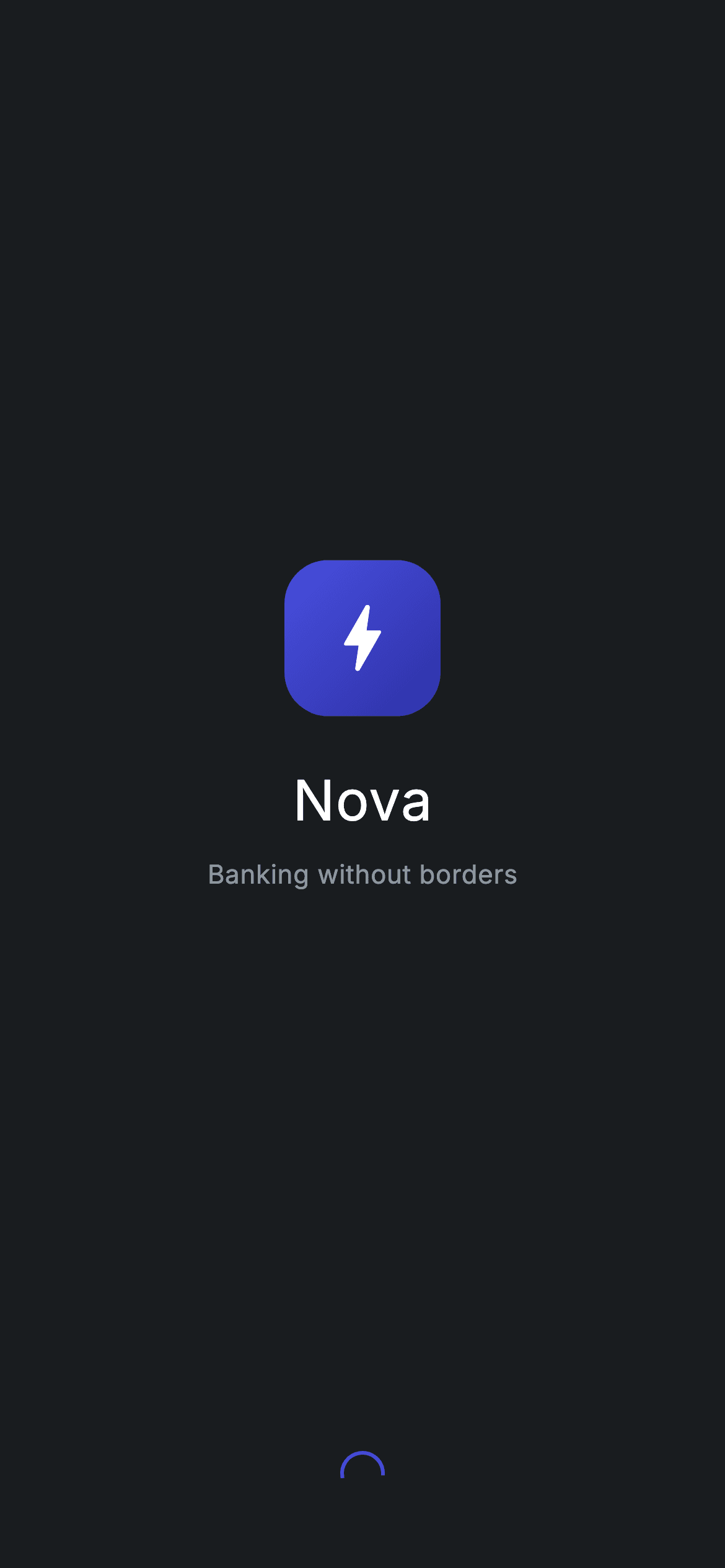
A launch splash is the very first frame a user sees, and this one sets a premium, dark tone for a fictional 'Nova' bank. In this tutorial you'll build it in pure Flutter: a near-black canvas that forces its own Material 3 dark theme, a gradient rounded-square logo drawn from a bolt icon (no image asset), the 'Nova' wordmark, a 'Banking without borders' tagline, and a small loading spinner tinted in the brand indigo. The whole screen is tappable to advance, stays centered on any device, and needs zero packages.
Watch the Flutter UI walkthrough
A short screen recording of Fintech · Splash running, if you'd rather see it before you read the code. The written tutorial below covers everything in it.
Can't see the video? Watch it on YouTube.
What you'll build
- ✓A near-black (#191C1F) splash that forces its own Material 3 dark theme so it renders correctly even when pushed as a standalone route
- ✓A gradient rounded-square brandmark built from a Container, a LinearGradient, and a bolt icon — no image file required
- ✓A vertically centered Column balanced by two equal Spacers, with the wordmark and tagline as the focal point
- ✓A brand-indigo CircularProgressIndicator that signals the app is loading
- ✓Tap-anywhere-to-advance behaviour via a full-bleed GestureDetector and an optional onContinue callback
Step-by-step build
Create the file
Add a new file at lib/fintech_splash/fintech_splash_screen.dart in your Flutter project.
Register the bundled fonts
No external packages — this is pure Flutter. It does bundle its design font (Inter), so drop the font file into fonts/ and declare it in pubspec.yaml:
flutter:
  fonts:
    - family: Inter
      fonts:
- asset: fonts/Inter-Regular.ttfBuild it, piece by piece
Here's how the screen goes together. Each block below is a real slice of the code with a plain-English explanation — paste them in order, or grab the whole file from the next section.
Imports, the screen class, and design tokens
import 'package:flutter/material.dart';

/// Splash — branded launch screen for the Nova fintech app (Revolut-inspired
/// dark design system). Self-contained per CONVENTIONS.md: pure Flutter, the
/// exact design font (Inter) is bundled under `fonts/`, and the screen forces
/// its own dark theme so it renders standalone when pushed as a route.
class FintechSplashScreen extends StatelessWidget {
  const FintechSplashScreen({super.key, this.onContinue});

  /// Optional tap-to-advance callback used by the gallery to chain the flow.
  final VoidCallback? onContinue;

  static const String _font = 'Inter';
  static const Color _bg = Color(0xFF191C1F);
  static const Color _brand = Color(0xFF494FDF);
  static const Color _brandDeep = Color(0xFF2D31A6);
  static const Color _muted = Color(0xFF8D969E);
The file imports only Flutter's material library, then declares FintechSplashScreen as a StatelessWidget — a splash never changes state, so stateless is correct. Its const constructor uses a super.key and exposes one optional onContinue VoidCallback, which the gallery uses to chain to the next screen on tap. Below that are the design tokens as private static const values: _font is 'Inter', _bg (#191C1F) is the near-black canvas, _brand (#494FDF) and _brandDeep (#2D31A6) are the two indigos used for the logo gradient, and _muted (#8D969E) is the grey for secondary text. Naming them once keeps the palette in a single place.
Forcing a dark theme and centering the content
  @override
  Widget build(BuildContext context) {
    return Theme(
      data: ThemeData.dark(useMaterial3: true),
      child: Scaffold(
        backgroundColor: _bg,
        body: GestureDetector(
          onTap: onContinue,
          behavior: HitTestBehavior.opaque,
          child: SafeArea(
            child: SizedBox.expand(
              child: Column(
                crossAxisAlignment: CrossAxisAlignment.center,
                children: <Widget>[
                  const Spacer(),
                  const _NovaLogo(size: 84),
                const SizedBox(height: 24),
build() wraps everything in a Theme with ThemeData.dark(useMaterial3: true) — that forces the screen's own dark theme so it looks right even when the host app is light. Inside sits a Scaffold painted with _bg, whose body is a GestureDetector: onTap fires onContinue and HitTestBehavior.opaque makes even the empty areas respond, so a tap anywhere advances. SafeArea keeps clear of the notch and home indicator, and SizedBox.expand tells the Column to fill the whole screen. The Column centers its children horizontally, opens with a Spacer() to push the brand down, then places the _NovaLogo at size 84 followed by a 24px gap.
Wordmark, tagline, and the loading spinner
                const Text(
                  'Nova',
                  style: TextStyle(
                    fontFamily: _font,
                    fontSize: 30,
                    fontWeight: FontWeight.w500,
                    letterSpacing: 0.5,
                    color: Colors.white,
                  ),
                ),
                const SizedBox(height: 8),
                const Text(
                  'Banking without borders',
                  style: TextStyle(
                    fontFamily: _font,
                    fontSize: 14,
                    fontWeight: FontWeight.w400,
                    letterSpacing: 0.24,
                    color: _muted,
                  ),
                ),
                const Spacer(),
                const SizedBox(
                  width: 22,
                  height: 22,
                  child: CircularProgressIndicator(
                    strokeWidth: 2,
                    valueColor: AlwaysStoppedAnimation<Color>(_brand),
                  ),
                ),
                const SizedBox(height: 40),
The 'Nova' wordmark is a Text in 30px Inter at FontWeight.w500 with 0.5 letter spacing in white. After an 8px gap comes the 'Banking without borders' tagline in 14px w400 Inter with 0.24 letter spacing in the _muted grey. A second Spacer() follows: because the two Spacers above and below the brand group carry equal weight, they park it exactly in the vertical middle. Below that, a 22×22 SizedBox holds a CircularProgressIndicator with strokeWidth 2 and a valueColor of AlwaysStoppedAnimation(_brand) — a compact indigo spinner that reads as 'loading'. A final SizedBox(height: 40) lifts it off the bottom edge.
Drawing the Nova brandmark from scratch
/// The Nova brandmark — a gradient rounded square with a bolt glyph.
class _NovaLogo extends StatelessWidget {
  const _NovaLogo({required this.size});

  final double size;

  @override
  Widget build(BuildContext context) {
    return Container(
      width: size,
      height: size,
      decoration: BoxDecoration(
        borderRadius: BorderRadius.circular(size * 0.28),
        gradient: const LinearGradient(
          begin: Alignment.topLeft,
          end: Alignment.bottomRight,
          colors: <Color>[
            FintechSplashScreen._brand,
            FintechSplashScreen._brandDeep,
          ],
        ),
      ),
      child: Icon(Icons.bolt_rounded, size: size * 0.56, color: Colors.white),
    );
  }
}
_NovaLogo is a small private StatelessWidget that takes a single size. It returns a square Container whose width and height both equal size, with a BoxDecoration giving it a borderRadius of size * 0.28 — a rounded square that scales with the logo. The fill is a LinearGradient running top-left to bottom-right from _brand to _brandDeep (referenced via FintechSplashScreen._brand), producing the signature indigo sheen. Its child is an Icons.bolt_rounded glyph sized at size * 0.56 in white, centered inside. Deriving every dimension from size means you can drop the logo in at any scale and it stays perfectly proportioned — no image asset needed.
Full code
The complete, ready-to-paste source. Free to use in your projects — one click copies it all.
import 'package:flutter/material.dart';

/// Splash — branded launch screen for the Nova fintech app (Revolut-inspired
/// dark design system). Self-contained per CONVENTIONS.md: pure Flutter, the
/// exact design font (Inter) is bundled under `fonts/`, and the screen forces
/// its own dark theme so it renders standalone when pushed as a route.
class FintechSplashScreen extends StatelessWidget {
  const FintechSplashScreen({super.key, this.onContinue});

  /// Optional tap-to-advance callback used by the gallery to chain the flow.
  final VoidCallback? onContinue;

  static const String _font = 'Inter';
  static const Color _bg = Color(0xFF191C1F);
  static const Color _brand = Color(0xFF494FDF);
  static const Color _brandDeep = Color(0xFF2D31A6);
  static const Color _muted = Color(0xFF8D969E);

  @override
  Widget build(BuildContext context) {
    return Theme(
      data: ThemeData.dark(useMaterial3: true),
      child: Scaffold(
        backgroundColor: _bg,
        body: GestureDetector(
          onTap: onContinue,
          behavior: HitTestBehavior.opaque,
          child: SafeArea(
            child: SizedBox.expand(
              child: Column(
                crossAxisAlignment: CrossAxisAlignment.center,
                children: <Widget>[
                  const Spacer(),
                  const _NovaLogo(size: 84),
                const SizedBox(height: 24),
                const Text(
                  'Nova',
                  style: TextStyle(
                    fontFamily: _font,
                    fontSize: 30,
                    fontWeight: FontWeight.w500,
                    letterSpacing: 0.5,
                    color: Colors.white,
                  ),
                ),
                const SizedBox(height: 8),
                const Text(
                  'Banking without borders',
                  style: TextStyle(
                    fontFamily: _font,
                    fontSize: 14,
                    fontWeight: FontWeight.w400,
                    letterSpacing: 0.24,
                    color: _muted,
                  ),
                ),
                const Spacer(),
                const SizedBox(
                  width: 22,
                  height: 22,
                  child: CircularProgressIndicator(
                    strokeWidth: 2,
                    valueColor: AlwaysStoppedAnimation<Color>(_brand),
                  ),
                ),
                const SizedBox(height: 40),
                ],
              ),
            ),
          ),
        ),
      ),
    );
  }
}

/// The Nova brandmark — a gradient rounded square with a bolt glyph.
class _NovaLogo extends StatelessWidget {
  const _NovaLogo({required this.size});

  final double size;

  @override
  Widget build(BuildContext context) {
    return Container(
      width: size,
      height: size,
      decoration: BoxDecoration(
        borderRadius: BorderRadius.circular(size * 0.28),
        gradient: const LinearGradient(
          begin: Alignment.topLeft,
          end: Alignment.bottomRight,
          colors: <Color>[
            FintechSplashScreen._brand,
            FintechSplashScreen._brandDeep,
          ],
        ),
      ),
      child: Icon(Icons.bolt_rounded, size: size * 0.56, color: Colors.white),
    );
  }
}
Plus bundled 1 binary asset (fonts/images). The CLI and MCP install those for you automatically.
Two faster ways to add it
Copy-paste works, but you can skip it entirely.
1. FlutterKit CLI
One command drops this screen — and its fonts — straight into your project.
$ flutterkit add fintech-splash2. AI agent (MCP)
Connect FlutterKit's MCP server in Claude or Cursor and just ask your agent to install fintech-splash — it fetches and writes the files for you.
FAQ
Is this Flutter splash screen free to use?
Yes. The full Dart source on this page is free to copy into your own projects, personal or commercial. Paste it directly, install it with the FlutterKit CLI (flutterkit add fintech-splash), or have an AI agent add it for you via MCP.
Does it need any external packages?
No — it's pure Flutter, built entirely on the material library. The only extra asset is the bundled Inter font, which you register in pubspec.yaml as shown in step 2. The CLI and MCP install that font file for you automatically.
Which Flutter version does it target?
It uses super parameters (super.key) and Material 3's ThemeData.dark(useMaterial3: true), so target modern Flutter 3.22+ (Dart 3). It doesn't use any deprecated color APIs like withOpacity, so there's nothing to swap out for a newer SDK.

