How to Build a Wallet Splash Screen in Flutter (Full Code + Preview)
Every app needs a first impression, and a splash / get-started screen is it. This tutorial walks you through building a polished fintech splash screen in Flutter — a deep indigo canvas with a custom-painted shield logo, a wordmark, a two-line tagline, and a single tappable 'Get Started' button. By the end you'll have a fully responsive screen that centers itself on tall devices, scrolls safely on short ones, and gives the CTA a satisfying press animation — all in pure Flutter, no packages.
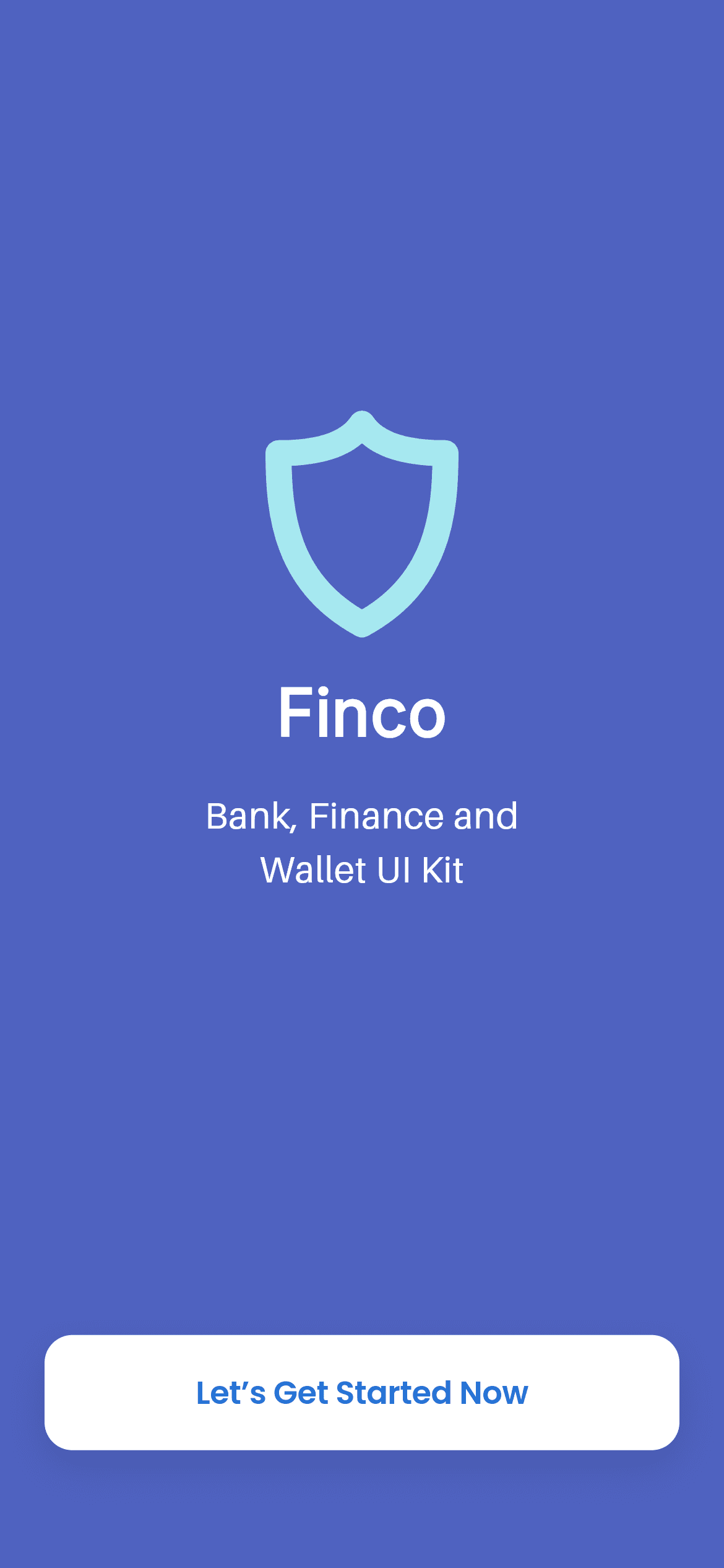
What you'll build
- ✓A full-bleed indigo splash canvas with a centered, custom-drawn shield logo (no image asset)
- ✓A responsive layout that centers on tall phones and scrolls instead of overflowing on short ones
- ✓A press-animated white 'Get Started' pill button that scales on touch
- ✓Clean design tokens for colors, plus three bundled fonts (Inter, Aileron, Poppins)
Step-by-step build
Create the file
Add a new file at lib/wallet_splash/wallet_splash_screen.dart in your Flutter project.
Register the bundled fonts
No external packages — this is pure Flutter. It does bundle its design fonts (Inter, Aileron, Poppins), so drop the font files into fonts/ and declare them in pubspec.yaml:
flutter:
  fonts:
    - family: Inter
      fonts:
        - asset: fonts/Inter-Regular.ttf
    - family: Aileron
      fonts:
        - asset: fonts/Aileron-Regular.ttf
    - family: Poppins
      fonts:
- asset: fonts/Poppins-Regular.ttfBuild it, piece by piece
Here's how the screen goes together. Each block below is a real slice of the code with a plain-English explanation — paste them in order, or grab the whole file from the next section.
Imports, the screen class, and design tokens
import 'package:flutter/material.dart';

import 'widgets/shield_logo.dart';

/// "Finco" splash / get-started screen from the Wallet App UI Kit: a full indigo
/// canvas with the centred shield brand mark, the wordmark, a two-line tagline,
/// and a white pill CTA pinned near the bottom.
///
/// Self-contained, pure Flutter. Bundles its exact design fonts (Inter,
/// Aileron, Poppins) and recreates the logo as a vector. Fully responsive — flex
/// spacers centre the brand mark on tall devices and a scroll fallback prevents
/// overflow on short ones. Renders standalone when pushed as a route.
class WalletSplashScreen extends StatelessWidget {
  const WalletSplashScreen({super.key});

  // Design tokens (from the kit's colors.xml + layout).
  static const Color _bg = Color(0xFF4F62C0);
  static const Color _ctaText = Color(0xFF2573D5);
The file imports Flutter's material library and the local ShieldLogo widget, then declares WalletSplashScreen as a StatelessWidget — the whole screen never changes state, so stateless is the right choice. Two private const Colors act as design tokens: _bg (#4F62C0) is the indigo canvas and _ctaText (#2573D5) is the blue used for the button label. Pulling the colors out as named constants keeps the palette in one place and makes the screen easy to retheme later.
A responsive, scroll-safe scaffold
  @override
  Widget build(BuildContext context) {
    return Scaffold(
      backgroundColor: _bg,
      body: SafeArea(
        child: LayoutBuilder(
          builder: (BuildContext context, BoxConstraints constraints) {
            return SingleChildScrollView(
              physics: const ClampingScrollPhysics(),
              child: ConstrainedBox(
                constraints: BoxConstraints(minHeight: constraints.maxHeight),
                child: IntrinsicHeight(
                  child: Padding(
                    padding: const EdgeInsets.symmetric(
                      horizontal: 24,
                      vertical: 24,
                    ),
build() returns a Scaffold painted with the indigo _bg, and SafeArea keeps everything clear of the notch and home indicator. The responsiveness lives in the next three widgets: LayoutBuilder hands you the available height, then SingleChildScrollView + ConstrainedBox(minHeight: maxHeight) + IntrinsicHeight together mean the content fills the screen on tall phones but becomes scrollable — instead of overflowing — on short ones. ClampingScrollPhysics stops it bouncing when it already fits, and a symmetric 24px padding insets the content from the edges.
Stacking the brand mark, wordmark, and CTA
                    child: Column(
                      crossAxisAlignment: CrossAxisAlignment.center,
                      children: <Widget>[
                        const Spacer(flex: 5),
                        const ShieldLogo(),
                        const SizedBox(height: 19),
                        const Text(
                          'Finco',
                          textAlign: TextAlign.center,
                          style: TextStyle(
                            fontFamily: 'Inter',
                            fontSize: 35,
                            fontWeight: FontWeight.w700,
                            color: Colors.white,
                            height: 1.2,
                          ),
                        ),
                        const SizedBox(height: 20),
                        const Text(
                          'Bank, Finance and\nWallet UI Kit',
                          textAlign: TextAlign.center,
                          style: TextStyle(
                            fontFamily: 'Aileron',
                            fontSize: 20,
                            fontWeight: FontWeight.w400,
                            color: Colors.white,
                            height: 1.45,
                          ),
                        ),
                        const Spacer(flex: 6),
                        _GetStartedButton(
                          onTap: () => Navigator.maybePop(context),
                        ),
                        const Spacer(flex: 1),
                      ],
                    ),
Everything sits in a centered Column, and the vertical placement is done with Spacer widgets carrying different flex weights: Spacer(flex: 5) above and Spacer(flex: 6) below the brand group park it just above the middle, while Spacer(flex: 1) leaves a small gap beneath the button. Between the spacers are the vector ShieldLogo, the 'Finco' wordmark in 35px bold Inter, and the two-line tagline in 20px Aileron — the \n inside the string forces the line break. Fixed text sizes plus proportional spacers keep the composition balanced across screen sizes.
A tactile 'Get Started' button
/// White rounded CTA — "Let's Get Started Now" — with a press feedback.
class _GetStartedButton extends StatefulWidget {
  const _GetStartedButton({required this.onTap});

  final VoidCallback onTap;

  @override
  State<_GetStartedButton> createState() => _GetStartedButtonState();
}

class _GetStartedButtonState extends State<_GetStartedButton> {
  bool _pressed = false;

  @override
  Widget build(BuildContext context) {
    return GestureDetector(
      onTapDown: (_) => setState(() => _pressed = true),
      onTapUp: (_) => setState(() => _pressed = false),
      onTapCancel: () => setState(() => _pressed = false),
      onTap: widget.onTap,
      child: AnimatedScale(
        scale: _pressed ? 0.97 : 1,
        duration: const Duration(milliseconds: 150),
        child: Container(
          width: double.infinity,
          padding: const EdgeInsets.symmetric(vertical: 19),
          decoration: BoxDecoration(
            color: Colors.white,
            borderRadius: BorderRadius.circular(15),
            boxShadow: <BoxShadow>[
              BoxShadow(
                color: Colors.black.withValues(alpha: 0.10),
                blurRadius: 18,
                offset: const Offset(0, 8),
              ),
            ],
          ),
          child: const Text(
            'Let’s Get Started Now',
            textAlign: TextAlign.center,
            style: TextStyle(
              fontFamily: 'Poppins',
              fontSize: 17,
              fontWeight: FontWeight.w600,
              color: WalletSplashScreen._ctaText,
              letterSpacing: -0.17,
            ),
          ),
        ),
      ),
    );
  }
}
The CTA is its own StatefulWidget so it can respond to touch. A single _pressed boolean is flipped in onTapDown, onTapUp, and onTapCancel, and AnimatedScale reads it to shrink the button to 0.97 for 150ms while it's held down — that tiny scale is what makes it feel physically pressable. The button is a white Container with a 15px corner radius and a soft downward shadow, and its label is 17px semibold Poppins in the blue _ctaText token. The real tap fires the onTap passed in by the parent (here Navigator.maybePop, which dismisses the splash).
Full code
The complete, ready-to-paste source (2 files). Free to use in your projects — one click copies it all.
import 'package:flutter/material.dart';

import 'widgets/shield_logo.dart';

/// "Finco" splash / get-started screen from the Wallet App UI Kit: a full indigo
/// canvas with the centred shield brand mark, the wordmark, a two-line tagline,
/// and a white pill CTA pinned near the bottom.
///
/// Self-contained, pure Flutter. Bundles its exact design fonts (Inter,
/// Aileron, Poppins) and recreates the logo as a vector. Fully responsive — flex
/// spacers centre the brand mark on tall devices and a scroll fallback prevents
/// overflow on short ones. Renders standalone when pushed as a route.
class WalletSplashScreen extends StatelessWidget {
  const WalletSplashScreen({super.key});

  // Design tokens (from the kit's colors.xml + layout).
  static const Color _bg = Color(0xFF4F62C0);
  static const Color _ctaText = Color(0xFF2573D5);

  @override
  Widget build(BuildContext context) {
    return Scaffold(
      backgroundColor: _bg,
      body: SafeArea(
        child: LayoutBuilder(
          builder: (BuildContext context, BoxConstraints constraints) {
            return SingleChildScrollView(
              physics: const ClampingScrollPhysics(),
              child: ConstrainedBox(
                constraints: BoxConstraints(minHeight: constraints.maxHeight),
                child: IntrinsicHeight(
                  child: Padding(
                    padding: const EdgeInsets.symmetric(
                      horizontal: 24,
                      vertical: 24,
                    ),
                    child: Column(
                      crossAxisAlignment: CrossAxisAlignment.center,
                      children: <Widget>[
                        const Spacer(flex: 5),
                        const ShieldLogo(),
                        const SizedBox(height: 19),
                        const Text(
                          'Finco',
                          textAlign: TextAlign.center,
                          style: TextStyle(
                            fontFamily: 'Inter',
                            fontSize: 35,
                            fontWeight: FontWeight.w700,
                            color: Colors.white,
                            height: 1.2,
                          ),
                        ),
                        const SizedBox(height: 20),
                        const Text(
                          'Bank, Finance and\nWallet UI Kit',
                          textAlign: TextAlign.center,
                          style: TextStyle(
                            fontFamily: 'Aileron',
                            fontSize: 20,
                            fontWeight: FontWeight.w400,
                            color: Colors.white,
                            height: 1.45,
                          ),
                        ),
                        const Spacer(flex: 6),
                        _GetStartedButton(
                          onTap: () => Navigator.maybePop(context),
                        ),
                        const Spacer(flex: 1),
                      ],
                    ),
                  ),
                ),
              ),
            );
          },
        ),
      ),
    );
  }
}

/// White rounded CTA — "Let's Get Started Now" — with a press feedback.
class _GetStartedButton extends StatefulWidget {
  const _GetStartedButton({required this.onTap});

  final VoidCallback onTap;

  @override
  State<_GetStartedButton> createState() => _GetStartedButtonState();
}

class _GetStartedButtonState extends State<_GetStartedButton> {
  bool _pressed = false;

  @override
  Widget build(BuildContext context) {
    return GestureDetector(
      onTapDown: (_) => setState(() => _pressed = true),
      onTapUp: (_) => setState(() => _pressed = false),
      onTapCancel: () => setState(() => _pressed = false),
      onTap: widget.onTap,
      child: AnimatedScale(
        scale: _pressed ? 0.97 : 1,
        duration: const Duration(milliseconds: 150),
        child: Container(
          width: double.infinity,
          padding: const EdgeInsets.symmetric(vertical: 19),
          decoration: BoxDecoration(
            color: Colors.white,
            borderRadius: BorderRadius.circular(15),
            boxShadow: <BoxShadow>[
              BoxShadow(
                color: Colors.black.withValues(alpha: 0.10),
                blurRadius: 18,
                offset: const Offset(0, 8),
              ),
            ],
          ),
          child: const Text(
            'Let’s Get Started Now',
            textAlign: TextAlign.center,
            style: TextStyle(
              fontFamily: 'Poppins',
              fontSize: 17,
              fontWeight: FontWeight.w600,
              color: WalletSplashScreen._ctaText,
              letterSpacing: -0.17,
            ),
          ),
        ),
      ),
    );
  }
}
Plus bundled 3 binary assets (fonts/images). The CLI and MCP install those for you automatically.
Two faster ways to add it
Copy-paste works, but you can skip it entirely.
1. FlutterKit CLI
One command drops this screen — and its fonts — straight into your project.
$ flutterkit add wallet-splash2. AI agent (MCP)
Connect FlutterKit's MCP server in Claude or Cursor and just ask your agent to install wallet-splash — it fetches and writes the files for you.
FAQ
Is this Flutter splash screen free to use?
Yes. The full Dart source on this page is free to copy and use in your own projects, personal or commercial. You can paste it directly, install it with the FlutterKit CLI (flutterkit add wallet-splash), or have an AI agent add it for you via MCP.
Does it need any external packages?
No — it's pure Flutter, built entirely on the material library. The only extra assets are the three bundled fonts (Inter, Aileron, Poppins), which you register in pubspec.yaml as shown in step 2. The CLI and MCP install those font files automatically.
Which Flutter version does it target?
It uses modern Flutter APIs like Color.withValues() and super parameters, so it targets Flutter 3.22+ (Dart 3). On an older SDK, swap withValues(alpha: 0.10) for withOpacity(0.10) and it will compile.

