How to Build an Email or Phone Sign Up Screen in Flutter (Full Code + Preview)
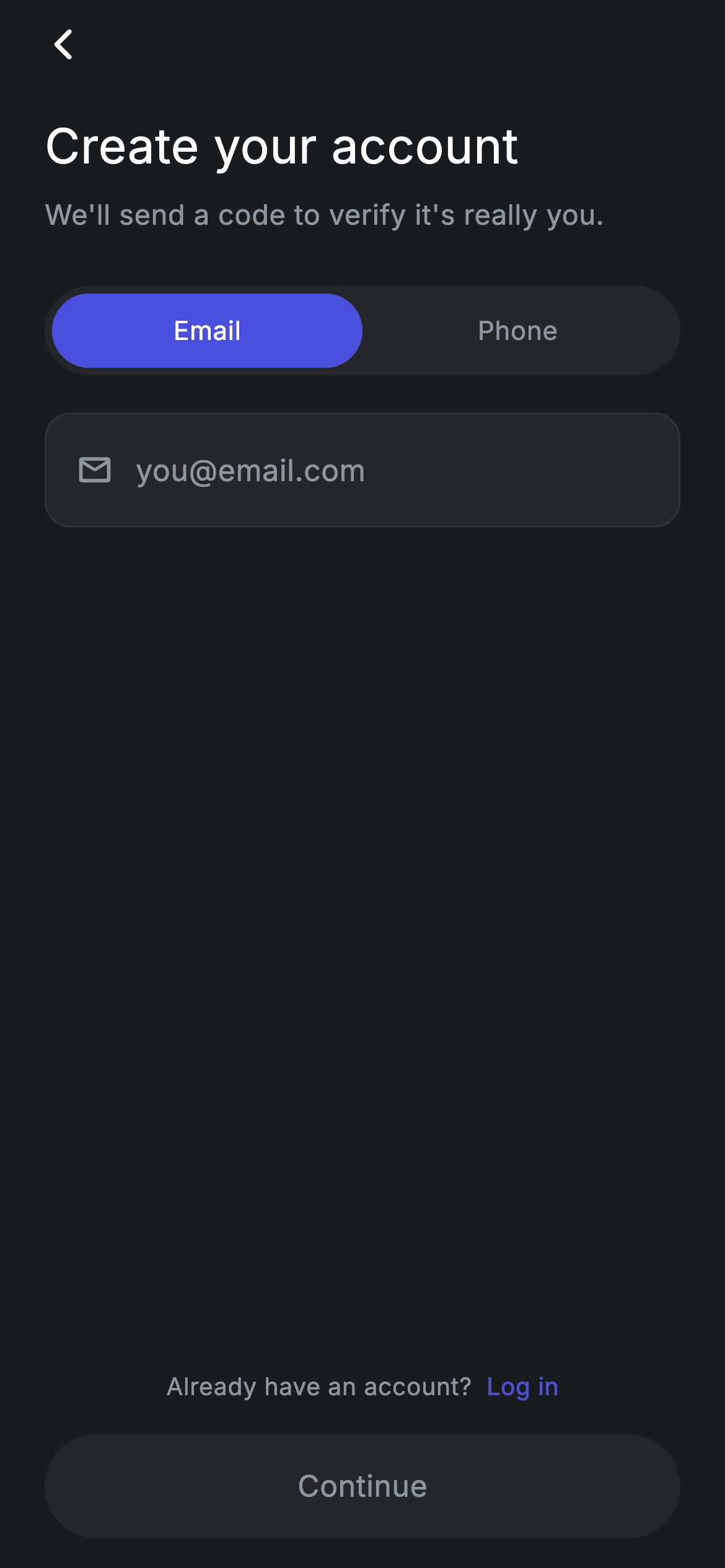
Modern fintech signup asks for one thing, not a form — but it lets you choose what that thing is. This tutorial builds a dark sign-up screen with a pill segmented control that swaps a single input between email mode (mail icon, you@email.com hint) and phone mode (a 🇬🇧 +44 prefix behind a divider), and a Continue button that stays greyed out until the entry passes a length check that itself depends on which mode you're in. You'll wire a controller listener, a validation getter, and a genuinely disabled button.
Watch the Flutter UI walkthrough
A short screen recording of Fintech · Sign Up running, if you'd rather see it before you read the code. The written tutorial below covers everything in it.
Can't see the video? Watch it on YouTube.
What you'll build
- ✓A pill segmented control built from two Expanded taps and one boolean
- ✓One input field that changes its icon, prefix, keyboard and hint based on that boolean
- ✓Live validation via a controller listener, with a mode-dependent minimum length
- ✓A Continue button that changes colour AND becomes non-interactive when invalid
- ✓An inline two-colour link built with Text.rich, wrapped in one tappable area
Step-by-step build
Create the file
Add a new file at lib/fintech_signup/fintech_signup_screen.dart in your Flutter project.
Register the bundled fonts
No external packages — this is pure Flutter. It does bundle its design font (Inter), so drop the font file into fonts/ and declare it in pubspec.yaml:
flutter:
  fonts:
    - family: Inter
      fonts:
- asset: fonts/Inter-Regular.ttfBuild it, piece by piece
Here's how the screen goes together. Each block below is a real slice of the code with a plain-English explanation — paste them in order, or grab the whole file from the next section.
State, the listener, and mode-aware validation
import 'package:flutter/material.dart';

/// Sign Up — create an account with email or phone. Self-contained per
/// CONVENTIONS.md: pure Flutter, bundled Inter font, forced dark theme. Stateful:
/// a segmented Email/Phone toggle and live input enable the Continue CTA.
class FintechSignupScreen extends StatefulWidget {
  const FintechSignupScreen({super.key, this.onContinue, this.onBack, this.onLogin});

  final VoidCallback? onContinue;
  final VoidCallback? onBack;
  final VoidCallback? onLogin;

  @override
  State<FintechSignupScreen> createState() => _FintechSignupScreenState();
}

class _FintechSignupScreenState extends State<FintechSignupScreen> {
  static const String _font = 'Inter';
  static const Color _bg = Color(0xFF191C1F);
  static const Color _surface = Color(0xFF242729);
  static const Color _brand = Color(0xFF494FDF);
  static const Color _muted = Color(0xFF8D969E);
  static const Color _hairline = Color(0xFF2E3235);

  final TextEditingController _controller = TextEditingController();
  bool _phone = false;

  @override
  void initState() {
    super.initState();
    _controller.addListener(() => setState(() {}));
  }

  @override
  void dispose() {
    _controller.dispose();
    super.dispose();
  }

  bool get _valid => _controller.text.trim().length >= (_phone ? 6 : 5);
Three optional callbacks — onContinue, onBack, onLogin — keep the screen navigation-agnostic. The state is one TextEditingController and one _phone boolean. initState attaches a listener that calls setState on every keystroke, which is what makes the Continue button react live; dispose() disposes the controller, and skipping that is a real leak. _valid is a getter rather than a stored field, so it can never go stale: it trims the text and compares against 6 characters in phone mode or 5 in email mode. A mode-dependent threshold from one expression is neater than two separate validators.
Header and the screen skeleton
  @override
  Widget build(BuildContext context) {
    return Theme(
      data: ThemeData.dark(useMaterial3: true),
      child: Scaffold(
        backgroundColor: _bg,
        body: SafeArea(
          child: Padding(
            padding: const EdgeInsets.fromLTRB(24, 4, 24, 16),
            child: Column(
              crossAxisAlignment: CrossAxisAlignment.stretch,
              children: <Widget>[
                Align(
                  alignment: Alignment.centerLeft,
                  child: _BackButton(onTap: widget.onBack),
                ),
                const SizedBox(height: 16),
                const Text(
                  'Create your account',
                  style: TextStyle(
                    fontFamily: _font,
                    fontSize: 26,
                    fontWeight: FontWeight.w500,
                    letterSpacing: 0.24,
                    color: Colors.white,
                  ),
                ),
                const SizedBox(height: 8),
                const Text(
                  'We\'ll send a code to verify it\'s really you.',
                  style: TextStyle(
                    fontFamily: _font,
                    fontSize: 15,
                    fontWeight: FontWeight.w400,
                    letterSpacing: 0.24,
                    color: _muted,
                  ),
                ),
                const SizedBox(height: 28),
                _segmented(),
                const SizedBox(height: 20),
                _inputField(),
                const Spacer(),
Theme(data: ThemeData.dark(useMaterial3: true)) forces dark styling regardless of the host app. The back button is left-aligned inside a stretched Column, then a 26px w500 heading and a 15px muted subtitle explaining that a code is coming. Note the escaped apostrophes in 'We\'ll' and 'it\'s' — the string is single-quoted, so each apostrophe needs a backslash. The segmented control and input follow, then Spacer() pushes everything after it to the bottom of the screen.
The inline log-in link and CTA
                Center(
                  child: GestureDetector(
                    onTap: widget.onLogin,
                    behavior: HitTestBehavior.opaque,
                    child: const Padding(
                      padding: EdgeInsets.all(8),
                      child: Text.rich(
                        TextSpan(
                          text: 'Already have an account?  ',
                          style: TextStyle(
                            fontFamily: _font,
                            fontSize: 13,
                            color: _muted,
                            letterSpacing: 0.24,
                          ),
                          children: <InlineSpan>[
                            TextSpan(
                              text: 'Log in',
                              style: TextStyle(
                                color: _brand,
                                fontWeight: FontWeight.w500,
                              ),
                            ),
                          ],
                        ),
                      ),
                    ),
                  ),
                ),
                const SizedBox(height: 8),
                _continueButton(),
              ],
            ),
          ),
        ),
      ),
    );
  }
The 'Already have an account? Log in' line is a Text.rich: one TextSpan carries the muted question, and a child span renders 'Log in' in the brand indigo at w500. The whole thing sits inside a single GestureDetector with HitTestBehavior.opaque and 8px padding, so the entire line is tappable — simpler than attaching a TapGestureRecognizer to just the link span, and a bigger target. That's the right trade-off when the sentence has only one destination. The Continue button closes the column 8px below.
The segmented control
  Widget _segmented() {
    return Container(
      padding: const EdgeInsets.all(4),
      decoration: BoxDecoration(
        color: _surface,
        borderRadius: BorderRadius.circular(9999),
      ),
      child: Row(
        children: <Widget>[
          _segment('Email', !_phone, () => setState(() => _phone = false)),
          _segment('Phone', _phone, () => setState(() => _phone = true)),
        ],
      ),
    );
  }

  Widget _segment(String label, bool active, VoidCallback onTap) {
    return Expanded(
      child: GestureDetector(
        onTap: onTap,
        behavior: HitTestBehavior.opaque,
        child: Container(
          height: 40,
          alignment: Alignment.center,
          decoration: BoxDecoration(
            color: active ? _brand : Colors.transparent,
            borderRadius: BorderRadius.circular(9999),
          ),
          child: Text(
            label,
            style: TextStyle(
              fontFamily: _font,
              fontSize: 14,
              fontWeight: FontWeight.w500,
              letterSpacing: 0.24,
              color: active ? Colors.white : _muted,
            ),
          ),
        ),
      ),
    );
  }
The track is a Container in the surface colour with 4px of padding and a 9999 radius, and the two segments are Expanded children so they split the width exactly in half regardless of label length. Each _segment is a 40px Container whose fill is the brand indigo when active and Colors.transparent when not — transparent rather than the surface colour, so the track shows through and there's only one background to reason about. The label colour flips white/muted in the same frame. Both segments use HitTestBehavior.opaque so the full pill area is tappable, not just the glyphs.
One field, two modes
  Widget _inputField() {
    return Container(
      decoration: BoxDecoration(
        color: _surface,
        borderRadius: BorderRadius.circular(14),
        border: Border.all(color: _hairline),
      ),
      padding: const EdgeInsets.symmetric(horizontal: 16),
      child: Row(
        children: <Widget>[
          if (_phone) ...<Widget>[
            const Text(
              '🇬🇧  +44',
              style: TextStyle(
                fontFamily: _font,
                fontSize: 16,
                color: Colors.white,
                letterSpacing: 0.24,
              ),
            ),
            Container(
              width: 1,
              height: 24,
              margin: const EdgeInsets.symmetric(horizontal: 12),
              color: _hairline,
            ),
          ] else
            const Padding(
              padding: EdgeInsets.only(right: 12),
              child: Icon(Icons.mail_outline_rounded, size: 20, color: _muted),
            ),
          Expanded(
            child: TextField(
              controller: _controller,
              keyboardType:
                  _phone ? TextInputType.phone : TextInputType.emailAddress,
              cursorColor: _brand,
              style: const TextStyle(
                fontFamily: _font,
                fontSize: 16,
                color: Colors.white,
                letterSpacing: 0.24,
              ),
              decoration: InputDecoration(
                isCollapsed: true,
                contentPadding: const EdgeInsets.symmetric(vertical: 18),
                border: InputBorder.none,
                hintText: _phone ? '7700 900123' : 'you@email.com',
                hintStyle: const TextStyle(
                  fontFamily: _font,
                  fontSize: 16,
                  color: _muted,
                  letterSpacing: 0.24,
                ),
              ),
            ),
          ),
        ],
      ),
    );
  }
This is the heart of the screen. A conditional spread — if (_phone) ...<Widget>[flag text, 1px divider] else Padding(icon) — swaps the leading affordance: phone mode shows '🇬🇧 +44' followed by a hairline Container acting as a vertical rule, while email mode shows a muted mail icon. The TextField below reads _phone three more times, for keyboardType (phone pad vs email keyboard with the @ key), and for the hint text. isCollapsed: true with an explicit 18px vertical contentPadding strips Flutter's default field metrics so the Container's own padding is the only thing setting the height.
A genuinely disabled button
  Widget _continueButton() {
    return SizedBox(
      height: 56,
      child: Material(
        color: _valid ? _brand : _surface,
        borderRadius: BorderRadius.circular(9999),
        child: InkWell(
          borderRadius: BorderRadius.circular(9999),
          onTap: _valid ? widget.onContinue : null,
          child: Center(
            child: Text(
              'Continue',
              style: TextStyle(
                fontFamily: _font,
                fontSize: 16,
                fontWeight: FontWeight.w500,
                letterSpacing: 0.24,
                color: _valid ? Colors.white : _muted,
              ),
            ),
          ),
        ),
      ),
    );
  }
}

class _BackButton extends StatelessWidget {
  const _BackButton({required this.onTap});

  final VoidCallback? onTap;

  @override
  Widget build(BuildContext context) {
    return GestureDetector(
      onTap: onTap ?? () => Navigator.of(context).maybePop(),
      behavior: HitTestBehavior.opaque,
      child: Container(
        width: 40,
        height: 40,
        alignment: Alignment.centerLeft,
        child: const Icon(Icons.arrow_back_ios_new_rounded,
            size: 20, color: Colors.white),
      ),
    );
  }
}
The Continue button reads _valid three times and changes both appearance and behaviour: Material's colour goes brand-indigo or surface-grey, the label goes white or muted, and — most importantly — onTap is _valid ? widget.onContinue : null. Passing null to InkWell's onTap is what actually disables it: no ripple, no tap. A button that only looks disabled but still fires is one of the most common bugs in hand-rolled Flutter forms. The _BackButton below uses onTap ?? () => Navigator.of(context).maybePop(), so it falls back to popping the route when no callback is supplied — maybePop rather than pop, so it's safe when this is the first route.
Full code
The complete, ready-to-paste source. Free to use in your projects — one click copies it all.
import 'package:flutter/material.dart';

/// Sign Up — create an account with email or phone. Self-contained per
/// CONVENTIONS.md: pure Flutter, bundled Inter font, forced dark theme. Stateful:
/// a segmented Email/Phone toggle and live input enable the Continue CTA.
class FintechSignupScreen extends StatefulWidget {
  const FintechSignupScreen({super.key, this.onContinue, this.onBack, this.onLogin});

  final VoidCallback? onContinue;
  final VoidCallback? onBack;
  final VoidCallback? onLogin;

  @override
  State<FintechSignupScreen> createState() => _FintechSignupScreenState();
}

class _FintechSignupScreenState extends State<FintechSignupScreen> {
  static const String _font = 'Inter';
  static const Color _bg = Color(0xFF191C1F);
  static const Color _surface = Color(0xFF242729);
  static const Color _brand = Color(0xFF494FDF);
  static const Color _muted = Color(0xFF8D969E);
  static const Color _hairline = Color(0xFF2E3235);

  final TextEditingController _controller = TextEditingController();
  bool _phone = false;

  @override
  void initState() {
    super.initState();
    _controller.addListener(() => setState(() {}));
  }

  @override
  void dispose() {
    _controller.dispose();
    super.dispose();
  }

  bool get _valid => _controller.text.trim().length >= (_phone ? 6 : 5);

  @override
  Widget build(BuildContext context) {
    return Theme(
      data: ThemeData.dark(useMaterial3: true),
      child: Scaffold(
        backgroundColor: _bg,
        body: SafeArea(
          child: Padding(
            padding: const EdgeInsets.fromLTRB(24, 4, 24, 16),
            child: Column(
              crossAxisAlignment: CrossAxisAlignment.stretch,
              children: <Widget>[
                Align(
                  alignment: Alignment.centerLeft,
                  child: _BackButton(onTap: widget.onBack),
                ),
                const SizedBox(height: 16),
                const Text(
                  'Create your account',
                  style: TextStyle(
                    fontFamily: _font,
                    fontSize: 26,
                    fontWeight: FontWeight.w500,
                    letterSpacing: 0.24,
                    color: Colors.white,
                  ),
                ),
                const SizedBox(height: 8),
                const Text(
                  'We\'ll send a code to verify it\'s really you.',
                  style: TextStyle(
                    fontFamily: _font,
                    fontSize: 15,
                    fontWeight: FontWeight.w400,
                    letterSpacing: 0.24,
                    color: _muted,
                  ),
                ),
                const SizedBox(height: 28),
                _segmented(),
                const SizedBox(height: 20),
                _inputField(),
                const Spacer(),
                Center(
                  child: GestureDetector(
                    onTap: widget.onLogin,
                    behavior: HitTestBehavior.opaque,
                    child: const Padding(
                      padding: EdgeInsets.all(8),
                      child: Text.rich(
                        TextSpan(
                          text: 'Already have an account?  ',
                          style: TextStyle(
                            fontFamily: _font,
                            fontSize: 13,
                            color: _muted,
                            letterSpacing: 0.24,
                          ),
                          children: <InlineSpan>[
                            TextSpan(
                              text: 'Log in',
                              style: TextStyle(
                                color: _brand,
                                fontWeight: FontWeight.w500,
                              ),
                            ),
                          ],
                        ),
                      ),
                    ),
                  ),
                ),
                const SizedBox(height: 8),
                _continueButton(),
              ],
            ),
          ),
        ),
      ),
    );
  }

  Widget _segmented() {
    return Container(
      padding: const EdgeInsets.all(4),
      decoration: BoxDecoration(
        color: _surface,
        borderRadius: BorderRadius.circular(9999),
      ),
      child: Row(
        children: <Widget>[
          _segment('Email', !_phone, () => setState(() => _phone = false)),
          _segment('Phone', _phone, () => setState(() => _phone = true)),
        ],
      ),
    );
  }

  Widget _segment(String label, bool active, VoidCallback onTap) {
    return Expanded(
      child: GestureDetector(
        onTap: onTap,
        behavior: HitTestBehavior.opaque,
        child: Container(
          height: 40,
          alignment: Alignment.center,
          decoration: BoxDecoration(
            color: active ? _brand : Colors.transparent,
            borderRadius: BorderRadius.circular(9999),
          ),
          child: Text(
            label,
            style: TextStyle(
              fontFamily: _font,
              fontSize: 14,
              fontWeight: FontWeight.w500,
              letterSpacing: 0.24,
              color: active ? Colors.white : _muted,
            ),
          ),
        ),
      ),
    );
  }

  Widget _inputField() {
    return Container(
      decoration: BoxDecoration(
        color: _surface,
        borderRadius: BorderRadius.circular(14),
        border: Border.all(color: _hairline),
      ),
      padding: const EdgeInsets.symmetric(horizontal: 16),
      child: Row(
        children: <Widget>[
          if (_phone) ...<Widget>[
            const Text(
              '🇬🇧  +44',
              style: TextStyle(
                fontFamily: _font,
                fontSize: 16,
                color: Colors.white,
                letterSpacing: 0.24,
              ),
            ),
            Container(
              width: 1,
              height: 24,
              margin: const EdgeInsets.symmetric(horizontal: 12),
              color: _hairline,
            ),
          ] else
            const Padding(
              padding: EdgeInsets.only(right: 12),
              child: Icon(Icons.mail_outline_rounded, size: 20, color: _muted),
            ),
          Expanded(
            child: TextField(
              controller: _controller,
              keyboardType:
                  _phone ? TextInputType.phone : TextInputType.emailAddress,
              cursorColor: _brand,
              style: const TextStyle(
                fontFamily: _font,
                fontSize: 16,
                color: Colors.white,
                letterSpacing: 0.24,
              ),
              decoration: InputDecoration(
                isCollapsed: true,
                contentPadding: const EdgeInsets.symmetric(vertical: 18),
                border: InputBorder.none,
                hintText: _phone ? '7700 900123' : 'you@email.com',
                hintStyle: const TextStyle(
                  fontFamily: _font,
                  fontSize: 16,
                  color: _muted,
                  letterSpacing: 0.24,
                ),
              ),
            ),
          ),
        ],
      ),
    );
  }

  Widget _continueButton() {
    return SizedBox(
      height: 56,
      child: Material(
        color: _valid ? _brand : _surface,
        borderRadius: BorderRadius.circular(9999),
        child: InkWell(
          borderRadius: BorderRadius.circular(9999),
          onTap: _valid ? widget.onContinue : null,
          child: Center(
            child: Text(
              'Continue',
              style: TextStyle(
                fontFamily: _font,
                fontSize: 16,
                fontWeight: FontWeight.w500,
                letterSpacing: 0.24,
                color: _valid ? Colors.white : _muted,
              ),
            ),
          ),
        ),
      ),
    );
  }
}

class _BackButton extends StatelessWidget {
  const _BackButton({required this.onTap});

  final VoidCallback? onTap;

  @override
  Widget build(BuildContext context) {
    return GestureDetector(
      onTap: onTap ?? () => Navigator.of(context).maybePop(),
      behavior: HitTestBehavior.opaque,
      child: Container(
        width: 40,
        height: 40,
        alignment: Alignment.centerLeft,
        child: const Icon(Icons.arrow_back_ios_new_rounded,
            size: 20, color: Colors.white),
      ),
    );
  }
}
Plus bundled 1 binary asset (fonts/images). The CLI and MCP install those for you automatically.
Two faster ways to add it
Copy-paste works, but you can skip it entirely.
1. FlutterKit CLI
One command drops this screen — and its fonts — straight into your project.
$ flutterkit add fintech-signup2. AI agent (MCP)
Connect FlutterKit's MCP server in Claude or Cursor and just ask your agent to install fintech-signup — it fetches and writes the files for you.
FAQ
Is this Flutter sign-up screen free to use?
Yes. The complete Dart source on this page is free for personal and commercial projects. Copy it here, install it with the FlutterKit CLI (flutterkit add fintech-signup), or have an AI agent add it via MCP.
How strict is the validation?
Deliberately light — the _valid getter only checks length (5 characters for email, 6 for phone), which is enough to gate the button without fighting the user mid-typing. Tighten it by putting an email regex or a phone-format check inside that one getter; the button already reads it directly.
Can I change the country prefix?
Yes — the '🇬🇧 +44' string is a plain Text in _inputField. Replace it with a tappable country picker, and note the flag is an emoji rather than an image asset, so any country code is a one-string change.
Which Flutter version does it target?
It uses ThemeData.dark(useMaterial3: true), super parameters and conditional spreads, so Flutter 3.16+ with Dart 3. There are no withValues() calls in this screen, so it also compiles on slightly older SDKs unchanged.

