How to Build an Auth Gateway Screen in Flutter (Full Code + Preview)
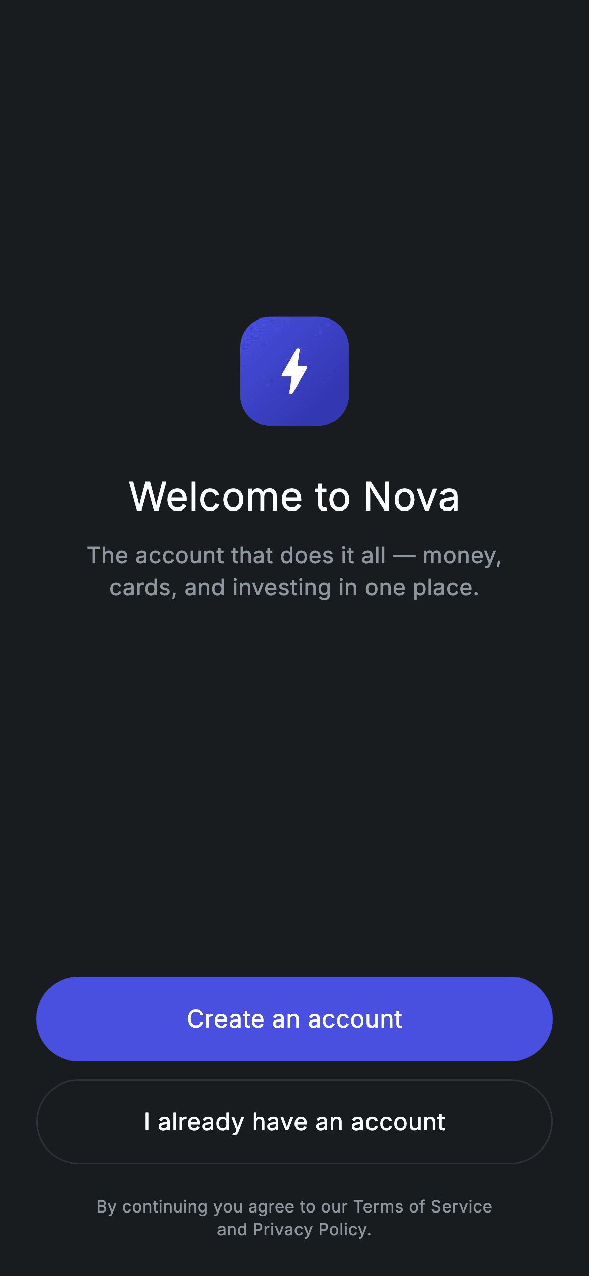
Before a user can sign up or log in, they have to be asked which one — and that question deserves its own screen. This tutorial builds the dark 'Welcome to Nova' gateway: a 72px gradient logo badge with a bolt icon, a centred heading and tagline, then a filled 'Create an account' button above an outlined 'I already have an account', with a Terms and Privacy footnote underneath. One _Button widget renders both the filled and the outlined variant from a single boolean.
Watch the Flutter UI walkthrough
A short screen recording of Fintech · Get Started running, if you'd rather see it before you read the code. The written tutorial below covers everything in it.
Can't see the video? Watch it on YouTube.
What you'll build
- ✓A gradient rounded-square logo badge — a squircle, not a circle, drawn with BoxDecoration
- ✓One button widget covering both filled and outlined styles via a `filled` flag
- ✓Material's `shape:` used to combine a pill radius with a conditional border
- ✓A 3:4 Spacer split that parks the brand group above centre and the buttons at the bottom
- ✓A forced dark theme so the screen renders correctly inside a light-themed app
Step-by-step build
Create the file
Add a new file at lib/fintech_get_started/fintech_get_started_screen.dart in your Flutter project.
Register the bundled fonts
No external packages — this is pure Flutter. It does bundle its design font (Inter), so drop the font file into fonts/ and declare it in pubspec.yaml:
flutter:
  fonts:
    - family: Inter
      fonts:
- asset: fonts/Inter-Regular.ttfBuild it, piece by piece
Here's how the screen goes together. Each block below is a real slice of the code with a plain-English explanation — paste them in order, or grab the whole file from the next section.
Dark tokens and the forced theme
import 'package:flutter/material.dart';

/// Get Started — the auth gateway: create an account or log in. Self-contained
/// per CONVENTIONS.md: pure Flutter, bundled Inter font, forced dark theme so it
/// renders standalone as a route.
class FintechGetStartedScreen extends StatelessWidget {
  const FintechGetStartedScreen({super.key, this.onSignup, this.onLogin});

  final VoidCallback? onSignup;
  final VoidCallback? onLogin;

  static const String _font = 'Inter';
  static const Color _bg = Color(0xFF191C1F);
  static const Color _brand = Color(0xFF494FDF);
  static const Color _brandDeep = Color(0xFF2D31A6);
  static const Color _muted = Color(0xFF8D969E);
  static const Color _hairline = Color(0xFF2E3235);

  @override
  Widget build(BuildContext context) {
    return Theme(
      data: ThemeData.dark(useMaterial3: true),
      child: Scaffold(
        backgroundColor: _bg,
        body: SafeArea(
          child: Padding(
            padding: const EdgeInsets.fromLTRB(24, 24, 24, 24),
            child: Column(
              crossAxisAlignment: CrossAxisAlignment.stretch,
              children: <Widget>[
                const Spacer(flex: 3),
Five colour consts: the #191C1F canvas, the #494FDF brand indigo with its darker #2D31A6 partner for the gradient, a muted grey for secondary text, and a #2E3235 hairline for the outlined button's border. Theme(data: ThemeData.dark(useMaterial3: true)) forces dark Material styling regardless of the host app's theme, which is what lets this render correctly when pushed as a route into any app. The layout opens with Spacer(flex: 3) — proportional headroom rather than a fixed SizedBox, so it grows on a tall device.
The gradient logo badge
                Center(
                  child: Container(
                    width: 72,
                    height: 72,
                    decoration: BoxDecoration(
                      borderRadius: BorderRadius.circular(20),
                      gradient: const LinearGradient(
                        begin: Alignment.topLeft,
                        end: Alignment.bottomRight,
                        colors: <Color>[_brand, _brandDeep],
                      ),
                    ),
                    child: const Icon(Icons.bolt_rounded,
                        size: 40, color: Colors.white),
                  ),
                ),
                const SizedBox(height: 28),
The mark is a 72×72 Container with borderRadius: BorderRadius.circular(20) rather than BoxShape.circle — a rounded square, which is what app icons look like, so the badge reads as 'this is the app' rather than 'this is an avatar'. Its LinearGradient runs topLeft to bottomRight through _brand into _brandDeep; that diagonal is what gives a flat shape a sense of light falling across it. Inside sits a 40px Icons.bolt_rounded in white. Because the parent Column uses CrossAxisAlignment.stretch, the badge has to be wrapped in a Center or it would be stretched to full width.
Heading, tagline and the Spacer split
                const Text(
                  'Welcome to Nova',
                  textAlign: TextAlign.center,
                  style: TextStyle(
                    fontFamily: _font,
                    fontSize: 26,
                    fontWeight: FontWeight.w500,
                    letterSpacing: 0.24,
                    color: Colors.white,
                  ),
                ),
                const SizedBox(height: 10),
                const Text(
                  'The account that does it all — money,\ncards, and investing in one place.',
                  textAlign: TextAlign.center,
                  style: TextStyle(
                    fontFamily: _font,
                    fontSize: 15,
                    fontWeight: FontWeight.w400,
                    height: 1.4,
                    letterSpacing: 0.24,
                    color: _muted,
                  ),
                ),
                const Spacer(flex: 4),
'Welcome to Nova' is 26px w500 — medium, not bold, because heavy weights bloom on dark backgrounds and read heavier than they measure. Both texts carry textAlign: TextAlign.center explicitly, needed because the stretched Column makes each Text as wide as the screen. The tagline uses an embedded \n so it breaks after 'money,' instead of wherever the device width lands, at height: 1.4 in the muted grey. Then Spacer(flex: 4) against the opening Spacer(flex: 3) — a 3:4 split that parks the brand group slightly above the vertical centre, which reads better than dead centre.
The two buttons and the footnote
                _Button(
                  label: 'Create an account',
                  filled: true,
                  onTap: onSignup,
                ),
                const SizedBox(height: 12),
                _Button(
                  label: 'I already have an account',
                  filled: false,
                  onTap: onLogin,
                ),
                const SizedBox(height: 20),
                const Text(
                  'By continuing you agree to our Terms of Service\nand Privacy Policy.',
                  textAlign: TextAlign.center,
                  style: TextStyle(
                    fontFamily: _font,
                    fontSize: 11,
                    fontWeight: FontWeight.w400,
                    height: 1.4,
                    letterSpacing: 0.24,
                    color: _muted,
                  ),
                ),
              ],
            ),
          ),
        ),
      ),
    );
  }
}
Both CTAs are the same _Button widget, distinguished only by filled: true or false and which callback they receive. They sit 12px apart — close enough to read as one decision with two answers. The 11px footnote below carries the Terms and Privacy line, again with an explicit \n so it always breaks into two balanced lines. Worth noting: the footnote is plain Text, not a link. If you need the policy names tappable, swap it for a Text.rich with a TapGestureRecognizer on those spans.
One button, two styles
class _Button extends StatelessWidget {
  const _Button({
    required this.label,
    required this.filled,
    required this.onTap,
  });

  final String label;
  final bool filled;
  final VoidCallback? onTap;

  @override
  Widget build(BuildContext context) {
    return SizedBox(
      height: 56,
      child: Material(
        color: filled ? FintechGetStartedScreen._brand : Colors.transparent,
        shape: RoundedRectangleBorder(
          borderRadius: BorderRadius.circular(9999),
          side: filled
              ? BorderSide.none
              : const BorderSide(color: FintechGetStartedScreen._hairline),
        ),
        child: InkWell(
          borderRadius: BorderRadius.circular(9999),
          onTap: onTap,
          child: Center(
            child: Text(
              label,
              style: const TextStyle(
                fontFamily: FintechGetStartedScreen._font,
                fontSize: 16,
                fontWeight: FontWeight.w500,
                letterSpacing: 0.24,
                color: Colors.white,
              ),
            ),
          ),
        ),
      ),
    );
  }
}
The filled flag drives two properties. color becomes either the brand indigo or Colors.transparent, and shape becomes a RoundedRectangleBorder whose side is either BorderSide.none or a hairline border. Using Material's shape: rather than borderRadius: is what makes this possible — shape carries both the corner radius and the border in one object, so a single widget covers both variants without a Container wrapper. The InkWell repeats the 9999 radius to clip its ripple, which is the step people forget; without it a pill button splashes as a rectangle. onTap takes the nullable callback directly, so a null handler yields a genuinely inert button.
Full code
The complete, ready-to-paste source. Free to use in your projects — one click copies it all.
import 'package:flutter/material.dart';

/// Get Started — the auth gateway: create an account or log in. Self-contained
/// per CONVENTIONS.md: pure Flutter, bundled Inter font, forced dark theme so it
/// renders standalone as a route.
class FintechGetStartedScreen extends StatelessWidget {
  const FintechGetStartedScreen({super.key, this.onSignup, this.onLogin});

  final VoidCallback? onSignup;
  final VoidCallback? onLogin;

  static const String _font = 'Inter';
  static const Color _bg = Color(0xFF191C1F);
  static const Color _brand = Color(0xFF494FDF);
  static const Color _brandDeep = Color(0xFF2D31A6);
  static const Color _muted = Color(0xFF8D969E);
  static const Color _hairline = Color(0xFF2E3235);

  @override
  Widget build(BuildContext context) {
    return Theme(
      data: ThemeData.dark(useMaterial3: true),
      child: Scaffold(
        backgroundColor: _bg,
        body: SafeArea(
          child: Padding(
            padding: const EdgeInsets.fromLTRB(24, 24, 24, 24),
            child: Column(
              crossAxisAlignment: CrossAxisAlignment.stretch,
              children: <Widget>[
                const Spacer(flex: 3),
                Center(
                  child: Container(
                    width: 72,
                    height: 72,
                    decoration: BoxDecoration(
                      borderRadius: BorderRadius.circular(20),
                      gradient: const LinearGradient(
                        begin: Alignment.topLeft,
                        end: Alignment.bottomRight,
                        colors: <Color>[_brand, _brandDeep],
                      ),
                    ),
                    child: const Icon(Icons.bolt_rounded,
                        size: 40, color: Colors.white),
                  ),
                ),
                const SizedBox(height: 28),
                const Text(
                  'Welcome to Nova',
                  textAlign: TextAlign.center,
                  style: TextStyle(
                    fontFamily: _font,
                    fontSize: 26,
                    fontWeight: FontWeight.w500,
                    letterSpacing: 0.24,
                    color: Colors.white,
                  ),
                ),
                const SizedBox(height: 10),
                const Text(
                  'The account that does it all — money,\ncards, and investing in one place.',
                  textAlign: TextAlign.center,
                  style: TextStyle(
                    fontFamily: _font,
                    fontSize: 15,
                    fontWeight: FontWeight.w400,
                    height: 1.4,
                    letterSpacing: 0.24,
                    color: _muted,
                  ),
                ),
                const Spacer(flex: 4),
                _Button(
                  label: 'Create an account',
                  filled: true,
                  onTap: onSignup,
                ),
                const SizedBox(height: 12),
                _Button(
                  label: 'I already have an account',
                  filled: false,
                  onTap: onLogin,
                ),
                const SizedBox(height: 20),
                const Text(
                  'By continuing you agree to our Terms of Service\nand Privacy Policy.',
                  textAlign: TextAlign.center,
                  style: TextStyle(
                    fontFamily: _font,
                    fontSize: 11,
                    fontWeight: FontWeight.w400,
                    height: 1.4,
                    letterSpacing: 0.24,
                    color: _muted,
                  ),
                ),
              ],
            ),
          ),
        ),
      ),
    );
  }
}

class _Button extends StatelessWidget {
  const _Button({
    required this.label,
    required this.filled,
    required this.onTap,
  });

  final String label;
  final bool filled;
  final VoidCallback? onTap;

  @override
  Widget build(BuildContext context) {
    return SizedBox(
      height: 56,
      child: Material(
        color: filled ? FintechGetStartedScreen._brand : Colors.transparent,
        shape: RoundedRectangleBorder(
          borderRadius: BorderRadius.circular(9999),
          side: filled
              ? BorderSide.none
              : const BorderSide(color: FintechGetStartedScreen._hairline),
        ),
        child: InkWell(
          borderRadius: BorderRadius.circular(9999),
          onTap: onTap,
          child: Center(
            child: Text(
              label,
              style: const TextStyle(
                fontFamily: FintechGetStartedScreen._font,
                fontSize: 16,
                fontWeight: FontWeight.w500,
                letterSpacing: 0.24,
                color: Colors.white,
              ),
            ),
          ),
        ),
      ),
    );
  }
}
Plus bundled 1 binary asset (fonts/images). The CLI and MCP install those for you automatically.
Two faster ways to add it
Copy-paste works, but you can skip it entirely.
1. FlutterKit CLI
One command drops this screen — and its fonts — straight into your project.
$ flutterkit add fintech-get-started2. AI agent (MCP)
Connect FlutterKit's MCP server in Claude or Cursor and just ask your agent to install fintech-get-started — it fetches and writes the files for you.
FAQ
Is this Flutter welcome screen free to use?
Yes. The full Dart source on this page is free for personal and commercial projects. Copy it here, install it with the FlutterKit CLI (flutterkit add fintech-get-started), or have an AI agent add it via MCP.
How do I wire it into my auth flow?
Pass onSignup and onLogin when you construct the screen — typically Navigator.push to your sign-up and login routes. Because the screen is stateless and holds no navigation logic of its own, it drops into a GoRouter or Navigator 2.0 setup without changes.
Does it need any external packages or images?
Neither. The logo badge is a gradient Container with a Material icon, so there's no image asset. The only bundled asset is the Inter font, registered in pubspec.yaml as shown in step 2.
Which Flutter version does it target?
It uses ThemeData.dark(useMaterial3: true) and super parameters, so Flutter 3.16+ with Dart 3. There are no withValues() calls in this screen, so it also compiles on slightly older SDKs without edits.

