How to Build a 6-Digit OTP Screen with a Custom Numpad in Flutter (Full Code + Preview)
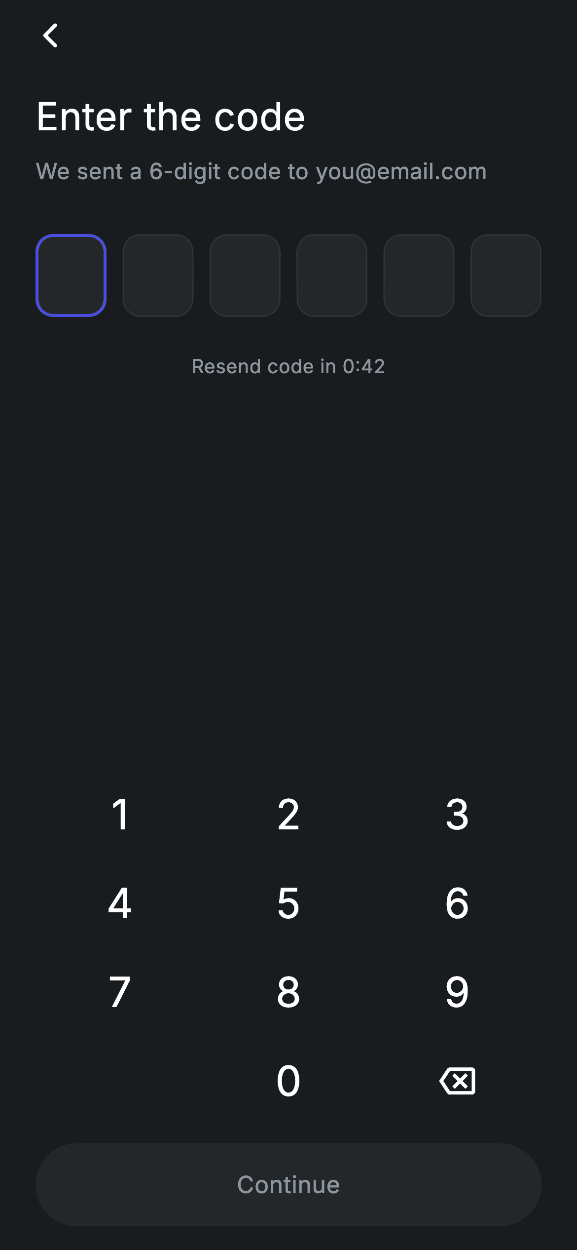
Most Flutter OTP screens fight the system keyboard: focus jumping between six TextFields, backspace behaving oddly, the layout leaping when the keyboard opens. This one sidesteps all of it by shipping its own 3×4 numpad and holding the code as a single String. Six boxes render from that string, the box after the last digit gets a brand-blue 2px border, and the Continue button only becomes tappable when all six are in. You'll build the keypad, the box states and a properly disabled CTA.
Watch the Flutter UI walkthrough
A short screen recording of Fintech · Verify Code running, if you'd rather see it before you read the code. The written tutorial below covers everything in it.
Can't see the video? Watch it on YouTube.
What you'll build
- ✓A code held as one String — no controllers, no focus nodes, no keyboard juggling
- ✓A 3×4 numpad built from a GridView.count with a blank slot for the bottom-left key
- ✓Six boxes whose border and width change when they're the next one to fill
- ✓A Continue button that is both visually and functionally disabled until the code is complete
- ✓A forced dark theme so the screen renders correctly inside a light-themed app
Step-by-step build
Create the file
Add a new file at lib/fintech_otp_verify/fintech_otp_verify_screen.dart in your Flutter project.
Register the bundled fonts
No external packages — this is pure Flutter. It does bundle its design font (Inter), so drop the font file into fonts/ and declare it in pubspec.yaml:
flutter:
  fonts:
    - family: Inter
      fonts:
- asset: fonts/Inter-Regular.ttfBuild it, piece by piece
Here's how the screen goes together. Each block below is a real slice of the code with a plain-English explanation — paste them in order, or grab the whole file from the next section.
One string of state and the key handler
import 'package:flutter/material.dart';

/// OTP Verify — enter the 6-digit code. Self-contained per CONVENTIONS.md: pure
/// Flutter, bundled Inter font, forced dark theme. Stateful: a custom numpad
/// fills the 6 code boxes and auto-enables the Continue CTA when complete.
class FintechOtpVerifyScreen extends StatefulWidget {
  const FintechOtpVerifyScreen({super.key, this.onContinue, this.onBack});

  final VoidCallback? onContinue;
  final VoidCallback? onBack;

  @override
  State<FintechOtpVerifyScreen> createState() => _FintechOtpVerifyScreenState();
}

class _FintechOtpVerifyScreenState extends State<FintechOtpVerifyScreen> {
  static const String _font = 'Inter';
  static const Color _bg = Color(0xFF191C1F);
  static const Color _surface = Color(0xFF242729);
  static const Color _brand = Color(0xFF494FDF);
  static const Color _muted = Color(0xFF8D969E);
  static const Color _hairline = Color(0xFF2E3235);

  static const int _len = 6;
  String _code = '';

  bool get _complete => _code.length == _len;

  void _onKey(String k) {
    setState(() {
      if (k == '⌫') {
        if (_code.isNotEmpty) _code = _code.substring(0, _code.length - 1);
      } else if (_code.length < _len) {
        _code += k;
      }
    });
  }
The whole code lives in a single String _code, with _len fixed at 6 and _complete as a getter comparing lengths. _onKey handles both cases inside one setState: the '⌫' key trims the last character with substring(0, length - 1) but only when there's something to remove, and any other key appends only while under the limit. Two guards, no index arithmetic, no array of controllers to keep in sync. This is the pattern that makes custom-keypad OTP screens dramatically simpler than six focus-linked TextFields.
Header and back action
  @override
  Widget build(BuildContext context) {
    return Theme(
      data: ThemeData.dark(useMaterial3: true),
      child: Scaffold(
        backgroundColor: _bg,
        body: SafeArea(
          child: Padding(
            padding: const EdgeInsets.fromLTRB(24, 4, 24, 16),
            child: Column(
              crossAxisAlignment: CrossAxisAlignment.stretch,
              children: <Widget>[
                Align(
                  alignment: Alignment.centerLeft,
                  child: GestureDetector(
                    onTap: widget.onBack ?? () => Navigator.of(context).maybePop(),
                    behavior: HitTestBehavior.opaque,
                    child: const SizedBox(
                      width: 40,
                      height: 40,
                      child: Align(
                        alignment: Alignment.centerLeft,
                        child: Icon(Icons.arrow_back_ios_new_rounded,
                            size: 20, color: Colors.white),
                      ),
                    ),
                  ),
                ),
                const SizedBox(height: 16),
                const Text(
                  'Enter the code',
                  style: TextStyle(
                    fontFamily: _font,
                    fontSize: 26,
                    fontWeight: FontWeight.w500,
                    letterSpacing: 0.24,
                    color: Colors.white,
                  ),
                ),
                const SizedBox(height: 8),
                const Text(
                  'We sent a 6-digit code to you@email.com',
                  style: TextStyle(
                    fontFamily: _font,
                    fontSize: 15,
                    fontWeight: FontWeight.w400,
                    letterSpacing: 0.24,
                    color: _muted,
                  ),
                ),
                const SizedBox(height: 32),
Theme(data: ThemeData.dark(useMaterial3: true)) forces dark Material styling regardless of the host app's theme. The back affordance is a GestureDetector over a 40×40 SizedBox with HitTestBehavior.opaque, which turns a 20px glyph into a proper touch target; its onTap falls back to Navigator.of(context).maybePop() when no callback is supplied — maybePop rather than pop, so it does nothing instead of crashing when this is the first route. The heading is 26px w500 and the subtitle names the destination address, which is the detail that stops users wondering where the code went.
The six boxes and the resend line
                Row(
                  mainAxisAlignment: MainAxisAlignment.spaceBetween,
                  children: <Widget>[
                    for (int i = 0; i < _len; i++) _box(i),
                  ],
                ),
                const SizedBox(height: 24),
                const Center(
                  child: Text(
                    'Resend code in 0:42',
                    style: TextStyle(
                      fontFamily: _font,
                      fontSize: 13,
                      fontWeight: FontWeight.w400,
                      letterSpacing: 0.24,
                      color: _muted,
                    ),
                  ),
                ),
                const Spacer(),
                _Numpad(onKey: _onKey),
                const SizedBox(height: 12),
                _continueButton(),
              ],
            ),
          ),
        ),
      ),
    );
  }
A Row with MainAxisAlignment.spaceBetween holds six boxes generated by a collection-for loop — spaceBetween distributes them edge to edge with even gaps and no manual SizedBox spacers. Below sits a 24px gap and the 'Resend code in 0:42' line, static in this build; wire it to a Timer.periodic if you want a live countdown. Then Spacer() pushes the numpad and CTA to the bottom of the screen, so the code boxes stay near the top where the user is reading.
Box states and the disabled CTA
  Widget _box(int i) {
    final bool filled = i < _code.length;
    final bool focused = i == _code.length && !_complete;
    return Container(
      width: 48,
      height: 56,
      alignment: Alignment.center,
      decoration: BoxDecoration(
        color: _surface,
        borderRadius: BorderRadius.circular(12),
        border: Border.all(
          color: focused ? _brand : _hairline,
          width: focused ? 2 : 1,
        ),
      ),
      child: Text(
        filled ? _code[i] : '',
        style: const TextStyle(
          fontFamily: _font,
          fontSize: 22,
          fontWeight: FontWeight.w500,
          color: Colors.white,
        ),
      ),
    );
  }

  Widget _continueButton() {
    return SizedBox(
      height: 56,
      child: Material(
        color: _complete ? _brand : _surface,
        borderRadius: BorderRadius.circular(9999),
        child: InkWell(
          borderRadius: BorderRadius.circular(9999),
          onTap: _complete ? widget.onContinue : null,
          child: Center(
            child: Text(
              'Continue',
              style: TextStyle(
                fontFamily: _font,
                fontSize: 16,
                fontWeight: FontWeight.w500,
                letterSpacing: 0.24,
                color: _complete ? Colors.white : _muted,
              ),
            ),
          ),
        ),
      ),
    );
  }
}
Each _box computes two booleans from the shared string: filled is i < _code.length, and focused is i == _code.length && !_complete — the second condition is what stops a border highlighting a seventh box that doesn't exist once the code is done. The focused box gets a 2px brand-blue border where the others get a 1px hairline; changing the width as well as the colour makes the active box read at a glance. The Continue button reads _complete three times: Material's colour, the label colour, and onTap, which becomes null when incomplete. That null is what actually disables the InkWell — a button that only looks disabled is the classic hand-rolled-form bug.
The custom numpad
/// Reusable 3×4 numpad (digits, blank, 0, backspace).
class _Numpad extends StatelessWidget {
  const _Numpad({required this.onKey});

  final ValueChanged<String> onKey;

  static const List<String> _keys = <String>[
    '1', '2', '3', '4', '5', '6', '7', '8', '9', '', '0', '⌫',
  ];

  @override
  Widget build(BuildContext context) {
    return GridView.count(
      crossAxisCount: 3,
      shrinkWrap: true,
      physics: const NeverScrollableScrollPhysics(),
      childAspectRatio: 1.9,
      children: <Widget>[
        for (final String k in _keys)
          if (k.isEmpty)
            const SizedBox.shrink()
          else
            GestureDetector(
              onTap: () => onKey(k),
              behavior: HitTestBehavior.opaque,
              child: Center(
                child: k == '⌫'
                    ? const Icon(Icons.backspace_outlined,
                        size: 24, color: Colors.white)
                    : Text(
                        k,
                        style: const TextStyle(
                          fontFamily: _FintechOtpVerifyScreenState._font,
                          fontSize: 28,
                          fontWeight: FontWeight.w500,
                          color: Colors.white,
                        ),
                      ),
              ),
            ),
      ],
    );
  }
}
_Numpad is a GridView.count with crossAxisCount: 3, shrinkWrap: true so it sizes to its content inside a Column, and NeverScrollableScrollPhysics so it can't scroll independently — those two settings together are what let a GridView live inside a Column at all. The keys list has twelve entries with an empty string at position 9, which renders as SizedBox.shrink() to leave the bottom-left cell blank and put 0 in the middle, matching a phone dialler. childAspectRatio: 1.9 makes each key nearly twice as wide as it is tall, giving a compact keypad. The '⌫' key renders a backspace icon instead of the character, and every key uses HitTestBehavior.opaque so the whole cell is tappable, not just the glyph.
Full code
The complete, ready-to-paste source. Free to use in your projects — one click copies it all.
import 'package:flutter/material.dart';

/// OTP Verify — enter the 6-digit code. Self-contained per CONVENTIONS.md: pure
/// Flutter, bundled Inter font, forced dark theme. Stateful: a custom numpad
/// fills the 6 code boxes and auto-enables the Continue CTA when complete.
class FintechOtpVerifyScreen extends StatefulWidget {
  const FintechOtpVerifyScreen({super.key, this.onContinue, this.onBack});

  final VoidCallback? onContinue;
  final VoidCallback? onBack;

  @override
  State<FintechOtpVerifyScreen> createState() => _FintechOtpVerifyScreenState();
}

class _FintechOtpVerifyScreenState extends State<FintechOtpVerifyScreen> {
  static const String _font = 'Inter';
  static const Color _bg = Color(0xFF191C1F);
  static const Color _surface = Color(0xFF242729);
  static const Color _brand = Color(0xFF494FDF);
  static const Color _muted = Color(0xFF8D969E);
  static const Color _hairline = Color(0xFF2E3235);

  static const int _len = 6;
  String _code = '';

  bool get _complete => _code.length == _len;

  void _onKey(String k) {
    setState(() {
      if (k == '⌫') {
        if (_code.isNotEmpty) _code = _code.substring(0, _code.length - 1);
      } else if (_code.length < _len) {
        _code += k;
      }
    });
  }

  @override
  Widget build(BuildContext context) {
    return Theme(
      data: ThemeData.dark(useMaterial3: true),
      child: Scaffold(
        backgroundColor: _bg,
        body: SafeArea(
          child: Padding(
            padding: const EdgeInsets.fromLTRB(24, 4, 24, 16),
            child: Column(
              crossAxisAlignment: CrossAxisAlignment.stretch,
              children: <Widget>[
                Align(
                  alignment: Alignment.centerLeft,
                  child: GestureDetector(
                    onTap: widget.onBack ?? () => Navigator.of(context).maybePop(),
                    behavior: HitTestBehavior.opaque,
                    child: const SizedBox(
                      width: 40,
                      height: 40,
                      child: Align(
                        alignment: Alignment.centerLeft,
                        child: Icon(Icons.arrow_back_ios_new_rounded,
                            size: 20, color: Colors.white),
                      ),
                    ),
                  ),
                ),
                const SizedBox(height: 16),
                const Text(
                  'Enter the code',
                  style: TextStyle(
                    fontFamily: _font,
                    fontSize: 26,
                    fontWeight: FontWeight.w500,
                    letterSpacing: 0.24,
                    color: Colors.white,
                  ),
                ),
                const SizedBox(height: 8),
                const Text(
                  'We sent a 6-digit code to you@email.com',
                  style: TextStyle(
                    fontFamily: _font,
                    fontSize: 15,
                    fontWeight: FontWeight.w400,
                    letterSpacing: 0.24,
                    color: _muted,
                  ),
                ),
                const SizedBox(height: 32),
                Row(
                  mainAxisAlignment: MainAxisAlignment.spaceBetween,
                  children: <Widget>[
                    for (int i = 0; i < _len; i++) _box(i),
                  ],
                ),
                const SizedBox(height: 24),
                const Center(
                  child: Text(
                    'Resend code in 0:42',
                    style: TextStyle(
                      fontFamily: _font,
                      fontSize: 13,
                      fontWeight: FontWeight.w400,
                      letterSpacing: 0.24,
                      color: _muted,
                    ),
                  ),
                ),
                const Spacer(),
                _Numpad(onKey: _onKey),
                const SizedBox(height: 12),
                _continueButton(),
              ],
            ),
          ),
        ),
      ),
    );
  }

  Widget _box(int i) {
    final bool filled = i < _code.length;
    final bool focused = i == _code.length && !_complete;
    return Container(
      width: 48,
      height: 56,
      alignment: Alignment.center,
      decoration: BoxDecoration(
        color: _surface,
        borderRadius: BorderRadius.circular(12),
        border: Border.all(
          color: focused ? _brand : _hairline,
          width: focused ? 2 : 1,
        ),
      ),
      child: Text(
        filled ? _code[i] : '',
        style: const TextStyle(
          fontFamily: _font,
          fontSize: 22,
          fontWeight: FontWeight.w500,
          color: Colors.white,
        ),
      ),
    );
  }

  Widget _continueButton() {
    return SizedBox(
      height: 56,
      child: Material(
        color: _complete ? _brand : _surface,
        borderRadius: BorderRadius.circular(9999),
        child: InkWell(
          borderRadius: BorderRadius.circular(9999),
          onTap: _complete ? widget.onContinue : null,
          child: Center(
            child: Text(
              'Continue',
              style: TextStyle(
                fontFamily: _font,
                fontSize: 16,
                fontWeight: FontWeight.w500,
                letterSpacing: 0.24,
                color: _complete ? Colors.white : _muted,
              ),
            ),
          ),
        ),
      ),
    );
  }
}

/// Reusable 3×4 numpad (digits, blank, 0, backspace).
class _Numpad extends StatelessWidget {
  const _Numpad({required this.onKey});

  final ValueChanged<String> onKey;

  static const List<String> _keys = <String>[
    '1', '2', '3', '4', '5', '6', '7', '8', '9', '', '0', '⌫',
  ];

  @override
  Widget build(BuildContext context) {
    return GridView.count(
      crossAxisCount: 3,
      shrinkWrap: true,
      physics: const NeverScrollableScrollPhysics(),
      childAspectRatio: 1.9,
      children: <Widget>[
        for (final String k in _keys)
          if (k.isEmpty)
            const SizedBox.shrink()
          else
            GestureDetector(
              onTap: () => onKey(k),
              behavior: HitTestBehavior.opaque,
              child: Center(
                child: k == '⌫'
                    ? const Icon(Icons.backspace_outlined,
                        size: 24, color: Colors.white)
                    : Text(
                        k,
                        style: const TextStyle(
                          fontFamily: _FintechOtpVerifyScreenState._font,
                          fontSize: 28,
                          fontWeight: FontWeight.w500,
                          color: Colors.white,
                        ),
                      ),
              ),
            ),
      ],
    );
  }
}
Plus bundled 1 binary asset (fonts/images). The CLI and MCP install those for you automatically.
Two faster ways to add it
Copy-paste works, but you can skip it entirely.
1. FlutterKit CLI
One command drops this screen — and its fonts — straight into your project.
$ flutterkit add fintech-otp-verify2. AI agent (MCP)
Connect FlutterKit's MCP server in Claude or Cursor and just ask your agent to install fintech-otp-verify — it fetches and writes the files for you.
FAQ
Is this Flutter OTP screen free to use?
Yes. The full Dart source on this page, including the reusable numpad, is free for personal and commercial projects. Copy it here, install it with the FlutterKit CLI (flutterkit add fintech-otp-verify), or have an AI agent add it via MCP.
Why a custom numpad instead of the system keyboard?
Control. With your own keypad there are no focus nodes, no keyboard-open layout shift, no autocorrect or paste surprises, and the code is one String you fully own. The trade-off is that SMS autofill won't work — if that matters more, use a hidden TextField with autofillHints instead.
How do I verify the code against a backend?
Call your verification endpoint from the Continue button's onTap, or fire it automatically from _onKey when _code.length hits _len. Add an error boolean to the state and colour the box borders red to show a failed attempt.
Which Flutter version does it target?
It uses ThemeData.dark(useMaterial3: true), super parameters and collection-if inside a widget list, so Flutter 3.16+ with Dart 3. There are no withValues() calls in this screen, so it compiles on slightly older SDKs without edits.

