How to Build a Send Money Screen in Flutter (Full Code + Preview)
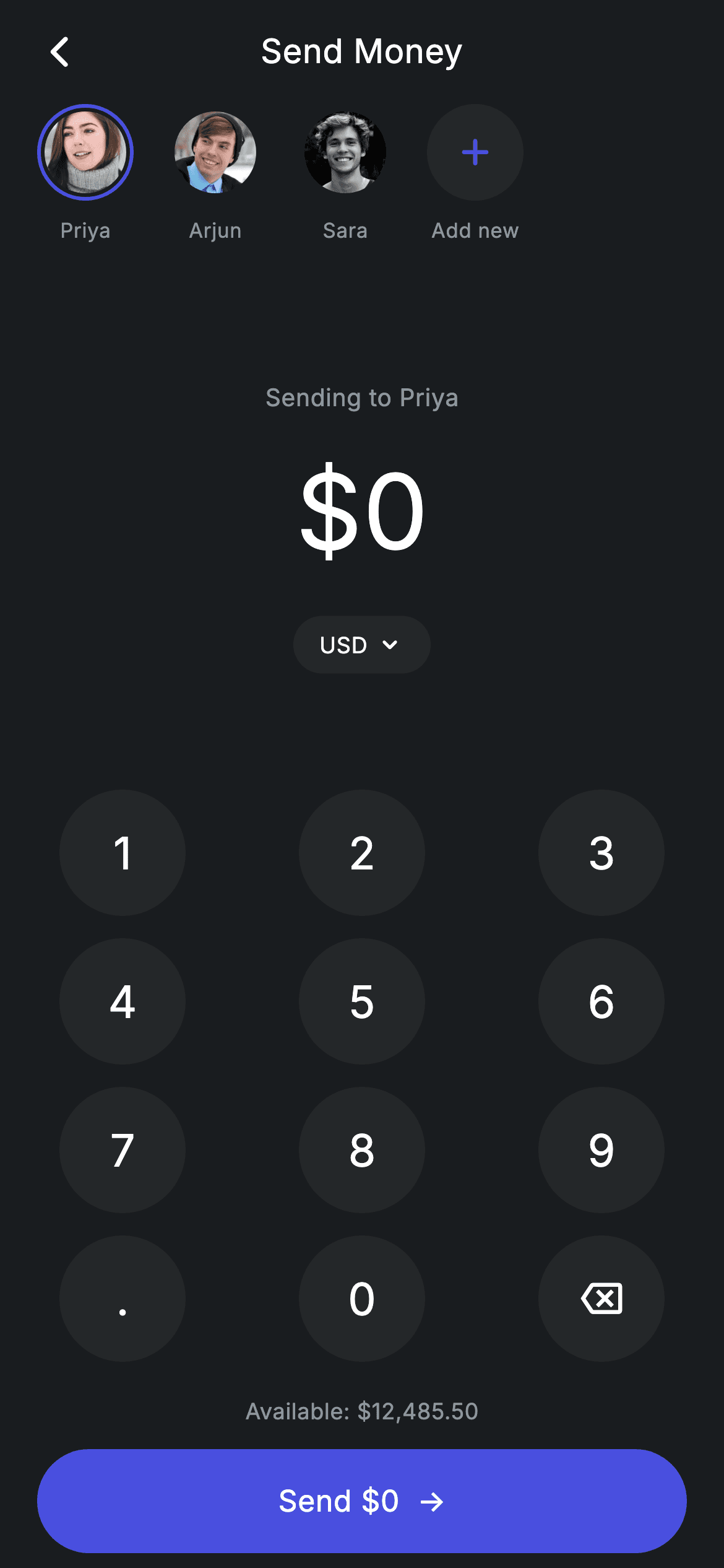
Amount entry is the part of a transfer flow people actually touch, and the system keyboard is bad at it — no decimal cap, no leading-zero handling, and a layout that jumps. This screen ships its own 3×4 keypad and keeps the amount as one String, so a single _onKey method enforces the rules: one decimal point, two digits after it, nine characters maximum. You'll build the dark Revolut-style canvas, a tappable contacts row, a 56px amount that shrinks instead of overflowing, and a Send button that reprints the total as you type.
Watch the Flutter UI walkthrough
A short screen recording of Fintech · Send Money running, if you'd rather see it before you read the code. The written tutorial below covers everything in it.
Can't see the video? Watch it on YouTube.
What you'll build
- ✓An amount held as a plain String, with input rules (one dot, two decimals, 9-char cap) enforced in one switch
- ✓A horizontal contacts row where tapping a face rewrites both the 'Sending to' line and the selection ring
- ✓A 56px amount inside a FittedBox, so a nine-digit transfer scales down rather than overflowing
- ✓A round-key 3×4 keypad generated from a nested list of strings, with a backspace key
- ✓An avatar widget that falls back to a tinted initial if its image asset ever fails to decode
Step-by-step build
Create the file
Add a new file at lib/fintech_send_money/fintech_send_money_screen.dart in your Flutter project.
Register the bundled fonts
No external packages — this is pure Flutter. It does bundle its design font (Inter), so drop the font file into fonts/ and declare it in pubspec.yaml:
flutter:
  fonts:
    - family: Inter
      fonts:
- asset: fonts/Inter-Regular.ttfBuild it, piece by piece
Here's how the screen goes together. Each block below is a real slice of the code with a plain-English explanation — paste them in order, or grab the whole file from the next section.
Design tokens, mock contacts, and the keypad rules
import 'package:flutter/material.dart';

/// Send Money — a dark money-transfer screen (Revolut-inspired design system).
///
/// Self-contained per CONVENTIONS.md: pure Flutter only, the exact design font
/// (Inter) is bundled under `fonts/`, contact avatars load over the network,
/// and the screen forces its own dark theme so it renders standalone when
/// pushed as a route. The numpad drives live amount state.
class FintechSendMoneyScreen extends StatefulWidget {
  const FintechSendMoneyScreen({super.key});

  @override
  State<FintechSendMoneyScreen> createState() => _FintechSendMoneyScreenState();
}

class _FintechSendMoneyScreenState extends State<FintechSendMoneyScreen> {
  // ── Revolut design tokens ────────────────────────────────────────────────
  static const String _font = 'Inter';
  static const Color _bg = Color(0xFF191C1F);
  static const Color _surface = Color(0xFF242729);
  static const Color _brand = Color(0xFF494FDF);
  static const Color _muted = Color(0xFF8D969E);

  static const List<_Contact> _contacts = <_Contact>[
    _Contact(
        name: 'Priya',
        img: 'lib/screens/fintech/fintech_send_money/images/avatar_5.jpg',
        tint: _brand),
    _Contact(
        name: 'Arjun',
        img: 'lib/screens/fintech/fintech_send_money/images/avatar_8.jpg',
        tint: Color(0xFF00A87E)),
    _Contact(
        name: 'Sara',
        img: 'lib/screens/fintech/fintech_send_money/images/avatar_12.jpg',
        tint: Color(0xFFEC7E00)),
  ];

  String _amount = '0';
  int _activeContact = 0;

  String get _recipient => _contacts[_activeContact].name;

  void _onKey(String key) {
    setState(() {
      switch (key) {
        case '⌫':
          _amount = _amount.length <= 1
              ? '0'
              : _amount.substring(0, _amount.length - 1);
        case '.':
          if (!_amount.contains('.')) {
            _amount = '$_amount.';
          }
        default:
          // digit
          if (_amount == '0') {
            _amount = key;
          } else if (_amount.length < 9) {
            // cap two decimals once a point exists
            final int dot = _amount.indexOf('.');
            if (dot == -1 || _amount.length - dot <= 2) {
              _amount = '$_amount$key';
            }
          }
      }
    });
  }
Four const Colors define the whole palette — _bg (#191C1F) for the canvas, _surface (#242729) for chips and keys, _brand (#494FDF) for the selection ring and CTA, and _muted (#8D969E) for secondary text — alongside _font = 'Inter'. _contacts is a hard-coded list of three _Contact records (Priya, Arjun, Sara), each with a bundled image path and its own tint used later for the avatar fallback. State is just two fields: _amount, a String starting at '0', and _activeContact, an int index that the _recipient getter turns back into a name. All the real logic is in _onKey, a Dart 3 switch with no break statements (cases don't fall through). '⌫' trims one character, or resets to '0' when only one is left, so the display is never empty. '.' is ignored if a dot is already present. Any digit replaces the leading '0' rather than appending to it, then stops at 9 characters — and once a dot exists, `_amount.length - dot <= 2` allows exactly two decimal places before further digits are silently dropped.
The column that pins the keypad to the bottom
  @override
  Widget build(BuildContext context) {
    return Theme(
      data: ThemeData.dark(useMaterial3: true),
      child: Scaffold(
        backgroundColor: _bg,
        body: SafeArea(
          child: Column(
            children: <Widget>[
              _buildAppBar(),
              _buildRecipients(),
              Expanded(child: _buildAmount()),
              _Numpad(onKey: _onKey),
              const SizedBox(height: 12),
              Text(
                r'Available: $12,485.50',
                style: const TextStyle(
                  fontFamily: _font,
                  fontSize: 12,
                  fontWeight: FontWeight.w400,
                  letterSpacing: 0.24,
                  color: _muted,
                ),
              ),
              const SizedBox(height: 12),
              _buildSendButton(),
            ],
          ),
        ),
      ),
    );
  }

  Widget _buildAppBar() {
    return Padding(
      padding: const EdgeInsets.fromLTRB(8, 4, 8, 4),
      child: Row(
        children: <Widget>[
          IconButton(
            onPressed: () => Navigator.of(context).maybePop(),
            icon: const Icon(Icons.arrow_back_ios_new_rounded,
                size: 20, color: Colors.white),
          ),
          const Expanded(
            child: Text(
              'Send Money',
              textAlign: TextAlign.center,
              style: TextStyle(
                fontFamily: _font,
                fontSize: 18,
                fontWeight: FontWeight.w500,
                letterSpacing: 0.24,
                color: Colors.white,
              ),
            ),
          ),
          const SizedBox(width: 48),
        ],
      ),
    );
  }

  Widget _buildRecipients() {
    return SizedBox(
      height: 92,
      child: ListView(
        scrollDirection: Axis.horizontal,
        physics: const BouncingScrollPhysics(),
        padding: const EdgeInsets.symmetric(horizontal: 20),
        children: <Widget>[
          for (int i = 0; i < _contacts.length; i++)
            _ContactChip(
              contact: _contacts[i],
              active: i == _activeContact,
              onTap: () => setState(() => _activeContact = i),
            ),
          const _AddContactChip(),
        ],
      ),
    );
  }
build() wraps everything in Theme(data: ThemeData.dark(useMaterial3: true)) so the screen renders dark even when pushed from a light-themed app, then paints the Scaffold with _bg inside a SafeArea. The Column stacks five pieces, and only the amount block is wrapped in Expanded — that single widget absorbs all leftover height, which is what keeps the keypad, the balance line and the Send button glued to the bottom on every device size. Note the balance uses a raw string, r'Available: $12,485.50', so Dart doesn't try to interpolate the dollar sign. _buildAppBar fakes a centred title without AppBar: an IconButton calling Navigator.maybePop() on the left, an Expanded centred Text, and a bare SizedBox(width: 48) on the right that balances the icon's width so the title sits optically centred. _buildRecipients is a 92px-tall horizontal ListView with BouncingScrollPhysics that generates a _ContactChip per contact via a collection-for, sets active on the matching index, and appends a const _AddContactChip at the end.
The live amount, currency chip, and Send button
  Widget _buildAmount() {
    return Center(
      child: Column(
        mainAxisAlignment: MainAxisAlignment.center,
        mainAxisSize: MainAxisSize.min,
        children: <Widget>[
          Text(
            'Sending to $_recipient',
            style: const TextStyle(
              fontFamily: _font,
              fontSize: 13,
              fontWeight: FontWeight.w400,
              letterSpacing: 0.24,
              color: _muted,
            ),
          ),
          const SizedBox(height: 12),
          FittedBox(
            fit: BoxFit.scaleDown,
            child: Text(
              '\$$_amount',
              style: const TextStyle(
                fontFamily: _font,
                fontSize: 56,
                fontWeight: FontWeight.w500,
                letterSpacing: 0.24,
                color: Colors.white,
              ),
            ),
          ),
          const SizedBox(height: 16),
          Container(
            padding: const EdgeInsets.symmetric(horizontal: 14, vertical: 7),
            decoration: BoxDecoration(
              color: _surface,
              borderRadius: BorderRadius.circular(9999),
            ),
            child: Row(
              mainAxisSize: MainAxisSize.min,
              children: const <Widget>[
                Text(
                  'USD',
                  style: TextStyle(
                    fontFamily: _font,
                    fontSize: 12,
                    fontWeight: FontWeight.w500,
                    letterSpacing: 0.24,
                    color: Colors.white,
                  ),
                ),
                SizedBox(width: 4),
                Icon(Icons.keyboard_arrow_down_rounded,
                    size: 16, color: Colors.white),
              ],
            ),
          ),
        ],
      ),
    );
  }

  Widget _buildSendButton() {
    return Padding(
      padding: const EdgeInsets.fromLTRB(20, 0, 20, 8),
      child: SizedBox(
        width: double.infinity,
        height: 56,
        child: Material(
          color: _brand,
          borderRadius: BorderRadius.circular(9999),
          child: InkWell(
            borderRadius: BorderRadius.circular(9999),
            onTap: () {},
            child: Center(
              child: Text(
                'Send \$$_amount  →',
                style: const TextStyle(
                  fontFamily: _font,
                  fontSize: 16,
                  fontWeight: FontWeight.w500,
                  letterSpacing: 0.24,
                  color: Colors.white,
                ),
              ),
            ),
          ),
        ),
      ),
    );
  }
_buildAmount centres a Column holding three things: a 13px muted 'Sending to $_recipient' line that updates the moment another chip is tapped, the amount itself, and a currency pill. The amount is 56px w500 white wrapped in FittedBox(fit: BoxFit.scaleDown) — that's the overflow guard, letting a long value shrink to fit instead of throwing a yellow-and-black overflow stripe. The USD chip is a _surface Container with borderRadius 9999 (any huge radius gives a perfect pill) holding a label plus keyboard_arrow_down_rounded; it's decorative here, with no picker attached. _buildSendButton is a full-width 56px Material in _brand with an InkWell on top, both given the same 9999 radius so the ripple is clipped to the pill instead of splashing past the corners. Its label, 'Send \$$_amount →', reprints the current amount on every keystroke, and onTap is an empty closure — wire your transfer call there.
Contact chips and the Add-new tile
// ── Contacts ─────────────────────────────────────────────────────────────────
class _Contact {
  const _Contact({
    required this.name,
    required this.img,
    required this.tint,
  });

  final String name;
  final String img;
  final Color tint;
}

class _ContactChip extends StatelessWidget {
  const _ContactChip({
    required this.contact,
    required this.active,
    required this.onTap,
  });

  final _Contact contact;
  final bool active;
  final VoidCallback onTap;

  @override
  Widget build(BuildContext context) {
    return GestureDetector(
      onTap: onTap,
      child: Padding(
        padding: const EdgeInsets.only(right: 18),
        child: Column(
          children: <Widget>[
            Container(
              width: 52,
              height: 52,
              padding: const EdgeInsets.all(2),
              decoration: BoxDecoration(
                shape: BoxShape.circle,
                border: Border.all(
                  color: active
                      ? _FintechSendMoneyScreenState._brand
                      : Colors.transparent,
                  width: 2,
                ),
              ),
              child: ClipOval(
                child: _Avatar(
                  url: contact.img,
                  tint: contact.tint,
                  initial: contact.name.characters.first,
                  size: 48,
                ),
              ),
            ),
            const SizedBox(height: 8),
            Text(
              contact.name,
              style: const TextStyle(
                fontFamily: _FintechSendMoneyScreenState._font,
                fontSize: 11,
                fontWeight: FontWeight.w400,
                letterSpacing: 0.24,
                color: _FintechSendMoneyScreenState._muted,
              ),
            ),
          ],
        ),
      ),
    );
  }
}

class _AddContactChip extends StatelessWidget {
  const _AddContactChip();

  @override
  Widget build(BuildContext context) {
    return Column(
      children: <Widget>[
        Container(
          width: 52,
          height: 52,
          decoration: const BoxDecoration(
            shape: BoxShape.circle,
            color: _FintechSendMoneyScreenState._surface,
          ),
          child: const Icon(
            Icons.add_rounded,
            size: 24,
            color: _FintechSendMoneyScreenState._brand,
          ),
        ),
        const SizedBox(height: 8),
        const Text(
          'Add new',
          style: TextStyle(
            fontFamily: _FintechSendMoneyScreenState._font,
            fontSize: 11,
            fontWeight: FontWeight.w400,
            letterSpacing: 0.24,
            color: _FintechSendMoneyScreenState._muted,
          ),
        ),
      ],
    );
  }
}
_Contact is a tiny immutable model with name, img and tint. _ContactChip renders a 52×52 circular Container whose Border.all is _brand when active and Colors.transparent otherwise — the border is always drawn, so selecting a contact never shifts the layout by two pixels. Inside, 2px of padding plus ClipOval frames a 48px _Avatar, and the initial passed to it comes from contact.name.characters.first: Flutter re-exports package:characters, so you get a grapheme-safe first character (correct even for emoji or accented names) without adding a dependency. The whole chip is a GestureDetector calling the onTap the parent supplied, which just sets _activeContact. _AddContactChip mirrors the same 52px circle and 11px muted caption but fills it with _surface and a brand-coloured Icons.add_rounded, so it reads as part of the same row while clearly not being a person — note it has no tap handler yet.
An avatar that never renders blank
/// Network avatar that never renders blank: shows a tinted initial while the
/// photo loads and falls back to it permanently if the request fails.
class _Avatar extends StatelessWidget {
  const _Avatar({
    required this.url,
    required this.tint,
    required this.initial,
    required this.size,
  });

  final String url;
  final Color tint;
  final String initial;
  final double size;

  Widget _fallback() {
    return Container(
      width: size,
      height: size,
      color: tint.withValues(alpha: 0.22),
      alignment: Alignment.center,
      child: Text(
        initial.toUpperCase(),
        style: TextStyle(
          fontFamily: _FintechSendMoneyScreenState._font,
          fontSize: size * 0.40,
          fontWeight: FontWeight.w500,
          color: tint,
        ),
      ),
    );
  }

  @override
  Widget build(BuildContext context) {
    return Image.asset(
      url,
      width: size,
      height: size,
      fit: BoxFit.cover,
      gaplessPlayback: true,
      errorBuilder: (BuildContext context, Object error, StackTrace? stack) =>
          _fallback(),
    );
  }
}
_Avatar is deliberately defensive. Image.asset loads the bundled JPG at the requested size with BoxFit.cover, and gaplessPlayback: true keeps the previously decoded frame on screen during a rebuild instead of flashing empty. The errorBuilder is the important part: if the asset is missing from pubspec.yaml or fails to decode, _fallback() draws a square of the contact's tint at 22% alpha with their uppercased initial centred on top, sized at size * 0.40 so the letter always scales with the circle. Because the parent already clipped it with ClipOval, that fallback appears as a coloured disc rather than a broken-image icon — the pattern to copy any time an avatar list can't guarantee its images. (The parameter is still named url from an earlier network version; here it's an asset path.)
Building the 3×4 keypad from a list of strings
// ── Numpad ───────────────────────────────────────────────────────────────────
class _Numpad extends StatelessWidget {
  const _Numpad({required this.onKey});

  final ValueChanged<String> onKey;

  static const List<List<String>> _rows = <List<String>>[
    <String>['1', '2', '3'],
    <String>['4', '5', '6'],
    <String>['7', '8', '9'],
    <String>['.', '0', '⌫'],
  ];

  @override
  Widget build(BuildContext context) {
    return Padding(
      padding: const EdgeInsets.symmetric(horizontal: 32),
      child: Column(
        mainAxisSize: MainAxisSize.min,
        children: <Widget>[
          for (final List<String> row in _rows)
            Padding(
              padding: const EdgeInsets.symmetric(vertical: 6),
              child: Row(
                mainAxisAlignment: MainAxisAlignment.spaceBetween,
                children: <Widget>[
                  for (final String key in row)
                    _NumKey(label: key, onTap: () => onKey(key)),
                ],
              ),
            ),
        ],
      ),
    );
  }
}

class _NumKey extends StatelessWidget {
  const _NumKey({required this.label, required this.onTap});

  final String label;
  final VoidCallback onTap;

  @override
  Widget build(BuildContext context) {
    final bool isBackspace = label == '⌫';
    return GestureDetector(
      onTap: onTap,
      behavior: HitTestBehavior.opaque,
      child: Container(
        width: 68,
        height: 68,
        decoration: const BoxDecoration(
          shape: BoxShape.circle,
          color: _FintechSendMoneyScreenState._surface,
        ),
        alignment: Alignment.center,
        child: isBackspace
            ? const Icon(Icons.backspace_outlined,
                size: 22, color: Colors.white)
            : Text(
                label,
                style: const TextStyle(
                  fontFamily: _FintechSendMoneyScreenState._font,
                  fontSize: 24,
                  fontWeight: FontWeight.w500,
                  letterSpacing: 0.24,
                  color: Colors.white,
                ),
              ),
      ),
    );
  }
}
_Numpad is stateless and holds no keypad state at all — it takes a ValueChanged<String> onKey and pushes every press up to the screen. Its layout comes from _rows, a static const List<List<String>> ending in ['.', '0', '⌫'], rendered by two nested collection-for loops: one Padding-wrapped Row per row, one _NumKey per label. MainAxisAlignment.spaceBetween spreads three keys across the width left by the 32px horizontal padding, so the gaps stay even without a single manual spacer. _NumKey is a 68×68 circle filled with _surface; it checks isBackspace = label == '⌫' and swaps in Icons.backspace_outlined instead of drawing the glyph, while digits render at 24px w500. HitTestBehavior.opaque on the GestureDetector makes the entire 68px disc tappable rather than just the character inside it — essential for a keypad used with one thumb.
Full code
The complete, ready-to-paste source. Free to use in your projects — one click copies it all.
import 'package:flutter/material.dart';

/// Send Money — a dark money-transfer screen (Revolut-inspired design system).
///
/// Self-contained per CONVENTIONS.md: pure Flutter only, the exact design font
/// (Inter) is bundled under `fonts/`, contact avatars load over the network,
/// and the screen forces its own dark theme so it renders standalone when
/// pushed as a route. The numpad drives live amount state.
class FintechSendMoneyScreen extends StatefulWidget {
  const FintechSendMoneyScreen({super.key});

  @override
  State<FintechSendMoneyScreen> createState() => _FintechSendMoneyScreenState();
}

class _FintechSendMoneyScreenState extends State<FintechSendMoneyScreen> {
  // ── Revolut design tokens ────────────────────────────────────────────────
  static const String _font = 'Inter';
  static const Color _bg = Color(0xFF191C1F);
  static const Color _surface = Color(0xFF242729);
  static const Color _brand = Color(0xFF494FDF);
  static const Color _muted = Color(0xFF8D969E);

  static const List<_Contact> _contacts = <_Contact>[
    _Contact(
        name: 'Priya',
        img: 'lib/screens/fintech/fintech_send_money/images/avatar_5.jpg',
        tint: _brand),
    _Contact(
        name: 'Arjun',
        img: 'lib/screens/fintech/fintech_send_money/images/avatar_8.jpg',
        tint: Color(0xFF00A87E)),
    _Contact(
        name: 'Sara',
        img: 'lib/screens/fintech/fintech_send_money/images/avatar_12.jpg',
        tint: Color(0xFFEC7E00)),
  ];

  String _amount = '0';
  int _activeContact = 0;

  String get _recipient => _contacts[_activeContact].name;

  void _onKey(String key) {
    setState(() {
      switch (key) {
        case '⌫':
          _amount = _amount.length <= 1
              ? '0'
              : _amount.substring(0, _amount.length - 1);
        case '.':
          if (!_amount.contains('.')) {
            _amount = '$_amount.';
          }
        default:
          // digit
          if (_amount == '0') {
            _amount = key;
          } else if (_amount.length < 9) {
            // cap two decimals once a point exists
            final int dot = _amount.indexOf('.');
            if (dot == -1 || _amount.length - dot <= 2) {
              _amount = '$_amount$key';
            }
          }
      }
    });
  }

  @override
  Widget build(BuildContext context) {
    return Theme(
      data: ThemeData.dark(useMaterial3: true),
      child: Scaffold(
        backgroundColor: _bg,
        body: SafeArea(
          child: Column(
            children: <Widget>[
              _buildAppBar(),
              _buildRecipients(),
              Expanded(child: _buildAmount()),
              _Numpad(onKey: _onKey),
              const SizedBox(height: 12),
              Text(
                r'Available: $12,485.50',
                style: const TextStyle(
                  fontFamily: _font,
                  fontSize: 12,
                  fontWeight: FontWeight.w400,
                  letterSpacing: 0.24,
                  color: _muted,
                ),
              ),
              const SizedBox(height: 12),
              _buildSendButton(),
            ],
          ),
        ),
      ),
    );
  }

  Widget _buildAppBar() {
    return Padding(
      padding: const EdgeInsets.fromLTRB(8, 4, 8, 4),
      child: Row(
        children: <Widget>[
          IconButton(
            onPressed: () => Navigator.of(context).maybePop(),
            icon: const Icon(Icons.arrow_back_ios_new_rounded,
                size: 20, color: Colors.white),
          ),
          const Expanded(
            child: Text(
              'Send Money',
              textAlign: TextAlign.center,
              style: TextStyle(
                fontFamily: _font,
                fontSize: 18,
                fontWeight: FontWeight.w500,
                letterSpacing: 0.24,
                color: Colors.white,
              ),
            ),
          ),
          const SizedBox(width: 48),
        ],
      ),
    );
  }

  Widget _buildRecipients() {
    return SizedBox(
      height: 92,
      child: ListView(
        scrollDirection: Axis.horizontal,
        physics: const BouncingScrollPhysics(),
        padding: const EdgeInsets.symmetric(horizontal: 20),
        children: <Widget>[
          for (int i = 0; i < _contacts.length; i++)
            _ContactChip(
              contact: _contacts[i],
              active: i == _activeContact,
              onTap: () => setState(() => _activeContact = i),
            ),
          const _AddContactChip(),
        ],
      ),
    );
  }

  Widget _buildAmount() {
    return Center(
      child: Column(
        mainAxisAlignment: MainAxisAlignment.center,
        mainAxisSize: MainAxisSize.min,
        children: <Widget>[
          Text(
            'Sending to $_recipient',
            style: const TextStyle(
              fontFamily: _font,
              fontSize: 13,
              fontWeight: FontWeight.w400,
              letterSpacing: 0.24,
              color: _muted,
            ),
          ),
          const SizedBox(height: 12),
          FittedBox(
            fit: BoxFit.scaleDown,
            child: Text(
              '\$$_amount',
              style: const TextStyle(
                fontFamily: _font,
                fontSize: 56,
                fontWeight: FontWeight.w500,
                letterSpacing: 0.24,
                color: Colors.white,
              ),
            ),
          ),
          const SizedBox(height: 16),
          Container(
            padding: const EdgeInsets.symmetric(horizontal: 14, vertical: 7),
            decoration: BoxDecoration(
              color: _surface,
              borderRadius: BorderRadius.circular(9999),
            ),
            child: Row(
              mainAxisSize: MainAxisSize.min,
              children: const <Widget>[
                Text(
                  'USD',
                  style: TextStyle(
                    fontFamily: _font,
                    fontSize: 12,
                    fontWeight: FontWeight.w500,
                    letterSpacing: 0.24,
                    color: Colors.white,
                  ),
                ),
                SizedBox(width: 4),
                Icon(Icons.keyboard_arrow_down_rounded,
                    size: 16, color: Colors.white),
              ],
            ),
          ),
        ],
      ),
    );
  }

  Widget _buildSendButton() {
    return Padding(
      padding: const EdgeInsets.fromLTRB(20, 0, 20, 8),
      child: SizedBox(
        width: double.infinity,
        height: 56,
        child: Material(
          color: _brand,
          borderRadius: BorderRadius.circular(9999),
          child: InkWell(
            borderRadius: BorderRadius.circular(9999),
            onTap: () {},
            child: Center(
              child: Text(
                'Send \$$_amount  →',
                style: const TextStyle(
                  fontFamily: _font,
                  fontSize: 16,
                  fontWeight: FontWeight.w500,
                  letterSpacing: 0.24,
                  color: Colors.white,
                ),
              ),
            ),
          ),
        ),
      ),
    );
  }
}

// ── Contacts ─────────────────────────────────────────────────────────────────
class _Contact {
  const _Contact({
    required this.name,
    required this.img,
    required this.tint,
  });

  final String name;
  final String img;
  final Color tint;
}

class _ContactChip extends StatelessWidget {
  const _ContactChip({
    required this.contact,
    required this.active,
    required this.onTap,
  });

  final _Contact contact;
  final bool active;
  final VoidCallback onTap;

  @override
  Widget build(BuildContext context) {
    return GestureDetector(
      onTap: onTap,
      child: Padding(
        padding: const EdgeInsets.only(right: 18),
        child: Column(
          children: <Widget>[
            Container(
              width: 52,
              height: 52,
              padding: const EdgeInsets.all(2),
              decoration: BoxDecoration(
                shape: BoxShape.circle,
                border: Border.all(
                  color: active
                      ? _FintechSendMoneyScreenState._brand
                      : Colors.transparent,
                  width: 2,
                ),
              ),
              child: ClipOval(
                child: _Avatar(
                  url: contact.img,
                  tint: contact.tint,
                  initial: contact.name.characters.first,
                  size: 48,
                ),
              ),
            ),
            const SizedBox(height: 8),
            Text(
              contact.name,
              style: const TextStyle(
                fontFamily: _FintechSendMoneyScreenState._font,
                fontSize: 11,
                fontWeight: FontWeight.w400,
                letterSpacing: 0.24,
                color: _FintechSendMoneyScreenState._muted,
              ),
            ),
          ],
        ),
      ),
    );
  }
}

class _AddContactChip extends StatelessWidget {
  const _AddContactChip();

  @override
  Widget build(BuildContext context) {
    return Column(
      children: <Widget>[
        Container(
          width: 52,
          height: 52,
          decoration: const BoxDecoration(
            shape: BoxShape.circle,
            color: _FintechSendMoneyScreenState._surface,
          ),
          child: const Icon(
            Icons.add_rounded,
            size: 24,
            color: _FintechSendMoneyScreenState._brand,
          ),
        ),
        const SizedBox(height: 8),
        const Text(
          'Add new',
          style: TextStyle(
            fontFamily: _FintechSendMoneyScreenState._font,
            fontSize: 11,
            fontWeight: FontWeight.w400,
            letterSpacing: 0.24,
            color: _FintechSendMoneyScreenState._muted,
          ),
        ),
      ],
    );
  }
}

/// Network avatar that never renders blank: shows a tinted initial while the
/// photo loads and falls back to it permanently if the request fails.
class _Avatar extends StatelessWidget {
  const _Avatar({
    required this.url,
    required this.tint,
    required this.initial,
    required this.size,
  });

  final String url;
  final Color tint;
  final String initial;
  final double size;

  Widget _fallback() {
    return Container(
      width: size,
      height: size,
      color: tint.withValues(alpha: 0.22),
      alignment: Alignment.center,
      child: Text(
        initial.toUpperCase(),
        style: TextStyle(
          fontFamily: _FintechSendMoneyScreenState._font,
          fontSize: size * 0.40,
          fontWeight: FontWeight.w500,
          color: tint,
        ),
      ),
    );
  }

  @override
  Widget build(BuildContext context) {
    return Image.asset(
      url,
      width: size,
      height: size,
      fit: BoxFit.cover,
      gaplessPlayback: true,
      errorBuilder: (BuildContext context, Object error, StackTrace? stack) =>
          _fallback(),
    );
  }
}

// ── Numpad ───────────────────────────────────────────────────────────────────
class _Numpad extends StatelessWidget {
  const _Numpad({required this.onKey});

  final ValueChanged<String> onKey;

  static const List<List<String>> _rows = <List<String>>[
    <String>['1', '2', '3'],
    <String>['4', '5', '6'],
    <String>['7', '8', '9'],
    <String>['.', '0', '⌫'],
  ];

  @override
  Widget build(BuildContext context) {
    return Padding(
      padding: const EdgeInsets.symmetric(horizontal: 32),
      child: Column(
        mainAxisSize: MainAxisSize.min,
        children: <Widget>[
          for (final List<String> row in _rows)
            Padding(
              padding: const EdgeInsets.symmetric(vertical: 6),
              child: Row(
                mainAxisAlignment: MainAxisAlignment.spaceBetween,
                children: <Widget>[
                  for (final String key in row)
                    _NumKey(label: key, onTap: () => onKey(key)),
                ],
              ),
            ),
        ],
      ),
    );
  }
}

class _NumKey extends StatelessWidget {
  const _NumKey({required this.label, required this.onTap});

  final String label;
  final VoidCallback onTap;

  @override
  Widget build(BuildContext context) {
    final bool isBackspace = label == '⌫';
    return GestureDetector(
      onTap: onTap,
      behavior: HitTestBehavior.opaque,
      child: Container(
        width: 68,
        height: 68,
        decoration: const BoxDecoration(
          shape: BoxShape.circle,
          color: _FintechSendMoneyScreenState._surface,
        ),
        alignment: Alignment.center,
        child: isBackspace
            ? const Icon(Icons.backspace_outlined,
                size: 22, color: Colors.white)
            : Text(
                label,
                style: const TextStyle(
                  fontFamily: _FintechSendMoneyScreenState._font,
                  fontSize: 24,
                  fontWeight: FontWeight.w500,
                  letterSpacing: 0.24,
                  color: Colors.white,
                ),
              ),
      ),
    );
  }
}
Plus bundled 4 binary assets (fonts/images). The CLI and MCP install those for you automatically.
Two faster ways to add it
Copy-paste works, but you can skip it entirely.
1. FlutterKit CLI
One command drops this screen — and its fonts — straight into your project.
$ flutterkit add fintech-send-money2. AI agent (MCP)
Connect FlutterKit's MCP server in Claude or Cursor and just ask your agent to install fintech-send-money — it fetches and writes the files for you.
FAQ
Can I use this send-money screen in a commercial app?
Yes. The full Dart on this page — the amount logic, the contact chips and the reusable _Numpad — is free to copy into personal or commercial projects. Paste it here, run flutterkit add fintech-send-money in your project, or let an AI agent install it for you over MCP.
What does it depend on besides Flutter?
Nothing. There are no pub packages — only package:flutter/material.dart. The assets are the bundled Inter font (referenced as fontFamily: 'Inter' on every TextStyle) and three local avatar JPGs; register both in pubspec.yaml as shown in the dependencies step, or let the CLI and MCP install copies for you. The _Avatar fallback means a missed asset registration shows a tinted initial rather than a crash.
What Flutter SDK does this compile against?
Flutter 3.27+ / Dart 3. Two things set that floor: tint.withValues(alpha: 0.22) in _Avatar._fallback, and the break-less switch inside _onKey, which relies on Dart 3's non-fallthrough switch statements. On an older SDK, change withValues(alpha: 0.22) to withOpacity(0.22) and add a break to each case.


