How to Build a Dark Fintech Onboarding Slide in Flutter (Full Code + Preview)
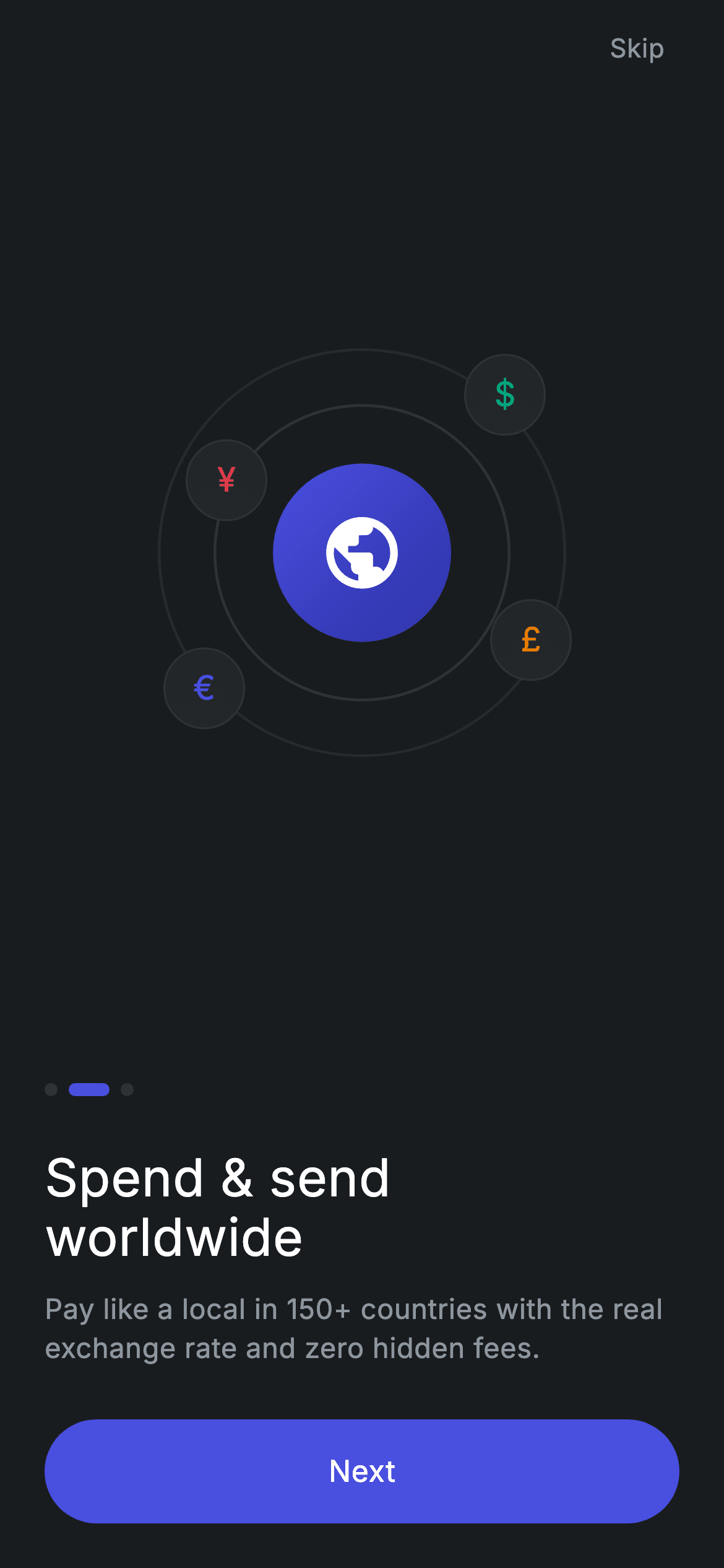
This is the 'spend worldwide' slide from a dark neobank onboarding flow, and its whole illustration is drawn in Flutter — two faint concentric rings, a gradient circle holding a globe icon, and four currency chips ($, €, £, ¥) pinned around it with Positioned. No images, no Lottie, no network calls. You'll build that motif, a pill page indicator where the active dot stretches into a bar, and a rounded Next button that keeps its ink ripple clipped to the pill shape.
Watch the Flutter UI walkthrough
A short screen recording of Fintech · Onboarding 2 running, if you'd rather see it before you read the code. The written tutorial below covers everything in it.
Can't see the video? Watch it on YouTube.
What you'll build
- ✓A globe motif made of concentric rings and floating chips, drawn entirely with Flutter widgets
- ✓A page indicator where the active dot is a 22px pill and the others are 7px circles
- ✓A forced dark theme so the screen renders correctly even in a light-themed app
- ✓A Material + InkWell pill button whose ripple is clipped to its rounded shape
- ✓onContinue / onSkip callbacks ready for a PageView or a route
Step-by-step build
Create the file
Add a new file at lib/fintech_onboarding_2/fintech_onboarding_2_screen.dart in your Flutter project.
Register the bundled fonts
No external packages — this is pure Flutter. It does bundle its design font (Inter), so drop the font file into fonts/ and declare it in pubspec.yaml:
flutter:
  fonts:
    - family: Inter
      fonts:
- asset: fonts/Inter-Regular.ttfBuild it, piece by piece
Here's how the screen goes together. Each block below is a real slice of the code with a plain-English explanation — paste them in order, or grab the whole file from the next section.
Dark tokens and a forced theme
import 'package:flutter/material.dart';

/// Onboarding 2/3 — "Spend & send worldwide". Self-contained per CONVENTIONS.md:
/// pure Flutter, bundled Inter font, custom-drawn illustration, forced dark
/// theme so it renders standalone as a route.
class FintechOnboardingTwoScreen extends StatelessWidget {
  const FintechOnboardingTwoScreen({super.key, this.onContinue, this.onSkip});

  final VoidCallback? onContinue;
  final VoidCallback? onSkip;

  static const String _font = 'Inter';
  static const Color _bg = Color(0xFF191C1F);
  static const Color _surface = Color(0xFF242729);
  static const Color _brand = Color(0xFF494FDF);
  static const Color _teal = Color(0xFF00A87E);
  static const Color _amber = Color(0xFFEC7E00);
  static const Color _muted = Color(0xFF8D969E);
  static const Color _hairline = Color(0xFF2E3235);

  @override
  Widget build(BuildContext context) {
    return Theme(
      data: ThemeData.dark(useMaterial3: true),
      child: Scaffold(
        backgroundColor: _bg,
        body: SafeArea(
          child: Padding(
            padding: const EdgeInsets.fromLTRB(24, 8, 24, 24),
            child: Column(
              crossAxisAlignment: CrossAxisAlignment.stretch,
              children: <Widget>[
Seven colour consts define the dark palette: #191C1F canvas, #242729 surface, #494FDF brand indigo, teal, amber, a muted grey for secondary text and a #2E3235 hairline. The key structural choice is wrapping everything in Theme(data: ThemeData.dark(useMaterial3: true)) — that forces dark styling for any Material descendant regardless of what the host app's theme is, which is what lets this screen be dropped into a light app and still look right. CrossAxisAlignment.stretch on the Column is why the headline, body and button all span the full width without individual width settings.
Skip, motif and page dots
                Align(
                  alignment: Alignment.centerRight,
                  child: GestureDetector(
                    onTap: onSkip,
                    behavior: HitTestBehavior.opaque,
                    child: const Padding(
                      padding: EdgeInsets.all(8),
                      child: Text(
                        'Skip',
                        style: TextStyle(
                          fontFamily: _font,
                          fontSize: 14,
                          fontWeight: FontWeight.w500,
                          letterSpacing: 0.24,
                          color: _muted,
                        ),
                      ),
                    ),
                  ),
                ),
                const Expanded(child: Center(child: _GlobeMotif())),
                const SizedBox(height: 32),
                const _Dots(active: 1),
                const SizedBox(height: 28),
Skip is an Align(centerRight) wrapping a GestureDetector with HitTestBehavior.opaque and 8px of padding — opaque makes that padding part of the tap target, so a 14px text link becomes a comfortable 30px touch area. The motif sits in Expanded(child: Center(...)), which is what gives the illustration all the leftover vertical space and keeps the text block anchored to the bottom regardless of device height. _Dots(active: 1) marks this as the second of three slides.
Headline, subtitle and CTA
                const Text(
                  'Spend & send\nworldwide',
                  style: TextStyle(
                    fontFamily: _font,
                    fontSize: 28,
                    fontWeight: FontWeight.w500,
                    height: 1.15,
                    letterSpacing: 0.24,
                    color: Colors.white,
                  ),
                ),
                const SizedBox(height: 12),
                const Text(
                  'Pay like a local in 150+ countries with the real exchange '
                  'rate and zero hidden fees.',
                  style: TextStyle(
                    fontFamily: _font,
                    fontSize: 15,
                    fontWeight: FontWeight.w400,
                    height: 1.4,
                    letterSpacing: 0.24,
                    color: _muted,
                  ),
                ),
                const SizedBox(height: 28),
                _PrimaryButton(label: 'Next', onTap: onContinue),
              ],
            ),
          ),
        ),
      ),
    );
  }
}
The headline is 28px w500 with an explicit \n splitting 'Spend & send' from 'worldwide', height: 1.15 pulling the two lines tight, and letterSpacing: 0.24 — a small positive tracking applied consistently across every text style on the screen, which is a deliberate typographic system rather than a per-widget guess. Note the weight: w500 rather than bold. On a dark background, heavy weights bloom and read heavier than they measure, so medium is often the right call. The subtitle is 15px muted at height: 1.4, then the Next button takes onContinue directly.
The globe motif
/// Concentric rings with floating currency chips — the "worldwide" motif.
class _GlobeMotif extends StatelessWidget {
  const _GlobeMotif();

  @override
  Widget build(BuildContext context) {
    return SizedBox(
      width: 250,
      height: 250,
      child: Stack(
        alignment: Alignment.center,
        children: <Widget>[
          _ring(220, 0.06),
          _ring(160, 0.10),
          Container(
            width: 96,
            height: 96,
            decoration: const BoxDecoration(
              shape: BoxShape.circle,
              gradient: LinearGradient(
                begin: Alignment.topLeft,
                end: Alignment.bottomRight,
                colors: <Color>[
                  FintechOnboardingTwoScreen._brand,
                  Color(0xFF2D31A6),
                ],
              ),
            ),
            child: const Icon(Icons.public_rounded, size: 46, color: Colors.white),
          ),
          const Positioned(
            top: 18,
            right: 26,
            child: _CurrencyChip(symbol: r'$', tint: FintechOnboardingTwoScreen._teal),
          ),
          const Positioned(
            bottom: 30,
            left: 18,
            child: _CurrencyChip(symbol: '€', tint: FintechOnboardingTwoScreen._brand),
          ),
          const Positioned(
            bottom: 56,
            right: 12,
            child: _CurrencyChip(symbol: '£', tint: FintechOnboardingTwoScreen._amber),
          ),
          const Positioned(
            top: 64,
            left: 30,
            child: _CurrencyChip(symbol: '¥', tint: Color(0xFFE23B4A)),
          ),
        ],
      ),
    );
  }

  Widget _ring(double size, double alpha) {
    return Container(
      width: size,
      height: size,
      decoration: BoxDecoration(
        shape: BoxShape.circle,
        border: Border.all(
          color: Colors.white.withValues(alpha: alpha),
          width: 1.5,
        ),
      ),
    );
  }
}
A fixed 250×250 SizedBox holds a centre-aligned Stack. Two _ring calls draw circles as borders only — a Container with BoxShape.circle and Border.all in white at 6% and 10% alpha, no fill — which is how you get concentric outlines with no CustomPainter. The centre is a 96px circle with a diagonal gradient from the brand indigo to a darker #2D31A6, holding a 46px globe icon. The four currency chips are Positioned at deliberately uneven offsets (top: 18/right: 26, bottom: 30/left: 18, and so on), because an asymmetric scatter reads as 'floating' where a symmetric one would read as a diagram.
Currency chips and the stretching dot
class _CurrencyChip extends StatelessWidget {
  const _CurrencyChip({required this.symbol, required this.tint});

  final String symbol;
  final Color tint;

  @override
  Widget build(BuildContext context) {
    return Container(
      width: 44,
      height: 44,
      decoration: BoxDecoration(
        shape: BoxShape.circle,
        color: FintechOnboardingTwoScreen._surface,
        border: Border.all(color: FintechOnboardingTwoScreen._hairline),
      ),
      alignment: Alignment.center,
      child: Text(
        symbol,
        style: TextStyle(
          fontFamily: FintechOnboardingTwoScreen._font,
          fontSize: 18,
          fontWeight: FontWeight.w500,
          color: tint,
        ),
      ),
    );
  }
}

class _Dots extends StatelessWidget {
  const _Dots({required this.active});

  final int active;

  @override
  Widget build(BuildContext context) {
    return Row(
      children: <Widget>[
        for (int i = 0; i < 3; i++)
          Padding(
            padding: const EdgeInsets.only(right: 6),
            child: Container(
              width: i == active ? 22 : 7,
              height: 7,
              decoration: BoxDecoration(
                color: i == active
                    ? FintechOnboardingTwoScreen._brand
                    : FintechOnboardingTwoScreen._hairline,
                borderRadius: BorderRadius.circular(9999),
              ),
            ),
          ),
      ],
    );
  }
}
Each _CurrencyChip is a 44px circle in the surface colour with a hairline border, and only its symbol takes the tint — so the four chips share one shape and differ by a single colour, which keeps them reading as a set. Note the dollar chip is passed r'$': a raw string, because a bare $ starts interpolation in Dart. _Dots loops three times and gives the active index a width of 22 against the others' 7, both 7px tall with a 9999 radius. That radius-larger-than-height trick means the same widget renders as a circle at 7px wide and a pill at 22px, with no shape branching.
The pill button
class _PrimaryButton extends StatelessWidget {
  const _PrimaryButton({required this.label, required this.onTap});

  final String label;
  final VoidCallback? onTap;

  @override
  Widget build(BuildContext context) {
    return SizedBox(
      height: 56,
      child: Material(
        color: FintechOnboardingTwoScreen._brand,
        borderRadius: BorderRadius.circular(9999),
        child: InkWell(
          borderRadius: BorderRadius.circular(9999),
          onTap: onTap,
          child: Center(
            child: Text(
              label,
              style: const TextStyle(
                fontFamily: FintechOnboardingTwoScreen._font,
                fontSize: 16,
                fontWeight: FontWeight.w500,
                letterSpacing: 0.24,
                color: Colors.white,
              ),
            ),
          ),
        ),
      ),
    );
  }
}
The CTA is a 56px SizedBox wrapping Material + InkWell rather than a Container + GestureDetector. That matters for one reason: InkWell paints a real Material ripple on tap. The borderRadius: BorderRadius.circular(9999) is set on both the Material and the InkWell — on the Material to shape the fill, on the InkWell to clip the ripple, and omitting the second one is the classic bug that leaves a rectangular splash on a pill button. onTap takes the nullable callback directly, so passing null gives you a genuinely disabled button with no ripple.
Full code
The complete, ready-to-paste source. Free to use in your projects — one click copies it all.
import 'package:flutter/material.dart';

/// Onboarding 2/3 — "Spend & send worldwide". Self-contained per CONVENTIONS.md:
/// pure Flutter, bundled Inter font, custom-drawn illustration, forced dark
/// theme so it renders standalone as a route.
class FintechOnboardingTwoScreen extends StatelessWidget {
  const FintechOnboardingTwoScreen({super.key, this.onContinue, this.onSkip});

  final VoidCallback? onContinue;
  final VoidCallback? onSkip;

  static const String _font = 'Inter';
  static const Color _bg = Color(0xFF191C1F);
  static const Color _surface = Color(0xFF242729);
  static const Color _brand = Color(0xFF494FDF);
  static const Color _teal = Color(0xFF00A87E);
  static const Color _amber = Color(0xFFEC7E00);
  static const Color _muted = Color(0xFF8D969E);
  static const Color _hairline = Color(0xFF2E3235);

  @override
  Widget build(BuildContext context) {
    return Theme(
      data: ThemeData.dark(useMaterial3: true),
      child: Scaffold(
        backgroundColor: _bg,
        body: SafeArea(
          child: Padding(
            padding: const EdgeInsets.fromLTRB(24, 8, 24, 24),
            child: Column(
              crossAxisAlignment: CrossAxisAlignment.stretch,
              children: <Widget>[
                Align(
                  alignment: Alignment.centerRight,
                  child: GestureDetector(
                    onTap: onSkip,
                    behavior: HitTestBehavior.opaque,
                    child: const Padding(
                      padding: EdgeInsets.all(8),
                      child: Text(
                        'Skip',
                        style: TextStyle(
                          fontFamily: _font,
                          fontSize: 14,
                          fontWeight: FontWeight.w500,
                          letterSpacing: 0.24,
                          color: _muted,
                        ),
                      ),
                    ),
                  ),
                ),
                const Expanded(child: Center(child: _GlobeMotif())),
                const SizedBox(height: 32),
                const _Dots(active: 1),
                const SizedBox(height: 28),
                const Text(
                  'Spend & send\nworldwide',
                  style: TextStyle(
                    fontFamily: _font,
                    fontSize: 28,
                    fontWeight: FontWeight.w500,
                    height: 1.15,
                    letterSpacing: 0.24,
                    color: Colors.white,
                  ),
                ),
                const SizedBox(height: 12),
                const Text(
                  'Pay like a local in 150+ countries with the real exchange '
                  'rate and zero hidden fees.',
                  style: TextStyle(
                    fontFamily: _font,
                    fontSize: 15,
                    fontWeight: FontWeight.w400,
                    height: 1.4,
                    letterSpacing: 0.24,
                    color: _muted,
                  ),
                ),
                const SizedBox(height: 28),
                _PrimaryButton(label: 'Next', onTap: onContinue),
              ],
            ),
          ),
        ),
      ),
    );
  }
}

/// Concentric rings with floating currency chips — the "worldwide" motif.
class _GlobeMotif extends StatelessWidget {
  const _GlobeMotif();

  @override
  Widget build(BuildContext context) {
    return SizedBox(
      width: 250,
      height: 250,
      child: Stack(
        alignment: Alignment.center,
        children: <Widget>[
          _ring(220, 0.06),
          _ring(160, 0.10),
          Container(
            width: 96,
            height: 96,
            decoration: const BoxDecoration(
              shape: BoxShape.circle,
              gradient: LinearGradient(
                begin: Alignment.topLeft,
                end: Alignment.bottomRight,
                colors: <Color>[
                  FintechOnboardingTwoScreen._brand,
                  Color(0xFF2D31A6),
                ],
              ),
            ),
            child: const Icon(Icons.public_rounded, size: 46, color: Colors.white),
          ),
          const Positioned(
            top: 18,
            right: 26,
            child: _CurrencyChip(symbol: r'$', tint: FintechOnboardingTwoScreen._teal),
          ),
          const Positioned(
            bottom: 30,
            left: 18,
            child: _CurrencyChip(symbol: '€', tint: FintechOnboardingTwoScreen._brand),
          ),
          const Positioned(
            bottom: 56,
            right: 12,
            child: _CurrencyChip(symbol: '£', tint: FintechOnboardingTwoScreen._amber),
          ),
          const Positioned(
            top: 64,
            left: 30,
            child: _CurrencyChip(symbol: '¥', tint: Color(0xFFE23B4A)),
          ),
        ],
      ),
    );
  }

  Widget _ring(double size, double alpha) {
    return Container(
      width: size,
      height: size,
      decoration: BoxDecoration(
        shape: BoxShape.circle,
        border: Border.all(
          color: Colors.white.withValues(alpha: alpha),
          width: 1.5,
        ),
      ),
    );
  }
}

class _CurrencyChip extends StatelessWidget {
  const _CurrencyChip({required this.symbol, required this.tint});

  final String symbol;
  final Color tint;

  @override
  Widget build(BuildContext context) {
    return Container(
      width: 44,
      height: 44,
      decoration: BoxDecoration(
        shape: BoxShape.circle,
        color: FintechOnboardingTwoScreen._surface,
        border: Border.all(color: FintechOnboardingTwoScreen._hairline),
      ),
      alignment: Alignment.center,
      child: Text(
        symbol,
        style: TextStyle(
          fontFamily: FintechOnboardingTwoScreen._font,
          fontSize: 18,
          fontWeight: FontWeight.w500,
          color: tint,
        ),
      ),
    );
  }
}

class _Dots extends StatelessWidget {
  const _Dots({required this.active});

  final int active;

  @override
  Widget build(BuildContext context) {
    return Row(
      children: <Widget>[
        for (int i = 0; i < 3; i++)
          Padding(
            padding: const EdgeInsets.only(right: 6),
            child: Container(
              width: i == active ? 22 : 7,
              height: 7,
              decoration: BoxDecoration(
                color: i == active
                    ? FintechOnboardingTwoScreen._brand
                    : FintechOnboardingTwoScreen._hairline,
                borderRadius: BorderRadius.circular(9999),
              ),
            ),
          ),
      ],
    );
  }
}

class _PrimaryButton extends StatelessWidget {
  const _PrimaryButton({required this.label, required this.onTap});

  final String label;
  final VoidCallback? onTap;

  @override
  Widget build(BuildContext context) {
    return SizedBox(
      height: 56,
      child: Material(
        color: FintechOnboardingTwoScreen._brand,
        borderRadius: BorderRadius.circular(9999),
        child: InkWell(
          borderRadius: BorderRadius.circular(9999),
          onTap: onTap,
          child: Center(
            child: Text(
              label,
              style: const TextStyle(
                fontFamily: FintechOnboardingTwoScreen._font,
                fontSize: 16,
                fontWeight: FontWeight.w500,
                letterSpacing: 0.24,
                color: Colors.white,
              ),
            ),
          ),
        ),
      ),
    );
  }
}
Plus bundled 1 binary asset (fonts/images). The CLI and MCP install those for you automatically.
Two faster ways to add it
Copy-paste works, but you can skip it entirely.
1. FlutterKit CLI
One command drops this screen — and its fonts — straight into your project.
$ flutterkit add fintech-onboarding-22. AI agent (MCP)
Connect FlutterKit's MCP server in Claude or Cursor and just ask your agent to install fintech-onboarding-2 — it fetches and writes the files for you.
FAQ
Is this Flutter onboarding screen free to use?
Yes. The complete Dart source on this page is free for personal and commercial projects. Copy it here, install it with the FlutterKit CLI (flutterkit add fintech-onboarding-2), or have an AI agent add it via MCP.
How do I use it inside a PageView?
Put this screen and its siblings in a PageView's children and point onContinue at controller.nextPage(). Since _Dots already takes an active index, you can bind it to the controller's page instead of the hard-coded 1 if you'd rather the indicator animate with the swipe.
Does it need any external packages or images?
Neither. The globe, rings and currency chips are all Flutter widgets, so there's nothing to download or cache. The only bundled asset is the Inter font, registered in pubspec.yaml as shown in step 2.
Which Flutter version does it target?
It uses Color.withValues() for the ring borders and ThemeData.dark(useMaterial3: true), so it targets Flutter 3.22+ (Dart 3). On an older SDK, swap withValues(alpha: 0.06) for withOpacity(0.06).

