How to Build a Fintech Onboarding Screen in Flutter (Full Code + Preview)
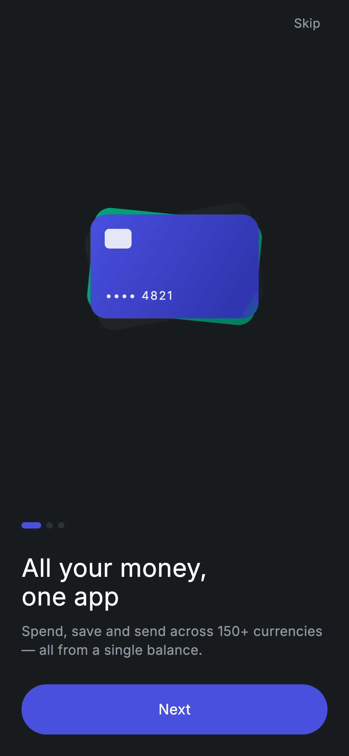
Onboarding is where a fintech app makes its promise, and this is slide one of a three-step flow. In this tutorial you'll build a dark neobank onboarding screen in Flutter: a hand-drawn stack of three overlapping gradient cards — each with a chip and a masked '•••• 4821' number — sitting above page dots, an 'All your money, one app' headline, a multi-currency subtitle, and a full-width pill 'Next' button, with a 'Skip' action top-right. It's pure Flutter, forces its own dark theme, and exposes onContinue and onSkip callbacks so it drops straight into a PageView.
Watch the Flutter UI walkthrough
A short screen recording of Fintech · Onboarding 1 running, if you'd rather see it before you read the code. The written tutorial below covers everything in it.
Can't see the video? Watch it on YouTube.
What you'll build
- ✓A dark, self-theming onboarding slide that renders standalone as a route (no parent theme required)
- ✓A custom-painted stack of three rotated gradient cards with a chip and masked card number — zero image assets
- ✓A three-dot page indicator where the active dot stretches into a pill
- ✓A headline, muted multi-currency subtitle, and a full-width pill 'Next' button using Material + InkWell
- ✓onContinue and onSkip callbacks plus a top-right 'Skip' tap target ready to wire into a PageView
Step-by-step build
Create the file
Add a new file at lib/fintech_onboarding_1/fintech_onboarding_1_screen.dart in your Flutter project.
Register the bundled fonts
No external packages — this is pure Flutter. It does bundle its design font (Inter), so drop the font file into fonts/ and declare it in pubspec.yaml:
flutter:
  fonts:
    - family: Inter
      fonts:
- asset: fonts/Inter-Regular.ttfBuild it, piece by piece
Here's how the screen goes together. Each block below is a real slice of the code with a plain-English explanation — paste them in order, or grab the whole file from the next section.
Imports, callbacks, and the dark color palette
import 'package:flutter/material.dart';

/// Onboarding 1/3 — "All your money, one app". Self-contained per CONVENTIONS.md:
/// pure Flutter, bundled Inter font, custom-drawn illustration (no network
/// dependency), forced dark theme so it renders standalone as a route.
class FintechOnboardingOneScreen extends StatelessWidget {
  const FintechOnboardingOneScreen({super.key, this.onContinue, this.onSkip});

  final VoidCallback? onContinue;
  final VoidCallback? onSkip;

  static const String _font = 'Inter';
  static const Color _bg = Color(0xFF191C1F);
  static const Color _surface = Color(0xFF242729);
  static const Color _brand = Color(0xFF494FDF);
  static const Color _brandDeep = Color(0xFF2D31A6);
  static const Color _teal = Color(0xFF00A87E);
  static const Color _muted = Color(0xFF8D969E);
  static const Color _hairline = Color(0xFF2E3235);
The file imports only Flutter's material library, then declares FintechOnboardingOneScreen as a StatelessWidget — the slide holds no changing state, it just fires callbacks. Its constructor takes two optional VoidCallback fields, onContinue and onSkip, so the parent decides what 'Next' and 'Skip' actually do. Below them sit the design tokens: _font is 'Inter', and a set of private const Colors define the dark theme — _bg (#191C1F) is the near-black canvas, _surface (#242729) the card grey, _brand (#494FDF) and _brandDeep (#2D31A6) the indigo gradient, _teal (#00A87E) the green card, _muted (#8D969E) the grey text, and _hairline (#2E3235) the inactive dot color.
Forcing a dark theme and the top-right Skip action
  Widget build(BuildContext context) {
    return Theme(
      data: ThemeData.dark(useMaterial3: true),
      child: Scaffold(
        backgroundColor: _bg,
        body: SafeArea(
          child: Padding(
            padding: const EdgeInsets.fromLTRB(24, 8, 24, 24),
            child: Column(
              crossAxisAlignment: CrossAxisAlignment.stretch,
              children: <Widget>[
                Align(
                  alignment: Alignment.centerRight,
                  child: GestureDetector(
                    onTap: onSkip,
                    behavior: HitTestBehavior.opaque,
                    child: const Padding(
                      padding: EdgeInsets.all(8),
                      child: Text(
                        'Skip',
                        style: TextStyle(
                          fontFamily: _font,
                          fontSize: 14,
                          fontWeight: FontWeight.w500,
                          letterSpacing: 0.24,
                          color: _muted,
                        ),
                      ),
                    ),
                  ),
                ),
build() wraps everything in a Theme with ThemeData.dark(useMaterial3: true) so the screen looks right even if the surrounding app is light — that's what lets it render standalone as a route. Inside sits a Scaffold painted _bg, a SafeArea, and a Padding of EdgeInsets.fromLTRB(24, 8, 24, 24) that insets the content. The Column uses CrossAxisAlignment.stretch so its children fill the width. Its first child is the 'Skip' link: an Align pushed centerRight, wrapping a GestureDetector whose onTap is onSkip. HitTestBehavior.opaque makes the whole padded area tappable, and the 14px w500 label uses the _muted grey so Skip reads as secondary.
The illustration slot, dots, headline, and Next button
                const Expanded(child: Center(child: _CardStack())),
                const SizedBox(height: 32),
                const _Dots(active: 0),
                const SizedBox(height: 28),
                const Text(
                  'All your money,\none app',
                  style: TextStyle(
                    fontFamily: _font,
                    fontSize: 28,
                    fontWeight: FontWeight.w500,
                    height: 1.15,
                    letterSpacing: 0.24,
                    color: Colors.white,
                  ),
                ),
                const SizedBox(height: 12),
                const Text(
                  'Spend, save and send across 150+ currencies — '
                  'all from a single balance.',
                  style: TextStyle(
                    fontFamily: _font,
                    fontSize: 15,
                    fontWeight: FontWeight.w400,
                    height: 1.4,
                    letterSpacing: 0.24,
                    color: _muted,
                  ),
                ),
                const SizedBox(height: 28),
                _PrimaryButton(label: 'Next', onTap: onContinue),
              ],
            ),
          ),
        ),
      ),
    );
  }
}
An Expanded wraps a Center holding the _CardStack, so the illustration takes all the leftover vertical space and stays centered regardless of screen height. Below it, fixed SizedBox gaps set the rhythm: 32 down to the _Dots(active: 0), 28 to the headline. The headline is a 28px w500 white Text with height 1.15 and a manual line break ('All your money,\none app'). A 12px gap leads to the subtitle — two string literals Dart concatenates into one 15px _muted paragraph about 150+ currencies. After a 28px gap, _PrimaryButton(label: 'Next', onTap: onContinue) closes the column.
Drawing the stacked gradient cards
/// Three overlapping gradient cards — the "one balance, many cards" motif.
class _CardStack extends StatelessWidget {
  const _CardStack();

  @override
  Widget build(BuildContext context) {
    return SizedBox(
      width: 240,
      height: 240,
      child: Stack(
        alignment: Alignment.center,
        children: <Widget>[
          Transform.rotate(
            angle: -0.18,
            child: _miniCard(const <Color>[
              FintechOnboardingOneScreen._surface,
              Color(0xFF1C1F22),
            ]),
          ),
          Transform.rotate(
            angle: 0.10,
            child: _miniCard(const <Color>[
              FintechOnboardingOneScreen._teal,
              Color(0xFF007A5C),
            ]),
          ),
          _miniCard(const <Color>[
            FintechOnboardingOneScreen._brand,
            FintechOnboardingOneScreen._brandDeep,
          ]),
        ],
      ),
    );
  }

  Widget _miniCard(List<Color> colors) {
    return Container(
      width: 188,
      height: 116,
      padding: const EdgeInsets.all(16),
      decoration: BoxDecoration(
        borderRadius: BorderRadius.circular(18),
        gradient: LinearGradient(
          begin: Alignment.topLeft,
          end: Alignment.bottomRight,
          colors: colors,
        ),
      ),
      child: Column(
        crossAxisAlignment: CrossAxisAlignment.start,
        children: <Widget>[
          Container(
            width: 30,
            height: 22,
            decoration: BoxDecoration(
              color: Colors.white.withValues(alpha: 0.85),
              borderRadius: BorderRadius.circular(5),
            ),
          ),
          const Spacer(),
          Text(
            '•••• 4821',
            style: TextStyle(
              fontFamily: FintechOnboardingOneScreen._font,
              fontSize: 13,
              fontWeight: FontWeight.w500,
              letterSpacing: 1.5,
              color: Colors.white.withValues(alpha: 0.92),
            ),
          ),
        ],
      ),
    );
  }
}
_CardStack is a 240×240 SizedBox holding a center-aligned Stack of three cards. Two of them are wrapped in Transform.rotate — the back card tilted -0.18 rad and the middle card +0.10 rad — while the front indigo card stays straight, giving the fanned 'many cards, one balance' look. Each card comes from _miniCard(colors): a 188×116 Container with an 18px radius and a LinearGradient running topLeft→bottomRight through the two colors passed in (surface grey, teal green, or brand indigo). Inside, a 30×22 rounded white-85% Container plays the EMV chip, a Spacer pushes the '•••• 4821' masked number to the bottom, and Colors.white.withValues(alpha: 0.92) keeps that text softly translucent.
The three-page progress dots
/// Shared onboarding page-position dots (3 pages).
class _Dots extends StatelessWidget {
  const _Dots({required this.active});

  final int active;

  @override
  Widget build(BuildContext context) {
    return Row(
      children: <Widget>[
        for (int i = 0; i < 3; i++)
          Padding(
            padding: const EdgeInsets.only(right: 6),
            child: Container(
              width: i == active ? 22 : 7,
              height: 7,
              decoration: BoxDecoration(
                color: i == active
                    ? FintechOnboardingOneScreen._brand
                    : FintechOnboardingOneScreen._hairline,
                borderRadius: BorderRadius.circular(9999),
              ),
            ),
          ),
      ],
    );
  }
}
_Dots takes an active index and builds a Row using a collection-for loop (for i in 0..2) instead of hardcoding three widgets. Each dot is a Container with a fixed height of 7 and a width that switches on i == active: the current page's dot stretches to 22 to become a pill, the rest stay 7 wide. The active dot is filled with _brand indigo and the inactive ones with the _hairline grey, and a BorderRadius.circular(9999) fully rounds every dot. Passing active: 0 here marks this as the first of three slides.
The reusable pill Next button
/// Shared full-width pill CTA.
class _PrimaryButton extends StatelessWidget {
  const _PrimaryButton({required this.label, required this.onTap});

  final String label;
  final VoidCallback? onTap;

  @override
  Widget build(BuildContext context) {
    return SizedBox(
      height: 56,
      child: Material(
        color: FintechOnboardingOneScreen._brand,
        borderRadius: BorderRadius.circular(9999),
        child: InkWell(
          borderRadius: BorderRadius.circular(9999),
          onTap: onTap,
          child: Center(
            child: Text(
              label,
              style: const TextStyle(
                fontFamily: FintechOnboardingOneScreen._font,
                fontSize: 16,
                fontWeight: FontWeight.w500,
                letterSpacing: 0.24,
                color: Colors.white,
              ),
            ),
          ),
        ),
      ),
    );
  }
}
_PrimaryButton is a small reusable widget taking a label and an onTap. It's a 56px-tall SizedBox holding a Material colored with _brand indigo and a BorderRadius.circular(9999) that makes it a full pill. The Material + InkWell pairing is deliberate: Material provides the fill and clips the ripple, while InkWell draws the tap splash and forwards onTap. Matching the button's radius on the InkWell keeps the ripple inside the pill. The centered label is 16px w500 white Inter, so the same widget can render 'Next' here and any other CTA elsewhere in the flow.
Full code
The complete, ready-to-paste source. Free to use in your projects — one click copies it all.
import 'package:flutter/material.dart';

/// Onboarding 1/3 — "All your money, one app". Self-contained per CONVENTIONS.md:
/// pure Flutter, bundled Inter font, custom-drawn illustration (no network
/// dependency), forced dark theme so it renders standalone as a route.
class FintechOnboardingOneScreen extends StatelessWidget {
  const FintechOnboardingOneScreen({super.key, this.onContinue, this.onSkip});

  final VoidCallback? onContinue;
  final VoidCallback? onSkip;

  static const String _font = 'Inter';
  static const Color _bg = Color(0xFF191C1F);
  static const Color _surface = Color(0xFF242729);
  static const Color _brand = Color(0xFF494FDF);
  static const Color _brandDeep = Color(0xFF2D31A6);
  static const Color _teal = Color(0xFF00A87E);
  static const Color _muted = Color(0xFF8D969E);
  static const Color _hairline = Color(0xFF2E3235);

  @override
  Widget build(BuildContext context) {
    return Theme(
      data: ThemeData.dark(useMaterial3: true),
      child: Scaffold(
        backgroundColor: _bg,
        body: SafeArea(
          child: Padding(
            padding: const EdgeInsets.fromLTRB(24, 8, 24, 24),
            child: Column(
              crossAxisAlignment: CrossAxisAlignment.stretch,
              children: <Widget>[
                Align(
                  alignment: Alignment.centerRight,
                  child: GestureDetector(
                    onTap: onSkip,
                    behavior: HitTestBehavior.opaque,
                    child: const Padding(
                      padding: EdgeInsets.all(8),
                      child: Text(
                        'Skip',
                        style: TextStyle(
                          fontFamily: _font,
                          fontSize: 14,
                          fontWeight: FontWeight.w500,
                          letterSpacing: 0.24,
                          color: _muted,
                        ),
                      ),
                    ),
                  ),
                ),
                const Expanded(child: Center(child: _CardStack())),
                const SizedBox(height: 32),
                const _Dots(active: 0),
                const SizedBox(height: 28),
                const Text(
                  'All your money,\none app',
                  style: TextStyle(
                    fontFamily: _font,
                    fontSize: 28,
                    fontWeight: FontWeight.w500,
                    height: 1.15,
                    letterSpacing: 0.24,
                    color: Colors.white,
                  ),
                ),
                const SizedBox(height: 12),
                const Text(
                  'Spend, save and send across 150+ currencies — '
                  'all from a single balance.',
                  style: TextStyle(
                    fontFamily: _font,
                    fontSize: 15,
                    fontWeight: FontWeight.w400,
                    height: 1.4,
                    letterSpacing: 0.24,
                    color: _muted,
                  ),
                ),
                const SizedBox(height: 28),
                _PrimaryButton(label: 'Next', onTap: onContinue),
              ],
            ),
          ),
        ),
      ),
    );
  }
}

/// Three overlapping gradient cards — the "one balance, many cards" motif.
class _CardStack extends StatelessWidget {
  const _CardStack();

  @override
  Widget build(BuildContext context) {
    return SizedBox(
      width: 240,
      height: 240,
      child: Stack(
        alignment: Alignment.center,
        children: <Widget>[
          Transform.rotate(
            angle: -0.18,
            child: _miniCard(const <Color>[
              FintechOnboardingOneScreen._surface,
              Color(0xFF1C1F22),
            ]),
          ),
          Transform.rotate(
            angle: 0.10,
            child: _miniCard(const <Color>[
              FintechOnboardingOneScreen._teal,
              Color(0xFF007A5C),
            ]),
          ),
          _miniCard(const <Color>[
            FintechOnboardingOneScreen._brand,
            FintechOnboardingOneScreen._brandDeep,
          ]),
        ],
      ),
    );
  }

  Widget _miniCard(List<Color> colors) {
    return Container(
      width: 188,
      height: 116,
      padding: const EdgeInsets.all(16),
      decoration: BoxDecoration(
        borderRadius: BorderRadius.circular(18),
        gradient: LinearGradient(
          begin: Alignment.topLeft,
          end: Alignment.bottomRight,
          colors: colors,
        ),
      ),
      child: Column(
        crossAxisAlignment: CrossAxisAlignment.start,
        children: <Widget>[
          Container(
            width: 30,
            height: 22,
            decoration: BoxDecoration(
              color: Colors.white.withValues(alpha: 0.85),
              borderRadius: BorderRadius.circular(5),
            ),
          ),
          const Spacer(),
          Text(
            '•••• 4821',
            style: TextStyle(
              fontFamily: FintechOnboardingOneScreen._font,
              fontSize: 13,
              fontWeight: FontWeight.w500,
              letterSpacing: 1.5,
              color: Colors.white.withValues(alpha: 0.92),
            ),
          ),
        ],
      ),
    );
  }
}

/// Shared onboarding page-position dots (3 pages).
class _Dots extends StatelessWidget {
  const _Dots({required this.active});

  final int active;

  @override
  Widget build(BuildContext context) {
    return Row(
      children: <Widget>[
        for (int i = 0; i < 3; i++)
          Padding(
            padding: const EdgeInsets.only(right: 6),
            child: Container(
              width: i == active ? 22 : 7,
              height: 7,
              decoration: BoxDecoration(
                color: i == active
                    ? FintechOnboardingOneScreen._brand
                    : FintechOnboardingOneScreen._hairline,
                borderRadius: BorderRadius.circular(9999),
              ),
            ),
          ),
      ],
    );
  }
}

/// Shared full-width pill CTA.
class _PrimaryButton extends StatelessWidget {
  const _PrimaryButton({required this.label, required this.onTap});

  final String label;
  final VoidCallback? onTap;

  @override
  Widget build(BuildContext context) {
    return SizedBox(
      height: 56,
      child: Material(
        color: FintechOnboardingOneScreen._brand,
        borderRadius: BorderRadius.circular(9999),
        child: InkWell(
          borderRadius: BorderRadius.circular(9999),
          onTap: onTap,
          child: Center(
            child: Text(
              label,
              style: const TextStyle(
                fontFamily: FintechOnboardingOneScreen._font,
                fontSize: 16,
                fontWeight: FontWeight.w500,
                letterSpacing: 0.24,
                color: Colors.white,
              ),
            ),
          ),
        ),
      ),
    );
  }
}
Plus bundled 1 binary asset (fonts/images). The CLI and MCP install those for you automatically.
Two faster ways to add it
Copy-paste works, but you can skip it entirely.
1. FlutterKit CLI
One command drops this screen — and its fonts — straight into your project.
$ flutterkit add fintech-onboarding-12. AI agent (MCP)
Connect FlutterKit's MCP server in Claude or Cursor and just ask your agent to install fintech-onboarding-1 — it fetches and writes the files for you.
FAQ
Is this fintech onboarding screen free to use?
Yes. The full Dart source on this page is free to copy into your own apps, personal or commercial. Paste it directly, install it with the FlutterKit CLI (flutterkit add fintech-onboarding-1), or have an AI agent add it for you via MCP.
Does it need any external packages?
No — it's pure Flutter, built entirely on the material library, and the card illustration is drawn with plain Containers and gradients so there are no network images. The only extra asset is the bundled Inter font, which you register in pubspec.yaml under fonts. The CLI and MCP install that font file for you automatically.
Which Flutter version does it target?
It uses modern Flutter APIs — Color.withValues() for the translucent chip and card number, plus super parameters in the constructors — so it targets Flutter 3.22+ (Dart 3). On an older SDK, swap withValues(alpha: 0.85) for withOpacity(0.85) (and likewise for 0.92) and it will compile.