How to Build a Confirm Passcode Screen in Flutter (Full Code + Preview)
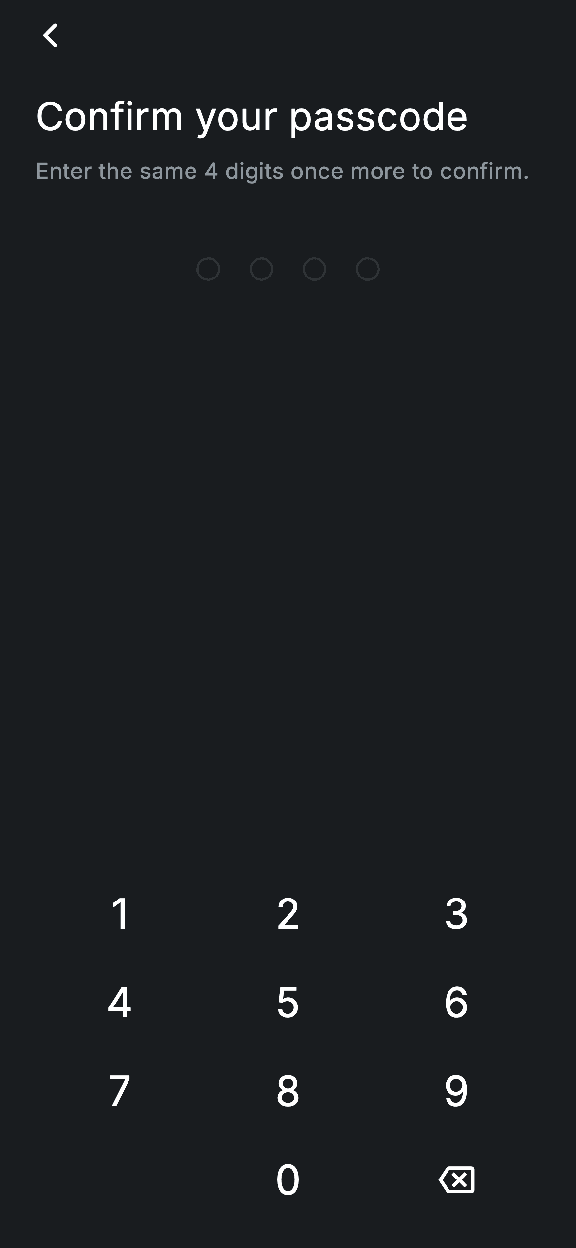
The re-entry half of a passcode flow looks like the first half, but it carries one thing the create screen doesn't: a mismatch state. This tutorial builds it — four masked dots fed by a built-in 3×4 numpad, an _error boolean that turns those dots red, and an auto-advance that fires onContinue the moment the fourth digit lands. You'll see exactly where the comparison against the original passcode belongs, and why _error is cleared on the next keypress rather than by a dismiss button.
Watch the Flutter UI walkthrough
A short screen recording of Fintech · Confirm Passcode running, if you'd rather see it before you read the code. The written tutorial below covers everything in it.
Can't see the video? Watch it on YouTube.
What you'll build
- ✓A confirm-passcode entry held as one String, with no TextFields or focus nodes
- ✓An _error flag that recolours all four dots through a single dotOn variable
- ✓Error clearing that happens on the next digit typed, not on a dismiss action
- ✓Auto-advance on the fourth digit — no Continue button in the flow
- ✓A 3×4 numpad built from a GridView.count with a blank bottom-left cell
Step-by-step build
Create the file
Add a new file at lib/fintech_confirm_passcode/fintech_confirm_passcode_screen.dart in your Flutter project.
Register the bundled fonts
No external packages — this is pure Flutter. It does bundle its design font (Inter), so drop the font file into fonts/ and declare it in pubspec.yaml:
flutter:
  fonts:
    - family: Inter
      fonts:
- asset: fonts/Inter-Regular.ttfBuild it, piece by piece
Here's how the screen goes together. Each block below is a real slice of the code with a plain-English explanation — paste them in order, or grab the whole file from the next section.
Two pieces of state, and where the comparison goes
import 'package:flutter/material.dart';

/// Confirm Passcode — re-enter the 4-digit passcode to confirm. Self-contained
/// per CONVENTIONS.md: pure Flutter, bundled Inter font, forced dark theme.
/// Stateful: re-entry fills the dots and auto-advances when 4 digits match.
class FintechConfirmPasscodeScreen extends StatefulWidget {
  const FintechConfirmPasscodeScreen({super.key, this.onContinue, this.onBack});

  final VoidCallback? onContinue;
  final VoidCallback? onBack;

  @override
  State<FintechConfirmPasscodeScreen> createState() =>
      _FintechConfirmPasscodeScreenState();
}

class _FintechConfirmPasscodeScreenState
    extends State<FintechConfirmPasscodeScreen> {
  static const String _font = 'Inter';
  static const Color _bg = Color(0xFF191C1F);
  static const Color _brand = Color(0xFF494FDF);
  static const Color _red = Color(0xFFE23B4A);
  static const Color _muted = Color(0xFF8D969E);
  static const Color _hairline = Color(0xFF2E3235);
  static const int _len = 4;

  String _code = '';
  bool _error = false;

  void _onKey(String k) {
    setState(() {
      if (k == '⌫') {
        if (_code.isNotEmpty) _code = _code.substring(0, _code.length - 1);
      } else if (_code.length < _len) {
        _error = false;
        _code += k;
      }
    });
    if (_code.length == _len) {
      // Demo: any matching 4-digit entry confirms. In a real flow this compares
      // against the passcode set on the previous screen.
      widget.onContinue?.call();
    }
  }
The state is a String _code and a bool _error. _onKey handles editing inside setState: backspace trims the last character when there is one; any other key clears _error and then appends, which is the detail worth copying — the mismatch message disappears the moment the user starts a new attempt, so there's no error banner to dismiss. After setState, reaching full length calls widget.onContinue?.call(). The comment on those lines is honest about the demo: in a real flow you'd compare _code against the passcode set on the previous screen here, calling onContinue on a match and setState(() => _error = true) with a cleared code on a mismatch.
One variable drives every dot's colour
  @override
  Widget build(BuildContext context) {
    final Color dotOn = _error ? _red : _brand;
    return Theme(
      data: ThemeData.dark(useMaterial3: true),
      child: Scaffold(
        backgroundColor: _bg,
        body: SafeArea(
          child: Padding(
            padding: const EdgeInsets.fromLTRB(24, 4, 24, 16),
            child: Column(
              crossAxisAlignment: CrossAxisAlignment.stretch,
              children: <Widget>[
                Align(
                  alignment: Alignment.centerLeft,
                  child: GestureDetector(
                    onTap:
                        widget.onBack ?? () => Navigator.of(context).maybePop(),
                    behavior: HitTestBehavior.opaque,
                    child: const SizedBox(
                      width: 40,
                      height: 40,
                      child: Align(
                        alignment: Alignment.centerLeft,
                        child: Icon(Icons.arrow_back_ios_new_rounded,
                            size: 20, color: Colors.white),
                      ),
                    ),
                  ),
                ),
                const SizedBox(height: 16),
build() opens by computing dotOn = _error ? _red : _brand — a single local that every dot below reads, so switching the whole screen into its error appearance is one ternary rather than four. Theme(data: ThemeData.dark(useMaterial3: true)) forces dark Material styling regardless of the host app. The back affordance is a GestureDetector over a 40×40 SizedBox with HitTestBehavior.opaque, giving the 20px chevron a real touch target, and it falls back to Navigator.of(context).maybePop() when no onBack is supplied — maybePop being the safe variant when this is the first route.
Heading and copy that names the task
                const Text(
                  'Confirm your passcode',
                  style: TextStyle(
                    fontFamily: _font,
                    fontSize: 26,
                    fontWeight: FontWeight.w500,
                    letterSpacing: 0.24,
                    color: Colors.white,
                  ),
                ),
                const SizedBox(height: 8),
                const Text(
                  'Enter the same 4 digits once more to confirm.',
                  style: TextStyle(
                    fontFamily: _font,
                    fontSize: 15,
                    fontWeight: FontWeight.w400,
                    letterSpacing: 0.24,
                    color: _muted,
                  ),
                ),
                const SizedBox(height: 48),
'Confirm your passcode' at 26px w500 and 'Enter the same 4 digits once more to confirm.' at 15px in the muted grey. The copy is doing real work here: on a screen with no visible input field and no button, the subtitle is the only thing telling the user this is a repeat rather than a new code. Both styles carry letterSpacing: 0.24, the small positive tracking applied uniformly across every text style in this fintech set — a system rather than a per-widget guess. A 48px gap then separates the copy from the dots.
The masked dots
                Row(
                  mainAxisAlignment: MainAxisAlignment.center,
                  children: <Widget>[
                    for (int i = 0; i < _len; i++)
                      Container(
                        width: 16,
                        height: 16,
                        margin: const EdgeInsets.symmetric(horizontal: 10),
                        decoration: BoxDecoration(
                          shape: BoxShape.circle,
                          color: i < _code.length ? dotOn : Colors.transparent,
                          border: Border.all(
                            color: i < _code.length ? dotOn : _hairline,
                            width: 1.5,
                          ),
                        ),
                      ),
                  ],
                ),
                const Spacer(),
                _Numpad(onKey: _onKey),
              ],
            ),
          ),
        ),
      ),
    );
  }
}
A centred Row generates four dots with a collection-for. Each is a 16px circle with 10px horizontal margins, and the single comparison i < _code.length sets both the fill (dotOn or Colors.transparent) and the border colour (dotOn or _hairline) at a 1.5px width. So an empty dot is a thin grey ring and a filled one is a solid disc — two visual states from one expression, and both flip to red automatically when dotOn changes. Then Spacer() pushes the numpad to the bottom of the screen, keeping the dots near the copy where the eye already is.
The numpad
class _Numpad extends StatelessWidget {
  const _Numpad({required this.onKey});

  final ValueChanged<String> onKey;

  static const List<String> _keys = <String>[
    '1', '2', '3', '4', '5', '6', '7', '8', '9', '', '0', '⌫',
  ];

  @override
  Widget build(BuildContext context) {
    return GridView.count(
      crossAxisCount: 3,
      shrinkWrap: true,
      physics: const NeverScrollableScrollPhysics(),
      childAspectRatio: 1.9,
      children: <Widget>[
        for (final String k in _keys)
          if (k.isEmpty)
            const SizedBox.shrink()
          else
            GestureDetector(
              onTap: () => onKey(k),
              behavior: HitTestBehavior.opaque,
              child: Center(
                child: k == '⌫'
                    ? const Icon(Icons.backspace_outlined,
                        size: 24, color: Colors.white)
                    : Text(
                        k,
                        style: const TextStyle(
                          fontFamily: _FintechConfirmPasscodeScreenState._font,
                          fontSize: 28,
                          fontWeight: FontWeight.w500,
                          color: Colors.white,
                        ),
                      ),
              ),
            ),
      ],
    );
  }
}
GridView.count with crossAxisCount: 3, shrinkWrap: true and NeverScrollableScrollPhysics — the last two are what let a GridView sit inside a Column without an unbounded-height error or a scroll-gesture conflict. The twelve-key list carries an empty string at index 9, rendered as SizedBox.shrink() so the bottom-left cell stays blank and 0 sits centred like a phone dialler. childAspectRatio: 1.9 makes each key close to twice as wide as tall, keeping the keypad compact. The '⌫' entry renders Icons.backspace_outlined instead of the character, and every key uses HitTestBehavior.opaque so the whole cell is tappable rather than just the glyph.
Full code
The complete, ready-to-paste source. Free to use in your projects — one click copies it all.
import 'package:flutter/material.dart';

/// Confirm Passcode — re-enter the 4-digit passcode to confirm. Self-contained
/// per CONVENTIONS.md: pure Flutter, bundled Inter font, forced dark theme.
/// Stateful: re-entry fills the dots and auto-advances when 4 digits match.
class FintechConfirmPasscodeScreen extends StatefulWidget {
  const FintechConfirmPasscodeScreen({super.key, this.onContinue, this.onBack});

  final VoidCallback? onContinue;
  final VoidCallback? onBack;

  @override
  State<FintechConfirmPasscodeScreen> createState() =>
      _FintechConfirmPasscodeScreenState();
}

class _FintechConfirmPasscodeScreenState
    extends State<FintechConfirmPasscodeScreen> {
  static const String _font = 'Inter';
  static const Color _bg = Color(0xFF191C1F);
  static const Color _brand = Color(0xFF494FDF);
  static const Color _red = Color(0xFFE23B4A);
  static const Color _muted = Color(0xFF8D969E);
  static const Color _hairline = Color(0xFF2E3235);
  static const int _len = 4;

  String _code = '';
  bool _error = false;

  void _onKey(String k) {
    setState(() {
      if (k == '⌫') {
        if (_code.isNotEmpty) _code = _code.substring(0, _code.length - 1);
      } else if (_code.length < _len) {
        _error = false;
        _code += k;
      }
    });
    if (_code.length == _len) {
      // Demo: any matching 4-digit entry confirms. In a real flow this compares
      // against the passcode set on the previous screen.
      widget.onContinue?.call();
    }
  }

  @override
  Widget build(BuildContext context) {
    final Color dotOn = _error ? _red : _brand;
    return Theme(
      data: ThemeData.dark(useMaterial3: true),
      child: Scaffold(
        backgroundColor: _bg,
        body: SafeArea(
          child: Padding(
            padding: const EdgeInsets.fromLTRB(24, 4, 24, 16),
            child: Column(
              crossAxisAlignment: CrossAxisAlignment.stretch,
              children: <Widget>[
                Align(
                  alignment: Alignment.centerLeft,
                  child: GestureDetector(
                    onTap:
                        widget.onBack ?? () => Navigator.of(context).maybePop(),
                    behavior: HitTestBehavior.opaque,
                    child: const SizedBox(
                      width: 40,
                      height: 40,
                      child: Align(
                        alignment: Alignment.centerLeft,
                        child: Icon(Icons.arrow_back_ios_new_rounded,
                            size: 20, color: Colors.white),
                      ),
                    ),
                  ),
                ),
                const SizedBox(height: 16),
                const Text(
                  'Confirm your passcode',
                  style: TextStyle(
                    fontFamily: _font,
                    fontSize: 26,
                    fontWeight: FontWeight.w500,
                    letterSpacing: 0.24,
                    color: Colors.white,
                  ),
                ),
                const SizedBox(height: 8),
                const Text(
                  'Enter the same 4 digits once more to confirm.',
                  style: TextStyle(
                    fontFamily: _font,
                    fontSize: 15,
                    fontWeight: FontWeight.w400,
                    letterSpacing: 0.24,
                    color: _muted,
                  ),
                ),
                const SizedBox(height: 48),
                Row(
                  mainAxisAlignment: MainAxisAlignment.center,
                  children: <Widget>[
                    for (int i = 0; i < _len; i++)
                      Container(
                        width: 16,
                        height: 16,
                        margin: const EdgeInsets.symmetric(horizontal: 10),
                        decoration: BoxDecoration(
                          shape: BoxShape.circle,
                          color: i < _code.length ? dotOn : Colors.transparent,
                          border: Border.all(
                            color: i < _code.length ? dotOn : _hairline,
                            width: 1.5,
                          ),
                        ),
                      ),
                  ],
                ),
                const Spacer(),
                _Numpad(onKey: _onKey),
              ],
            ),
          ),
        ),
      ),
    );
  }
}

class _Numpad extends StatelessWidget {
  const _Numpad({required this.onKey});

  final ValueChanged<String> onKey;

  static const List<String> _keys = <String>[
    '1', '2', '3', '4', '5', '6', '7', '8', '9', '', '0', '⌫',
  ];

  @override
  Widget build(BuildContext context) {
    return GridView.count(
      crossAxisCount: 3,
      shrinkWrap: true,
      physics: const NeverScrollableScrollPhysics(),
      childAspectRatio: 1.9,
      children: <Widget>[
        for (final String k in _keys)
          if (k.isEmpty)
            const SizedBox.shrink()
          else
            GestureDetector(
              onTap: () => onKey(k),
              behavior: HitTestBehavior.opaque,
              child: Center(
                child: k == '⌫'
                    ? const Icon(Icons.backspace_outlined,
                        size: 24, color: Colors.white)
                    : Text(
                        k,
                        style: const TextStyle(
                          fontFamily: _FintechConfirmPasscodeScreenState._font,
                          fontSize: 28,
                          fontWeight: FontWeight.w500,
                          color: Colors.white,
                        ),
                      ),
              ),
            ),
      ],
    );
  }
}
Plus bundled 1 binary asset (fonts/images). The CLI and MCP install those for you automatically.
Two faster ways to add it
Copy-paste works, but you can skip it entirely.
1. FlutterKit CLI
One command drops this screen — and its fonts — straight into your project.
$ flutterkit add fintech-confirm-passcode2. AI agent (MCP)
Connect FlutterKit's MCP server in Claude or Cursor and just ask your agent to install fintech-confirm-passcode — it fetches and writes the files for you.
FAQ
Is this Flutter confirm-passcode screen free to use?
Yes. The full Dart source on this page, including the numpad, is free for personal and commercial projects. Copy it here, install it with the FlutterKit CLI (flutterkit add fintech-confirm-passcode), or have an AI agent add it via MCP.
How do I wire the real comparison?
Pass the original passcode into the screen (or read it from secure storage), and in _onKey replace the unconditional onContinue call with a check: on a match call onContinue, on a mismatch setState to _error = true and reset _code to an empty string so the dots clear and turn red.
Why does the error clear on the next keypress?
Because that's the moment the user has moved on. _onKey sets _error = false before appending a digit, so the red state disappears as soon as a new attempt starts — no dismiss button, no timer, and no stale error hanging over a fresh entry.
Which Flutter version does it target?
It uses ThemeData.dark(useMaterial3: true), super parameters and collection-if inside widget lists, so Flutter 3.16+ with Dart 3. There are no withValues() calls in this screen, so it also compiles on slightly older SDKs unchanged.

