How to Build a Manage Watchlists Screen in Flutter (Full Code + Preview)
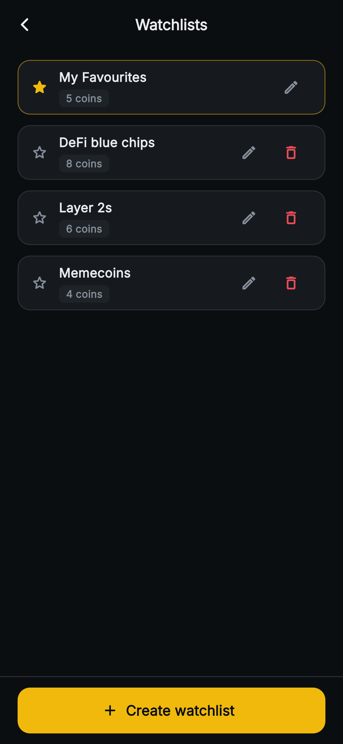
Once a crypto app lets people keep more than one watchlist, they need somewhere to organise the lists themselves rather than the coins inside them. This tutorial builds Aurum's Watchlists manager in Flutter: one card per list with a coin-count chip, a gold star and tinted border marking the protected default, a red delete that is simply not rendered on that default row, and a pinned Create button that appends a fresh list. One StatefulWidget, a three-field model class, and no packages.
What you'll build
- ✓A card per watchlist with the list name stacked over a compact 'N coins' chip on the #1E2329 raised surface
- ✓A default-list treatment (filled gold star plus a half-strength gold border) that also removes the delete action from that row
- ✓Per-row delete that drops a list from state with a single removeAt inside setState
- ✓A full-width 52px gold 'Create watchlist' button pinned in the bottomNavigationBar slot that appends numbered 'New list' rows
- ✓An edit pencil on every row wired to an empty handler, ready for the rename dialog you plug in
Step-by-step build
Create the file
Add a new file at lib/web3_watchlist_manage/web3_watchlist_manage_screen.dart in your Flutter project.
Register the bundled fonts
No external packages — this is pure Flutter. It does bundle its design font (Inter), so drop the font file into fonts/ and declare it in pubspec.yaml:
flutter:
  fonts:
    - family: Inter
      fonts:
- asset: fonts/Inter-Regular.ttfBuild it, piece by piece
Here's how the screen goes together. Each block below is a real slice of the code with a plain-English explanation — paste them in order, or grab the whole file from the next section.
Lists of lists: the state this screen owns
import 'package:flutter/material.dart';

/// Web3 — Manage Watchlists. Multiple named lists with create / rename / delete
/// rows and per-list count chips. Self-contained per CONVENTIONS.md: pure
/// Flutter, bundled Inter font, no glyphs / no network image, forced dark theme
/// so it renders standalone as a route.
class Web3WatchlistManageScreen extends StatefulWidget {
  const Web3WatchlistManageScreen({super.key, this.onBack});

  final VoidCallback? onBack;

  @override
  State<Web3WatchlistManageScreen> createState() =>
      _Web3WatchlistManageScreenState();
}

class _Web3WatchlistManageScreenState extends State<Web3WatchlistManageScreen> {
  static const String _font = 'Inter';
  static const Color _bg = Color(0xFF0B0E11);
  static const Color _surface = Color(0xFF161A1E);
  static const Color _surfaceAlt = Color(0xFF1E2329);
  static const Color _brand = Color(0xFFF0B90B);
  static const Color _down = Color(0xFFF6465D);
  static const Color _text = Color(0xFFEAECEF);
  static const Color _muted = Color(0xFF848E9C);
  static const Color _hairline = Color(0xFF2B3139);

  final List<_List> _lists = <_List>[
    _List('My Favourites', 5, true),
    _List('DeFi blue chips', 8, false),
    _List('Layer 2s', 6, false),
    _List('Memecoins', 4, false),
  ];
The coin-level watchlist screen manages the coins inside one list; this one sits a level up and manages the lists themselves, so its state is a `List<_List>` rather than a list of coins. Four entries are seeded — 'My Favourites' with 5 coins and `isDefault: true`, then 'DeFi blue chips' (8), 'Layer 2s' (6) and 'Memecoins' (4). The only callback is `onBack`; there is no `onCreate` or `onDelete`, because creation and deletion mutate `_lists` locally. The Aurum palette constants are the usual set, but note which ones this screen actually reaches for: `_surfaceAlt` `#1E2329` only for the count chip, and `_down` `#F6465D` borrowed from the market red purely as a destructive-action colour for the trash icon.
An always-editable list with no mode toggle
  @override
  Widget build(BuildContext context) {
    return Theme(
      data: ThemeData.dark(useMaterial3: true),
      child: Scaffold(
        backgroundColor: _bg,
        appBar: AppBar(
          backgroundColor: _bg,
          elevation: 0,
          centerTitle: true,
          leading: IconButton(
            onPressed: widget.onBack,
            icon: const Icon(Icons.arrow_back_ios_new_rounded,
                size: 18, color: _text),
          ),
          title: const Text(
            'Watchlists',
            style: TextStyle(
              fontFamily: _font,
              fontSize: 17,
              fontWeight: FontWeight.w700,
              color: _text,
            ),
          ),
        ),
        body: SafeArea(
          top: false,
          child: ListView.separated(
            padding: const EdgeInsets.fromLTRB(20, 12, 20, 24),
            itemCount: _lists.length,
            separatorBuilder: (BuildContext context, int i) =>
                const SizedBox(height: 12),
Inside the screen-local dark `Theme`, the `AppBar` carries a back chevron and a centred 17px 'Watchlists' title — and, notably, no actions. There is no Edit/Done button because this whole route is the edit mode: every row shows its controls permanently, which is the right call when managing is the screen's only job and a toggle would just add a tap. The body is a `ListView.separated` padded `fromLTRB(20, 12, 20, 24)`, with `separatorBuilder` returning a fixed 12px `SizedBox`. Using `.separated` instead of padding each card means the gap exists only between cards, never above the first or below the last, so the outer padding stays honest. Order is insertion order; nothing here is draggable.
Marking the default list twice
            itemBuilder: (BuildContext context, int i) {
              final _List l = _lists[i];
              return Container(
                padding: const EdgeInsets.symmetric(horizontal: 14, vertical: 6),
                decoration: BoxDecoration(
                  color: _surface,
                  borderRadius: BorderRadius.circular(14),
                  border: Border.all(
                    color: l.isDefault ? _brand.withValues(alpha: 0.5) : _hairline,
                  ),
                ),
                child: Row(
                  children: <Widget>[
                    Icon(
                      l.isDefault ? Icons.star_rounded : Icons.star_outline_rounded,
                      size: 20,
                      color: l.isDefault ? _brand : _muted,
                    ),
                    const SizedBox(width: 12),
Each card is a `_surface` `#161A1E` Container with a 14px radius and a border chosen per row: `_brand.withValues(alpha: 0.5)` when `l.isDefault`, `_hairline` `#2B3139` otherwise. Half-strength gold reads as an outline rather than a highlight, so the default card is identifiable without competing with the solid gold Create button below. The leading icon repeats the signal — `Icons.star_rounded` in gold for the default, `Icons.star_outline_rounded` in `_muted` grey for the rest — so the distinction survives even for someone who does not perceive the border colour. Vertical padding is only 6px because the trailing `IconButton`s already impose a 48px tap target; that, not the padding, sets each row's height.
Name over a hugging count chip
                    Expanded(
                      child: Column(
                        crossAxisAlignment: CrossAxisAlignment.start,
                        children: <Widget>[
                          Text(
                            l.name,
                            style: const TextStyle(
                              fontFamily: _font,
                              fontSize: 14.5,
                              fontWeight: FontWeight.w700,
                              color: _text,
                            ),
                          ),
                          const SizedBox(height: 4),
                          Container(
                            padding: const EdgeInsets.symmetric(
                                horizontal: 8, vertical: 2),
                            decoration: BoxDecoration(
                              color: _surfaceAlt,
                              borderRadius: BorderRadius.circular(6),
                            ),
                            child: Text(
                              '${l.count} coins',
                              style: const TextStyle(
                                fontFamily: _font,
                                fontSize: 11.5,
                                fontWeight: FontWeight.w600,
                                color: _muted,
                              ),
                            ),
                          ),
                        ],
                      ),
                    ),
The name and count sit in an `Expanded` Column, the only flexible child in the row, so it absorbs whatever width the trailing buttons leave — which matters because the default row has one button fewer. The name is 14.5px `w700`; beneath it, after a 4px gap, a Container with `EdgeInsets.symmetric(horizontal: 8, vertical: 2)` and a 6px radius renders `'${l.count} coins'` at 11.5px in muted grey. `crossAxisAlignment: CrossAxisAlignment.start` is what makes the chip hug its label instead of stretching to full width. Two honest caveats: the count is a stored int, not derived from real holdings, and the string has no singular branch, so a one-coin list reads '1 coins'.
A placeholder edit and a guarded delete
                    IconButton(
                      onPressed: () {},
                      icon: const Icon(Icons.edit_outlined,
                          size: 19, color: _muted),
                    ),
                    if (!l.isDefault)
                      IconButton(
                        onPressed: () => setState(() => _lists.removeAt(i)),
                        icon: const Icon(Icons.delete_outline_rounded,
                            size: 19, color: _down),
                      ),
                  ],
                ),
              );
            },
          ),
        ),
The pencil `IconButton` has `onPressed: () {}` — a non-null no-op, so it renders as enabled and ripples on tap but renames nothing; the code ships the affordance and leaves the dialog to you. The delete button is wrapped in a collection-if, `if (!l.isDefault)`, so on 'My Favourites' it is not disabled or greyed out but absent altogether. That is a cleaner guard than a disabled icon, which would invite a tap and then explain nothing. Its handler, `setState(() => _lists.removeAt(i))`, captures the builder index `i`; that is safe because `setState` rebuilds every row with fresh indices. There is no confirmation and no undo, so one tap is final.
The pinned Create button and its naming rule
        bottomNavigationBar: Container(
          decoration: const BoxDecoration(
            color: _bg,
            border: Border(top: BorderSide(color: _hairline)),
          ),
          child: SafeArea(
            top: false,
            child: Padding(
              padding: const EdgeInsets.fromLTRB(20, 12, 20, 12),
              child: SizedBox(
                width: double.infinity,
                height: 52,
                child: FilledButton.icon(
                  onPressed: () => setState(() => _lists.add(
                      _List('New list ${_lists.length + 1}', 0, false))),
                  style: FilledButton.styleFrom(
                    backgroundColor: _brand,
                    shape: RoundedRectangleBorder(
                      borderRadius: BorderRadius.circular(14),
                    ),
                  ),
                  icon: const Icon(Icons.add_rounded, size: 20, color: _bg),
                  label: const Text(
                    'Create watchlist',
                    style: TextStyle(
                      fontFamily: _font,
                      fontSize: 16,
                      fontWeight: FontWeight.w700,
                      color: _bg,
                    ),
                  ),
                ),
              ),
            ),
          ),
        ),
      ),
    );
  }
}
The create action lives in `Scaffold.bottomNavigationBar`, so it stays pinned regardless of how many lists exist. The slot holds a `_bg` Container with a top hairline, and `SafeArea(top: false)` sits inside it, letting the dark background run under the home indicator while the button stays above it. The `FilledButton.icon` is forced to full width and 52px tall by a `SizedBox`, filled `_brand` gold with the icon and 'Create watchlist' label in `_bg` near-black for contrast, and its 14px radius matches the cards. Tapping appends `_List('New list ${_lists.length + 1}', 0, false)`. Because the number comes from the current length, deleting then creating can repeat a name, and new rows land at the bottom without scrolling into view.
An immutable three-field model
class _List {
  _List(this.name, this.count, this.isDefault);

  final String name;
  final int count;
  final bool isDefault;
}
`_List` is a positional-constructor value class with three `final` fields: `name`, `count` and `isDefault`. Immutability is why the edit pencil cannot simply assign a new name — renaming means replacing the element, `_lists[i] = _List(newName, l.count, l.isDefault)`, inside `setState`. When you connect a backend, add a stable `id` field here: names can collide (see the create rule above), and an id gives you a reliable target for delete requests and a natural `ValueKey` if you later animate insertions and removals. Keeping `isDefault` on the model rather than checking `i == 0` means the protected list stays protected even if you sort the lists differently.
Full code
The complete, ready-to-paste source. Free to use in your projects — one click copies it all.
import 'package:flutter/material.dart';

/// Web3 — Manage Watchlists. Multiple named lists with create / rename / delete
/// rows and per-list count chips. Self-contained per CONVENTIONS.md: pure
/// Flutter, bundled Inter font, no glyphs / no network image, forced dark theme
/// so it renders standalone as a route.
class Web3WatchlistManageScreen extends StatefulWidget {
  const Web3WatchlistManageScreen({super.key, this.onBack});

  final VoidCallback? onBack;

  @override
  State<Web3WatchlistManageScreen> createState() =>
      _Web3WatchlistManageScreenState();
}

class _Web3WatchlistManageScreenState extends State<Web3WatchlistManageScreen> {
  static const String _font = 'Inter';
  static const Color _bg = Color(0xFF0B0E11);
  static const Color _surface = Color(0xFF161A1E);
  static const Color _surfaceAlt = Color(0xFF1E2329);
  static const Color _brand = Color(0xFFF0B90B);
  static const Color _down = Color(0xFFF6465D);
  static const Color _text = Color(0xFFEAECEF);
  static const Color _muted = Color(0xFF848E9C);
  static const Color _hairline = Color(0xFF2B3139);

  final List<_List> _lists = <_List>[
    _List('My Favourites', 5, true),
    _List('DeFi blue chips', 8, false),
    _List('Layer 2s', 6, false),
    _List('Memecoins', 4, false),
  ];

  @override
  Widget build(BuildContext context) {
    return Theme(
      data: ThemeData.dark(useMaterial3: true),
      child: Scaffold(
        backgroundColor: _bg,
        appBar: AppBar(
          backgroundColor: _bg,
          elevation: 0,
          centerTitle: true,
          leading: IconButton(
            onPressed: widget.onBack,
            icon: const Icon(Icons.arrow_back_ios_new_rounded,
                size: 18, color: _text),
          ),
          title: const Text(
            'Watchlists',
            style: TextStyle(
              fontFamily: _font,
              fontSize: 17,
              fontWeight: FontWeight.w700,
              color: _text,
            ),
          ),
        ),
        body: SafeArea(
          top: false,
          child: ListView.separated(
            padding: const EdgeInsets.fromLTRB(20, 12, 20, 24),
            itemCount: _lists.length,
            separatorBuilder: (BuildContext context, int i) =>
                const SizedBox(height: 12),
            itemBuilder: (BuildContext context, int i) {
              final _List l = _lists[i];
              return Container(
                padding: const EdgeInsets.symmetric(horizontal: 14, vertical: 6),
                decoration: BoxDecoration(
                  color: _surface,
                  borderRadius: BorderRadius.circular(14),
                  border: Border.all(
                    color: l.isDefault ? _brand.withValues(alpha: 0.5) : _hairline,
                  ),
                ),
                child: Row(
                  children: <Widget>[
                    Icon(
                      l.isDefault ? Icons.star_rounded : Icons.star_outline_rounded,
                      size: 20,
                      color: l.isDefault ? _brand : _muted,
                    ),
                    const SizedBox(width: 12),
                    Expanded(
                      child: Column(
                        crossAxisAlignment: CrossAxisAlignment.start,
                        children: <Widget>[
                          Text(
                            l.name,
                            style: const TextStyle(
                              fontFamily: _font,
                              fontSize: 14.5,
                              fontWeight: FontWeight.w700,
                              color: _text,
                            ),
                          ),
                          const SizedBox(height: 4),
                          Container(
                            padding: const EdgeInsets.symmetric(
                                horizontal: 8, vertical: 2),
                            decoration: BoxDecoration(
                              color: _surfaceAlt,
                              borderRadius: BorderRadius.circular(6),
                            ),
                            child: Text(
                              '${l.count} coins',
                              style: const TextStyle(
                                fontFamily: _font,
                                fontSize: 11.5,
                                fontWeight: FontWeight.w600,
                                color: _muted,
                              ),
                            ),
                          ),
                        ],
                      ),
                    ),
                    IconButton(
                      onPressed: () {},
                      icon: const Icon(Icons.edit_outlined,
                          size: 19, color: _muted),
                    ),
                    if (!l.isDefault)
                      IconButton(
                        onPressed: () => setState(() => _lists.removeAt(i)),
                        icon: const Icon(Icons.delete_outline_rounded,
                            size: 19, color: _down),
                      ),
                  ],
                ),
              );
            },
          ),
        ),
        bottomNavigationBar: Container(
          decoration: const BoxDecoration(
            color: _bg,
            border: Border(top: BorderSide(color: _hairline)),
          ),
          child: SafeArea(
            top: false,
            child: Padding(
              padding: const EdgeInsets.fromLTRB(20, 12, 20, 12),
              child: SizedBox(
                width: double.infinity,
                height: 52,
                child: FilledButton.icon(
                  onPressed: () => setState(() => _lists.add(
                      _List('New list ${_lists.length + 1}', 0, false))),
                  style: FilledButton.styleFrom(
                    backgroundColor: _brand,
                    shape: RoundedRectangleBorder(
                      borderRadius: BorderRadius.circular(14),
                    ),
                  ),
                  icon: const Icon(Icons.add_rounded, size: 20, color: _bg),
                  label: const Text(
                    'Create watchlist',
                    style: TextStyle(
                      fontFamily: _font,
                      fontSize: 16,
                      fontWeight: FontWeight.w700,
                      color: _bg,
                    ),
                  ),
                ),
              ),
            ),
          ),
        ),
      ),
    );
  }
}

class _List {
  _List(this.name, this.count, this.isDefault);

  final String name;
  final int count;
  final bool isDefault;
}
Plus bundled 1 binary asset (fonts/images). The CLI and MCP install those for you automatically.
Two faster ways to add it
Copy-paste works, but you can skip it entirely.
1. FlutterKit CLI
One command drops this screen — and its fonts — straight into your project.
$ flutterkit add web3-watchlist-manage2. AI agent (MCP)
Connect FlutterKit's MCP server in Claude or Cursor and just ask your agent to install web3-watchlist-manage — it fetches and writes the files for you.
FAQ
Can I use this Manage Watchlists screen in a commercial app?
Yes. It is free for personal and commercial work alike: copy the Dart from this page, add it with the CLI command, or pull it through MCP, then ship it inside your wallet or exchange. No licence key, no account and no attribution line.
What packages or fonts does it depend on?
Nothing beyond the Flutter SDK; the only import is `package:flutter/material.dart`, and the stars, pencil, trash and plus are all built-in Material icons. Typography uses the bundled Inter face through `fontFamily: 'Inter'`, so there is no `google_fonts` dependency or runtime font download.
How do I make the edit pencil actually rename a list?
Replace the empty `onPressed: () {}` with a call to `showDialog` containing a `TextField` prefilled with `l.name`. When the dialog returns a non-empty string, run `setState(() => _lists[i] = _List(newName, l.count, l.isDefault))`. The model's fields are `final`, so you swap in a new instance rather than mutating the old one.
How can I add an undo before a deleted list is gone for good?
Keep a reference before removing: store `final removed = _lists.removeAt(i);` inside `setState`, then show a `SnackBar` with an 'Undo' `SnackBarAction` that calls `setState(() => _lists.insert(i, removed))`. Only send the delete to your backend once the SnackBar closes without the action being pressed, so an undo never needs a second network call.
Which Flutter version is required?
Flutter 3.22 or later, because the default card's border uses `_brand.withValues(alpha: 0.5)`. On an older SDK write `_brand.withOpacity(0.5)` instead, and change the `super.key` constructor parameter to `{Key? key, this.onBack}` with `: super(key: key)`.


