How to Build a Wallet Sign In Screen in Flutter (Full Code + Preview)
A returning user doesn't need a warm welcome, they need two fields and a button. This tutorial builds the Finco kit's login screen accordingly: a left-aligned 'Sign In To Account' header, a short helper line, a username field and an obscured password field, a blue 'Sign in' CTA, a black 'Sign up with Mobile' alternative, and a Sign Up footer link. It's a StatelessWidget — no controllers, no local state — which makes it a clean base to drop your own auth logic into.
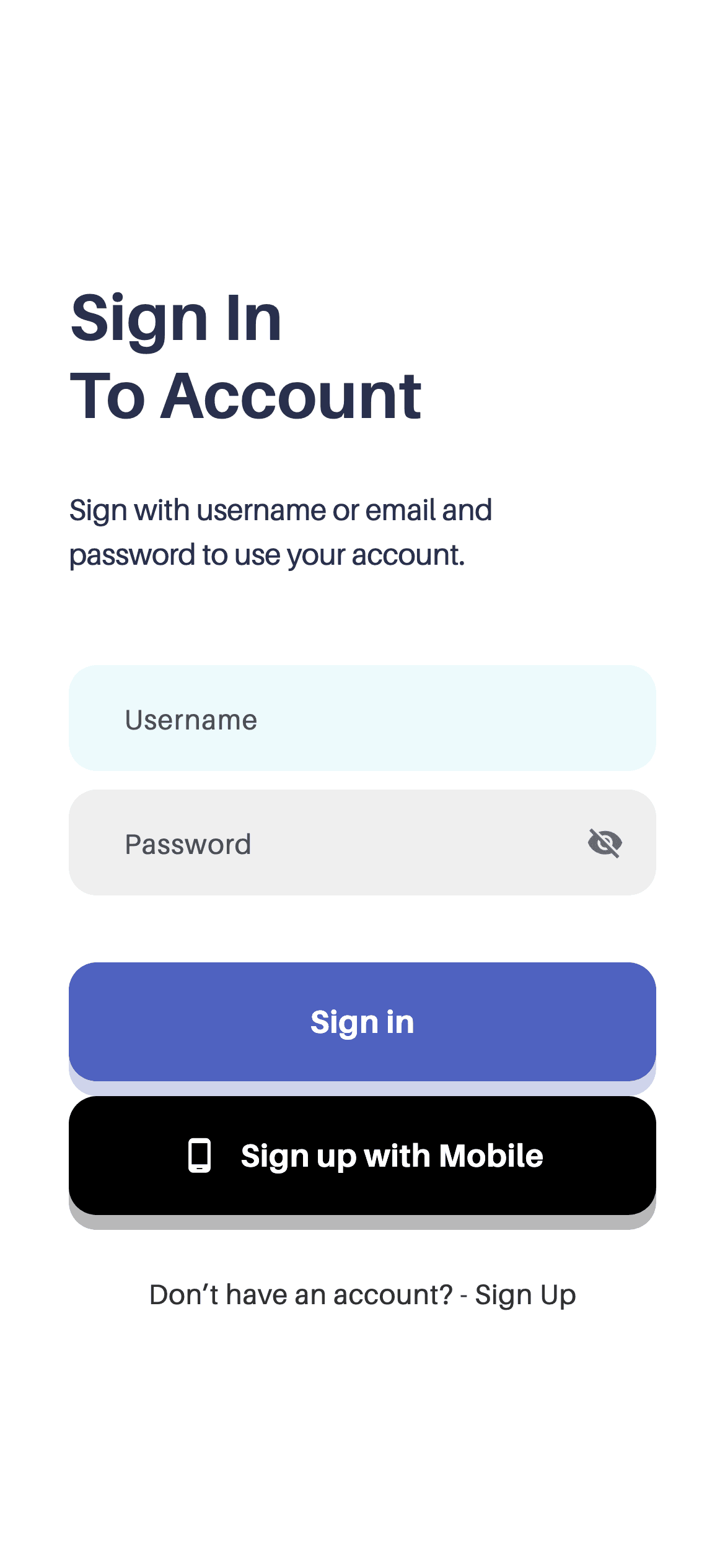
What you'll build
- ✓A left-aligned login header, deliberately different from the centred signup screen it pairs with
- ✓An obscured password field created by passing one flag to the shared WalletInput widget
- ✓One _Button widget that renders both the blue and black CTAs and derives its shadow from its own colour
- ✓A negative-letter-spacing helper line inset on the right so it wraps where the design says
- ✓A width-capped scrolling form that behaves when the keyboard opens
Step-by-step build
Create the file
Add a new file at lib/wallet_sign_in/wallet_sign_in_screen.dart in your Flutter project.
Register the bundled fonts
No external packages — this is pure Flutter. It does bundle its design font (Aileron), so drop the font file into fonts/ and declare it in pubspec.yaml:
flutter:
  fonts:
    - family: Aileron
      fonts:
- asset: fonts/Aileron-Regular.ttfBuild it, piece by piece
Here's how the screen goes together. Each block below is a real slice of the code with a plain-English explanation — paste them in order, or grab the whole file from the next section.
A stateless screen and its scroll layout
import 'package:flutter/material.dart';

import 'widgets/wallet_input.dart';

/// "Sign In To Account" screen from the Wallet App UI Kit (Finco): a
/// left-aligned header, username + password inputs, a blue "Sign in" CTA, a
/// black "Sign up with Mobile" button, and a "Sign Up" link.
///
/// Self-contained, pure Flutter. Bundles its exact design font (Aileron).
/// Fully responsive — scrolls and caps its width on large screens. Renders
/// standalone when pushed as a route.
class WalletSignInScreen extends StatelessWidget {
  const WalletSignInScreen({super.key});

  static const Color _ink = Color(0xFF29304D);
  static const Color _blue = Color(0xFF4F62C0);
  static const Color _muted = Color(0xFF323232);

  @override
  Widget build(BuildContext context) {
    return Scaffold(
      backgroundColor: Colors.white,
      body: SafeArea(
        child: Center(
          child: SingleChildScrollView(
            physics: const ClampingScrollPhysics(),
            padding: const EdgeInsets.fromLTRB(37, 56, 37, 40),
            child: ConstrainedBox(
              constraints: const BoxConstraints(maxWidth: 460),
              child: Column(
                crossAxisAlignment: CrossAxisAlignment.stretch,
                children: <Widget>[
One local import (WalletInput) and no packages. Unlike its sign-up sibling this is a StatelessWidget, because nothing here changes until you add controllers — the fields keep their own text internally. The three colour tokens are private statics on the class: _ink, _blue and _muted. The layout is the kit's standard form recipe: Center, then SingleChildScrollView with ClampingScrollPhysics so the content scrolls under a keyboard without rubber-banding, then ConstrainedBox(maxWidth: 460) so the form doesn't stretch across a tablet. Padding is 37px left/right with 56px of headroom, and CrossAxisAlignment.stretch makes the fields and buttons full-width.
The left-aligned header
                  // Header — left aligned.
                  const Text(
                    'Sign In\nTo Account',
                    textAlign: TextAlign.left,
                    style: TextStyle(
                      fontFamily: 'Aileron',
                      fontWeight: FontWeight.w700,
                      fontSize: 35,
                      height: 1.2,
                      color: _ink,
                    ),
                  ),
                  const SizedBox(height: 29),
                  const Padding(
                    padding: EdgeInsets.only(right: 58),
                    child: Text(
                      'Sign with username or email and password to use '
                      'your account.',
                      style: TextStyle(
                        fontFamily: 'Aileron',
                        fontWeight: FontWeight.w400,
                        fontSize: 16,
                        height: 1.5,
                        letterSpacing: -0.16,
                        color: _ink,
                      ),
                    ),
                  ),
                  const SizedBox(height: 48),
'Sign In\nTo Account' breaks across two lines at 35px w700 Aileron with height: 1.2, and textAlign: TextAlign.left is stated explicitly — worth noting because the sign-up screen in the same kit centres its header. Left-aligning login reads as businesslike where the signup 'Welcome!' reads as friendly. The helper line below is wrapped in Padding(right: 58), pulling the right edge in so the sentence wraps early rather than running the full width. It uses letterSpacing: -0.16, a slight negative tracking that tightens 16px text — a common trick for making larger body copy read as one block.
Username and password
                  // Inputs.
                  const WalletInput(hint: 'Username', accent: true),
                  const SizedBox(height: 10),
                  const WalletInput(hint: 'Password', obscure: true),

                  // CTAs.
                  const SizedBox(height: 36),
                  _Button(
                    label: 'Sign in',
                    background: _blue,
                    onTap: () {},
                  ),
                  const SizedBox(height: 8),
                  _Button(
                    label: 'Sign up with Mobile',
                    background: Colors.black,
                    icon: Icons.phone_android,
                    onTap: () {},
                  ),
Two WalletInputs, 10px apart. The first passes accent: true so the username field carries the highlighted style that draws the eye to where typing starts; the second passes obscure: true, which is all it takes to mask the password. A single shared field widget with flags like these is why both inputs can't drift apart in radius, padding or font. The two CTAs follow 36px below: the blue 'Sign in' and the black 'Sign up with Mobile' with a phone icon, only 8px apart so they read as a pair of routes into the app rather than an action and its afterthought.
The footer link
                  // Footer link.
                  const SizedBox(height: 28),
                  GestureDetector(
                    behavior: HitTestBehavior.opaque,
                    onTap: () {},
                    child: const Padding(
                      padding: EdgeInsets.symmetric(vertical: 4),
                      child: Text(
                        'Don’t have an account? - Sign Up',
                        textAlign: TextAlign.center,
                        style: TextStyle(
                          fontFamily: 'Aileron',
                          fontWeight: FontWeight.w400,
                          fontSize: 15,
                          color: _muted,
                        ),
                      ),
                    ),
                  ),
                ],
              ),
            ),
          ),
        ),
      ),
    );
  }
}
The 'Don't have an account? - Sign Up' link is a GestureDetector with HitTestBehavior.opaque wrapping a Padding of 4px vertical. That combination matters: opaque hit-test behaviour makes the padding itself tappable, so the touch target is taller than the 15px glyphs, which is the difference between a link that feels responsive and one users have to aim at. Point its onTap at your sign-up route — typically Navigator.pushReplacement, so the user doesn't stack login and signup screens on top of each other.
The reusable two-tone button
/// Full-width rounded button, optionally with a leading icon.
class _Button extends StatefulWidget {
  const _Button({
    required this.label,
    required this.background,
    required this.onTap,
    this.icon,
  });

  final String label;
  final Color background;
  final VoidCallback onTap;
  final IconData? icon;

  @override
  State<_Button> createState() => _ButtonState();
}

class _ButtonState extends State<_Button> {
  bool _pressed = false;

  @override
  Widget build(BuildContext context) {
    return GestureDetector(
      onTapDown: (_) => setState(() => _pressed = true),
      onTapUp: (_) => setState(() => _pressed = false),
      onTapCancel: () => setState(() => _pressed = false),
      onTap: widget.onTap,
      child: AnimatedScale(
        scale: _pressed ? 0.98 : 1,
        duration: const Duration(milliseconds: 150),
        child: Container(
          padding: const EdgeInsets.symmetric(vertical: 20),
          decoration: BoxDecoration(
            color: widget.background,
            borderRadius: BorderRadius.circular(15),
            boxShadow: <BoxShadow>[
              BoxShadow(
                color: widget.background.withValues(alpha: 0.28),
                blurRadius: 16,
                offset: const Offset(0, 8),
              ),
            ],
          ),
          child: Row(
            mainAxisAlignment: MainAxisAlignment.center,
            children: <Widget>[
              if (widget.icon != null) ...<Widget>[
                Icon(widget.icon, size: 20, color: Colors.white),
                const SizedBox(width: 12),
              ],
              Flexible(
                child: Text(
                  widget.label,
                  maxLines: 1,
                  overflow: TextOverflow.ellipsis,
                  textAlign: TextAlign.center,
                  style: const TextStyle(
                    fontFamily: 'Aileron',
                    fontWeight: FontWeight.w700,
                    fontSize: 17,
                    color: Colors.white,
                  ),
                ),
              ),
            ],
          ),
        ),
      ),
    );
  }
}
_Button is a StatefulWidget holding one _pressed boolean, set on onTapDown and cleared on both onTapUp and onTapCancel so a finger dragged off it springs back. AnimatedScale animates to 0.98 over 150ms. The nice detail is the shadow: widget.background.withValues(alpha: 0.28) derives the glow from whichever colour was passed in, so blue glows blue and black stays neutral, with no extra parameter. The optional leading icon is injected using if (widget.icon != null) ...<Widget>[...] — a spread that adds the icon and its 12px gap or nothing at all — and the label is Flexible with maxLines: 1 and ellipsis so a long translation truncates instead of overflowing.
Full code
The complete, ready-to-paste source (2 files). Free to use in your projects — one click copies it all.
import 'package:flutter/material.dart';

import 'widgets/wallet_input.dart';

/// "Sign In To Account" screen from the Wallet App UI Kit (Finco): a
/// left-aligned header, username + password inputs, a blue "Sign in" CTA, a
/// black "Sign up with Mobile" button, and a "Sign Up" link.
///
/// Self-contained, pure Flutter. Bundles its exact design font (Aileron).
/// Fully responsive — scrolls and caps its width on large screens. Renders
/// standalone when pushed as a route.
class WalletSignInScreen extends StatelessWidget {
  const WalletSignInScreen({super.key});

  static const Color _ink = Color(0xFF29304D);
  static const Color _blue = Color(0xFF4F62C0);
  static const Color _muted = Color(0xFF323232);

  @override
  Widget build(BuildContext context) {
    return Scaffold(
      backgroundColor: Colors.white,
      body: SafeArea(
        child: Center(
          child: SingleChildScrollView(
            physics: const ClampingScrollPhysics(),
            padding: const EdgeInsets.fromLTRB(37, 56, 37, 40),
            child: ConstrainedBox(
              constraints: const BoxConstraints(maxWidth: 460),
              child: Column(
                crossAxisAlignment: CrossAxisAlignment.stretch,
                children: <Widget>[
                  // Header — left aligned.
                  const Text(
                    'Sign In\nTo Account',
                    textAlign: TextAlign.left,
                    style: TextStyle(
                      fontFamily: 'Aileron',
                      fontWeight: FontWeight.w700,
                      fontSize: 35,
                      height: 1.2,
                      color: _ink,
                    ),
                  ),
                  const SizedBox(height: 29),
                  const Padding(
                    padding: EdgeInsets.only(right: 58),
                    child: Text(
                      'Sign with username or email and password to use '
                      'your account.',
                      style: TextStyle(
                        fontFamily: 'Aileron',
                        fontWeight: FontWeight.w400,
                        fontSize: 16,
                        height: 1.5,
                        letterSpacing: -0.16,
                        color: _ink,
                      ),
                    ),
                  ),
                  const SizedBox(height: 48),

                  // Inputs.
                  const WalletInput(hint: 'Username', accent: true),
                  const SizedBox(height: 10),
                  const WalletInput(hint: 'Password', obscure: true),

                  // CTAs.
                  const SizedBox(height: 36),
                  _Button(
                    label: 'Sign in',
                    background: _blue,
                    onTap: () {},
                  ),
                  const SizedBox(height: 8),
                  _Button(
                    label: 'Sign up with Mobile',
                    background: Colors.black,
                    icon: Icons.phone_android,
                    onTap: () {},
                  ),

                  // Footer link.
                  const SizedBox(height: 28),
                  GestureDetector(
                    behavior: HitTestBehavior.opaque,
                    onTap: () {},
                    child: const Padding(
                      padding: EdgeInsets.symmetric(vertical: 4),
                      child: Text(
                        'Don’t have an account? - Sign Up',
                        textAlign: TextAlign.center,
                        style: TextStyle(
                          fontFamily: 'Aileron',
                          fontWeight: FontWeight.w400,
                          fontSize: 15,
                          color: _muted,
                        ),
                      ),
                    ),
                  ),
                ],
              ),
            ),
          ),
        ),
      ),
    );
  }
}

/// Full-width rounded button, optionally with a leading icon.
class _Button extends StatefulWidget {
  const _Button({
    required this.label,
    required this.background,
    required this.onTap,
    this.icon,
  });

  final String label;
  final Color background;
  final VoidCallback onTap;
  final IconData? icon;

  @override
  State<_Button> createState() => _ButtonState();
}

class _ButtonState extends State<_Button> {
  bool _pressed = false;

  @override
  Widget build(BuildContext context) {
    return GestureDetector(
      onTapDown: (_) => setState(() => _pressed = true),
      onTapUp: (_) => setState(() => _pressed = false),
      onTapCancel: () => setState(() => _pressed = false),
      onTap: widget.onTap,
      child: AnimatedScale(
        scale: _pressed ? 0.98 : 1,
        duration: const Duration(milliseconds: 150),
        child: Container(
          padding: const EdgeInsets.symmetric(vertical: 20),
          decoration: BoxDecoration(
            color: widget.background,
            borderRadius: BorderRadius.circular(15),
            boxShadow: <BoxShadow>[
              BoxShadow(
                color: widget.background.withValues(alpha: 0.28),
                blurRadius: 16,
                offset: const Offset(0, 8),
              ),
            ],
          ),
          child: Row(
            mainAxisAlignment: MainAxisAlignment.center,
            children: <Widget>[
              if (widget.icon != null) ...<Widget>[
                Icon(widget.icon, size: 20, color: Colors.white),
                const SizedBox(width: 12),
              ],
              Flexible(
                child: Text(
                  widget.label,
                  maxLines: 1,
                  overflow: TextOverflow.ellipsis,
                  textAlign: TextAlign.center,
                  style: const TextStyle(
                    fontFamily: 'Aileron',
                    fontWeight: FontWeight.w700,
                    fontSize: 17,
                    color: Colors.white,
                  ),
                ),
              ),
            ],
          ),
        ),
      ),
    );
  }
}
Plus bundled 2 binary assets (fonts/images). The CLI and MCP install those for you automatically.
Two faster ways to add it
Copy-paste works, but you can skip it entirely.
1. FlutterKit CLI
One command drops this screen — and its fonts — straight into your project.
$ flutterkit add wallet-sign-in2. AI agent (MCP)
Connect FlutterKit's MCP server in Claude or Cursor and just ask your agent to install wallet-sign-in — it fetches and writes the files for you.
FAQ
Is this Flutter sign-in screen free to use?
Yes. The full Dart source on this page, including the WalletInput field widget, is free for personal and commercial projects. Install it with the FlutterKit CLI (flutterkit add wallet-sign-in) or have an AI agent add it via MCP.
How do I hook it up to real authentication?
Give each WalletInput a TextEditingController, read them in the 'Sign in' button's onTap, and call your auth provider — with Firebase that's FirebaseAuth.instance.signInWithEmailAndPassword(). You'll want to convert the screen to a StatefulWidget at that point so you can show a loading state.
Does it need any external packages?
No — it's pure Flutter on the material library. The only bundled asset is the Aileron font family (Regular and Bold), registered in pubspec.yaml as shown in step 2; the CLI and MCP install those font files for you.
Which Flutter version does it target?
Color.withValues() in the button shadow puts it at Flutter 3.22+ (Dart 3). On an older SDK, swap withValues(alpha: 0.28) for withOpacity(0.28) and it compiles unchanged.

