Pulse · Text Story
Pulse · Text Story is a production-ready Social Flutter screen from FlutterKit — free, with full source code.
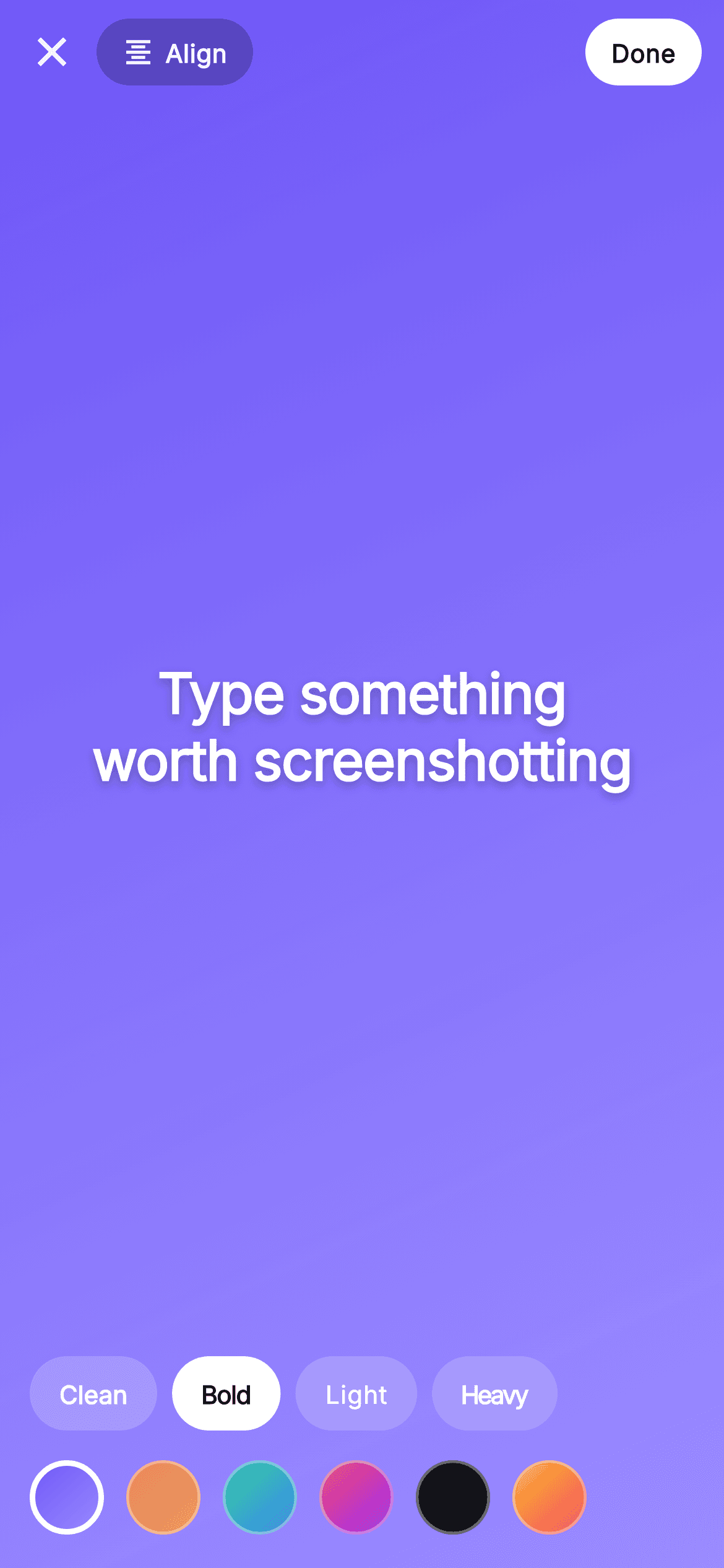
Text Story is Pulse's story-composer screen, built as a full-bleed gradient canvas that fills the whole viewport. Top-to-bottom: a SafeArea top bar carries a plain close (X) IconButton, a rounded _PillButton labelled Align whose icon cycles format_align_center / left / right on tap, a Spacer, and a filled white Done pill. The Expanded center holds the editable caption 'Type something worth screenshotting' in bundled Inter at 30px with a soft drop shadow, honoring the live text alignment. Below sit two horizontal ListView.separated rows: a font-style chip row (Clean w600, Bold w800, Light w300, Heavy w900 — each carrying its own weight and letter-spacing) where the selected chip flips to a solid white pill, and a circular background-swatch picker of six two-stop LinearGradients (indigo #6E56F7, sunset, teal-blue, magenta, near-black, and gold-to-pink) with the active swatch ringed in a thicker white border. Selection state (_bg, _font, _align) lives in the widget via setState so it works standalone, and every user action is surfaced through injected callbacks — onClose, onDone, onBackground(int), and onFont(String) — making it a backend-agnostic drop-in. It uses Pulse's dark near-mono aesthetic with the #6E56F7 indigo accent, ThemeData.dark, bundled Inter, SafeArea, and is self-contained pure Flutter with no network images and an overflow-proof layout.
Full tutorial coming soon.
The step-by-step walkthrough and complete Dart source for this screen haven't been published yet. They'll be free when they are — no sign-up, no payment. In the meantime, browse the screens that already have their tutorial.
What's included
- ✓Full-bleed topLeft-to-bottomRight LinearGradient canvas driven by the selected background index
- ✓Reusable _PillButton with icon+label, filled/ghost variants, used for Align and Done
- ✓Align pill that cycles TextAlign center/left/right and swaps its format_align icon on each tap
- ✓Font-style chip row of four _FontStyleOption presets (Clean/Bold/Light/Heavy) each with its own weight and letterSpacing
- ✓Six-swatch circular background picker of two-stop gradients with a thick white ring on the active swatch
- ✓Injected onClose, onDone, onBackground(int) and onFont(String) callbacks plus bundled Inter font and ThemeData.dark theme
Use cases
- ✓Drop-in story-composer screen for posting text-only stories in a social or chat app
- ✓Quick gradient quote-card or announcement creator inside a community product
- ✓Reusable caption editor with live font-weight and alignment controls for user-generated content
- ✓Starter screen for a Stories feature where backend save is wired through the onDone callback


