Pulse · Highlights
Pulse · Highlights is a production-ready Social Flutter screen from FlutterKit — free, with full source code.
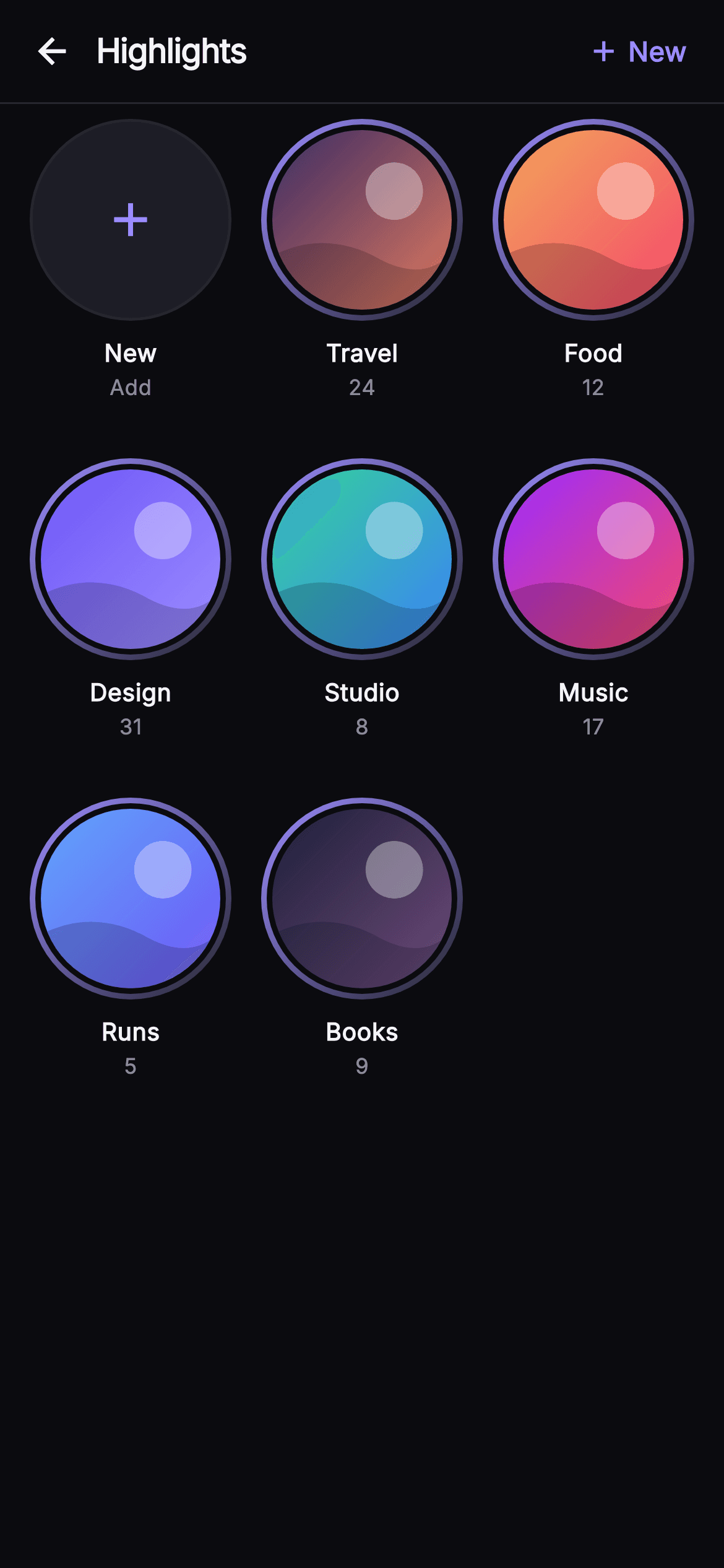
The Pulse Highlights screen renders the "Highlights" tab of a profile as a clean, self-contained Flutter component. A 56px top bar pins a back IconButton, a bold 'Highlights' title, and an indigo '+ New' action with an add icon. Below it, an Expanded GridView.count lays out three columns with 18px vertical and 16px horizontal spacing at a 0.66 child aspect ratio, so covers never overflow. The first cell is a _NewTile: a dark surface-alt circle outlined by a hairline border with a centered add glyph and 'New / Add' labels. Every other cell is a _HighlightTile — a gradient-ringed circular cover whose artwork is drawn entirely by the _CoverPainter CustomPainter: a two-tone diagonal LinearGradient fill, a soft translucent white disc as a light bleb, and a quadratic-bezier wave shadow across the lower third. Each cover carries a w600 title (Travel, Food, Design, Studio, Music, Runs, Books) and a muted saved-story count. Tapping a cover fires onHighlight with the title; the New tile and top-bar action both fire onNew; the back arrow fires onBack — so it is fully backend-agnostic and driven by injected callbacks. It ships Pulse's dark near-mono palette (0xFF0B0B0F background, 0xFF1D1D26 surface, 0xFF26262F hairline) with a lavender-indigo accent, bundled Inter typography, wrapped in a dark Theme and SafeArea. Pure Flutter, no network images — the covers are painted, not fetched.
Full tutorial coming soon.
The step-by-step walkthrough and complete Dart source for this screen haven't been published yet. They'll be free when they are — no sign-up, no payment. In the meantime, browse the screens that already have their tutorial.
What's included
- ✓_CoverPainter CustomPainter that draws each highlight cover from a two-tone diagonal gradient, a translucent white light disc, and a quadratic-bezier wave shadow
- ✓_HighlightTile cluster: gradient-ringed ClipOval cover over a bg gap, plus w600 title and muted saved-story count text
- ✓_NewTile leading cell — surface-alt circle with hairline border and indigo add glyph, labelled New / Add, wired to onNew
- ✓_TopBar with back IconButton, bold Highlights title, and an indigo '+ New' GestureDetector action
- ✓GridView.count 3-column layout at 0.66 aspect ratio with 18/16 spacing, Expanded and overflow-proof
- ✓Injected onBack, onNew and ValueChanged<String> onHighlight callbacks, bundled Inter font, own dark Theme and SafeArea
Use cases
- ✓Ship the Highlights tab on a user's profile where saved Stories are grouped into labelled circular collections
- ✓Give creators a place to curate and reorder highlight albums like Travel, Design or Music with live story counts
- ✓Kick off new-highlight creation from the leading New tile or top-bar action before an album has any cover art
- ✓Drop a painted, network-free cover grid into a social or portfolio app that must render offline with no image fetch


