Pulse · Topics
Pulse · Topics is a production-ready Social Flutter screen from FlutterKit — free, with full source code.
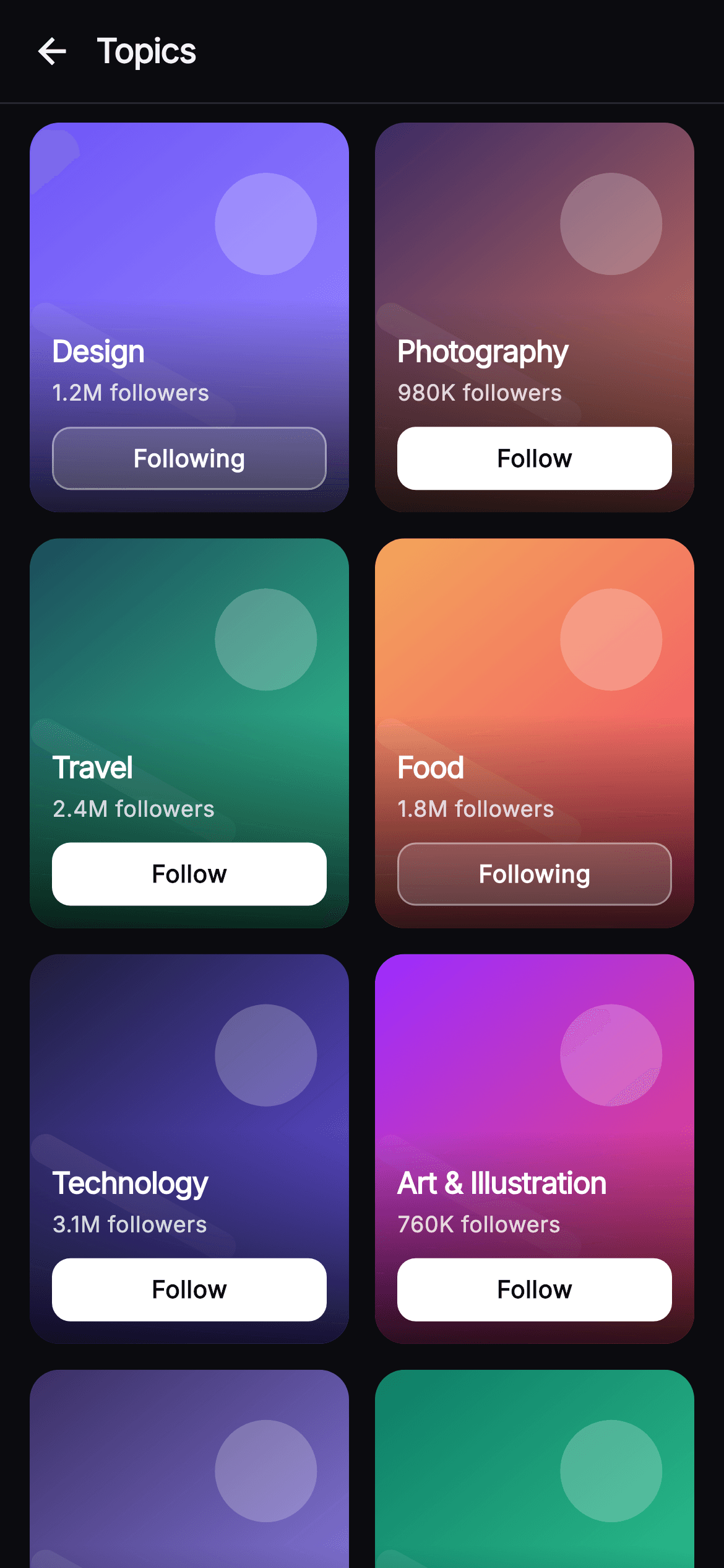
Pulse Topics is the explore-by-interest surface of the Pulse social network, shipped as a self-contained Flutter screen. A 56px top bar with a back arrow and a bold, tightly-tracked 'Topics' title sits above a hairline divider (#26262F). Below it, an Expanded GridView.builder lays out topic cards in two columns (SliverGridDelegateWithFixedCrossAxisCount, 0.82 aspect ratio, 14px gaps). Every card is a ClipRRect(16) stack: a custom-painted cover from _CoverPainter draws a top-left-to-bottom-right color gradient, a soft translucent white accent circle, and a rounded diagonal light streak, so each topic — Design, Photography, Travel, Food, Technology, Art & Illustration, Music, Fitness — gets its own vivid duotone with zero network images. A bottom-anchored black scrim gradient keeps the overlaid text legible; the card shows the topic title (w800, ellipsised at 2 lines), an '<n> followers' line at 80% white, and a full-width Follow button that flips to a bordered translucent 'Following' pill. Tapping the card fires onTopic(title); tapping the pill runs _toggle(i), which mutates a local _following Set and calls onFollow(title), re-rendering just that button. The palette is Pulse's dark near-mono (#0B0B0F ground, #F4F4F7 text) with the signature indigo #6E56F7 threaded through several covers, all set in the bundled Inter font. Pure Flutter (Material dark theme, SafeArea, overflow-proof, no plugins), it is backend-agnostic and drops into any app through its three injected callbacks.
Full tutorial coming soon.
The step-by-step walkthrough and complete Dart source for this screen haven't been published yet. They'll be free when they are — no sign-up, no payment. In the meantime, browse the screens that already have their tutorial.
What's included
- ✓_CoverPainter CustomPainter that renders each topic's duotone gradient cover with a translucent accent circle and diagonal light streak
- ✓Two-column GridView.builder with a fixed 0.82 aspect ratio and 14px main/cross spacing driving eight seeded topic cards
- ✓_TopicCard cluster: ClipRRect cover stack, bottom scrim gradient, w800 title, follower count, and inline follow pill
- ✓Stateful Follow / Following toggle backed by a local _following Set that flips button fill, border, and label per card
- ✓Injected callback hooks onBack, onTopic(title), and onFollow(title) keeping the screen fully backend-agnostic
- ✓Bundled Inter font with Pulse dark near-mono palette (#0B0B0F, #F4F4F7) and indigo #6E56F7 accents, SafeArea and overflow-proof
Use cases
- ✓Interest-onboarding step where new members pick topics to follow and personalize their feed
- ✓An Explore or Discover tab surfacing trending topic communities with live follower counts
- ✓A 'topics you might like' recommendation grid deep-linked from a post or hashtag
- ✓A settings-style manage-interests screen where users audit and toggle the topics they follow


