How to Build a No Friends Empty State in Flutter (Full Code + Preview)
An empty contacts tab is a dead end unless you give it something to do. This tutorial builds a warm 'no friends yet' empty state: a 'Better with friends' title on top, a playful bread-and-jam character illustration in the middle, a two-line prompt telling the user what the button does, and a bright mint circular '+' with a soft glow near the bottom. You'll size the artwork from its real 844:916 ratio, balance the four elements with weighted Spacers, and add a press animation that makes the add button feel like the obvious next tap.
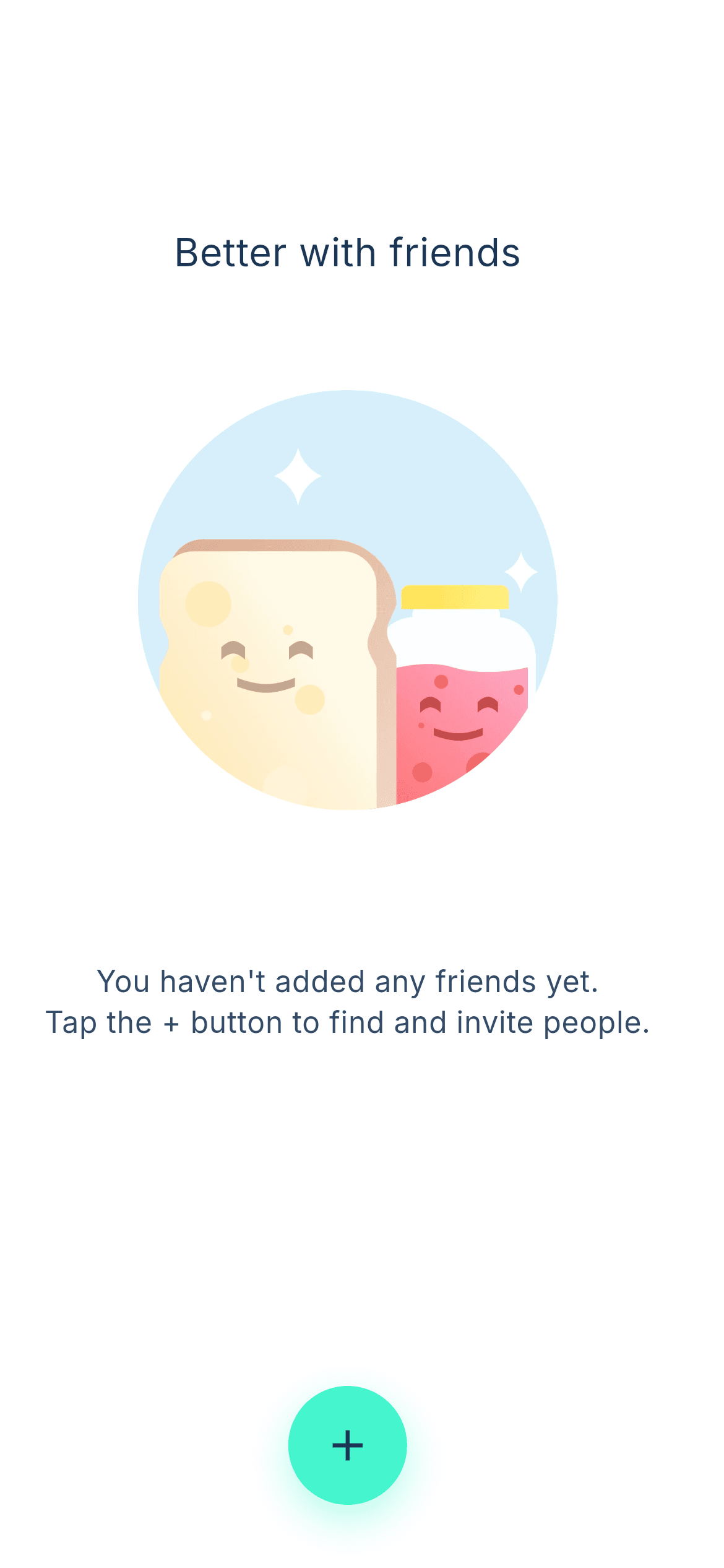
What you'll build
- ✓An illustration whose height is derived from the artwork's true 844:916 aspect ratio, never squashed
- ✓A title-above-art layout — unusual for empty states, and the reason this one reads as friendly rather than apologetic
- ✓A 64px circular mint '+' button with a colour-matched glow and a 0.94 press scale
- ✓Copy that names the action ('Tap the + button') so the empty state teaches instead of just informing
- ✓The bundled Inter design font wired through pubspec.yaml
Step-by-step build
Create the file
Add a new file at lib/no_friends/no_friends_screen.dart in your Flutter project.
Register the bundled fonts
No external packages — this is pure Flutter. It does bundle its design font (Inter), so drop the font file into fonts/ and declare it in pubspec.yaml:
flutter:
  fonts:
    - family: Inter
      fonts:
- asset: fonts/Inter-Regular.ttfBuild it, piece by piece
Here's how the screen goes together. Each block below is a real slice of the code with a plain-English explanation — paste them in order, or grab the whole file from the next section.
Tokens and ratio-driven image sizing
import 'package:flutter/material.dart';

/// "No Friends" empty-state screen from the Empty States UI Kit: a centred
/// title ("Better with friends"), a cheerful bread-and-jam pair illustration, a
/// short supporting line, and a circular "+" action button pinned near the
/// bottom to add the first friend.
///
/// Self-contained, pure Flutter. Bundles its design font (Inter) and the kit's
/// original illustration (converted to WebP). Fully responsive — flex spacers
/// centre the content on tall devices and a scroll fallback prevents overflow
/// on short ones. Renders standalone when pushed as a route.
class NoFriendsScreen extends StatelessWidget {
  const NoFriendsScreen({super.key});

  static const Color _ink = Color(0xFF1B3554);
  static const Color _body = Color(0xFF344B67);
  static const Color _mint = Color(0xFF46F5CD);
  static const String _font = 'Inter';
  static const String _image =
      'lib/screens/empty_states/no_friends/images/no_friends_bread_jam.webp';

  @override
  Widget build(BuildContext context) {
    return Scaffold(
      backgroundColor: Colors.white,
      body: SafeArea(
        child: LayoutBuilder(
          builder: (BuildContext context, BoxConstraints constraints) {
            // Illustration scales to the viewport width within a sensible
            // range; height follows the artwork's 844:916 ratio.
            final double imgWidth =
                (constraints.maxWidth * 0.58).clamp(190.0, 300.0);
            final double imgHeight = imgWidth * (916 / 844);
The palette is three consts: _ink (#1B3554) for the title and the glyph inside the button, _body (#344B67) for the softer supporting line, and _mint (#46F5CD) for the add button. _font and _image are consts too, so the font name and asset path each appear once. The sizing is the interesting part: imgWidth is 58% of the available width clamped between 190 and 300 logical pixels, and imgHeight is imgWidth * (916 / 844) — the artwork's actual pixel ratio written as a division. Deriving height from width like this means the character illustration scales without ever distorting, on any device.
The scroll-safe scaffold
            return SingleChildScrollView(
              physics: const ClampingScrollPhysics(),
              child: ConstrainedBox(
                constraints: BoxConstraints(minHeight: constraints.maxHeight),
                child: IntrinsicHeight(
                  child: Padding(
                    padding: const EdgeInsets.symmetric(horizontal: 24),
                    child: Column(
                      crossAxisAlignment: CrossAxisAlignment.center,
                      children: <Widget>[
Three widgets make this layout impossible to overflow. SingleChildScrollView with ClampingScrollPhysics allows scrolling but suppresses the iOS bounce when the content already fits. ConstrainedBox(minHeight: constraints.maxHeight) forces the column to be at least a screen tall, so the Spacers below have room to distribute. IntrinsicHeight then lets the column size itself to its children when it needs more than a screen. Without this trio, an empty state with an image plus four Spacers is one small phone away from a yellow-and-black overflow stripe.
Title, illustration and prompt
                        const Spacer(flex: 2),
                        const Text(
                          'Better with friends',
                          textAlign: TextAlign.center,
                          style: TextStyle(
                            fontFamily: _font,
                            fontWeight: FontWeight.w500,
                            fontSize: 21,
                            height: 1.2,
                            color: _ink,
                          ),
                        ),
                        const Spacer(flex: 1),
                        Image.asset(
                          _image,
                          width: imgWidth,
                          height: imgHeight,
                          fit: BoxFit.contain,
                          filterQuality: FilterQuality.high,
                        ),
                        const Spacer(flex: 1),
                        const Text(
                          "You haven't added any friends yet.\n"
                          'Tap the + button to find and invite people.',
                          textAlign: TextAlign.center,
                          style: TextStyle(
                            fontFamily: _font,
                            fontWeight: FontWeight.w500,
                            fontSize: 16,
                            height: 1.37,
                            color: _body,
                          ),
                        ),
                        const Spacer(flex: 3),
The composition runs Spacer(flex: 2), title, Spacer(flex: 1), image, Spacer(flex: 1), body copy, Spacer(flex: 3). Putting the title above the art — rather than the usual art-then-text order — is what makes this state feel like a headline rather than an error message. 'Better with friends' is 21px w500 Inter at height: 1.2 in _ink; the two-line prompt below the image is 16px w500 at height: 1.37 in the lighter _body. That prompt is written as two adjacent strings with an explicit \n, and note the double-quoted first literal — it's quoted that way so the apostrophe in "haven't" needs no escaping. The largest gap, Spacer(flex: 3), sits just before the button so the action is clearly separated from the explanation.
The circular mint add button
/// Circular "+" button with a pressed-scale animation and a soft mint shadow,
/// matching the kit's floating add action for this screen.
class _AddButton extends StatefulWidget {
  const _AddButton();

  @override
  State<_AddButton> createState() => _AddButtonState();
}

class _AddButtonState extends State<_AddButton> {
  bool _pressed = false;

  @override
  Widget build(BuildContext context) {
    return GestureDetector(
      onTapDown: (_) => setState(() => _pressed = true),
      onTapUp: (_) => setState(() => _pressed = false),
      onTapCancel: () => setState(() => _pressed = false),
      onTap: () {},
      child: AnimatedScale(
        scale: _pressed ? 0.94 : 1,
        duration: const Duration(milliseconds: 150),
        child: Container(
          width: 64,
          height: 64,
          decoration: BoxDecoration(
            color: NoFriendsScreen._mint,
            shape: BoxShape.circle,
            boxShadow: <BoxShadow>[
              BoxShadow(
                color: NoFriendsScreen._mint.withValues(alpha: 0.40),
                blurRadius: 18,
                offset: const Offset(0, 8),
              ),
            ],
          ),
          // Dark glyph on the bright mint button for contrast.
          child: const Icon(Icons.add, color: NoFriendsScreen._ink, size: 28),
        ),
      ),
    );
  }
}
_AddButton is a StatefulWidget holding a single _pressed boolean, toggled by onTapDown / onTapUp / onTapCancel. AnimatedScale drops it to 0.94 over 150ms — a deeper squeeze than the 0.98 used on wide pill buttons elsewhere in the library, because a small round target needs a bigger scale change to register as pressed. The Container is a flat 64×64 circle via shape: BoxShape.circle filled with _mint, and its BoxShadow is _mint at 40% alpha with an 18px blur offset 8px down, which produces the soft mint glow rather than a grey drop shadow. The Icons.add glyph is drawn in the dark _ink navy at 28px, because a white icon on a bright mint fill would fail contrast.
Full code
The complete, ready-to-paste source. Free to use in your projects — one click copies it all.
import 'package:flutter/material.dart';

/// "No Friends" empty-state screen from the Empty States UI Kit: a centred
/// title ("Better with friends"), a cheerful bread-and-jam pair illustration, a
/// short supporting line, and a circular "+" action button pinned near the
/// bottom to add the first friend.
///
/// Self-contained, pure Flutter. Bundles its design font (Inter) and the kit's
/// original illustration (converted to WebP). Fully responsive — flex spacers
/// centre the content on tall devices and a scroll fallback prevents overflow
/// on short ones. Renders standalone when pushed as a route.
class NoFriendsScreen extends StatelessWidget {
  const NoFriendsScreen({super.key});

  static const Color _ink = Color(0xFF1B3554);
  static const Color _body = Color(0xFF344B67);
  static const Color _mint = Color(0xFF46F5CD);
  static const String _font = 'Inter';
  static const String _image =
      'lib/screens/empty_states/no_friends/images/no_friends_bread_jam.webp';

  @override
  Widget build(BuildContext context) {
    return Scaffold(
      backgroundColor: Colors.white,
      body: SafeArea(
        child: LayoutBuilder(
          builder: (BuildContext context, BoxConstraints constraints) {
            // Illustration scales to the viewport width within a sensible
            // range; height follows the artwork's 844:916 ratio.
            final double imgWidth =
                (constraints.maxWidth * 0.58).clamp(190.0, 300.0);
            final double imgHeight = imgWidth * (916 / 844);

            return SingleChildScrollView(
              physics: const ClampingScrollPhysics(),
              child: ConstrainedBox(
                constraints: BoxConstraints(minHeight: constraints.maxHeight),
                child: IntrinsicHeight(
                  child: Padding(
                    padding: const EdgeInsets.symmetric(horizontal: 24),
                    child: Column(
                      crossAxisAlignment: CrossAxisAlignment.center,
                      children: <Widget>[
                        const Spacer(flex: 2),
                        const Text(
                          'Better with friends',
                          textAlign: TextAlign.center,
                          style: TextStyle(
                            fontFamily: _font,
                            fontWeight: FontWeight.w500,
                            fontSize: 21,
                            height: 1.2,
                            color: _ink,
                          ),
                        ),
                        const Spacer(flex: 1),
                        Image.asset(
                          _image,
                          width: imgWidth,
                          height: imgHeight,
                          fit: BoxFit.contain,
                          filterQuality: FilterQuality.high,
                        ),
                        const Spacer(flex: 1),
                        const Text(
                          "You haven't added any friends yet.\n"
                          'Tap the + button to find and invite people.',
                          textAlign: TextAlign.center,
                          style: TextStyle(
                            fontFamily: _font,
                            fontWeight: FontWeight.w500,
                            fontSize: 16,
                            height: 1.37,
                            color: _body,
                          ),
                        ),
                        const Spacer(flex: 3),
                        const _AddButton(),
                        const SizedBox(height: 34),
                      ],
                    ),
                  ),
                ),
              ),
            );
          },
        ),
      ),
    );
  }
}

/// Circular "+" button with a pressed-scale animation and a soft mint shadow,
/// matching the kit's floating add action for this screen.
class _AddButton extends StatefulWidget {
  const _AddButton();

  @override
  State<_AddButton> createState() => _AddButtonState();
}

class _AddButtonState extends State<_AddButton> {
  bool _pressed = false;

  @override
  Widget build(BuildContext context) {
    return GestureDetector(
      onTapDown: (_) => setState(() => _pressed = true),
      onTapUp: (_) => setState(() => _pressed = false),
      onTapCancel: () => setState(() => _pressed = false),
      onTap: () {},
      child: AnimatedScale(
        scale: _pressed ? 0.94 : 1,
        duration: const Duration(milliseconds: 150),
        child: Container(
          width: 64,
          height: 64,
          decoration: BoxDecoration(
            color: NoFriendsScreen._mint,
            shape: BoxShape.circle,
            boxShadow: <BoxShadow>[
              BoxShadow(
                color: NoFriendsScreen._mint.withValues(alpha: 0.40),
                blurRadius: 18,
                offset: const Offset(0, 8),
              ),
            ],
          ),
          // Dark glyph on the bright mint button for contrast.
          child: const Icon(Icons.add, color: NoFriendsScreen._ink, size: 28),
        ),
      ),
    );
  }
}
Plus bundled 2 binary assets (fonts/images). The CLI and MCP install those for you automatically.
Two faster ways to add it
Copy-paste works, but you can skip it entirely.
1. FlutterKit CLI
One command drops this screen — and its fonts — straight into your project.
$ flutterkit add no-friends2. AI agent (MCP)
Connect FlutterKit's MCP server in Claude or Cursor and just ask your agent to install no-friends — it fetches and writes the files for you.
FAQ
Is this Flutter empty state free to use?
Yes. The full Dart source on this page is free for personal and commercial projects. Copy it directly, install it with the FlutterKit CLI (flutterkit add no-friends), or have an AI agent add it via MCP.
Can I use my own illustration?
Yes. Point _image at your file and change the 916 / 844 ratio to your artwork's height over width — that single number is the only thing tying the layout to this particular picture.
Does it need any external packages?
No — it's pure Flutter on the material library. It bundles the Inter font and the bread-and-jam illustration as a WebP, both registered in pubspec.yaml as shown in step 2. The CLI and MCP install those files for you.
Which Flutter version does it target?
It uses Color.withValues() for the button glow, so it targets Flutter 3.22+ (Dart 3). On an older SDK, swap withValues(alpha: 0.40) for withOpacity(0.40). WebP images are supported on all current Flutter targets.

